


 This blog covers three exercises on using Matplotlib in Python. Exercise 11.1 demonstrates plotting a function using numpy.arange for dense points. Exercise 11.2 involves plotting functions with least-squares solutions using numpy.linalg.lstsq. Exercise 11.3 explores histogram and density estimation with scipy.stats.gaussian_kde. Each exercise includes analysis, relevant explanations, code implementation, and corresponding images."
132851840,10220647,AutoSAR入门:理解基础与核心概念,"['autosar', '开发语言', '软件架构']
This blog covers three exercises on using Matplotlib in Python. Exercise 11.1 demonstrates plotting a function using numpy.arange for dense points. Exercise 11.2 involves plotting functions with least-squares solutions using numpy.linalg.lstsq. Exercise 11.3 explores histogram and density estimation with scipy.stats.gaussian_kde. Each exercise includes analysis, relevant explanations, code implementation, and corresponding images."
132851840,10220647,AutoSAR入门:理解基础与核心概念,"['autosar', '开发语言', '软件架构']
Exercise 11.1: Plotting a function

分析:
要绘制这样的函数图像,用点来描绘,选择给定区间较密集的点(用numpy.arange实现其x坐标在该区域的等距选取),y用给定的表达式给出,使用plot绘制即可。
相关说明:
- pylab将pyplot与numpy合并为一个命名空间。这对于交互式工作很方便,但是对于编程来说,建议将名称空间分开。
例:画 y = sin x 图像(我由此找到了解题的方法)
import numpy as np
import matplotlib.pyplot as plt

x = np.arange(0, 5, 0.1);
y = np.sin(x)
plt.plot(x, y)
plt.show()
2 . arrange()函数
函数说明:arange([start,] stop[, step,], dtype=None)根据start与stop指定的范围以及step设定的步长,生成一个 ndarray。 dtype : dtype
The type of the output array. If dtype is not given, infer the data
type from the other input arguments.
ow、high、size三个参数。默认high是None,如果只有low,那范围就是[0,low)。如果有high,范围就是[low,high)。
一些例子:
np.random.randint(2, size=10)
array([1, 0, 0, 0, 1, 1, 0, 0, 1, 0])

 np.random.randint(1, size=10)
array([0, 0, 0, 0, 0, 0, 0, 0, 0, 0])

 np.random.randint(5, size=(2, 4))
array([[4, 0, 2, 1],
       [3, 2, 2, 0]])
代码实现
x = np.arange(0,2,0.01);
y = ((np.sin(x-2))**2)*np.power(math.e, -x*x)
plt.plot(x, y)
plt.title('f(x) = sin^2(x-2)*e^(-x^2)')
plt.ylabel('y')
plt.xlabel('x')
plt.show()
图像:

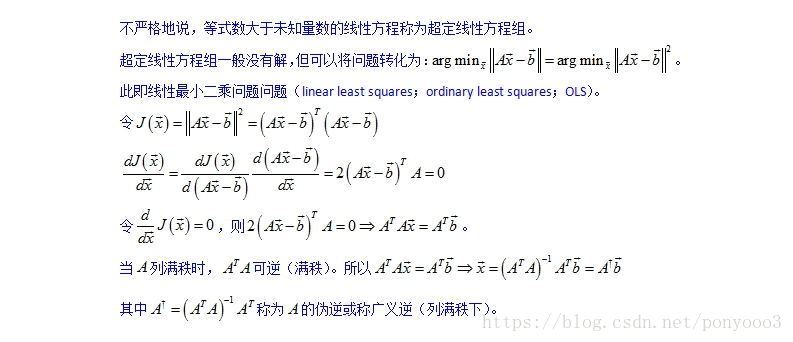
Exercise 11.2: Plotting a function

分析:
按照题目要求分别实现各变量,再绘制x-b和x-b^即可,其中b^可以用最小二乘法实现。
相关说明:
- x轴上下限设定xlim([a,b])
y轴上下限设定ylim([a,b]) - https://blog.youkuaiyun.com/lk274857347/article/details/54618934
- numpy.linalg.lstsq(a, b, rcond=-1)
Return the least-squares solution to a linear matrix equation.
Solves the equation a x = b by computing a vector x that minimizes the Euclidean 2-norm || b - a x ||^2. The equation may be under-, well-, or over- determined (i.e., the number of linearly independent rows of a can be less than, equal to, or greater than its number of linearly independent columns). If a is square and of full rank, then x (but for round-off error) is the “exact” solution of the equation.
代码实现:
#11.2
X = np.random.random_sample((20, 10)) * 10
b = np.random.random(10)*3-1.5
z = np.random.normal(0,1,size=20)
y = np.dot(X,b) + z
x = np.arange(0, 10)
B = np.array(np.linalg.lstsq(X, y, rcond = -1)[0])
plt.xlim(0, 9)
plt.ylim(-1.5, 1.5)
plt.xlabel("index")
plt.ylabel("value")
plt.scatter(x, b, c = 'r', marker = 'x', label='True coefficients')       #redx for x
plt.scatter(x, B, c = 'b', marker = 'o', label='Estimated coefficients')  #blueo for B
plt.hlines(0, 0, 9, colors='k', linestyle="-")
plt.tight_layout()  #tight show
plt.show()          #middle show
图像:

Exercise 11.3: Histogram and density estimation

相关说明:
- scipy.stats.gaussian_kde
Attributes

dataset (ndarray) The dataset with which gaussian_kde was initialized.
d   (int) Number of dimensions.
n   (int) Number of datapoints.
factor  (float) The bandwidth factor, obtained from kde.covariance_factor, with which the covariance matrix is multiplied.
covariance  (ndarray) The covariance matrix of dataset, scaled by the calculated bandwidth (kde.factor).
inv_cov (ndarray) The inverse of covariance.

Methods
kde.evaluate(points)    (ndarray) Evaluate the estimated pdf on a provided set of points.
kde(points) (ndarray) Same as kde.evaluate(points)
kde.integrate_gaussian(mean, cov)   (float) Multiply pdf with a specified Gaussian and integrate over the whole domain.
kde.integrate_box_1d(low, high) (float) Integrate pdf (1D only) between two bounds.
kde.integrate_box(low_bounds, high_bounds)  (float) Integrate pdf over a rectangular space between low_bounds and high_bounds.
kde.integrate_kde(other_kde)    (float) Integrate two kernel density estimates multiplied together.
kde.resample(size=None) (ndarray) Randomly sample a dataset from the estimated pdf.
kde.set_bandwidth(bw_method=’scott’)    (None) Computes the bandwidth, i.e. the coefficient that multiplies the data covariance matrix to obtain the kernel covariance matrix. .. versionadded:: 0.11.0
代码实现:
#11.3
z = np.random.normal(100, 50, 10000)
kernel = stats.gaussian_kde(z)
x = np.linspace(-100,300,1000)
plt.hist(z, 25,rwidth=0.8,color = 'blue',density=True)
plt.plot(x, kernel.evaluate(x), c = 'r')
plt.show()
图像:

完整代码:
#coding=utf-8
import numpy as np
import matplotlib.pyplot as plt
from scipy import linalg
from scipy import stats


import math

#11.1
x = np.arange(0,2,0.01);
y = ((np.sin(x-2))**2)*np.power(math.e, -x*x)
plt.plot(x, y)
plt.title('f(x) = sin^2(x-2)*e^(-x^2)')
plt.ylabel('y')
plt.xlabel('x')
plt.show()

#11.2
X = np.random.random_sample((20, 10)) * 10
b = np.random.random(10)*3-1.5
z = np.random.normal(0,1,size=20)
y = np.dot(X,b) + z
x = np.arange(0, 10)
B = np.array(np.linalg.lstsq(X, y, rcond = -1)[0])
plt.xlim(0, 9)
plt.ylim(-1.5, 1.5)
plt.xlabel("index")
plt.ylabel("value")
plt.scatter(x, b, c = 'r', marker = 'x', label='True coefficients')       #redx for x
plt.scatter(x, B, c = 'b', marker = 'o', label='Estimated coefficients')  #blueo for B
plt.hlines(0, 0, 9, colors='k', linestyle="-")
plt.tight_layout()  #tight show
plt.show()          #middle show

#11.3
z = np.random.normal(100, 50, 10000)
kernel = stats.gaussian_kde(z)
x = np.linspace(-100,300,1000)
plt.hist(z, 25,rwidth=0.8,color = 'blue',density=True)
plt.plot(x, kernel.evaluate(x), c = 'r')
plt.show()


 17
17

 被折叠的 条评论
为什么被折叠?
被折叠的 条评论
为什么被折叠?
 到【灌水乐园】发言


