


前言
近期在完善博客内容,发现关于【景点后台管理系统】的项目内容没有更新完,所以接下来会找时间完善一下。
上篇:项目介绍以及准备、初始化工作
中篇:前端页面开发
下篇:后端接口开发+调试+项目完结
本文是【中篇】,我们将实现前端页面内容。
一、实现效果
首先看一下实现效果。
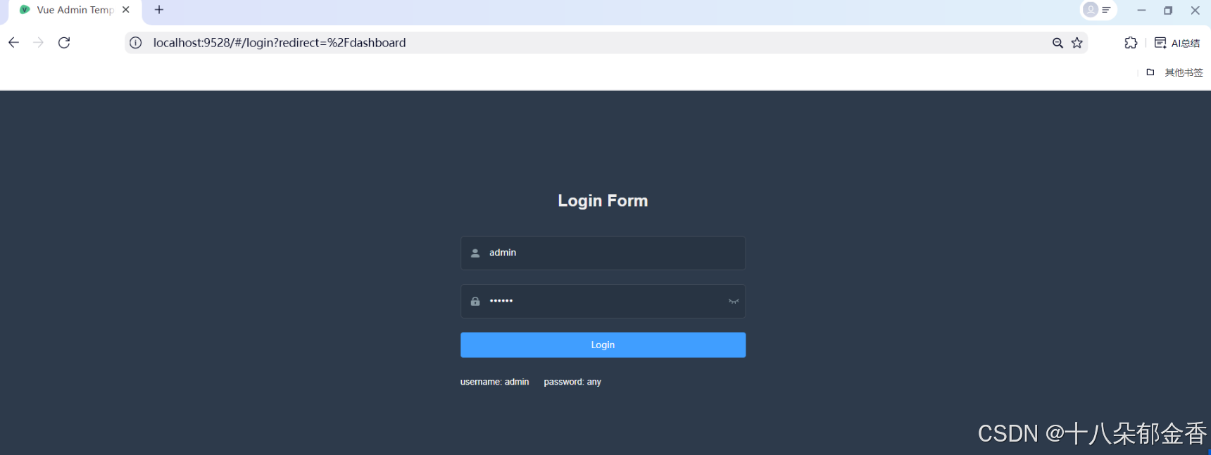
登录页(vue-admin-template后台模板已实现)
景点管理列表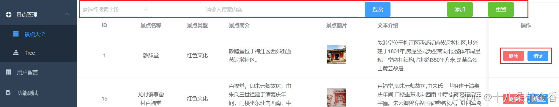
具体的展示内容,可以看express+Vue2进行项目实战-景点后台管理系统(上篇)_express vue项目实战-优快云博客
这里有详细介绍。
二、开发内容
接下来正式进入到开发环节
1、登录页
vue-admin-template后台模板已经实现登录页面样式以及登录功能。
登录逻辑
    handleLogin() {
      this.$refs.loginForm.validate(valid => {
        if (valid) {
          this.loading = true
          this.$store.dispatch('user/login', this.loginForm).then(() => {
            this.$router.push({ path: this.redirect || '/' })
            this.loading = false
          }).catch(() => {
            this.loading = false
          })
        } else {
          console.log('error submit!!')
          return false
        }
      })
    }
这段代码实现了一个完整的登录流程控制,包括表单验证、加载状态管理、登录请求触发、以及登录成功 / 失败后的相应处理,是 Vue 项目中常见的登录功能实现方式。
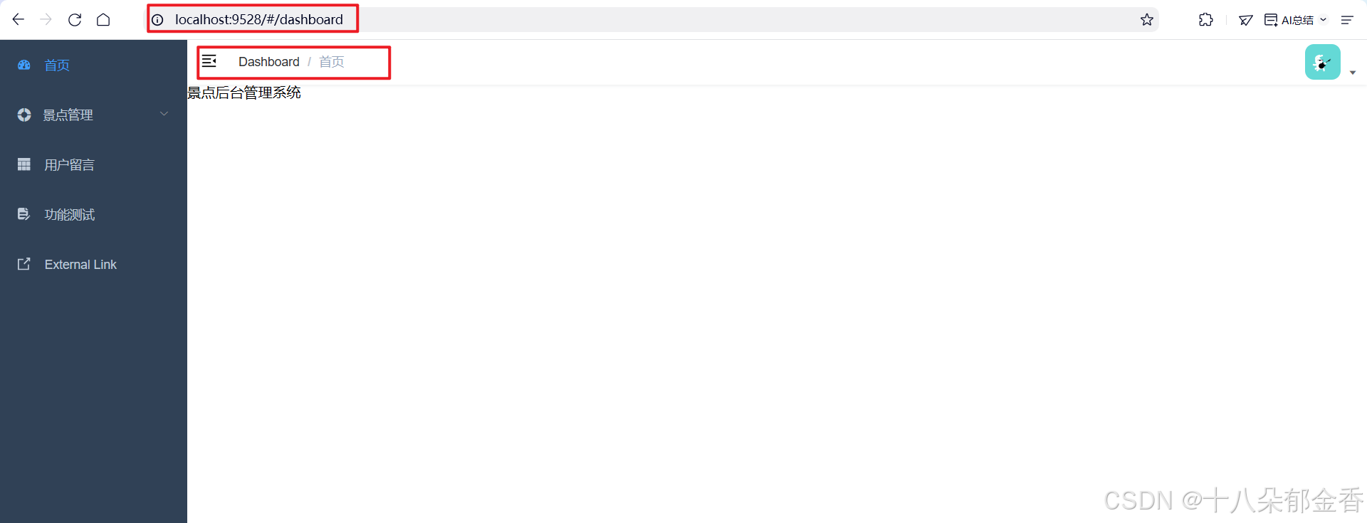
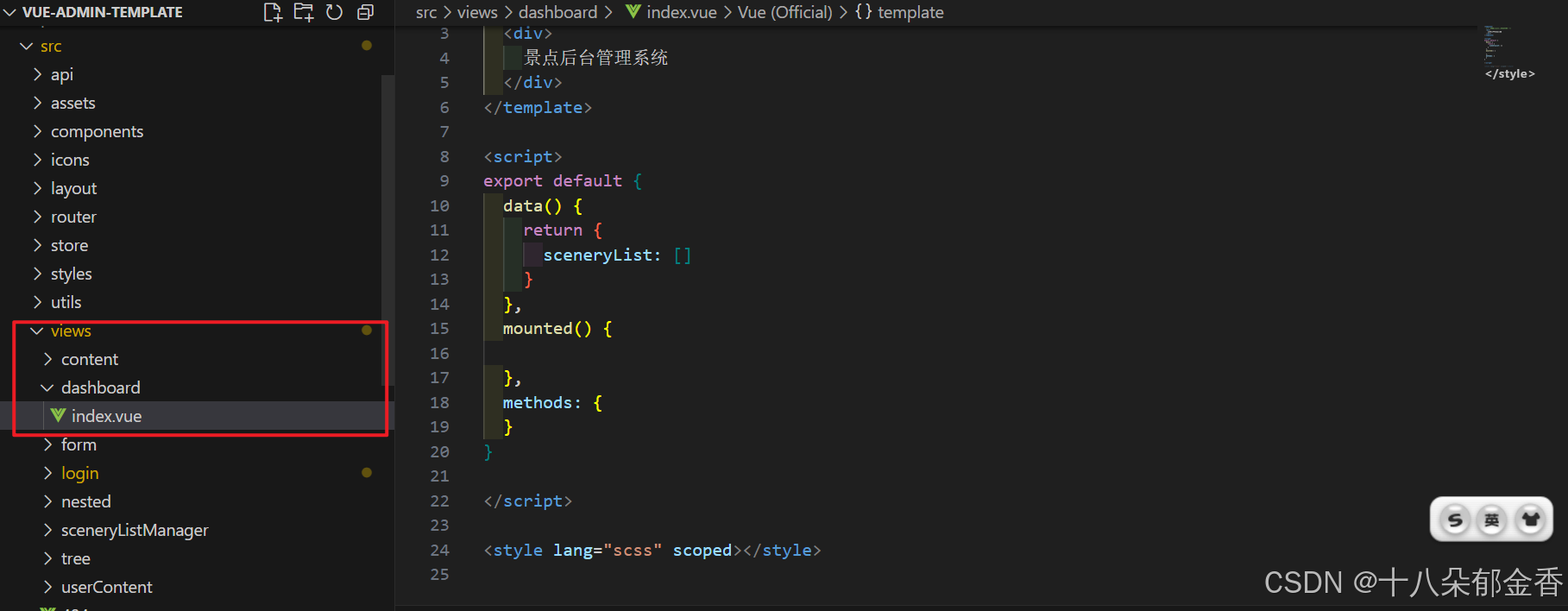
2、首页
登录成功后,会跳转到首页
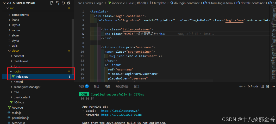
首页位置:src\views\dashboard
可以添加代码,丰富首页的内容。
3、如何添加层次菜单?
代码位置:src\router\index.js
建议:参考模版提供的写法。
这里演示手动配置定义 "景点管理" 的路由模块。
  {
    path: '/scenery',
    component: Layout,
    redirect: '/scenery/sceneryListManager',
    name: 'Scenery',
    meta: {
      title: '景点管理',
      icon: 'el-icon-s-help'
    },
    children: [
      {
        path: 'sceneryListManager',
        name: 'sceneryListManager',
        component: () => import('@/views/sceneryListManager/index'),
        meta: {
          title: '景点大全',
          icon: 'table'
        }
      },
      {
        path: 'tree',
        name: 'Tree',
        component: () => import('@/views/tree/index'),
        meta: {
          title: 'Tree',
          icon: 'tree'
        }
      }
    ]
},路由基本配置:
path: '/scenery':定义路由路径,访问时使用/scenerycomponent: Layout:指定该路由使用的布局组件(通常是包含侧边栏、顶部导航的公共布局)redirect: '/scenery/sceneryListManager':设置重定向,当访问/scenery时自动跳转到其第一个子路由name: 'Scenery':路由名称,用于标识路由(需唯一)
子路由配置(children):
这是一个嵌套路由数组,表示
/scenery下的子页面:
第一个子路由:
{
  path: 'sceneryListManager',
  name: 'sceneryListManager',
  component: () => import('@/views/sceneryListManager/index'),
  meta: {
    title: '景点大全',
    icon: 'table'
  }
}
- 完整访问路径为
/scenery/sceneryListManager- 使用懒加载方式导入组件
@/views/sceneryListManager/index- 菜单显示文本为 "景点大全",图标为表格图标
第二个子路由:
{
  path: 'tree',
  name: 'Tree',
  component: () => import('@/views/tree/index'),
  meta: {
    title: 'Tree',
    icon: 'tree'
  }
}
- 完整访问路径为
/scenery/tree- 对应组件为
@/views/tree/index- 菜单显示文本为 "Tree",图标为树形图标
4、景点管理页面
这里可以分为两个模块:信息查询(暂时忽略【添加按钮】)、列表展示
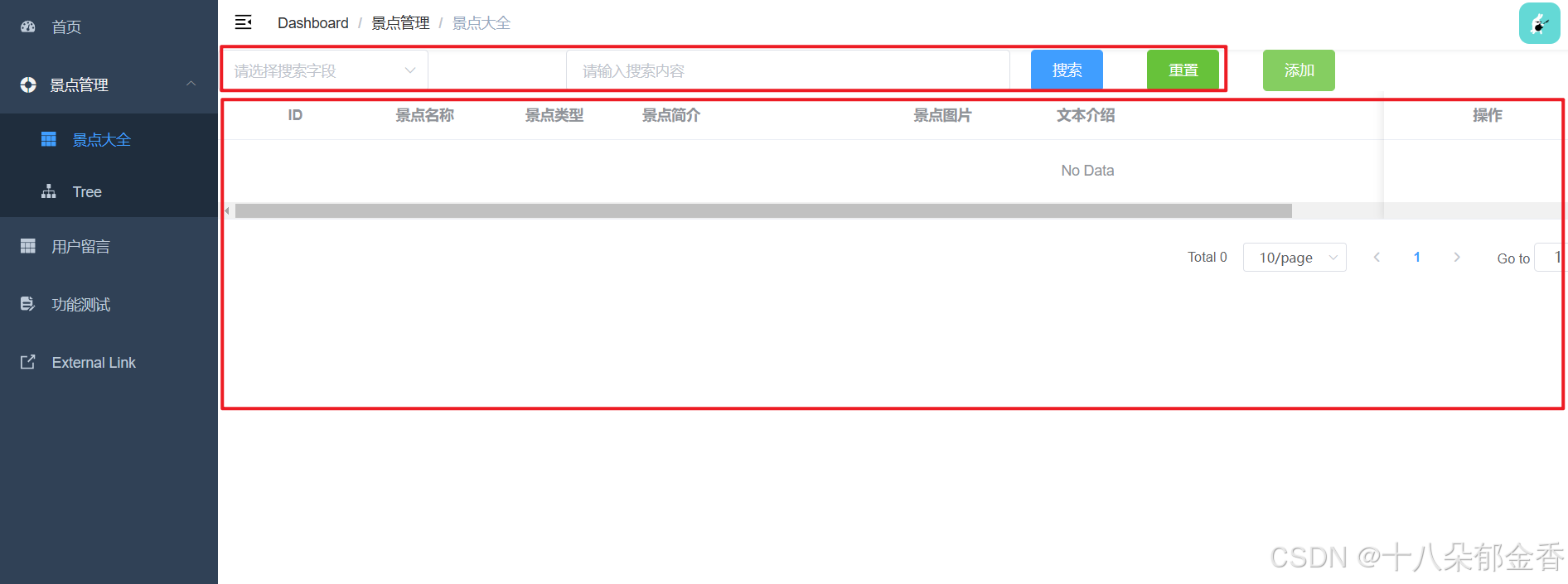
4.1、搜索模块
<el-row :gutter="20" type="flex" align="bottom" class-name="topSerachBox">
      <el-col :span="6">
        <el-select v-model="searchField" placeholder="请选择搜索字段">
          <el-option label="名称" value="name" />
          <el-option label="类型" value="type" />
          <el-option label="内容" value="content" />
        </el-select>
      </el-col>
      <el-col :span="8">
        <el-input v-model="searchKeyword" placeholder="请输入搜索内容" clearable @change="handleClear" />
      </el-col>
      <el-col :span="2">
        <el-button type="primary" @click="handleSearch">搜索</el-button>
      </el-col>
      <el-col :span="2">
        <el-button type="success" @click="handleReset">重置</el-button>
      </el-col>
    </el-row>
在data中添加变量
searchField: '', // 搜索类型
searchKeyword: '', // 搜索关键词
函数方法
// 搜索功能
    handleSearch() {
      if (!this.searchField || !this.searchKeyword) {
        this.$message({
          type: 'warning',
          message: '搜索字段或值不能为空!'
        })
        return
      }
      console.log('选择的搜索字段是>>>,', this.searchField, '对应的值是>>>', this.searchKeyword)
      // 发送接口
      const params = {
        fieldName: this.searchField,
        fieldValue: this.searchKeyword
      }
     //xxx后续【下篇】补充获取景点数据的接口
    },
// 重置
    handleReset() {
      this.searchField = ''
      this.searchKeyword = ''
    },
这段代码实现了一个包含 "搜索字段选择"、"搜索内容输入"、"搜索按钮" 和 "重置按钮" 的完整搜索区域,采用栅格布局确保各元素排列整齐,是后台管理系统中查询功能的常见实现方式。
4.2、列表模块
    <el-row>
      <el-col :span="24">
        <el-table :data="dataList" style="width: 100%">
          <el-table-column prop="id" label="ID" width="150" align="center" />
          <el-table-column prop="name" label="景点名称" width="100" align="center" />

          <el-table-column prop="type" label="景点类型" width="150" align="center" />
          <el-table-column prop="title" label="景点简介" width="200" class-name="dateColumn" />
          <el-table-column label="景点图片" width="200" align="center">
            <template slot-scope="scope">
              <img :src="Array.isArray(scope.row.pic)?scope.row.pic[0]:scope.row.pic" class="table-pic">
            </template>
          </el-table-column>
          <el-table-column prop="content" label="文本介绍" width="300" class-name="dateColumn" />
          <el-table-column prop="latitude" label="经度" width="150" align="center" />
          <el-table-column prop="longitude" label="维度" width="150" align="center" />
          <el-table-column prop="address" label="所在地" align="center" />
          <!-- 操作栏 -->
          <!-- 固定操作列在右侧 -->
          <el-table-column label="操作" fixed="right" width="200" align="center">
            <template slot-scope="scope">
              <el-button type="danger" size="mini" @click="handleDelete(scope.row)">删除</el-button>
              <el-button type="primary" size="mini" @click="handleEdit(scope.$index, scope.row)">编辑</el-button>
            </template>
          </el-table-column>
        </el-table>
      </el-col>
    </el-row>
这段代码实现了一个功能完整的景点信息表格,展示了 ID、名称、类型、简介、图片等多种数据类型,并提供了编辑和删除的操作入口,是后台管理系统中数据展示的典型实现方式。
4.3、弹窗模块(添加/编辑)
添加弹窗和编辑弹窗用的是同一个,逻辑不同而已,添加 新数据,编辑 旧数据。
点击【添加】按钮,弹窗出现
//html代码
      <el-col :span="2">
        <el-button type="success" @click="showAddModal(1)">添加</el-button>
      </el-col>

//js代码
    showAddModal() {
      this.editDialogVisible = true
      console.log('打开新增状态下的表单,当前存储的表单数据是>>>>', this.currentEditItem)
      this.addFlag = true
    },
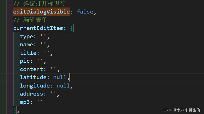
在data中添加变量
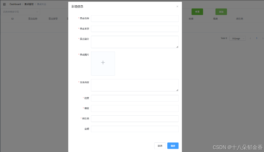
    <el-dialog width="700px" height="300px" :visible.sync="editDialogVisible" :title="addFlag==true?'新增信息':'编辑信息'" @close="resetForm">
      <el-form ref="editForm" :model="currentEditItem" label-width="120px" :rules="rules">
        <el-form-item label="景点名称" prop="name">
          <el-input v-model="currentEditItem.name" clearable autocomplete="off" />
        </el-form-item>
        <el-form-item label="景点类型" prop="type">
          <el-input v-model="currentEditItem.type" clearable autocomplete="off" />
        </el-form-item>
        <el-form-item label="景点简介" prop="title">
          <el-input
            v-model="currentEditItem.title"
            clearable
            type="textarea"
            :autosize="{ minRows: 3, maxRows: 7 }"
            autocomplete="off"
          />
        </el-form-item>
        <el-form-item label="景点图片" prop="pic">
          <el-upload
            ref="upload"
            action="http://localhost:4000/api/upload"
            list-type="picture-card"
            :on-preview="handlePictureCardPreview"
            :on-remove="handleRemove"
            :file-list="fileList"
            :on-change="handleFileChange"
            :on-success="handleUploadSuccess"
            :on-error="handleUploadError"
            name="file"
          >
            <i class="el-icon-plus" />
          </el-upload>
          <!-- 预览区域 -->
          <el-dialog :visible.sync="dialogVisible">
            <img width="100%" :src="dialogImageUrl" alt="">
          </el-dialog>
          <image
            :src="currentEditItem.pic"
            mode="scaleToFill"
          />
        </el-form-item>
        <el-form-item label="文本内容" prop="content">
          <el-input
            v-model="currentEditItem.content"
            clearable
            type="textarea"
            :autosize="{ minRows: 3, maxRows: 6 }"
            autocomplete="off"
          />
        </el-form-item>
        <el-form-item label="经度" prop="latitude">
          <el-input v-model.number="currentEditItem.latitude" clearable autocomplete="off" />
        </el-form-item>
        <el-form-item label="维度" prop="longitude">
          <el-input v-model.number="currentEditItem.longitude" clearable autocomplete="off" />
        </el-form-item>
        <el-form-item label="所在地" prop="address">
          <el-input v-model="currentEditItem.address" clearable autocomplete="off" />
        </el-form-item>
        <el-form-item label="音频">
          <el-input v-model="currentEditItem.mp3" clearable autocomplete="off" />
        </el-form-item>
      </el-form>
      <div slot="footer" class="dialog-footer">
        <el-button @click="handleCancle">取消</el-button>
        <el-button type="primary" @click="handleSubmitEdit">确定</el-button>
      </div>
    </el-dialog>
//图片放大预览
    <el-dialog :visible.sync="dialogVisible">
      <img width="100%" :src="dialogImageUrl" alt="">
    </el-dialog>
对话框基本设置:
- 固定宽度为 700px(注意:Element UI 的 el-dialog 本身没有 height 属性,该属性可能不生效)
- 根据 addFlag 动态显示标题为 "新增信息" 或 "编辑信息"
- 绑定 visible 状态为 editDialogVisible,关闭时触发 resetForm 方法
核心表单功能:
- 使用 el-form 组件,绑定数据模型 currentEditItem 和校验规则 rules
- 包含多个表单项,涵盖景点名称、类型、简介、图片、文本内容、经纬度、所在地、音频等信息
- 部分输入框使用 textarea 类型,并设置了自适应高度
图片上传与预览:
- 集成 el-upload 组件实现图片上传功能,配置了上传地址、预览、删除等回调
- 包含图片预览对话框,点击预览时显示大图
底部操作按钮:
- 提供 "取消" 和 "确定" 按钮,分别绑定 handleCancle 和 handleSubmitEdit 方法
【确定】和【取消】按钮,本文不做数据层面上的处理,因此先统一关闭掉弹窗即可。
//点击弹窗的确定按钮
handleSubmitEdit() {
        this.editDialogVisible = false
    },
//点击弹窗的取消按钮
handleCancle() {
        this.editDialogVisible = false
    },
三、本篇小结
因为本文提供的代码只是起到借鉴和引导作用,很多细节需要大家完善,比如组件/模块用到的变量,相关函数方法等,要确保每个模块的逻辑走得通,后续引入数据层面的内容,也就更好处理。


 扫一扫
扫一扫


 到【灌水乐园】发言


