


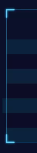
 本文将介绍如何利用CSS技巧实现边框四个角的不同样式效果,包括但不限于圆角、斜角、渐变等,让你的网页元素更加独特和吸引人。
<div class="bottom">
  <!-- 四个角的边框效果 -->
  <div class="border_corner border_corner_left_top"></div>
  <div class="border_corner border_corner_right_top"></div>
  <div class="border_corner border_corner_left_bottom"></div>
  <div class="border_corner border_corner_right_bottom"></div>
  <div class="main">
       111
  </div>
</div>
.bottom{
    position: relative;
    width: 85%;
    margin: 0 auto;
    .main{
        width: 100%;
        height: 550px;
        border: 2px solid #1C93CB;
        border-radius: 4px;
    }
    .border_corner{
        z-index: 2500;
        position: absolute;
        width: 39px;
        height: 39px;
        background: rgba(0,0,0,0);
        border: 6px solid #58C7EE;
    }
    .border_corner_left_top{
        top: -2px;
        left: -2px;
        border-right: none;
        border-bottom: none;
        border-top-left-radius: 4px;
    }
    .border_corner_right_top{
        top: -2px;
        right: -6px;
        border-left: none;
        border-bottom: none;
        border-top-right-radius: 4px;
    }
    .border_corner_left_bottom{
        bottom: -1px;
        left: -2px;
        border-right: none;
        border-top: none;
        border-bottom-left-radius: 4px;
    }
    .border_corner_right_bottom{
        bottom: -2px;
        right: -6px;
        border-left: none;
        border-top: none;
        border-bottom-right-radius: 4px;
    }
  }
效果图


 扫一扫
扫一扫


 1225
1225

 被折叠的 条评论
为什么被折叠?
被折叠的 条评论
为什么被折叠?
 到【灌水乐园】发言


