


 本文详细讲解了CSS定位模式(静态、相对、绝对、固定)及其应用,包括边偏移属性,以及如何实现元素定位、重叠管理和层级控制。实例演示了定位在网页布局中的实际操作,包括绝对定位使元素相对于祖先、固定定位的浏览器粘性效果,以及使用z-index调整盒子堆叠顺序。
定位是可以让盒子自由自在的在某个盒子内移动位置或者固定屏幕中某个位置,并且可以压住其他盒子。
定位:将盒子定在某一个位置。所以也是在摆放盒子,按照定位的方式移动盒子。
定位=定位模式+边偏移
定位模式用于指定一个元素在文档中的定位方式。
边偏移则决定了该元素的最终位置。
1.定位模式
定位模式决定元素的定位方式,它通过css的position属性来设置,其值可以分为四个:
| 值 | 语义 |
| static | 静态定位 |
| relative | 相对定位 |
| absolute | 绝对定位 |
| fixed | 固定定位 |
2.边偏移
边偏移就是定位的盒子移动到最终位置。有top, bottom, left 和 right 4个属性。
| 边偏移属性 | 示例 | 描述 |
| top | top:80px | 顶端偏移量。定义元素相对于其父元素上边线的距离 |
| bottom | bottom:80px | 底部偏移量。定义元素相对于其父元素下边线的距离 |
| left | left:80px | 左侧偏移量。定义元素相对于其父元素左边线的距离 |
| right | right:80px | 右侧偏移量。定义元素相对于其父元素右边线的距离 |
静态定位:
静态定位是元素的默认定位方式,无定位的意思
语法格式:
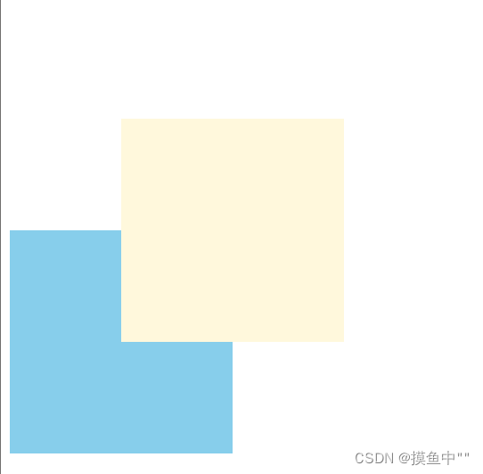
选择器{position: static;}相对定位:
相对定位是元素在移动位置的时候,是相对于它原来的位置来说的
语法格式:
选择器{position: relative;}例:
<!DOCTYPE html>
<html>
	<head>
		<meta charset="UTF-8">
		<title></title>
		<style>
			.one{
				position: relative;
				top: 100px;
				left: 100px;
				width: 200px;
				height: 200px;
				background-color: cornsilk;
			}
			.two{
				width: 200px;
				height: 200px;
				background-color: skyblue;
			}
		</style>
	</head>
	<body>
		<div class="one"></div>
		<div class="two"></div>
	</body>
</html>
结果图;
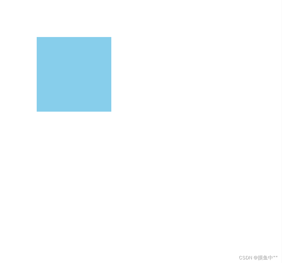
绝对定位:
绝对定位是元素在移动位置的时候,是相对于它祖先元素来说的。
语法格式:
选择器{position: absolute;}<!DOCTYPE html>
<html>
<head>
<meta charset="UTF-8">
<title></title>
<style>
.three{
position: absolute;
top: 100px;
left: 100px;
width: 200px;
height: 200px;
background-color: skyblue;
}
</style>
</head>
<body>
<div class="three"></div>
</body>
</html>
结果图:
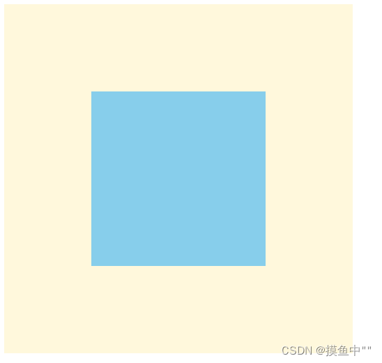
绝对定位以浏览器为准定位
<!DOCTYPE html>
<html>
	<head>
		<meta charset="UTF-8">
		<title></title>
		<style>
			.three{
				position: absolute;
				width: 400px;
				height: 400px;
				background-color: cornsilk;
			}
			.four{
				position: absolute;
				top: 100px;
				left: 100px;
				width: 200px;
				height: 200px;
				background-color: skyblue;
			}
		</style>
	</head>
	<body>
		<div class="three">
			<div class="four"></div>
		</div>
	</body>
</html>
结果图:
产品模块加hot模块(利用之前代码加以修改):
<!DOCTYPE html>
<html>
	<head>
		<meta charset="UTF-8">
		<title></title>
		<style>
			*{
				margin: 0;
				padding: 0;
			}
			.zong{
				width: 350px;
				height: 400px;
				background-color: skyblue;
				/*上块级盒子水平居中*/
				margin: 100px auto;
				position: relative;
			}
			.zong em img{
				position: absolute;
				top: 0;
				right: 0;
			}
			.zong>img{
				width: 100%;
				height: 200px;
			}
			.pingjia{
				height: 30px;
				padding: 0 50px;
				margin-top: 20px;
			}
			.nei{
				height: 1px;
				margin-top: 70px;
				color: gray;
				padding: 0 50px;
			}
			.shangpin{
				margin-top:50px ;
				padding: 0 50px;
			}
			.shangpin h4{
				display: inline-block;
				font-weight:400 ;
			}
			.shangpin span{
				color: orangered;
			}
			.shangpin em{
				margin: 0 6px 0 15px;
				font-style:normal ;
				color: darkgray;
			}
			a{
				color: black;
				text-decoration: none;
			}

		</style>
	</head>
	<body>
		<div class="zong">
			<em>
			<img src="img/hot.jpg" alt=""/>
			</em>
			<img src="img/pkj.jpg" alt=""/>
			<p class="pingjia">容量大,快递包邮,质量保证,七天无理由退款</p>
			<div class="nei">
				来自与117532345的评价
			</div>
			<div class="shangpin">
				<h4><a href="#">皮卡丘儿童书包... </a></h4>
				<em>|</em>
				<span>39.9元</span>
			</div>
		</div>
	</body>
</html>
结果图:
固定定位:
固定定位是元素固定于浏览器可视区的位置。主要使用场景:可以在浏览器页面滚动时元素的位置不会改变。
语法格式:
选择器{position: fixed;}
例:
<!DOCTYPE html>
<html>
	<head>
		<meta charset="UTF-8">
		<title></title>
		<style>
			.five{
				position: fixed;
				top: 100px;
				right: 40px;
			}
		</style>
	</head>
	<body>
		<div class="five">
			<img src="img/1.png" alt="" />
		</div>
	</body>
</html>
结果图:

粘性定位:
粘性定位可以被认为是相对定位和混合定位的混合。
语法格式:
选择器{position: sticky; top: 10px;}定位的叠放顺序:
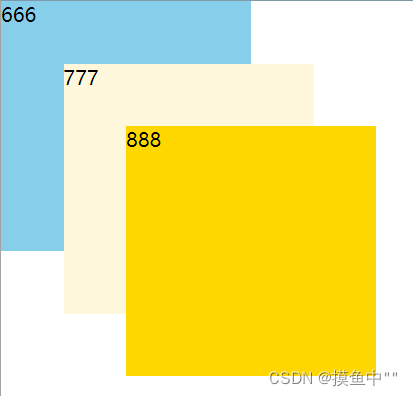
在使用定位布局时,可能会出现盒子重叠的情况。此时,可以使用z-index来控制盒子的前后次序
语法格式:
选择器{z-index: 1;}数值越大 ,盒子越靠上
<!DOCTYPE html>
<html>
	<head>
		<meta charset="UTF-8">
		<title></title>
		<style>
			.box{
				position: absolute;
				top: 0;
				left: 0;
				width: 200px;
				height: 200px;
			}
			.six{
				background-color: skyblue;
				z-index: 1;
			}
			.seven{
				background-color: cornsilk;
				left: 50px;
				top: 50px;
				z-index: 2;
			}
			.eight{
				background-color: gold;
				left: 100px;
				top: 100px;
				z-index: 3;
			}
		</style>
	</head>
	<body>
		<div class="box six">666</div>
		<div class="box seven">777</div>
		<div class="box eight">888</div>
	</body>
</html>
结果图:
绝对定位的盒子居中:
<!DOCTYPE html>
<html>
	<head>
		<meta charset="UTF-8">
		<title></title>
		<style>
			.nine{
				position: absolute;
				/*父容器宽度的一半*/
				left: 50%;
				/*盒子的一半*/
				margin-left: -100px;
				top: 50%;
				margin-top: -100px;
				width: 200px;
				height: 200px;
				background-color: skyblue;
			}
		</style>
	</head>
	<body>
		<div class="nine"></div>
	</body>
</html>
结果图:

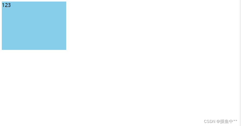
定位的特殊性:
绝对定位和固定定位也和浮动类似
1.行内元素添加绝对或者固定定位,可以直接设置高度和宽度
<!DOCTYPE html>
<html>
	<head>
		<meta charset="UTF-8">
		<title></title>
		<style>
			.ten{
				position: absolute;
				width: 200px;
				height: 150px;
				background-color: skyblue;
			}
		</style>
	</head>
	<body>
		<span class="ten">123</span>
	</body>
</html>
结果图:
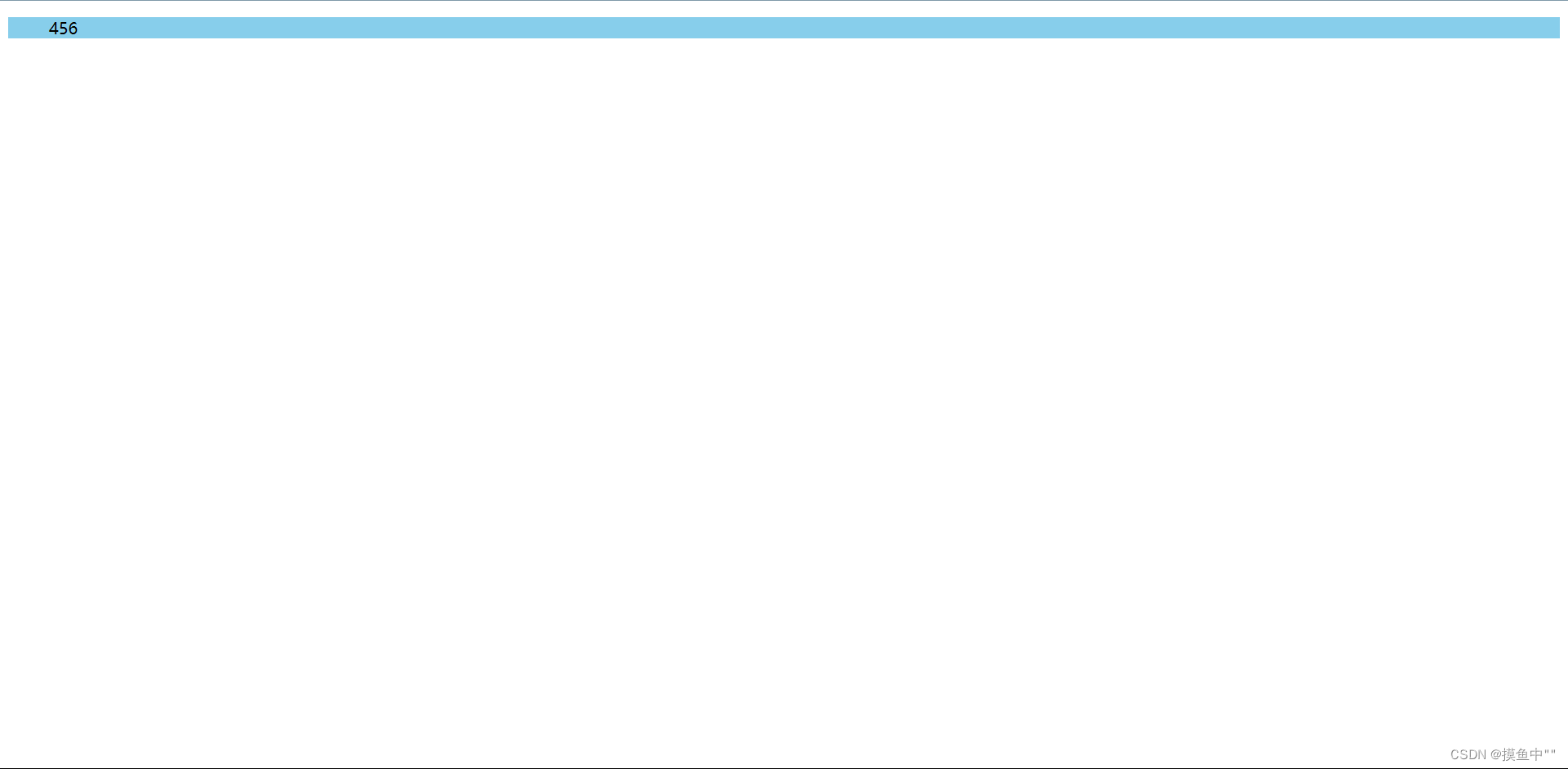
2.块元素添加绝对或者固定定位,如果不给宽度或者是高度,默认大小是内容的大小
未给宽度和高度:
<!DOCTYPE html>
<html>
	<head>
		<meta charset="UTF-8">
		<title></title>
		<style>
			.eleven{
				background-color: cornsilk;
			}
		</style>
	</head>
	<body>
		<dir class="eleven">456</dir>
	</body>
</html>
结果图:
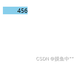
定位后:
<!DOCTYPE html>
<html>
	<head>
		<meta charset="UTF-8">
		<title></title>
		<style>
			.eleven{
				position: absolute;
				background-color: skyblue;
			}
		</style>
	</head>
	<body>
		<dir class="eleven">456</dir>
	</body>
</html>
结果图:
脱标的盒子不会触发外边距塌陷:
浮动元素,绝对定位(固定定位)元素都不会触发外边距合并的问题
绝对定位(固定定位)会完全压住盒子:
浮动元素不同,只会压住它下面标准流的盒子,但是不会压住下面标准流盒子里面的文字(图片)
但是绝对定位(固定定位)会压住下面标准流所有的内容。
浮动之所以不会压住文字,因为浮动产生的目的最初是为了做文字环绕效果的。文字会围绕浮动元素
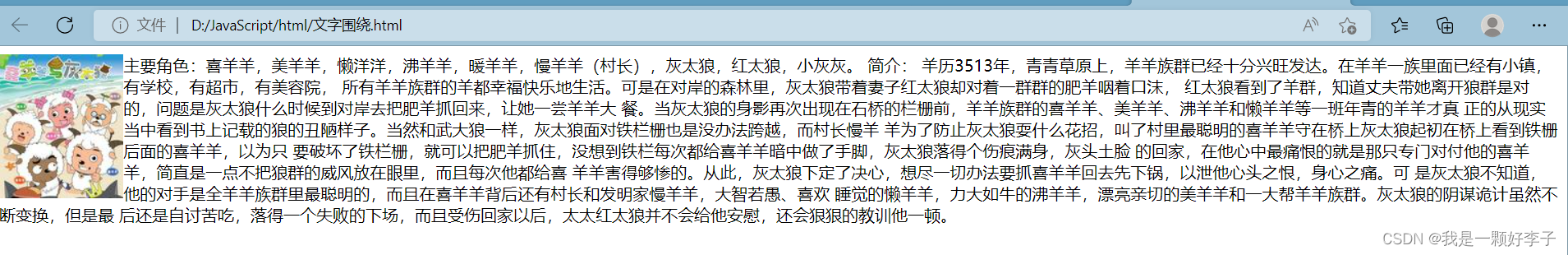
文字围绕效果图:
代码:
<!DOCTYPE html>
<html>

<head>
	<meta charset="UTF-8">
	<title></title>
	<style>
		img {
			float: left;
		}
	</style>
</head>

<body>
	主要角色:喜羊羊,美羊羊,懒洋洋,沸羊羊,暖羊羊,慢羊羊(村长),灰太狼,红太狼,小灰灰。

	<img src="img/喜洋洋与灰太狼.jpg">
	简介:

	羊历3513年,青青草原上,羊羊族群已经十分兴旺发达。在羊羊一族里面已经有小镇,有学校,有超市,有美容院,
	所有羊羊族群的羊都幸福快乐地生活。可是在对岸的森林里,灰太狼带着妻子红太狼却对着一群群的肥羊咽着口沫,
	红太狼看到了羊群,知道丈夫带她离开狼群是对的,问题是灰太狼什么时候到对岸去把肥羊抓回来,让她一尝羊羊大
	餐。当灰太狼的身影再次出现在石桥的栏栅前,羊羊族群的喜羊羊、美羊羊、沸羊羊和懒羊羊等一班年青的羊羊才真
	正的从现实当中看到书上记载的狼的丑陋样子。当然和武大狼一样,灰太狼面对铁栏栅也是没办法跨越,而村长慢羊
	羊为了防止灰太狼耍什么花招,叫了村里最聪明的喜羊羊守在桥上灰太狼起初在桥上看到铁栅后面的喜羊羊,以为只
	要破坏了铁栏栅,就可以把肥羊抓住,没想到铁栏每次都给喜羊羊暗中做了手脚,灰太狼落得个伤痕满身,灰头土脸
	的回家,在他心中最痛恨的就是那只专门对付他的喜羊羊,简直是一点不把狼群的威风放在眼里,而且每次他都给喜
	羊羊害得够惨的。从此,灰太狼下定了决心,想尽一切办法要抓喜羊羊回去先下锅,以泄他心头之恨,身心之痛。可
	是灰太狼不知道,他的对手是全羊羊族群里最聪明的,而且在喜羊羊背后还有村长和发明家慢羊羊,大智若愚、喜欢
	睡觉的懒羊羊,力大如牛的沸羊羊,漂亮亲切的美羊羊和一大帮羊羊族群。灰太狼的阴谋诡计虽然不断变换,但是最
	后还是自讨苦吃,落得一个失败的下场,而且受伤回家以后,太太红太狼并不会给他安慰,还会狠狠的教训他一顿。
</body>
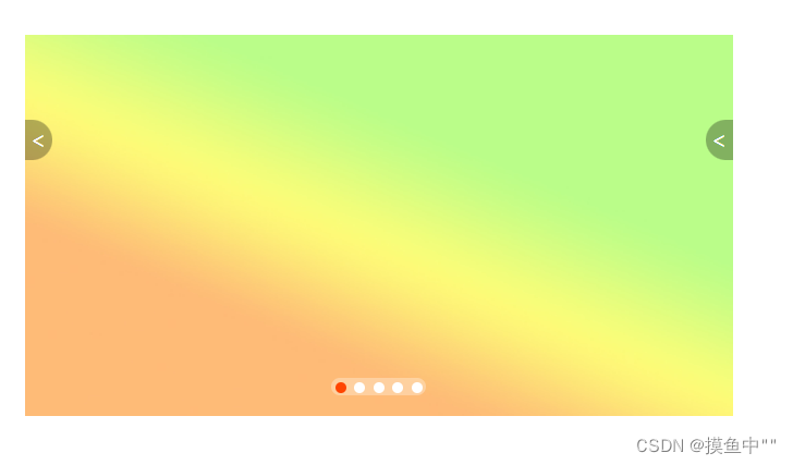
</html>焦点图布局(html+css):
<!DOCTYPE html>
<html>
<head>
<meta charset="UTF-8">
<title></title>
<style>
*{
margin: 0;
padding: 0;
}
li{
list-style: none;
}
.promo{
position: relative;
width: 520px;
height: 280px;
margin: 100px auto;
}
/*并集选择器*/
.promo img{
width: 520px;
height: 280px;
}
.prev,.next{
position: absolute;
top: 50%;
/*高度的一半*/
margin-top: -15%;
/*加了绝对定位的盒子可以直接设置高度和宽度*/
width: 20px;
height: 30px;
background:rgba(0,0,0,0.3);
text-align: center;
line-height: 30px;
color: #fff;
text-decoration: none;
}
.prev{
left: 0;
border-top-right-radius: 15px;
border-bottom-right-radius: 15px;
}
.next{
right: 0;
border-top-left-radius: 15px;
border-bottom-left-radius: 15px;
}
.promo-nav{
position: absolute;
bottom: 15px;
left: 50%;
margin-left: -35px;
width: 70px;
height: 13px;
background: rgba(255,255,255,0.3);
border-radius: 7px;
}
.promo-nav li{
float: left;
width: 8px;
height: 8px;
background-color:white;
border-radius: 50%;
margin: 3px;
}
.promo-nav .selected{
background-color: orangered;
}
</style>
</head>
<body>
<div class="promo">
<img src="img/焦点图.jpg" alt=""/>
<a href="#" class="prev"><</a>
<a href="#" class="next"><</a>
<ul class="promo-nav">
<li class="selected"></li>
<li></li>
<li></li>
<li></li>
<li></li>
</ul>
</div>
</body>
</html>
结果图:


 扫一扫
扫一扫


 3021
3021

 被折叠的 条评论
为什么被折叠?
被折叠的 条评论
为什么被折叠?
 到【灌水乐园】发言


