


 本文介绍了Ant Design Vue V3的Dropdown组件,用于创建下拉菜单。它包含何时使用Dropdown、API详情、Dropdown.Button及其事件。示例展示了如何创建可点击的下拉菜单,包括菜单项和自定义图标,以及处理点击事件。
向下弹出的列表。
何时使用 #
当页面上的操作命令过多时,用此组件可以收纳操作元素。点击或移入触点,会出现一个下拉菜单。可在列表中进行选择,并执行相应的命令。
- 用于收罗一组命令操作。
- Select 用于选择,而 Dropdown 是命令集合。
API#
#
属性如下
| 参数 | 说明 | 类型 | 默认值 |
|---|---|---|---|
| disabled | 菜单是否禁用 | boolean | - |
| getPopupContainer | 菜单渲染父节点。默认渲染到 body 上,如果你遇到菜单滚动定位问题,试试修改为滚动的区域,并相对其定位。 | Function(triggerNode) | () => document.body |
| overlay(v-slot) | 菜单 | Menu | - |
| overlayClassName | 下拉根元素的类名称 | string | - |
| overlayStyle | 下拉根元素的样式 | object | - |
| placement | 菜单弹出位置:bottomLeft bottomCenter bottomRight topLeft topCenter topRight | String | bottomLeft |
| trigger | 触发下拉的行为, 移动端不支持 hover | Array<click|hover|contextmenu> | ['hover'] |
| visible(v-model) | 菜单是否显示 | boolean | - |
overlay 菜单使用 Menu,还包括菜单项 Menu.Item,分割线 Menu.Divider。
注意: Menu.Item 必须设置唯一的 key 属性。
Dropdown 下的 Menu 默认不可选中。如果需要菜单可选中,可以指定
<Menu selectable>.
事件 #
| 事件名称 | 说明 | 回调参数 |
|---|---|---|
| visibleChange | 菜单显示状态改变时调用,参数为 visible | function(visible) |
Dropdown.Button #
| 参数 | 说明 | 类型 | 默认值 | 版本 |
|---|---|---|---|---|
| disabled | 菜单是否禁用 | boolean | - | |
| icon | 右侧的 icon | VNode | slot | - | 1.5.0 |
| overlay(v-slot) | 菜单 | Menu | - | |
| placement | 菜单弹出位置:bottomLeft bottomCenter bottomRight topLeft topCenter topRight | String | bottomLeft | |
| size | 按钮大小,和 Button 一致 | string | 'default' | |
| trigger | 触发下拉的行为 | Array<click|hover|contextmenu> | ['hover'] | |
| type | 按钮类型,和 Button 一致 | string | 'default' | |
| visible(v-model) | 菜单是否显示 | boolean | - |
Dropdown.Button 事件 #
| 事件名称 | 说明 | 回调参数 |
|---|---|---|
| click | 点击左侧按钮的回调,和 Button 一致 | Function |
| visibleChange | 菜单显示状态改变时调用,参数为 visible | function(visible) |
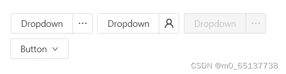
左边是按钮,右边是额外的相关功能菜单。可设置 icon 属性来修改右边的图标。
<template>
<div class="demo-dropdown-wrap">
<a-dropdown-button @click="handleButtonClick">
Dropdown
<template #overlay>
<a-menu @click="handleMenuClick">
<a-menu-item key="1">
<UserOutlined />
1st menu item
</a-menu-item>
<a-menu-item key="2">
<UserOutlined />
2nd menu item
</a-menu-item>
<a-menu-item key="3">
<UserOutlined />
3rd item
</a-menu-item>
</a-menu>
</template>
</a-dropdown-button>
<a-dropdown-button>
Dropdown
<template #overlay>
<a-menu @click="handleMenuClick">
<a-menu-item key="1">
<UserOutlined />
1st menu item
</a-menu-item>
<a-menu-item key="2">
<UserOutlined />
2nd menu item
</a-menu-item>
<a-menu-item key="3">
<UserOutlined />
3rd item
</a-menu-item>
</a-menu>
</template>
<template #icon><UserOutlined /></template>
</a-dropdown-button>
<a-dropdown-button disabled @click="handleButtonClick">
Dropdown
<template #overlay>
<a-menu @click="handleMenuClick">
<a-menu-item key="1">
<UserOutlined />
1st menu item
</a-menu-item>
<a-menu-item key="2">
<UserOutlined />
2nd menu item
</a-menu-item>
<a-menu-item key="3">
<UserOutlined />
3rd item
</a-menu-item>
</a-menu>
</template>
</a-dropdown-button>
<a-dropdown>
<template #overlay>
<a-menu @click="handleMenuClick">
<a-menu-item key="1">
<UserOutlined />
1st menu item
</a-menu-item>
<a-menu-item key="2">
<UserOutlined />
2nd menu item
</a-menu-item>
<a-menu-item key="3">
<UserOutlined />
3rd item
</a-menu-item>
</a-menu>
</template>
<a-button>
Button
<DownOutlined />
</a-button>
</a-dropdown>
</div>
</template>
<script>
import { defineComponent } from 'vue';
import { UserOutlined, DownOutlined } from '@ant-design/icons-vue';
export default defineComponent({
components: {
UserOutlined,
DownOutlined,
},
setup() {
const handleButtonClick = e => {
console.log('click left button', e);
};
const handleMenuClick = e => {
console.log('click', e);
};
return {
handleButtonClick,
handleMenuClick,
};
},
});
</script>
<style lang="less" scoped>
.demo-dropdown-wrap :deep(.ant-dropdown-button) {
margin-right: 8px;
margin-bottom: 8px;
}
</style>
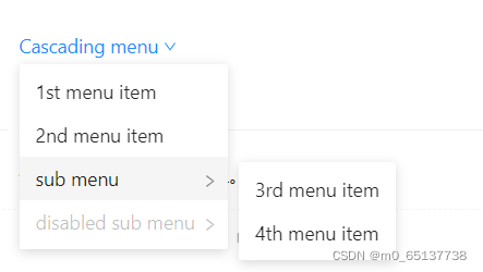
<template>
<a-dropdown>
<a class="ant-dropdown-link" @click.prevent>
Cascading menu
<DownOutlined />
</a>
<template #overlay>
<a-menu>
<a-menu-item>1st menu item</a-menu-item>
<a-menu-item>2nd menu item</a-menu-item>
<a-sub-menu key="sub1" title="sub menu">
<a-menu-item>3rd menu item</a-menu-item>
<a-menu-item>4th menu item</a-menu-item>
</a-sub-menu>
<a-sub-menu key="sub2" title="disabled sub menu" disabled>
<a-menu-item>5d menu item</a-menu-item>
<a-menu-item>6th menu item</a-menu-item>
</a-sub-menu>
</a-menu>
</template>
</a-dropdown>
</template>
<script>
import { defineComponent } from 'vue';
import { DownOutlined } from '@ant-design/icons-vue';
export default defineComponent({
components: {
DownOutlined,
},
});
</script>


 扫一扫
扫一扫


 被折叠的 条评论
为什么被折叠?
被折叠的 条评论
为什么被折叠?
 到【灌水乐园】发言


