


1、效果图(需求:实现鼠标移入echarts的图表范围内变为小手,包含标题区,图表内容区即整个图表盒子区域)
2、思路:很多博主都是使用z-index来提高层级或者pointer-events: auto来定义穿透,以及使用 myChart.getZr().on('mousemove', param => {
var pointInPixel= [param.offsetX, param.offsetY];
if (myChart.containPixel('grid',pointInPixel)) {//若鼠标滑过区域位置在当前图表范围内 鼠标设置为小手
myChart.getZr().setCursorStyle('pointer')
}else{
myChart.getZr().setCursorStyle('default')
}
})来判断鼠标是否移入图表中,但是实测是不满足需求的,有的方法是修改鼠标移入图表本身的形状,而不是整个盒子,完全不满足需求。
3、代码
<div id="mainTwo" class="chart_box" @click="getCompleteDetails"> </div>
const onEchartsTwo = () => {
// 基于准备好的dom,初始化echarts实例
let myChart = echarts.init(document.getElementById('mainTwo'));
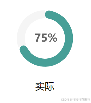
// 指定图表的配置项和数据(进度环图)
let option = {
title: {
text: '75%', //主标题文本
left: '33%', // 水平居中(这里设置的是标题的左上角)
top: '40%', // 垂直居中(这里设置的是标题的左上角)
textStyle: {
fontWeight: 800,
fontSize: 18,
color: '#666666',
align: 'center',
},
},
series: [
{
name: '达成率', //系列的标题
type: 'pie', // 图表类型
radius: ['50%', '70%'], //饼图的半径大小
center: ['50%', '50%'], //饼图的中心位置
data: [
{
//实际数据
value: 70,
name: '实际',
itemStyle: {
color: '#00A198',
borderRadius: 10, // 设置圆角
},
},
{
//补足到 100% 的背景数据(值为 100 - data)。
value: 100 - 70,
name: '',
itemStyle: {
color: '#F5F5F5',
},
},
], //数据
label: {
normal: {
formatter: '{b}', //表示使用数据的名称作为标签内容
position: 'bottom', //标签的位置
},
},
labelLine: {
normal: {
show: false, //表示不显示标签线
},
},
itemStyle: {
normal: {
color: function (params) {
let colorList = ['#46B3A8'];
return colorList[params.dataIndex];
},
},
},
},
],
};
// 使用刚指定的配置项和数据显示图表。
myChart.setOption(option);
};
#mainTwo >>> canvas {
cursor: pointer;
}


 被折叠的 条评论
为什么被折叠?
被折叠的 条评论
为什么被折叠?
 到【灌水乐园】发言


