


一、自定义组件
1、自定义组件
自定义组件,最基础的结构如下:
@Component
struct Header {
  build() {

  }
}
提取头部标题部分的代码,写成自定义组件。
1、新建ArkTs文件,把Header内容写好。
2、在需要用到的地方,导入引用即可
@Component
export struct Header {
  private title: ResourceStr = ''

  build() {
    Row() {
      Text(this.title)
        .fontWeight(FontWeight.Bold)
        .fontSize(24)
    }
    .width('100%')
    .margin({ bottom: 10 })
  }
}
import { Header } from "../conponents/CommonHeader"
@Entry
@Component
struct Index {
@State
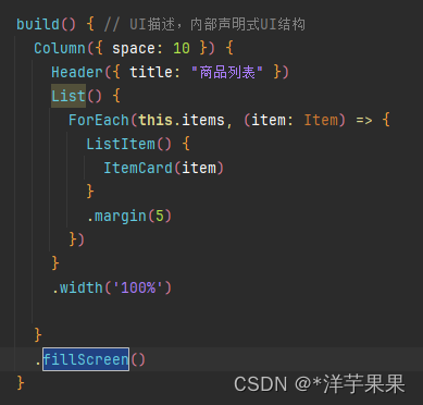
build() { // UI描述,内部声明式UI结构
Column({ space: 10 }) {
Header({ title: "商品列表" })
}
.width('100%')
}
.backgroundColor('#f0f8ff')
.padding(20)
.width('100%')
.height('100%')
}
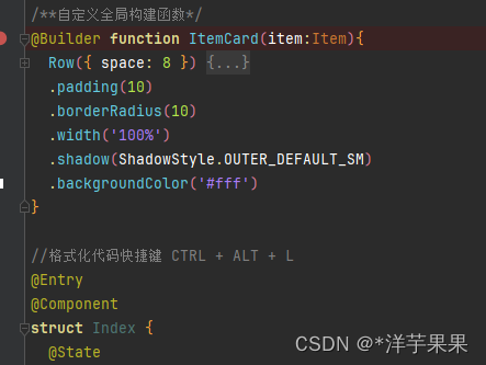
}2、构建函数
如果是仅在该页面内部运用的组件,就可以用构建函数的方式来定义组件
分两类:全局和局部,区别就是写在struct函数外还是内,若是放在struct之内,就不需要些‘function’字段了
这样封装,就保证了代码易读易维护
3、公共样式
类似的,样式也可以这样封装
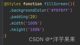
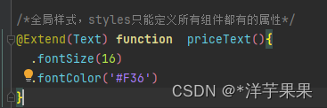
但是Styles只能封装所有组件都有的公共属性,那对于个别的如何处理呢
就需要用到Extend(注意:只能定义成全局的,不能写在struct函数内部)
 最低0.47元/天 解锁文章


 扫一扫
扫一扫


 被折叠的 条评论
为什么被折叠?
被折叠的 条评论
为什么被折叠?
 到【灌水乐园】发言


