


方式一:浮动布局 float
所谓的浮动就是会使元素向左或向右移动,其周围的元素也会重新排列。类似于往一个容器中注水满水,里面的物体都浮动到最上层,之后依次排列。
关键代码:
float:left
代码展示
<!DOCTYPE html>
<html lang="en">
<head>
    <meta charset="UTF-8">
    <meta name="viewport" content="width=device-width, initial-scale=1.0">
    <title>浮动布局_float</title>
    <style type="text/css">
        .container{
            width: 1100px;
            height: 880px;
            border: 1px solid rgb(220, 217, 218);
            margin: 0px auto;
            background-color: rgb(233, 213, 213);
        }
        /* 设置头部样式 */
        .title{
            width: 1000px;
            height: 100px;
            border: 1px solid rgb(220, 217, 218);
            margin: 10px auto;
            background-color: pink;
        }
        /* 设置导航样式 */
        .nav{
            width: 1000px;
            height: 120px;
            margin: 10px auto;
            background-color: rgb(220, 36, 107);
        }
        /* 设置主体内容样式 */
        .content{
			width: 1000px;
            height: 500px;
            background-color: rgb(186, 171, 171);
            margin: 10px auto;
        }
        /* 设置主体内容左列的样式 */
        .content .content-left{
            width: 200px;
            height: 100%;
            background-color: rgb(235, 210, 13);
            margin-right: 20px;
            float: left;
        }
        /* 设置主体内容的中间的内容的样式 */
        .content .content-center{
            width: 400px;
            height: 100%;
            background-color: rgb(233, 113, 161);
            float: left;
            margin-left: 20px;
        }
        /* 设置主体内容右列的样式 */
        .content .content-right{
            width: 310px;
            height: 100%;
            background-color: rgb(58, 195, 51);
            float: right;
        }

        /* 设置底部 */
        .bottom{
            width: 1000px;
            height: 100px;
            background-color: rgb(138, 135, 134);
            margin: 0px auto;
        }
        </style>
</head>
<body>
    <div class="container">
        <div class="title">这是头部</div>
        <div class="nav">这是导航</div>
        <div class="content">
            <div class="content-left">主体内容的左列</div>
            <div class="content-center">主体内容的中间内容</div>
            <div class="content-right">主体内容的右列</div>
        </div>
        <div class="bottom">这是底部</div>
    </div>
</body>
</html>
效果图
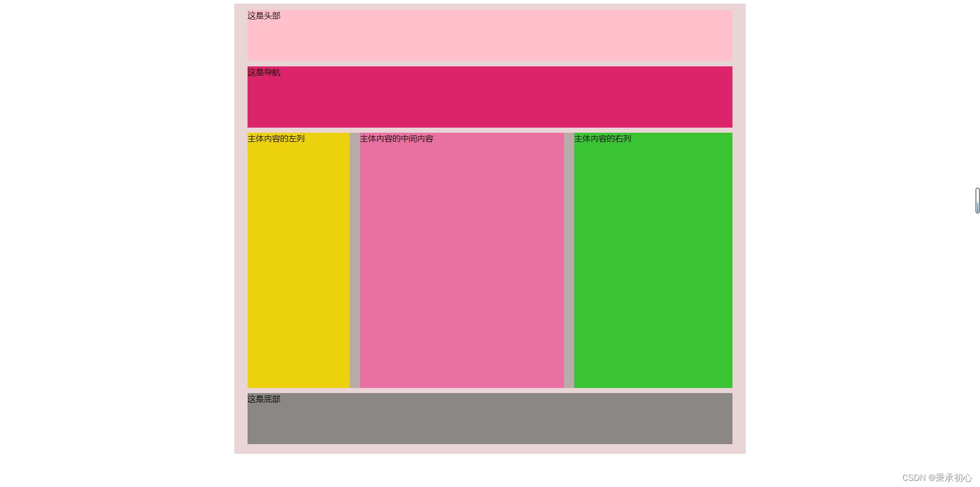
优点:代码简单,容易上手。
缺点:一般要计算页面中每个模块的具体大小和位置,更复杂的布局还要借助position和display,而且代码量较大。
方式二:弹性布局 flex
Flex 是 Flexible Box 的缩写,意为"弹性布局",用来为盒状模型提供最大的灵活性。简单来说就是一套布局框架,我们只需要使用里面的语法,不用自己计算就能完成页面布局。
关键代码:
display:flex
代码展示:
<!DOCTYPE html>
<html lang="en">
<head>
    <meta charset="UTF-8">
    <meta name="viewport" content="width=device-width, initial-scale=1.0">
    <title>弹性布局_flex</title>
    <style type="text/css">
        .container{
            width: 1100px;
            height: 880px;
            border: 1px solid rgb(220, 217, 218);
            margin: 0px auto;
            background-color: rgb(233, 213, 213);
        }
        /* 设置头部样式 */
        .title{
            width: 1000px;
            height: 100px;
            border: 1px solid rgb(220, 217, 218);
            margin: 10px auto;
            background-color: pink;
        }
        /* 设置导航样式 */
        .nav{
            width: 1000px;
            height: 120px;
            margin: 10px auto;
            background-color: rgb(220, 36, 107);
        }
        /* 设置主体内容样式 */
        .content{
			width: 1000px;
            height: 500px;
            background-color: rgb(186, 171, 171);
            margin: 10px auto;
			display: flex;
			justify-content: space-between
        }
        /* 设置主体内容左列的样式 */
        .content .content-left{
            width: 200px;
            height: 100%;
            background-color: rgb(235, 210, 13);

        }
        /* 设置主体内容的中间的内容的样式 */
        .content .content-center{
            width: 400px;
            height: 100%;
            background-color: rgb(233, 113, 161);

        }
        /* 设置主体内容右列的样式 */
        .content .content-right{
            width: 310px;
            height: 100%;
            background-color: rgb(58, 195, 51);
        }

        /* 设置底部 */
        .bottom{
            width: 1000px;
            height: 100px;
            background-color: rgb(138, 135, 134);
            margin: 0px auto;
        }
        </style>
</head>
<body>
    <div class="container">
        <div class="title">这是头部</div>
        <div class="nav">这是导航</div>
        <div class="content">
            <div class="content-left">主体内容的左列</div>
            <div class="content-center">主体内容的中间内容</div>
            <div class="content-right">主体内容的右列</div>
        </div>
        <div class="bottom">这是底部</div>
    </div>
</body>
</html>效果图:
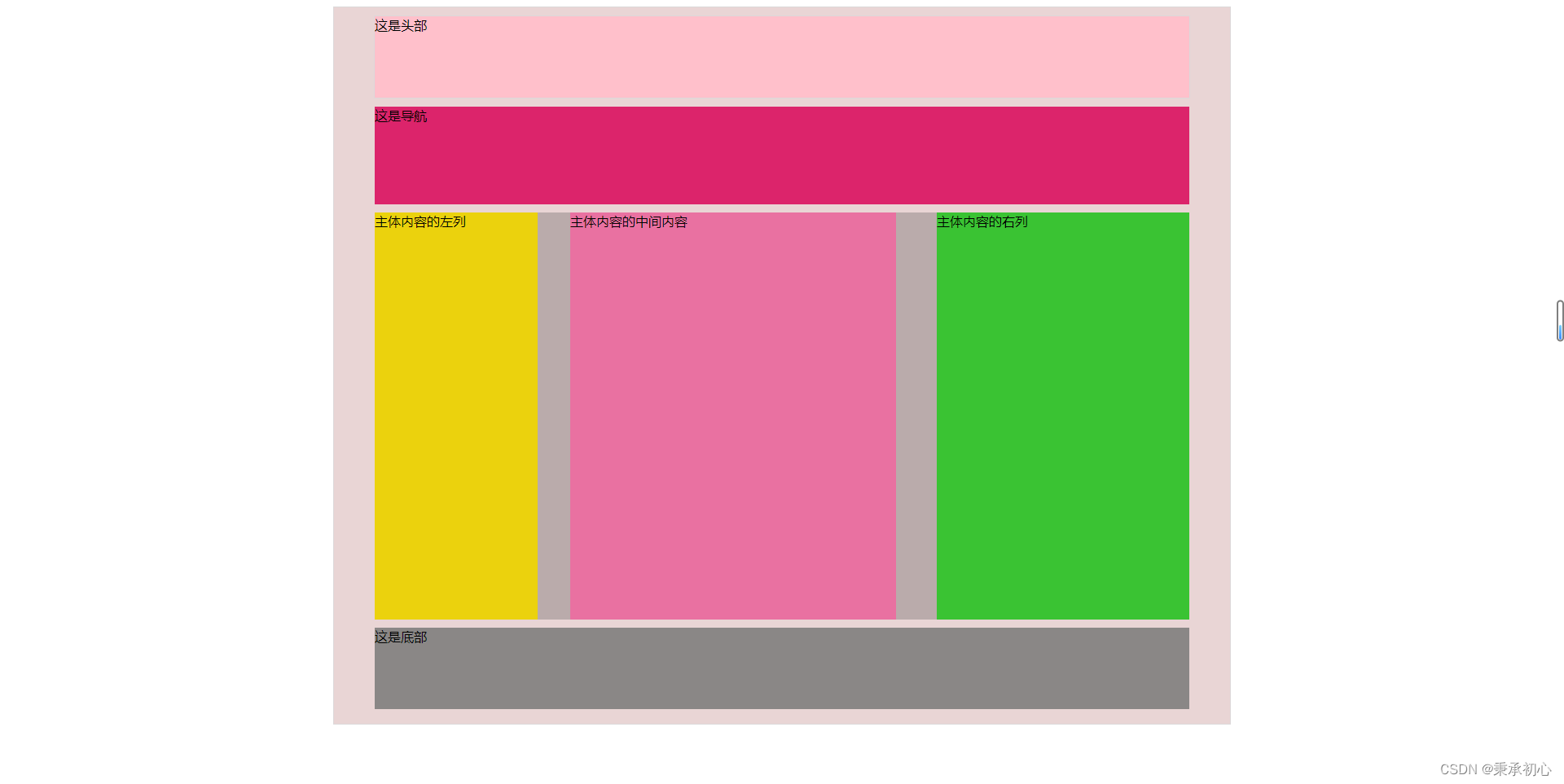
优点: 不用去精确计算页面中每个模块的具体位置和大小就能完成更为复杂的布局。
缺点:上手有难度,需要去练习使用。
练习教程推荐“阮一峰”的文章,写的十分详细。


 扫一扫
扫一扫


 被折叠的 条评论
为什么被折叠?
被折叠的 条评论
为什么被折叠?
 到【灌水乐园】发言


