


| 名称 | 内容 |
| Grid | 常用容器 |
|
StackPanel
| 容器,局部容器,可垂直水平排列 |
|
DockPanel
| DockPanel容器,可以停靠四周 |
|
WrapPanel
| WrapPanel容器,自适应,可根据 控件大小,适应排列 |
| UniformGrid | UniformGrid容器,在有限的空间内均分空间 |
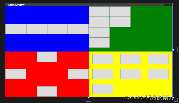
<Grid>
        <Grid.RowDefinitions>
            <RowDefinition/>
            <RowDefinition/>
        </Grid.RowDefinitions>
        <Grid.ColumnDefinitions>
            <ColumnDefinition/>
            <ColumnDefinition/>
        </Grid.ColumnDefinitions>
        <Border Grid.Row="0" Background="Blue" />
        <Border Grid.Row="1" Background="Red"/>
        <Border Grid.Row="0" Grid.Column="1" Background="Green"/>
        <Border Grid.Row="1" Grid.Column="1" Background="Yellow"/>

        <!--StackPanel容器,局部容器,可垂直水平排列,-->
        <StackPanel Orientation="Horizontal">
            <Button Width="100" Height="50"></Button>
            <Button Width="100" Height="50"></Button>
            <Button Width="100" Height="50"></Button>
            <Button Width="100" Height="50"></Button>
            <Button Width="100" Height="50"></Button>

        </StackPanel>
        <!--WrapPanel容器,自适应,可根据 控件大小,适应排列 -->
        <WrapPanel Grid.Column="1" Orientation="Vertical">
            <Button Width="100" Height="50"></Button>
            <Button Width="100" Height="50"></Button>
            <Button Width="100" Height="50"></Button>
            <Button Width="100" Height="50"></Button>
            <Button Width="100" Height="50"></Button>
            <Button Width="100" Height="50"></Button>
        </WrapPanel>
        <!--DockPanel容器,可以停靠四周 -->
        <DockPanel Grid.Row="1" LastChildFill="False">
            <Button Width="100" Height="50" DockPanel.Dock="Left"></Button>
            <Button Width="100" Height="50" DockPanel.Dock="Right"></Button>
            <Button Width="100" Height="50" DockPanel.Dock="Top"></Button>
            <Button Width="100" Height="50" DockPanel.Dock="Bottom"></Button>
        </DockPanel>
        <!--UniformGrid容器,在有限的空间内均分空间 -->
        <UniformGrid Grid.Row="1" Grid.Column="1" Rows="3" Columns="3">
            <Button Width="100" Height="50"></Button>
            <Button Width="100" Height="50"></Button>
            <Button Width="100" Height="50"></Button>
            <Button Width="100" Height="50"></Button>
            <Button Width="100" Height="50"></Button>
            <Button Width="100" Height="50"></Button>
            <Button Width="100" Height="50"></Button>
        </UniformGrid>
    </Grid>


 扫一扫
扫一扫


 1127
1127

 被折叠的 条评论
为什么被折叠?
被折叠的 条评论
为什么被折叠?
 到【灌水乐园】发言


