


 本文展示了如何使用Vue编写一个公共导航栏组件,该组件包含一个进度条,能够根据外部传入的阶段ID和步骤列表动态显示当前进度。代码包括模板、脚本和样式,实现了进度条的宽度计算和不同阶段的样式变化。通过父组件传入数据,可以自定义进度条的内容和当前位置。
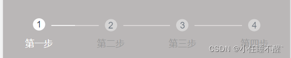
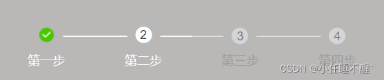
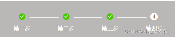
用vue写了个公共导航栏功能进度条
效果如下:

公共组件代码
<template>
  <div class="status_count">
    <div class="ul"
         v-if="opt.speedList">
      <div v-for="(item,index) in opt.speedList"
           :key="index"
           data-item="item"
           :class="['li',index<=opt.stageId?'chooseStatus':'']">
        <div class="statusType">{{item.title}}</div>
        <div class="statusImgBox">
          <div :class="['statusImg',index<opt.stageId?'statusImg1':'',]">
            <div v-if="index>=opt.stageId"
                 class="number">{{index+1}}</div>
          </div>
        </div>
        <div class="statusTime">{{item.name}}</div>
      </div>
    </div>
    <div v-if="opt.speedList"
         class="lineBg"
         style="width:75%;"></div>
    <div v-if="opt.speedList"
         class="line"
         :style="'width:'+lineWidth+'%'"></div>
  </div>
</template>

<script>
export default {
  data() {
    return {}
  },
  props: {
    opt: {
      type: Object,
      default: {
        stageId: 0,//处于第几个进度
        speedList: [],//用于外部传递的列表文字
      },
    },
  },
  computed: {
    //动态的进度条宽度
    lineWidth() {
      return Number(this.opt.stageId * 25) + Number(12.5) < 75
        ? Number(this.opt.stageId * 25) + Number(12.5)
        : 75
    },
  },
  mounted() {},
  methods: {},
}
</script>

<style  scoped>
.status_count {
  background-color: #bab7b7;
  padding: 0.6rem 0 0.98rem 0;
  overflow: hidden;
  position: relative;
}
.status_count .lineBg {
  width: 75%;
  position: absolute;
  top: 0.69rem;
  left: 12.5%;
  overflow: hidden;
  border-bottom: 0.01rem solid #e4e0e0;
}
.status_count .line {
  width: 75%;
  position: absolute;
  top: 0.69rem;
  left: 12.5%;
  overflow: hidden;
  border-bottom: 0.01rem solid #fff;
}
.status_count .ul {
  width: 100%;
  position: absolute;
  top: 0;
  left: 0;
  overflow: hidden;
  z-index: 1;
}
.status_count .ul .li {
  width: 25%;
  float: left;
  text-align: center;
}
.status_count .ul .li .statusType {
  font-size: 0.26rem;
  color: #999999;
  height: 0.36rem;
}
.status_count .ul .li .statusImgBox {
  width: 0.64rem;
  height: 0.64rem;
  display: inline-block;
  background-color: #bab7b7;
}
.status_count .ul .li .statusImg {
  cursor: pointer;
  display: inline-block;
  width: 0.32rem;
  height: 0.32rem;
  background-color: #e9e9e9;
  opacity: 0.6;
  border-radius: 0.2rem;
  margin-top: 0.18rem;
  margin-bottom: -0.01rem;
}
.status_count .ul .li .number {
  position: absolute;
  font-size: 0.1rem;
  width: 0.32rem;
  height: 0.32rem;
  vertical-align: middle;
  line-height: 0.32rem;
}
.status_count .ul .li .statusTime {
  font-size: 0.24rem;
  color: #999999;
}
.status_count .ul .chooseStatus .statusType {
  color: #4a80ff;
}
.status_count .ul .chooseStatus .statusImg {
  background: #fff;
  opacity: 1;
  margin-top: 0.16rem;
  width: 0.32rem;
  height: 0.32rem;
  margin-bottom: 0rem;
}
.status_count .ul .chooseStatus .statusImg1 {
  background: url('../assets/validation/signsuccess.png') 0 0 no-repeat; //随便用什么图片都可以
  background-position: center;
  background-size: 0.28rem 0.28rem;
  opacity: 1;
  margin-top: 0.16rem;
  width: 0.32rem;
  height: 0.32rem;
  margin-bottom: 0rem;
}
.status_count .ul .chooseStatus .statusTime {
  color: #fff;
}
</style>
父组件调用-引入组件
import speed from '../../components/speed.vue'
组建中注册
  components: {
    'v-speed': speed,
  },
模板展示
<v-speed :opt="speedopt"></v-speed>
自定义需要的文案和进度id
    let speedopt = ref({ 此处用的vue3 正常2就放在data中即可
      stageId: 0,
      speedList: [
        { title: '', name: '第一步' },
        { title: '', name: '第二步' },
        { title: '', name: '第三步' },
        { title: '', name: '第四步' },
      ],
    })
  return {
      speedopt
    }
此时即可看到效果图


 扫一扫
扫一扫


 1934
1934

 被折叠的 条评论
为什么被折叠?
被折叠的 条评论
为什么被折叠?
 到【灌水乐园】发言


