


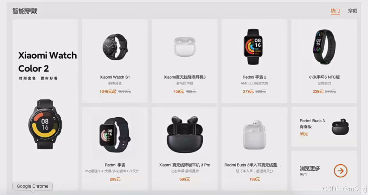
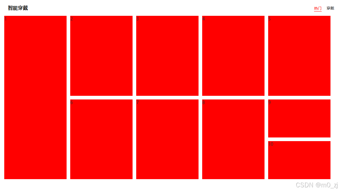
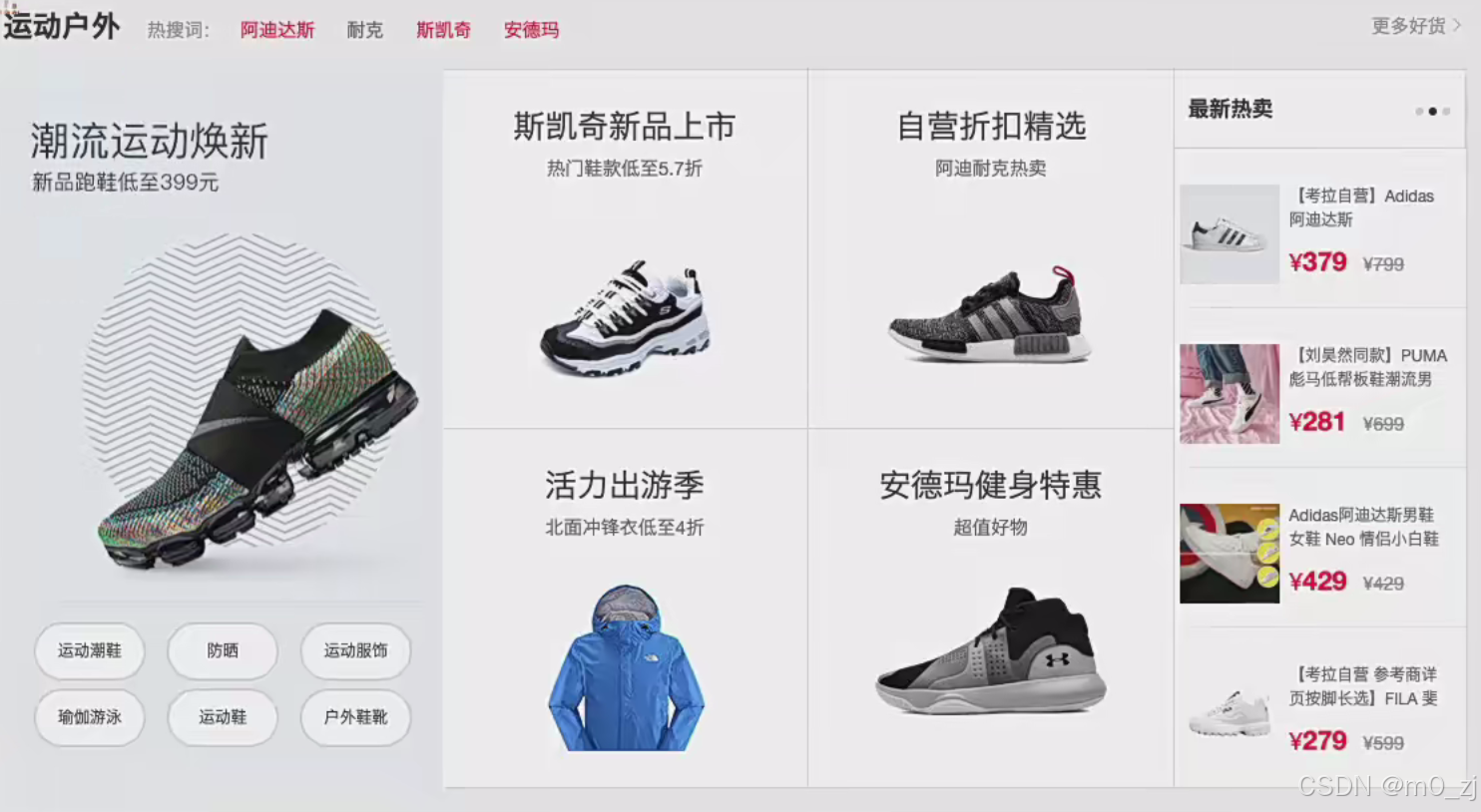
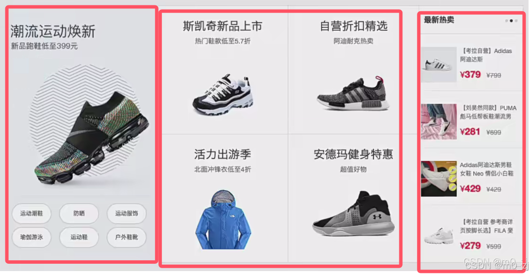
一、小米穿戴设备(浮动)
完整代码
<!DOCTYPE html>
<html lang="en">
<head>
  <meta charset="UTF-8">
  <meta http-equiv="X-UA-Compatible" content="IE=edge">
  <meta name="viewport" content="width=device-width, initial-scale=1.0">
  <title>小米官网</title>
  <link rel="stylesheet" href="./css/reset.css">
  <link rel="stylesheet" href="./css/common.css">
  <style>
    .dress {
      margin-top: 30px;
    }

    .dress .header {
      height: 58px;
      line-height: 58px;
    }

    .dress .header .left-area {
      float: left;
    }

    .dress .header .right-area  {
      float: right;
      font-size: 14px;
    }

    .dress .header .right-area .item {
      margin-left: 15px;
    }

    .dress .header .right-area .item:hover,
    .dress .header .right-area .item.active {
      padding: 3px 0;
      border-bottom: 2px solid red;
      color: red;
    }

    /* 列表内容 */
    .dress .list {
      margin-right: -14px;
    }

    .dress .list .item {
      float: left;
      /* position: relative;
      top: 0; */

      /* box model */
      width: 234px;
      height: 300px;
      margin-right: 14px;
      margin-bottom: 14px;

      background-color: #f00;

      /* 动画 */
      transition: all 0.3s ease-in;
    }

    .dress .list .item.item1 {
      height: 614px;
    }

    .dress .list .item.item9,
    .dress .list .item.item10 {
      height: 143px;
    }

    .dress .list .item:hover {
      box-shadow: 0 15px 30px rgba(0,255,0,1);
      /* top: -2px; */
      transform: translateY(-2px);
    }

    .dress .list .item a {
      display: inline-block;
      width: 100%;
      height: 100%;
    }
  </style>
</head>
<body>

  <div class="mi_wrapper dress">
    <div class="header clear_fix">
      <div class="left-area">
        <h3 class="title">智能穿戴</h3>
      </div>
      <div class="right-area">
        <a class="item active hot" href="#">热门</a>
        <a class="item info" href="#">穿戴</a>
      </div>
    </div>
    <div>
      <ul class="list clear_fix">
        <li class="item item1"><a href="#">1</a></li>
        <li class="item item2"><a href="#">2</a></li>
        <li class="item item3"><a href="#">3</a></li>
        <li class="item item4"><a href="#">4</a></li>
        <li class="item item5"><a href="#">5</a></li>
        <li class="item item6"><a href="#">6</a></li>
        <li class="item item7"><a href="#">7</a></li>
        <li class="item item8"><a href="#">8</a></li>
        <li class="item item9"><a href="#">9</a></li>
        <li class="item item10"><a href="#">10</a></li>
      </ul>
    </div>
  </div>

</body>
</html>
common.css
.mi_wrapper {
  width: 1226px;
  margin: 0 auto;
}

.kl_wrapper {
  width: 1100px;
  margin: 0 auto;
}

.clear_fix::after {
  content: "";
  display: block;
  clear: both;

  height: 0;
  visibility: hidden;
}

.clear_fix {
  *zoom: 1;
}
reset.css
body, h1, h2, h3, ul, li {
  margin: 0;
  padding: 0;
}

a {
  text-decoration: none;
  color: #333;
}

ul, li {
  list-style: none;
}
1.区域抽取
对结构进行简单搭建
<!DOCTYPE html>
<html lang="en">
<head>
  <meta charset="UTF-8">
  <meta http-equiv="X-UA-Compatible" content="IE=edge">
  <meta name="viewport" content="width=device-width, initial-scale=1.0">
  <title>小米官网</title>
  <link rel="stylesheet" href="./css/common.css">

  <style>
    .dress{
      height: 200px;
      background-color: orange;
    }

  </style>
</head>
<body>

  <div class="mi_wrapper dress">
    <div class="header"></div>
    <div class="list"></div>

  </div>


</body>
</html>
common.css
.mi_wrapper{
  width:1226px;
  margin:0 auto;  /*居中*/
}
2.头部的布局
让“智能穿戴”左浮动;让“热门和穿戴”右浮动
让文字居中且对齐:用line-hight
然后进行微调,比如用a标签啊,可以有小手点击啊
用hover,鼠标放上去会变红色啊,有下划线啊
用acitve,后面js会有涉及
<!DOCTYPE html>
<html lang="en">
<head>
  <meta charset="UTF-8">
  <meta http-equiv="X-UA-Compatible" content="IE=edge">
  <meta name="viewport" content="width=device-width, initial-scale=1.0">
  <title>小米官网</title>
  <link rel="stylesheet" href="./css/reset.css">
  <link rel="stylesheet" href="./css/common.css"> <!--注意,这个放在后面-->>

  <style>
    .dress{
      margin-top:30px;
    }
    .header{
      height: 58px;
      line-height: 58px;
    }
    .dress .header .left-area{
      float: left;
    }
    .dress .header .right-area{
      float: right;
      font-size:14px;

    }
    .dress .header .right-area .item{
      margin-left: 15px;
    }
    .dress .header .right-area .item:hover,
    .dress .header .right-area .item.active{
      padding:3px 0;
      border-bottom: 2px solid red;
      color:red;

    }

  </style>
</head>
<body>
  <!-- 设置浮动后 智能穿戴 和热门 穿戴是顶部对齐的 -->
  <div class="mi_wrapper dress">
    <div class="header clear-fix"> <!-- common.css里的清浮动:clear_fix -->
      <div class="left-area">
        <h3 class="title">智能穿戴</h3>
      </div>
      <div class="right-area">
        <a class="item active hot" href="#">热门</a> <!-- 一旦写a就要对a的默认样式进行重置 -->
        <a class="item info" href="#">穿戴</a>
      </div>
    </div>
    <div class="list"></div>

  </div>


</body>
</html>
reset.css
body, h1, h2, h3, ul, li {
  margin: 0;
  padding: 0;
}

a {
  text-decoration: none;
  color: #333;
}

ul, li {
  list-style: none;
}

/*对浏览器默认样式进行重置*/
common.css
.mi_wrapper{
  width:1226px;
  margin:0 auto;  /*居中*/
}

.clear-fix::after{
  content:"";
  display: block;
  clear: both;/*清除浮动*/

  /*为了更好的兼容*/
  height: 0;
  visibility: hidden;
}

/*为了更好的兼容*/
.clear_fix{
  *zoom:1;
}
3.内容列表布局过程
<!DOCTYPE html>
<html lang="en">
<head>
  <meta charset="UTF-8">
  <meta http-equiv="X-UA-Compatible" content="IE=edge">
  <meta name="viewport" content="width=device-width, initial-scale=1.0">
  <title>小米官网</title>
  <link rel="stylesheet" href="./css/reset.css">
  <link rel="stylesheet" href="./css/common.css"> <!--注意,这个放在后面-->>

  <style>
    .dress{
      margin-top:30px;
    }
    .header{
      height: 58px;
      line-height: 58px;
    }
    .dress .header .left-area{
      float: left;
    }
    .dress .header .right-area{
      float: right;
      font-size:14px;

    }
    .dress .header .right-area .item{
      margin-left: 15px;
    }
    .dress .header .right-area .item:hover,
    .dress .header .right-area .item.active{
      padding:3px 0;
      border-bottom: 2px solid red;
      color:red;


    }
   /*列表的内容*/
   .dress .list{
    margin-left: -14px;


   }
   .dress .list .item{
    float: left;
    /*box model*/
    width: 234px;
    height: 300px;
    margin-right: 14px;
    margin-bottom: 14px;

    background-color: #f00;
   }
   .dress .list .item.item1{/*注意:item.item1没有空格*/
    height: 614px;
   }
   .dress .list .item.item9,
   .dress .list .item.item10{
    height: 143px;

   }


  </style>
</head>
<body>
  <!-- 设置浮动后 智能穿戴 和热门 穿戴是顶部对齐的 -->
  <div class="mi_wrapper dress">
    <div class="header clear-fix"> <!-- common.css里的清浮动:clear_fix -->
      <div class="left-area">
        <h3 class="title">智能穿戴</h3>
      </div>
      <div class="right-area">
        <a class="item active hot" href="#">热门</a> <!-- 一旦写a就要对a的默认样式进行重置 -->
        <a class="item info" href="#">穿戴</a>
      </div>
    </div>
    <div>
      <ul class="list">
        <li class="item item1"><a href="#">1</a></li>
        <li class="item item2"><a href="#">2</a></li>
        <li class="item item3"><a href="#">3</a></li>
        <li class="item item4"><a href="#">4</a></li>
        <li class="item item5"><a href="#">5</a></li>
        <li class="item item6"><a href="#">6</a></li>
        <li class="item item7"><a href="#">7</a></li>
        <li class="item item8"><a href="#">8</a></li>
        <li class="item item9"><a href="#">9</a></li>
        <li class="item item10"><a href="#">10</a></li>
      </ul>

    </div>


  </div>


</body>
</html>
rest.css 不变
body, h1, h2, h3, ul, li {
  margin: 0;
  padding: 0;
}

a {
  text-decoration: none;
  color: #333;
}

ul, li {
  list-style: none;
}

/*对浏览器默认样式进行重置*/
common.css 不变
.mi_wrapper{
  width:1226px;
  margin:0 auto;  /*居中*/
}

.clear-fix::after{
  content:"";
  display: block;
  clear: both;/*清除浮动*/

  /*为了更好的兼容*/
  height: 0;
  visibility: hidden;
}

/*为了更好的兼容*/
.clear_fix{
  *zoom:1;
}
4.hover动画效果(补充)
鼠标放上去,会有弹跳的效果
注意,我们发现为啥鼠标点到红色方块,a元素上 没变成小手
原因是,a是inline元素,不会占据整个大小
解决方案;我们可以设置a为inline-block,给一个百分之百的宽度和高度。这样我们放上去后,会变成一个小手。
.dress .list .item a{
    display: inline-block;
    width: 100%;
    height: 100%;
   }
可以查MDN,看看支不支持动画(top支持)
.dress .list .item:hover{
      box-shadow: 0 15px 30px rgba(0,0,0,0.5);/*小手放上去会有阴影*/
      /*小手放上去,快快会往上走一点*/
      position: relative;
      top:-2px;

   }
   .dress .list .item{
      float: left;
      position: relative;
      top:0;
    /*box model*/
      width: 234px;
      height: 300px;
      margin-right: 14px;
      margin-bottom: 14px;

      background-color: #f00;
      /*动画*/
      transform: all 0.3s ease-in;

   }
二、考拉界面布局
完整代码
<!DOCTYPE html>
<html lang="en">
<head>
  <meta charset="UTF-8">
  <meta http-equiv="X-UA-Compatible" content="IE=edge">
  <meta name="viewport" content="width=device-width, initial-scale=1.0">
  <title>考拉布局</title>
  <link rel="stylesheet" href="./css/reset.css">
  <link rel="stylesheet" href="./css/common.css">
  <style>
    .sport {
      margin-top: 20px;
      background-color: orange;
    }

    .sport .item {
      float: left;
      height: 541px;
    }

    .sport .item.left {
      width: 330px;
      background-color: purple;
    }

    .sport .item.center {
      width: 550px;
    }

    .sport .center .center-item {
      float: left;
      width: 275px;
      height: 271px;

      box-sizing: border-box;
      border: 1px solid #000;
      border-left: none;
    }

    .sport .center .center-item:nth-last-child(-n+2) {
      margin-top: -1px;
    }

    .sport .item.right {
      width: 220px;
    }

    .sport .right .item {
      float: left;
      width: 220px;
      height: 121px;

      box-sizing: border-box;
      border: 1px solid #000;
      border-left: none;
      margin-top: -1px;
    }

    .sport .right .item.header {
      height: 61px;
      margin-top: 0;
    }
  </style>
</head>
<body>

  <div class="kl_wrapper sport">
    <div class="item left"></div>
    <div class="item center">
      <div class="center-item">1</div>
      <div class="center-item">2</div>
      <div class="center-item">3</div>
      <div class="center-item">4</div>
    </div>
    <div class="item right">
      <div class="item header">header</div>
      <!-- .item{$}*4 -->
      <div class="item">1</div>
      <div class="item">2</div>
      <div class="item">3</div>
      <div class="item">4</div>
    </div>
  </div>

</body>
</html>
1.页面布局分析
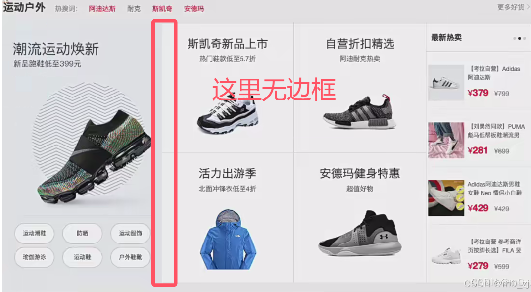
如果一个东西有border,需要考虑清楚,给谁加边框
整体结构怎么划分?看成下面三个整体来做。先分成三个部分,然后一个个做。
注意:
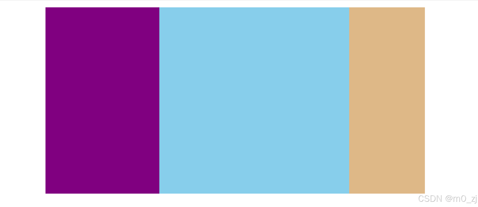
2.整体和中间的布局
可以发现宽度刚好是1100
     .sport .item.item-left{
      width: 330px;


    }
    .sport .item.item-center{
      width: 550px;
    }
    .sport  .item.item-right{
      width: 220px;
    }
目前的效果:
<!DOCTYPE html>
<html lang="en">
<head>
  <meta charset="UTF-8">
  <meta http-equiv="X-UA-Compatible" content="IE=edge">
  <meta name="viewport" content="width=device-width, initial-scale=1.0">
  <title>考拉布局</title>
  <link rel="stylesheet" href="./css/reset.css">
  <link rel="stylesheet" href="./css/common.css">
  <style>
    .sport{
      height: 100px;
      margin-top: 20px;
      background-color: orange;
    }
    .sport .item{
      float:left;
      height: 541px;
    }
    .sport .item.item-left{
      width: 330px;
      background-color: purple;

    }
    .sport .item.item-center{
      width: 550px;
      background-color: skyblue;
    }
    .sport  .item.item-right{
      width: 220px;
      background-color: burlywood;
    }

  </style>
</head>
<body>
  <div class="kl_wrapper sport">
    <div class="item item-left"></div>
    <div class="item item-center"></div>
    <div class="item item-right"></div>
  </div>

</body>
</html>
common.css
.kl_wrapper{
  width: 1100px;
  margin: 0 auto;

}

.clear-fix::after{
  content:"";
  display: block;
  clear: both;/*清除浮动*/

  /*为了更好的兼容*/
  height: 0;
  visibility: hidden;
}

/*为了更好的兼容*/
.clear_fix{
  *zoom:1;
}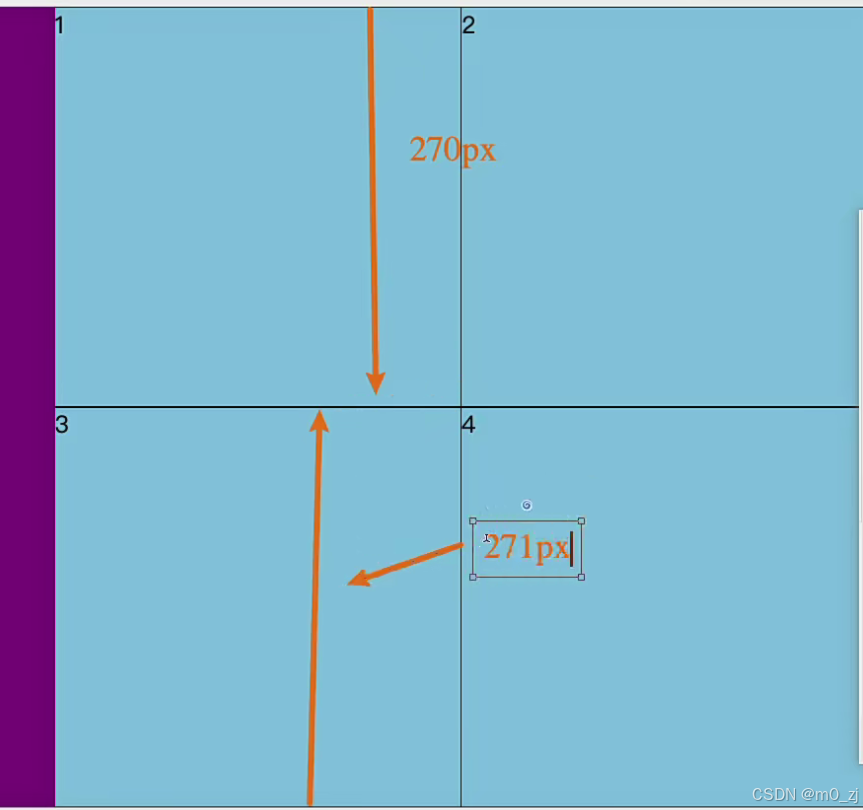
我们设置宽度为271px,蓝色块1的下边框被蓝色快3盖住,所以蓝色1的高度是270px,块3有上下边框,所以是271px
<!DOCTYPE html>
<html lang="en">
<head>
  <meta charset="UTF-8">
  <meta http-equiv="X-UA-Compatible" content="IE=edge">
  <meta name="viewport" content="width=device-width, initial-scale=1.0">
  <title>考拉布局</title>
  <link rel="stylesheet" href="./css/reset.css">
  <link rel="stylesheet" href="./css/common.css">
  <style>
    .sport{
      height: 100px;
      margin-top: 20px;
      background-color: orange;
    }
    .sport .item{
      float:left;
      height: 541px;
    }
    .sport .item.left{
      width: 330px;
      background-color: purple;

    }
    .sport .item.center{
      width: 550px;
      background-color: skyblue;
    }
    .sport .center .center-item{
      float: left;
      width: 275px;
      height: 271px;

      box-sizing: border-box;/*让边框算在宽度里面*/
      border: 1px solid black;
      border-left: none;
    }
    .sport .center .center-item:nth-last-child(-n+2){
      margin-top: -1px;
    }
    .sport  .item.right{
      width: 220px;
      background-color: burlywood;
    }

  </style>
</head>
<body>
  <div class="kl_wrapper sport">
    <div class="item left"></div>
    <div class="item center">
      <div class="center-item">1</div>
      <div class="center-item">2</div>
      <div class="center-item">3</div>
      <div class="center-item">4</div>

    </div>
    <div class="item right"></div>
  </div>

</body>
</html>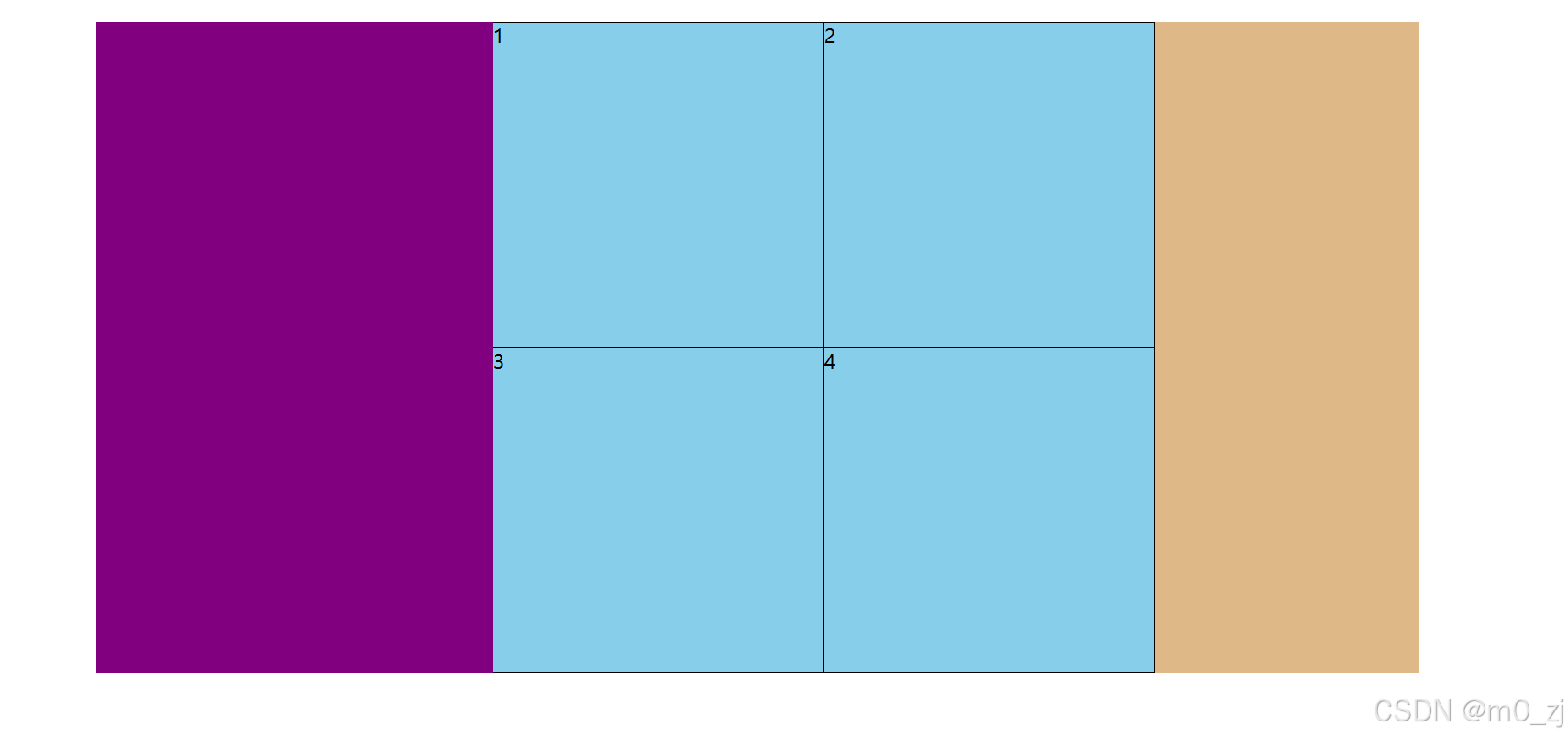
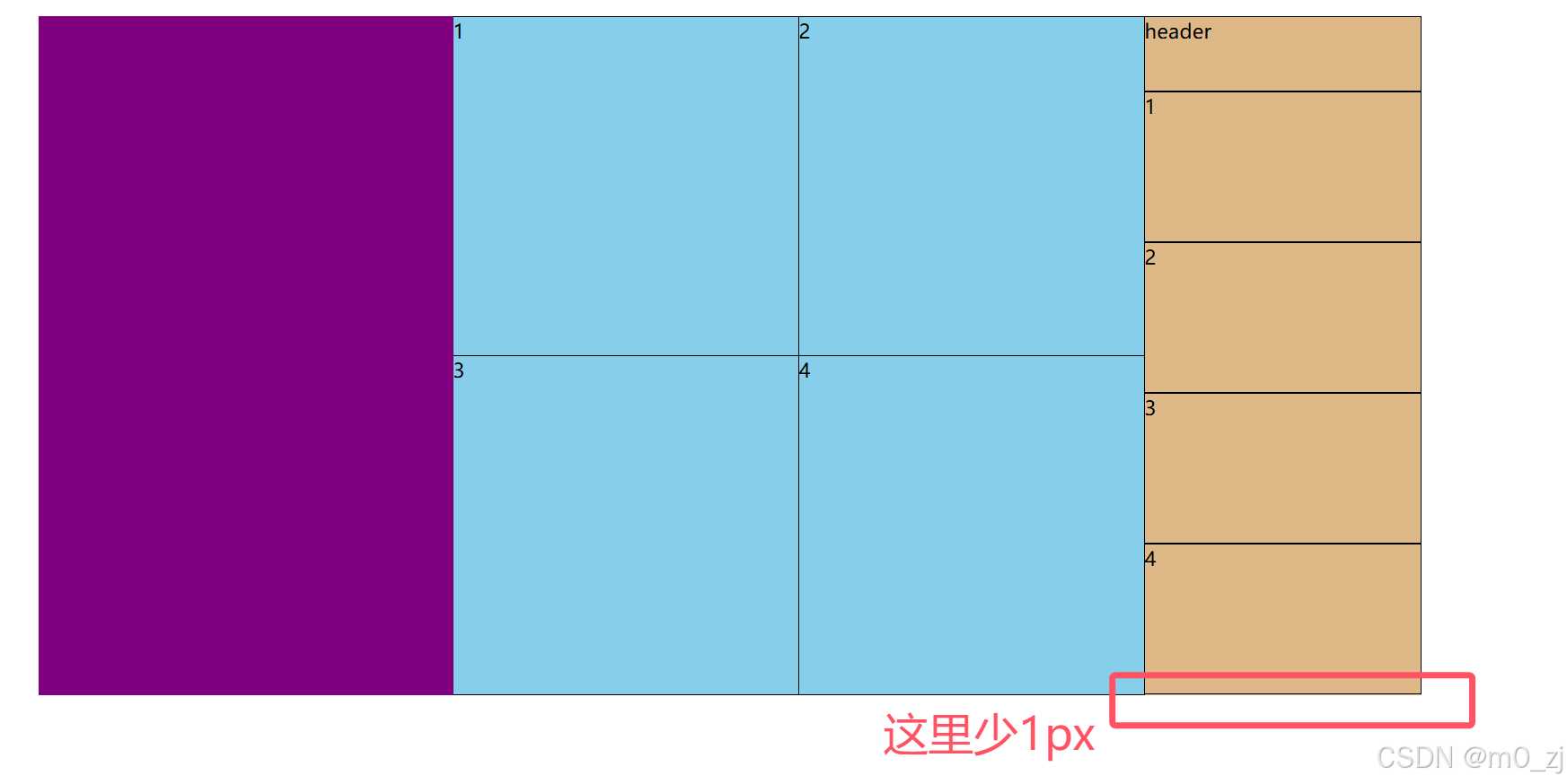
3.右侧的布局
右侧,每块只用加三边的边框即可
box-sizing: border-box;
border:1px solid black;
border-left: none;
现在的状态
<!DOCTYPE html>
<html lang="en">
<head>
  <meta charset="UTF-8">
  <meta http-equiv="X-UA-Compatible" content="IE=edge">
  <meta name="viewport" content="width=device-width, initial-scale=1.0">
  <title>考拉布局</title>
  <link rel="stylesheet" href="./css/reset.css">
  <link rel="stylesheet" href="./css/common.css">
  <style>
    .sport{
      height: 100px;
      margin-top: 20px;
      background-color: orange;
    }
    .sport .item{
      float:left;
      height: 541px;
    }
    .sport .item.left{
      width: 330px;
      background-color: purple;

    }
    .sport .item.center{
      width: 550px;
      background-color: skyblue;
    }
    .sport .center .center-item{
      float: left;
      width: 275px;
      height: 271px;

      box-sizing: border-box;/*让边框算在宽度里面*/
      border: 1px solid black;
      border-left: none;
    }
    .sport .center .center-item:nth-last-child(-n+2){
      margin-top: -1px;
    }
    .sport  .item.right{
      width: 220px;
      background-color: burlywood;
    }
    .sport .right .item{
      float: left;
      width: 220px;
      height: 120px;

      box-sizing: border-box;
      border:1px solid black;
      border-left: none;
    }
    .sport .right .item.header{
      height: 60px;

    }


  </style>
</head>
<body>
  <div class="kl_wrapper sport">
    <div class="item left"></div>
    <div class="item center">
      <div class="center-item">1</div>
      <div class="center-item">2</div>
      <div class="center-item">3</div>
      <div class="center-item">4</div>

    </div>
    <div class="item right">
      <div class="item header">header</div>
      <div class="item">1</div>
      <div class="item">2</div>
      <div class="item">3</div>
      <div class="item">4</div>
    </div>
  </div>

</body>
</html>
我们可以这样做:
    .sport .right .item{
      float: left;
      width: 220px;
      height: 121px;

      box-sizing: border-box;
      border:1px solid black;
      border-left: none;
      margin-top: -1px;
    }
    .sport .right .item.header{
      height: 61px;
      margin-top: 0;

    }


 扫一扫
扫一扫


 771
771

 被折叠的 条评论
为什么被折叠?
被折叠的 条评论
为什么被折叠?
 到【灌水乐园】发言


