


菜鸟教程:https://www.runoob.com/css3/css3-tutorial.html
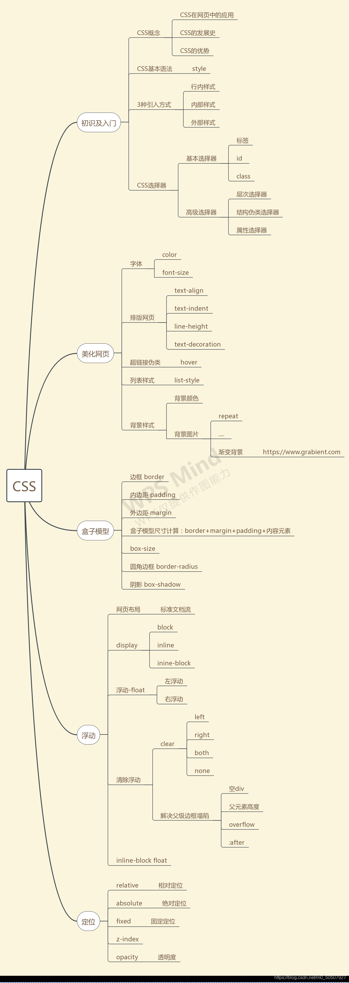
一,CSS
常用网站:
CSS3 教程|菜鸟教程:
https://www.runoob.com/css3/css3-tutorial.html
模板之家:
http://www.cssmoban.com/
(1)什么是CSS
Cascading Style Sheet 层叠级联样式表
CSS:表现层(美化网页
<字体,颜色,边距,高度,宽度,背景图片,网页定位,网页浮动>)
(2)CSS发展史
CSS1.0
CSS2.0:DIV(块)+CSS,HTML与CSS结构分离的思想,网页变得简单,SEO
CSS2.1:浮动,定位
CSS3.0:圆角、阴影、动画… 浏览器兼容性~
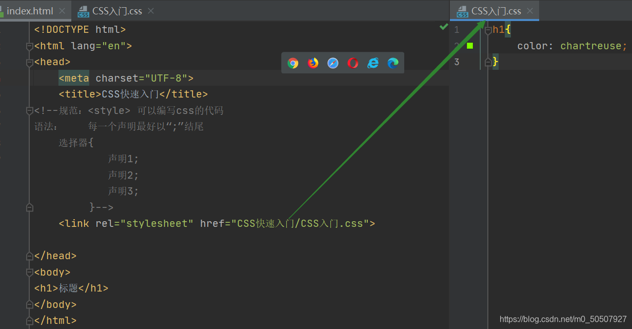
(3)CSS快速入门
<!DOCTYPE html>
<html lang="en">
<head>
    <meta charset="UTF-8">
    <title>CSS快速入门</title>
<!--规范:<style> 可以编写css的代码
语法:    每一个声明最好以“;”结尾
	选择器{
			声明1;
			声明2;
			声明3;
		 }-->
    <style>
        h1{
            color: chartreuse;
        }
    </style>

</head>
<body>
<h1>标题</h1>
</body>
</html>
CSS的优势:
1、内容和表现分离;
2、网页结构表现统一,可以实现复用
3、样式十分的丰富
4、建议使用独立于html的css文件
5、利用SEO,容易被搜索引擎收录!
(4)4种CSS的导入方式
CSS三种导入方式:
优先级:就近原则,离元素越近越优先
<!DOCTYPE html>
<html lang="en">
<head>
    <meta charset="UTF-8">
    <title>CSS的导入方式</title>
    <!--内部样式-->
    <style>
        h1{
            color: red;
        }
    </style>
<!--外部样式-->
    <link rel="stylesheet" href="css/css的导入方式.css">
</head>
<body>
<h1 style="color: seagreen">行内样式:在标签元素中,
    编写一个style属性,编写样式即可</h1>
</body>
</html>
外部样式两种方法:
1,链接式 html
<!--外部样式-->
    <link rel="stylesheet" href="css/css的导入方式.css">
2,导入式 @import 是CSS2.1特有的!
 <title>导入式</title>
    <style>
        @import "css/css的导入方式.css";
    </style>
二,选择器
作用:选择页面上的某一个后者某一类元素
(1)基本选择器
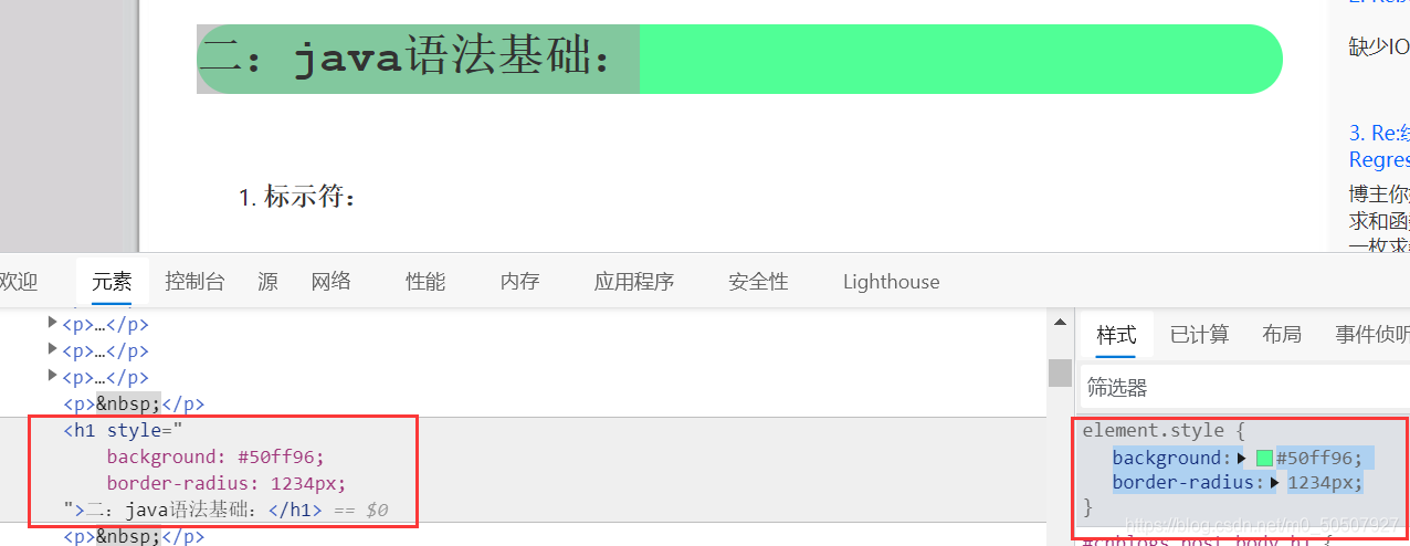
1、标签选择器:会选择到页面上所有的这个标签的元素
<head>
    <meta charset="UTF-8">
    <title>标签选择器</title>
    <style>
        /*标签选择器,会选择到页面上所有的这个标签的元素*/
        h1{
            color: greenyellow;
            background: #50ff96;
            border-radius: 24px;
        }
        p{
            font-size: 100px;
        }
    </style>
</head>
<body>
<h1>王某某</h1>
<h1>张三</h1>
<p>法外狂徒张三</p>
</body>
2、类 选择器class:选择所有class一致的标签,跨标签,
类选择器的格式 : .class的名称{}
<head>
    <meta charset="UTF-8">
    <title>类选择器</title>
    <style>
        /*类选择器的格式  .class的名称{}
          好处:可以多个标签归类,是同一个class*/
        .类选择器一{
            color: #992e2e;
        }
        .类选择器二{
            color: greenyellow;
        }
    </style>
</head>
<body>
<h1 class="类选择器一">王某某</h1>
<h1 class="类选择器二">张三</h1>
<h1 class="类选择器二">法外狂徒张三</h1>
</body>
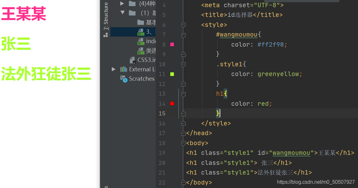
3、id 选择器:全局唯一 格式:#id名{}
<head>
    <meta charset="UTF-8">
    <title>id选择器</title>
    <style>
        /*id选择器:id必须保证全局唯一
              格式:#id名称{}*/
        #wangmoumou{
            color: #ff2f90;
        }
    </style>
</head>
<body>
<h1 id="wangmoumou">王某某</h1>
</body>
4,总结:不遵循就近原则,优先级是固定的
id选择器 > class选择器 > 标签选择器
(2)层次选择器
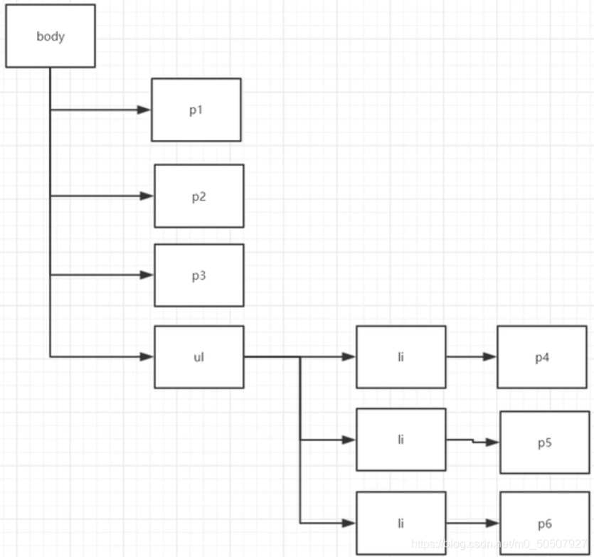
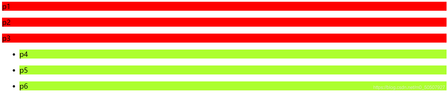
<body>
<p>p1</p>
<p>p2</p>
<p>p3</p>
<ul>
    <li>
        <p>p4</p>
    </li>
    <li>
        <p>p5</p>
    </li>
    <li>
        <p>p6</p>
    </li>
</ul>
</body>
1,后代选择器:在某个元素的后面 -->爷,爸,我
2,子选择器,一代 -->儿子
/*后代选择器*/
        body li{
            background: greenyellow;
        }
    /*子选择器*/
        body>p{
            background: red;
        }
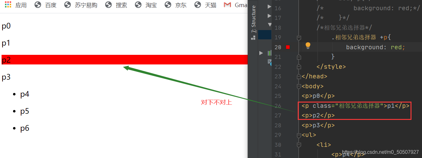
3,相邻的兄弟选择器 同辈<对下不对上> 当前选中元素的向下的一个兄弟元素
/*相邻兄弟选择器*/
        .相邻兄弟选择器 +p{
            background: red;
        }
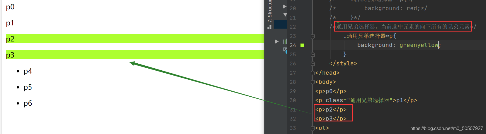
4,通用选择器 当前选中元素的向下所有的兄弟元素
/*通用兄弟选择器,当前选中元素的向下所有的兄弟元素*/
        .通用兄弟选择器~p{
            background: greenyellow;
        }
(3)结构伪类选择器
<title>结构伪类选择器</title>
    <style>
        /*ul的第一个子元素*/
        ul li:first-child{
            background: red;
        }
    /*ul的最后一个元素*/
        ul li:last-child{
            background: greenyellow;
        }
        /*选中p1:定位到父元素,选择当前的第一个元素
            选择当前p元素 的父级元素,选中父级元素的第一个,并且是当前元素才生效!
        */
        p:nth-child(1){
            background: #d2ab1e;
        }
        /*选中父元素下的,第2个p元素*/
        p:nth-of-type(2){
            background: #002aff;
        }
        /*伪类*/
        a:hover{
            background: cyan;
        }
    </style>
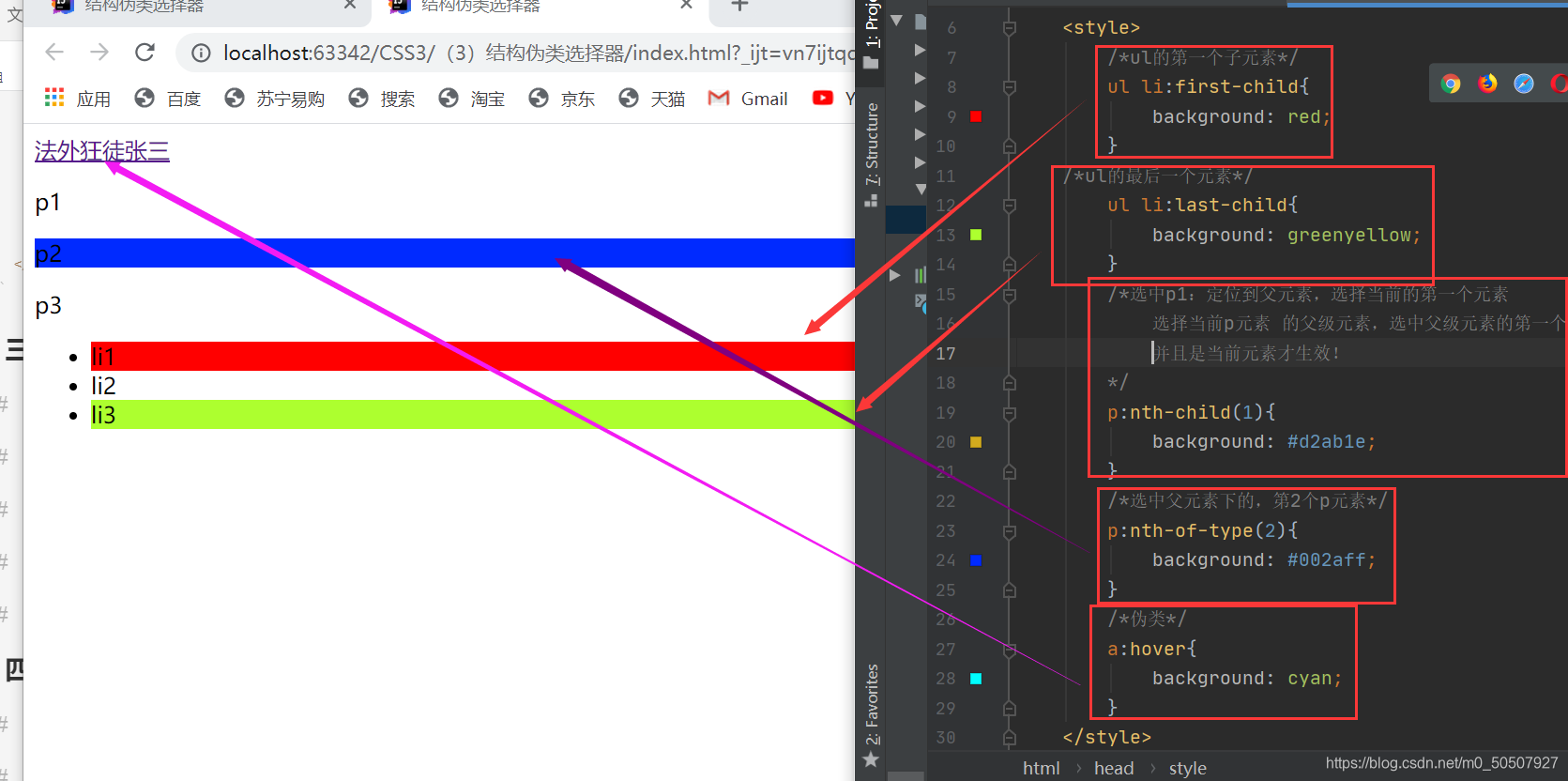
<body>
<a href="">法外狂徒张三</a>
<p>p1</p>
<p>p2</p>
<p>p3</p>
<ul>
    <li>li1</li>
    <li>li2</li>
    <li>li3</li>
</ul>
</body>
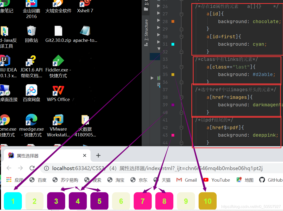
(4)属性选择器(常用)id + class结合
<head>
    <meta charset="UTF-8">
    <title>属性选择器</title>
    <style>
        .demo a{
            float: left;
            display: block;
            height: 50px;
            width: 50px;
            border-radius: 10px;
            background: beige;
            text-align: center;
            color: greenyellow;
            text-decoration: none;
            margin-right:10px;
            font: bold 20px/50px Arial;
        }
    </style>
</head>
<body>
<p class="demo">
    <a href="http://www.baidu.com" class="links item first" id="first">1</a>
    <a href="" class="links item active" targer="_blank" title="test" >2</a>
    <a href="images/123.html" class="links item" >3</a>
    <a href="images/123.png" class="links item" >4</a>
    <a href="images/123.jpg" class="links item" >5</a>
    <a href="abc" class="links item" >6</a>
    <a href="/a.pdf" class="links item" >7</a>
    <a href="/abc.pdf" class="links item" >8</a>
    <a href="abc.doc" class="links item" >9</a>
    <a href="abcd.doc" class="links item last" >10</a>
</p>
</body>
/*属性名   属性名=属性值<正则>
    =绝对等于
    *=包含这个元素
    ^=以这个开头
    $=以这个结尾
    */
    /*存在id属性的元素   a[]{}    */
        a[id]{
            background: chocolate;
        }
        a[id=first]{
            background: cyan;
        }
    /*class中有links的元素*/
        a[class*="last"]{
            background: #d2ab1e;
        }
    /*选中href中以images开头的元素*/
        a[href^=images]{
            background: darkmagenta;
        }
    /*以pdf结尾的*/
        a[href$=pdf]{
            background: deeppink;
        }
三,美化网页元素
(1)为什么要美化网页
1,有效的传递页面信息
2,美化网页,页面漂亮才能吸引客户
3,凸显页面的主题
4,提高用户的体验
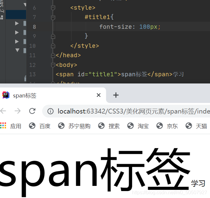
span标签:重点要突出的字,使用span标签套起来
(2)字体样式
font-family:字体
font-size:字体大小     px像素 em缩进
font-weight:字体粗细
color:字体颜色
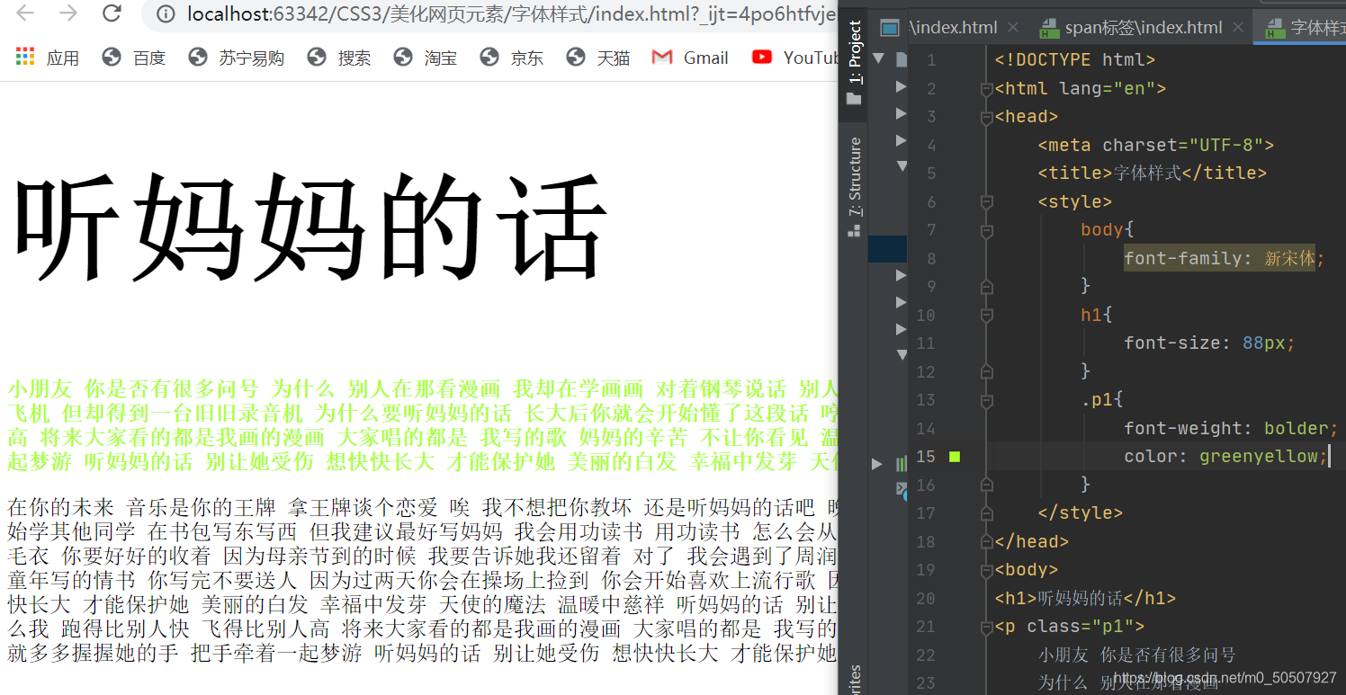
<!--字体风格-->
    <style>
        p{
            font:oblique bolder 16px 楷体;
        }
    </style>
(3)文本样式
1,颜色–>color
2,文本对齐方式–>text-align排版:center
<!--颜色:
RGB 0~F
PGBA{红 绿 蓝 透明度} A<0~1>-->
<style>
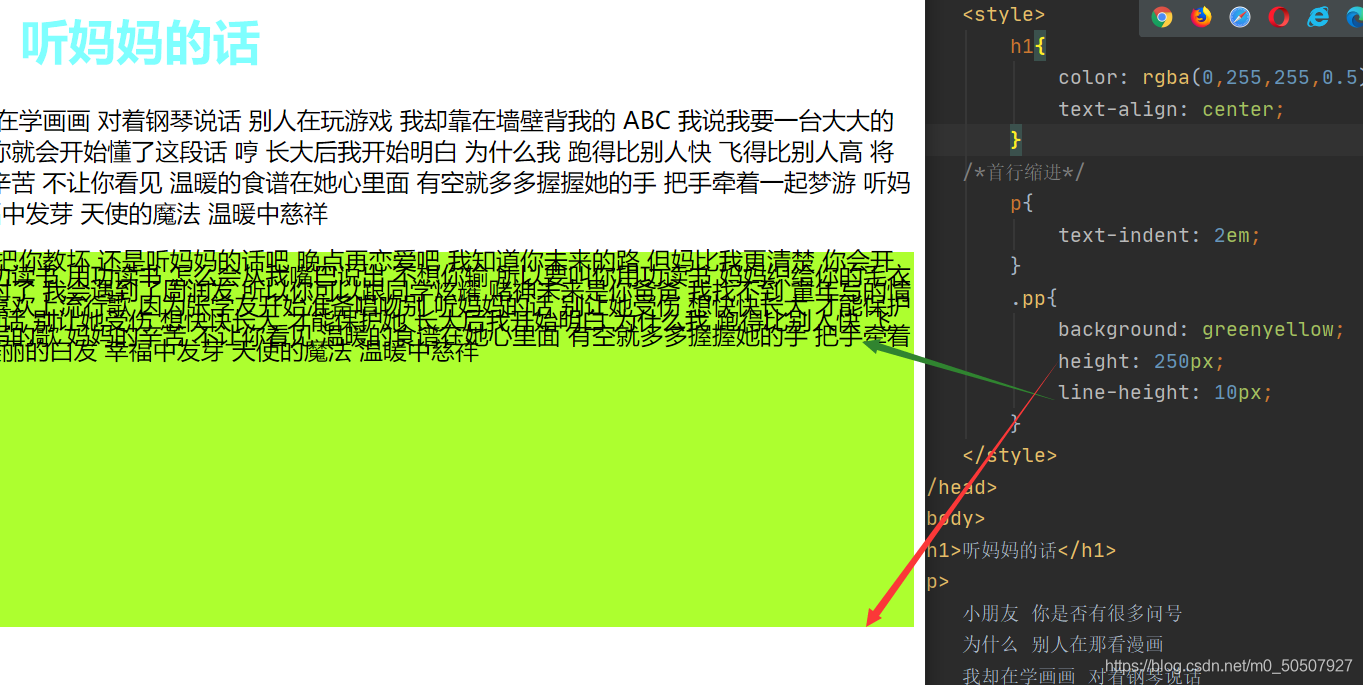
h1{
color: rgba(0,255,255,0.5);
text-align: center;
}
</style>
3,段落首行缩进–>text-indent:2em
4,行高–>line-height:300px;行高和块的高度一致就可以上下居中
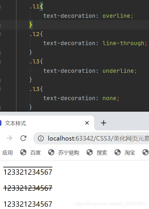
5,下划线–>text-decoration
text-decoration:underline/*下划线*/
text-decoration:line-through/*中划线*/
text-decoration:overline/*上划线*/
text-decoration:none/*超链接去下划线*/
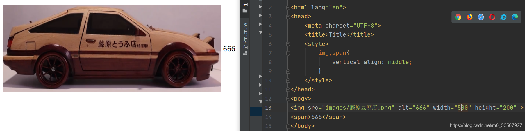
6,图片、文字水平对齐
img,span{vetical-align:middle}
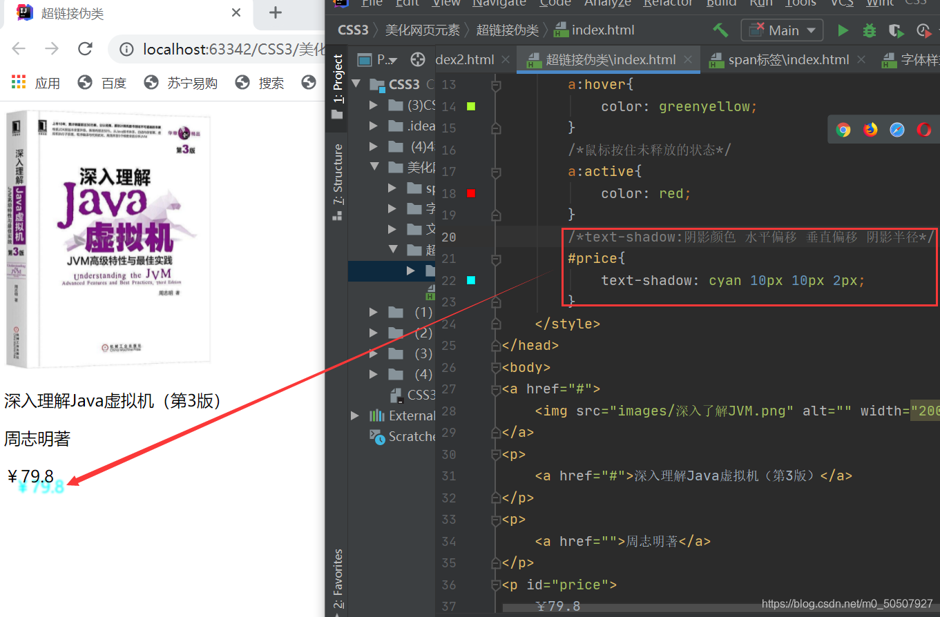
(4)文本,阴影和超链接伪类
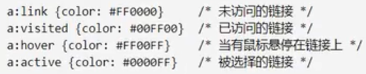
<style>
        /*默认的颜色*/
        a{
            text-decoration: none;
            color: #000000;
        }
        /*鼠标悬浮的颜色*/
        a:hover{
            color: greenyellow;
        }
        /*鼠标按住未释放的状态*/
        a:active{
            color: red;
        }
    </style>
阴影:
(5)列表ul li
/*ul li
list-style:
    none:去掉圆点
    circle:空心圆
    decimal:数字
    spuare:正方形
*/
ul li{
    height: 30px;
    list-style: none;
    text-indent: 1em;
}
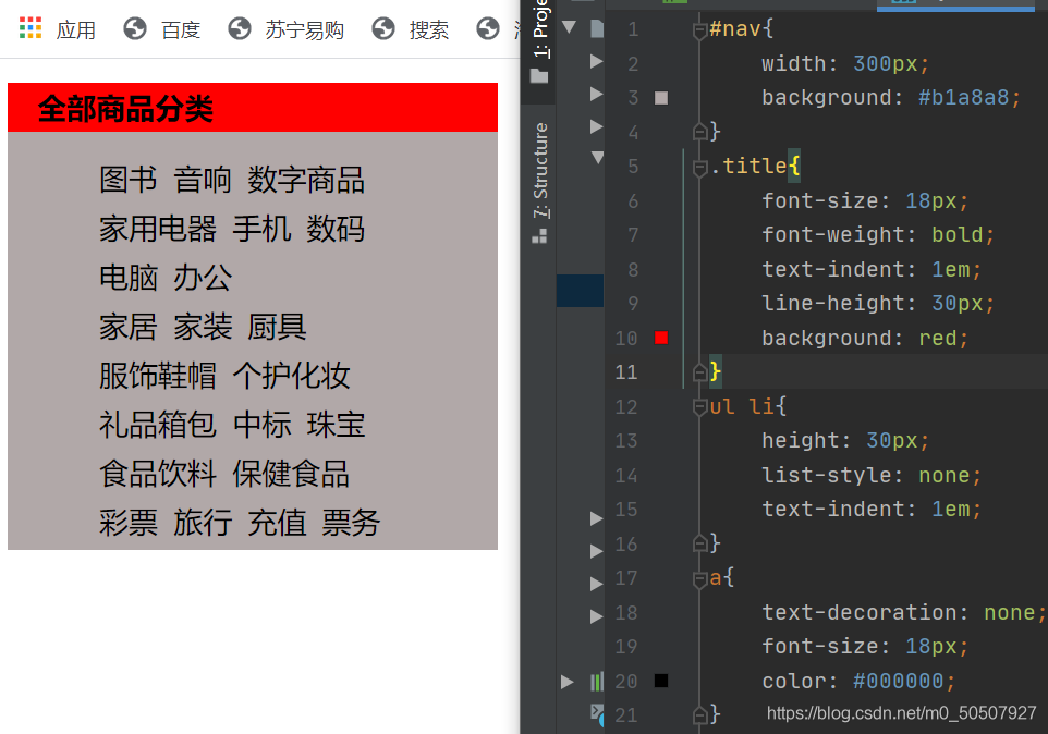
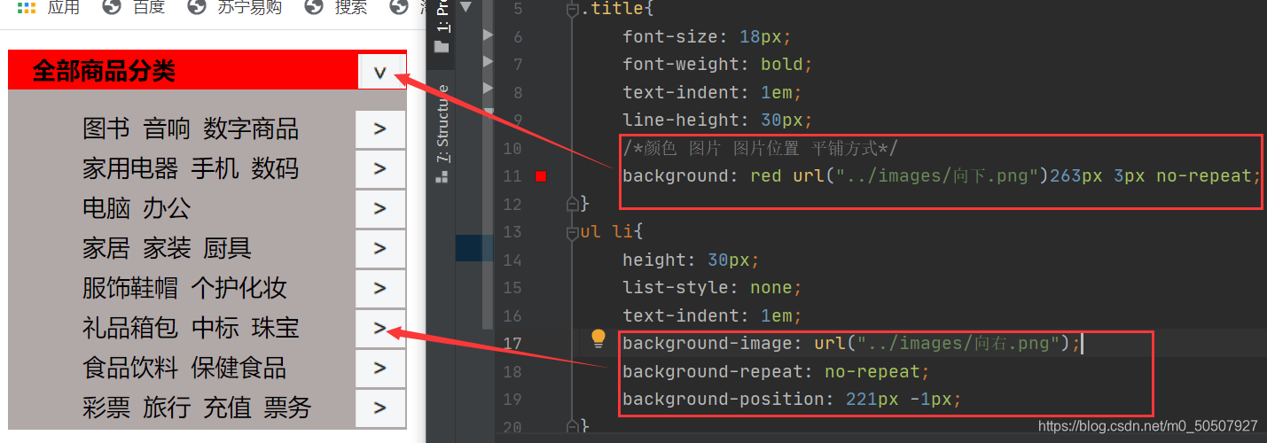
(6)背景
1,背景颜色:background
2,背景图片
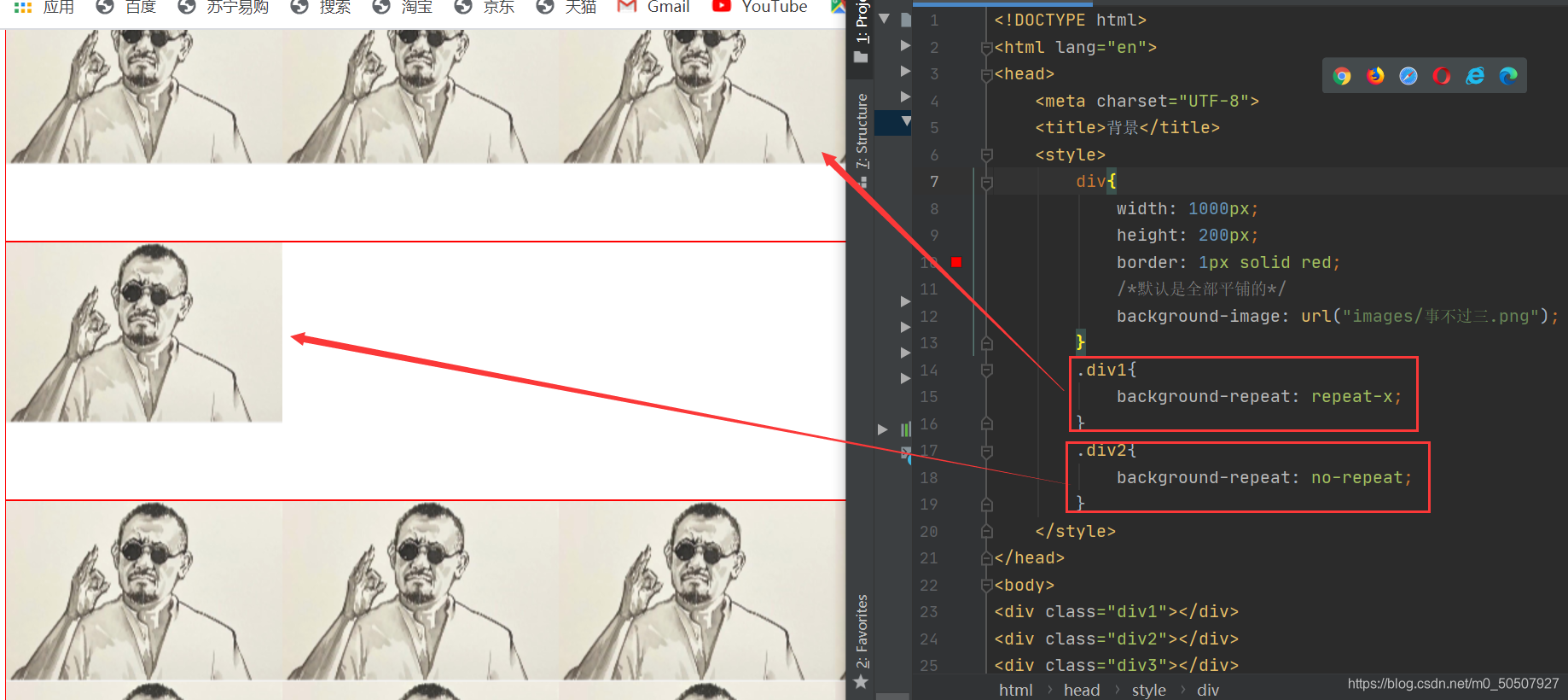
给列表加上背景图:
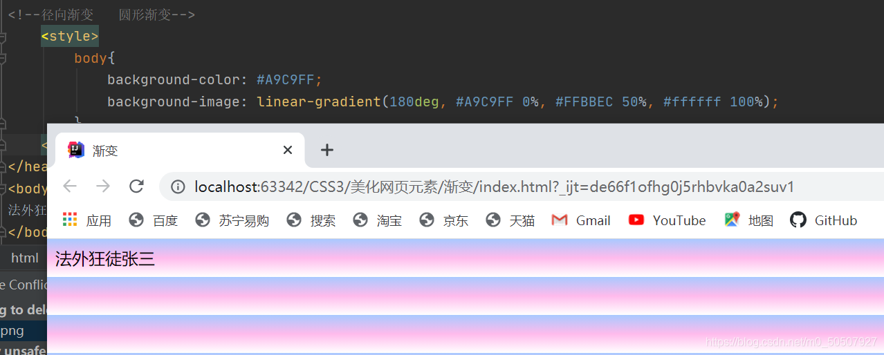
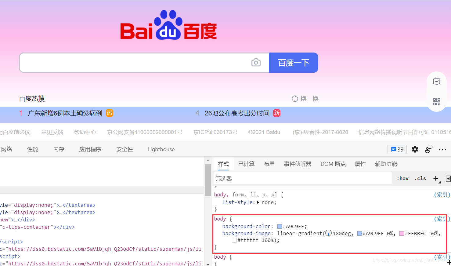
(7)渐变
链接: CSS代码渐变颜色生成工具-Grabient在线网页渐变 配色 方案网站
四,盒子模型
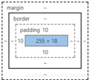
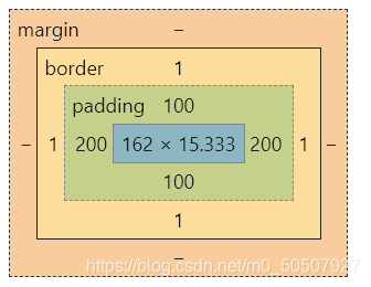
(1)什么是盒子模型
margin:外边距
padding:内边距
border:边框
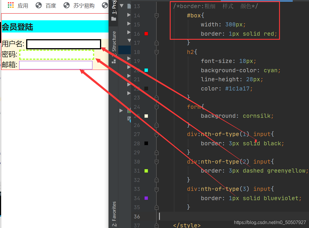
(2)边框
border:粗细 样式 颜色
1,边框的粗细
2,边框的样式
3,边框的颜色
(3)内外边距及div居中
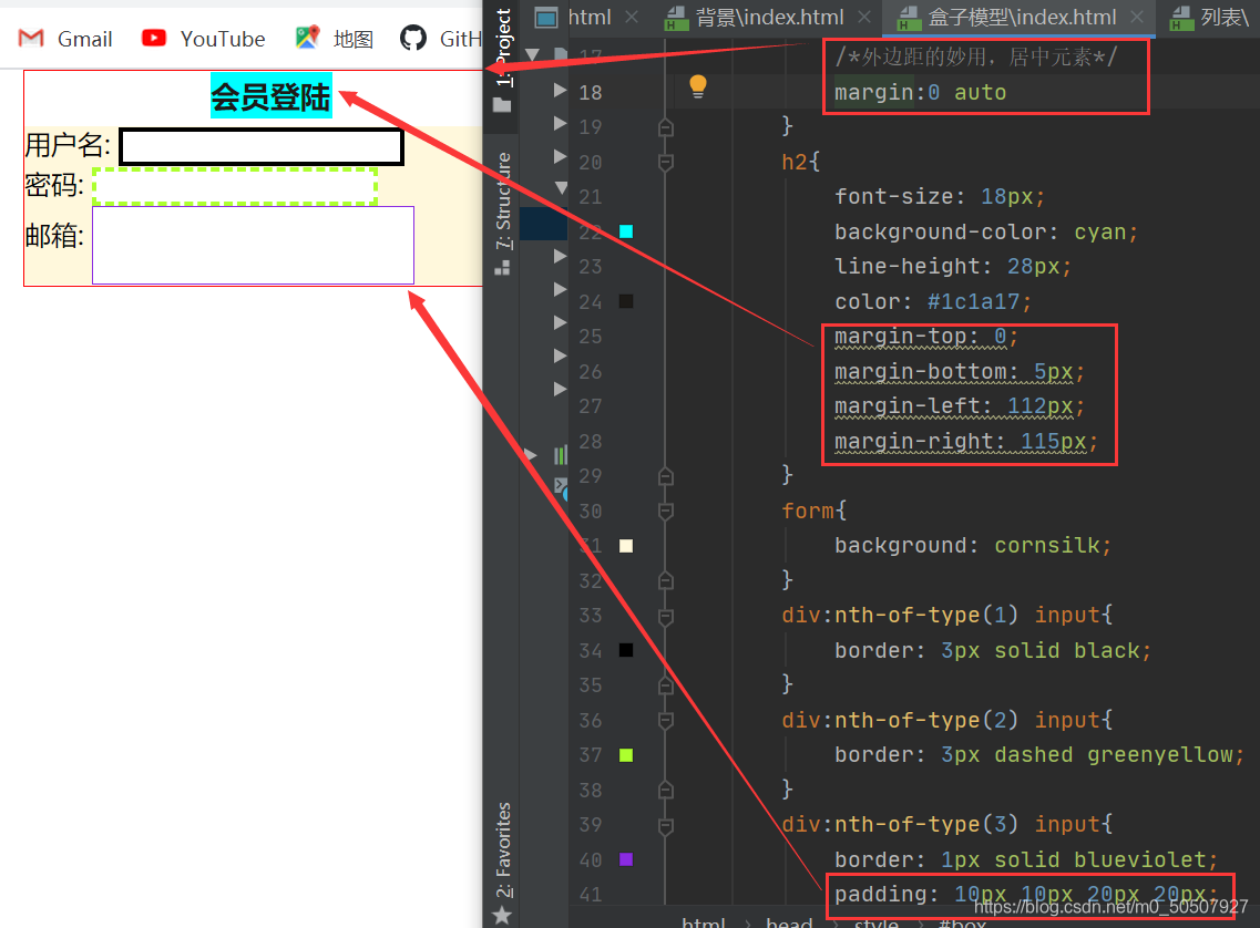
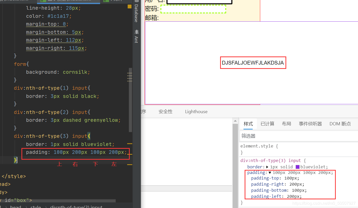
盒子的计算方式:
margin+border+padding+内容的大小
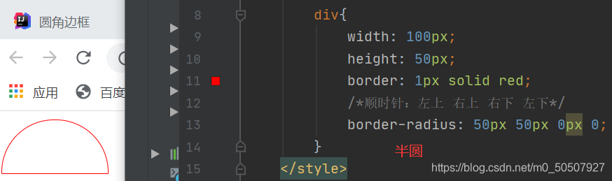
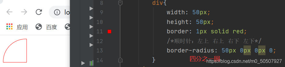
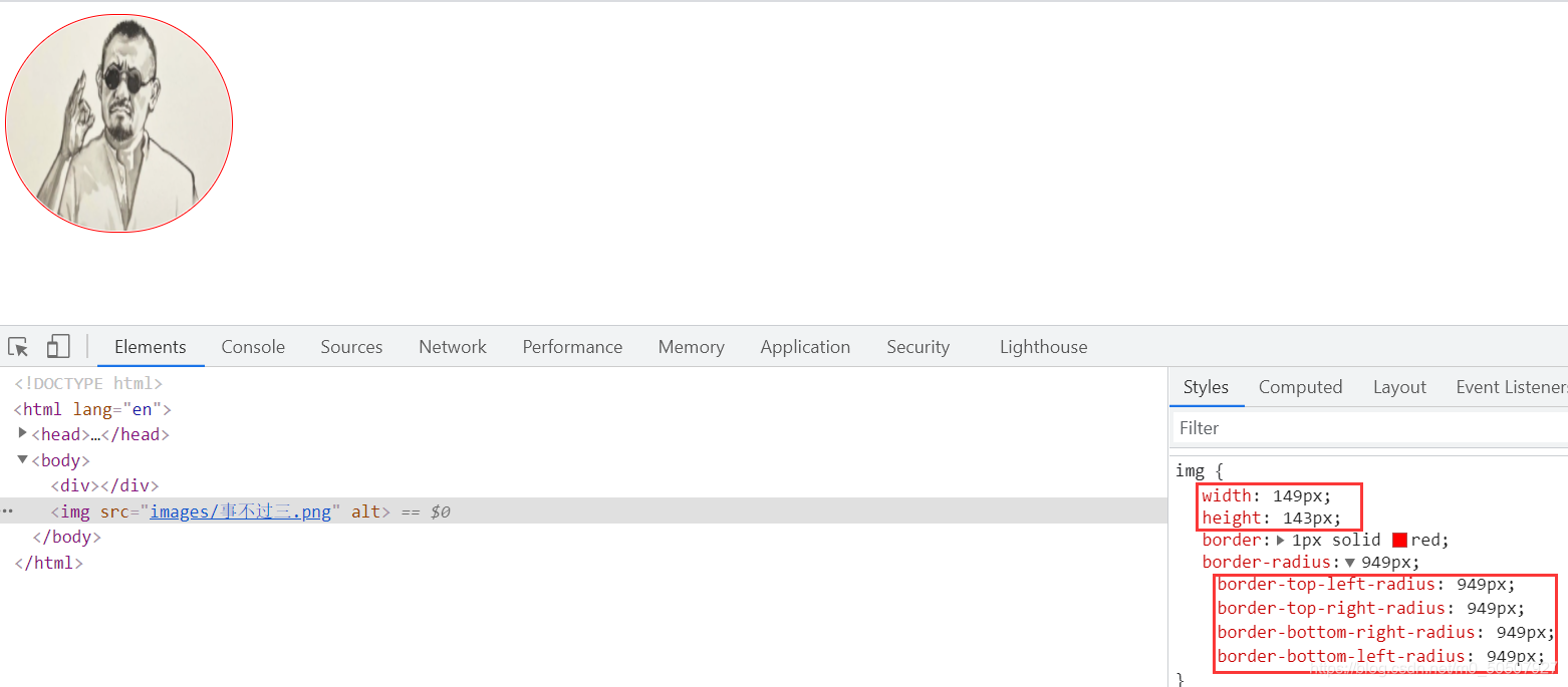
(4)圆角边框
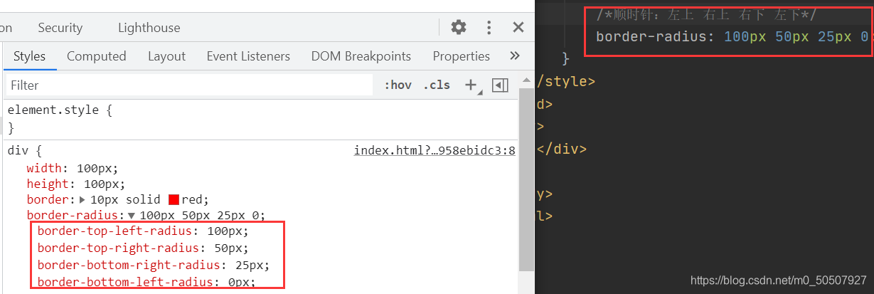
图形:
1,半圆
2,扇形
3,图片
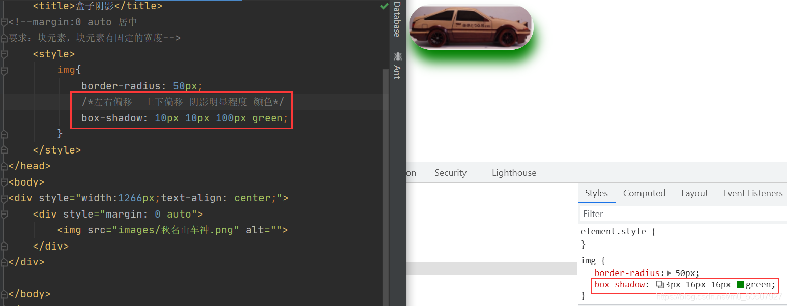
(5)盒子阴影
常用网站:
源码之家:https://www.mycodes.net/
模板之家:http://www.cssmoban.com/
五,浮动
(1)标准文档流
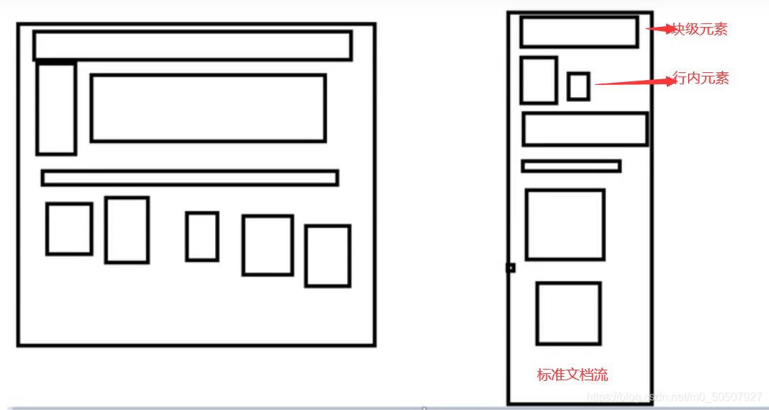
块级元素:独占一行 h1~h6 、p、div、 列表…
行内元素:不独占一行 span、a、img、strong
注: 行内元素可以包含在块级元素中,反之则不可以。
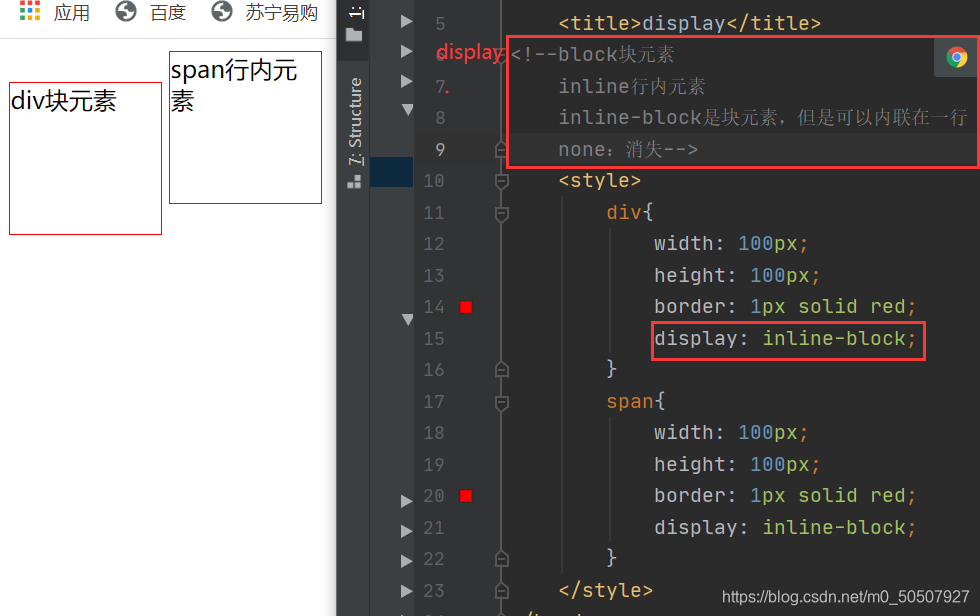
(2)display 属性规定元素应该生成的框的类型
这是一种实现行内元素排列的方式,但是我们很多情况用float
QQ会员练习:
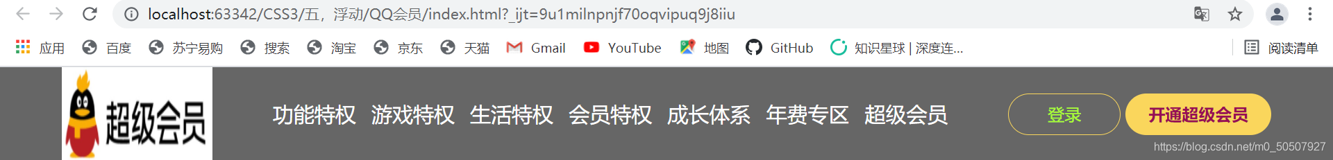
<body>
<div class="wrap">
    <!--头部-->
    <header class="nav-header">
        <div class="head-contain">
            <a href="" class="top-logo"><img src="images/QQ.png" width="145" height="90" /></a>
            <nav class="top-nav">
                <ul>
                    <li><a href="">功能特权</a> </li>
                    <li><a href="">游戏特权</a> </li>
                    <li><a href="">生活特权</a> </li>
                    <li><a href="">会员特权</a> </li>
                    <li><a href="">成长体系</a> </li>
                    <li><a href="">年费专区</a> </li>
                    <li><a href="">超级会员</a> </li>
                </ul>
            </nav>
            <div class="top-right">
                <a href="">登录</a>
                <a href="">开通超级会员</a>
            </div>
        </div>
    </header>
</div>
</body>
<title>QQ会员</title>
    <style>
        *{
            padding:0;
            margin: 0;
        }
        a{
            text-decoration: none;
        }
        .nav-header{
            height: 90px;
            width: 100%;
            background: rgba(0,0,0,.6);
        }
        .head-contain{
            width: 1180px;
            height: 90px;
            margin: 0 auto;
            text-align: center;
        }
        .top-logo,.top-nav,.top-nav li,.top-right{
            height: 90px;
            display: inline-block;
            vertical-align: top; /*垂直对齐文本的顶部*/
        }
        .top-nav{
            margin: 0 48px;
        }
        .top-nav li{
            line-height: 90px;
            width: 90px;
        }
        .top-nav li a{
            display: block;
            text-align: center;
            font-size: 20px;
            color: #fff;
        }
        .top-nav li a:hover{
            color: blue;
        }

        .top-right a{
            display: inline-block;
            font-size: 16px;
            text-align: center;
            margin-top: 25px;
            border-radius: 35px;
        }
        .top-right a:first-of-type{
            width: 106px;
            height: 38px;
            line-height: 38px;
            color: greenyellow;
            border: 1px #fad65c solid;
        }
        .top-right a:first-of-type:hover{
            color: #000000;
            background: white;
        }
        .top-right a:last-of-type{
            width: 140px;
            height: 40px;
            font-weight: 700;
            line-height: 40px;
            background: #fad65c;
            color: #980d55;
        }
        .top-right a:last-of-type:hover{
            background: #71fd6c;
        }
    </style>
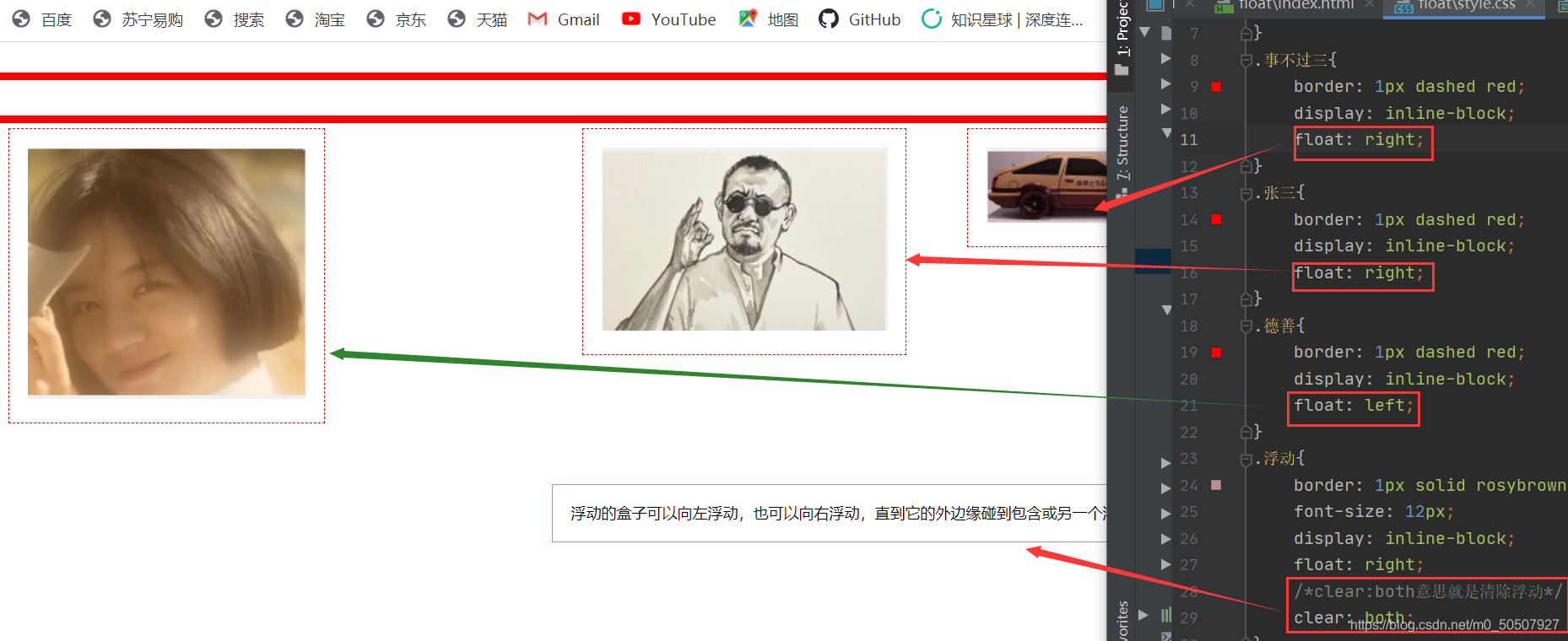
(3)float:left/right左右浮动
<html lang="en">
<head>
    <meta charset="UTF-8">
    <title>float:left/right左右浮动</title>
    <link rel="stylesheet" href="style.css" type="text/css">
</head>
<body>
<div id="图片">
    <div class="事不过三"><img src="images/事不过三.png" alt=""></div>
    <div class="张三"><img src="images/张三.png" alt=""></div>
    <div class="德善"><img src="images/德善1.png" alt=""></div>
    <div class="浮动">
        浮动的盒子可以向左浮动,也可以向右浮动,直到它的外边缘碰到包含或另一个浮动盒子为止
    </div>
</div>
</body>
div{
margin: 24px;
padding: 14px;
}
#图片{
border: 6px solid red;
}
.事不过三{
border: 1px dashed red;
display: inline-block;
float: right;
}
.张三{
border: 1px dashed red;
display: inline-block;
float: right;
}
.德善{
border: 1px dashed red;
display: inline-block;
float: left;
}
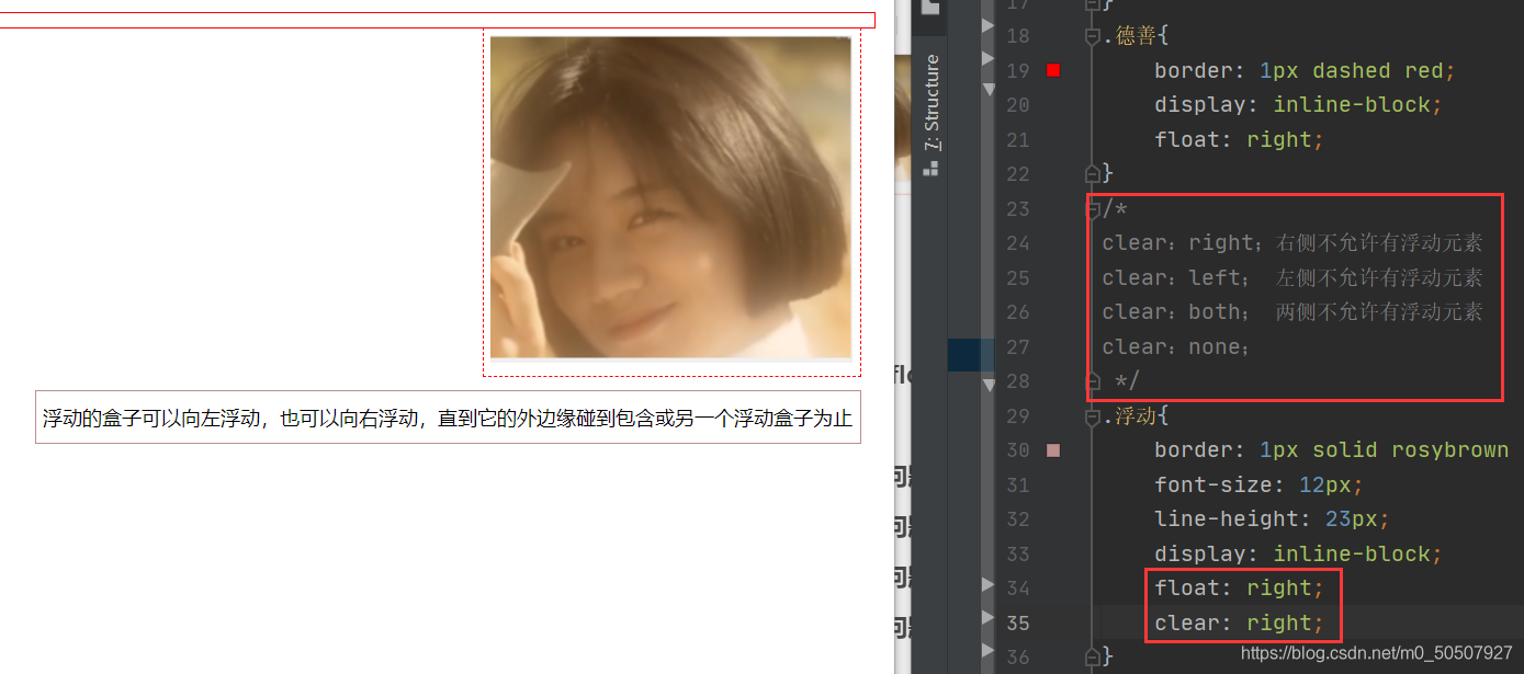
.浮动{
border: 1px solid rosybrown ;
font-size: 12px;
display: inline-block;
float: right;
/*clear:both意思就是清除浮动*/
clear: both;
}
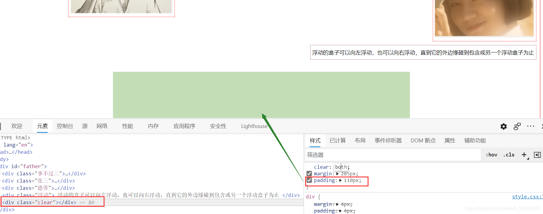
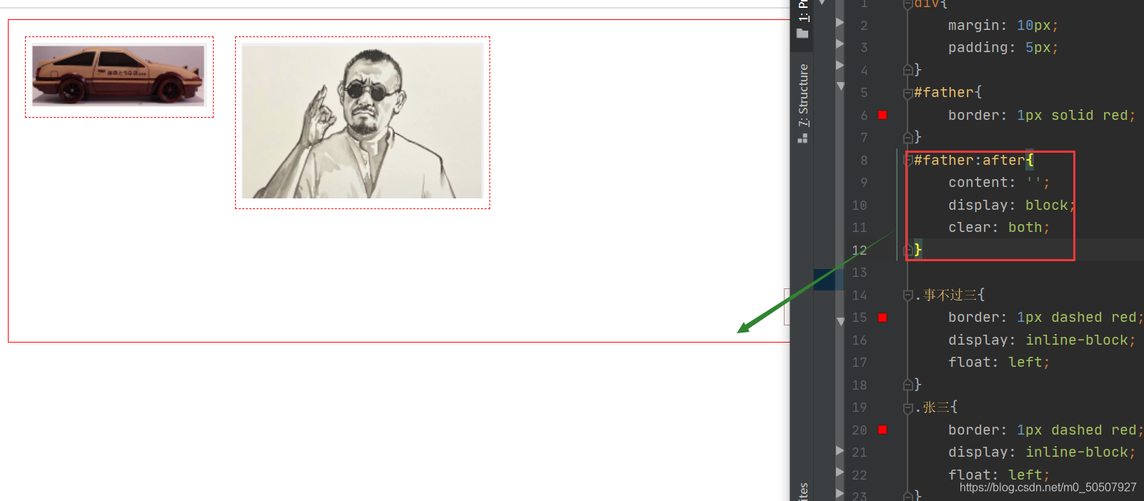
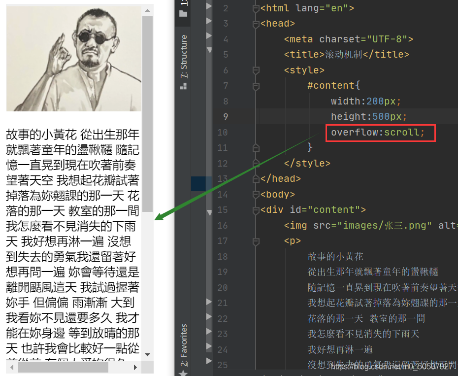
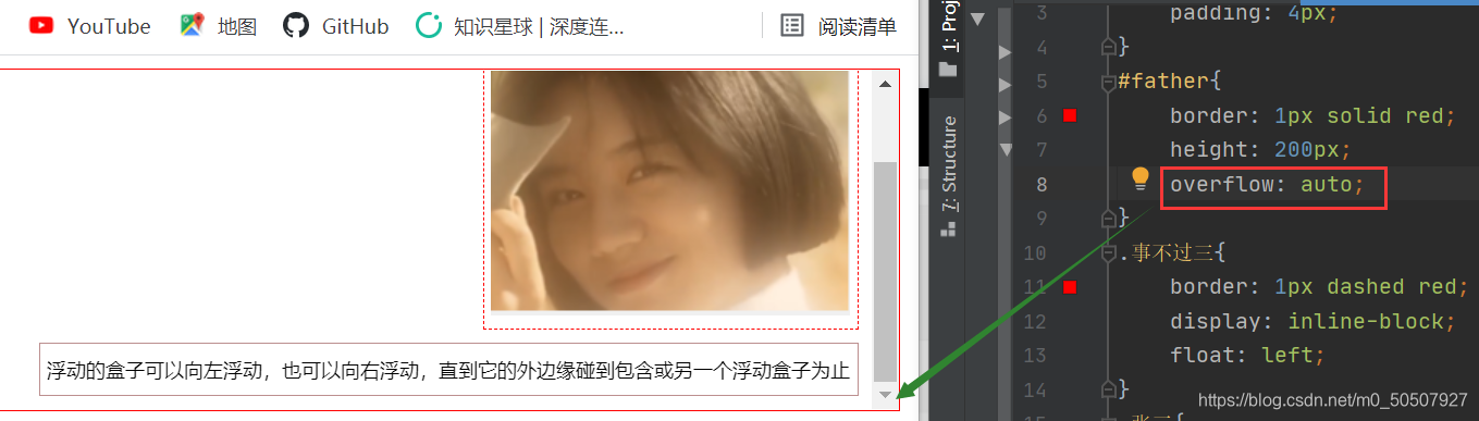
(4)overflow及父级边框塌陷问题
1,clear
2,解决塌陷问题方案-增加父级元素的高度
#father{
    border: 1px solid red;
    height: 500px;
}
3,解决塌陷问题方案-增加一个空的div(class=“clear”)标签,清除浮动
<div class="clear"></div>

.clear{
    clear: both;
    margin: 0;
    padding: 0;
}
4,解决塌陷问题方案-父类添加一个伪类:after
5,解决塌陷问题方案-overflow
这个属性定义溢出元素内容区的内容会如何处理。如果值为 scroll,不论是否需要,用户代理都会提供一种滚动机制
6,小结
1,浮动元后面增加空div

简单,代码中尽量避免空div

2,设置父元素的高度

简单,元素假设有了固定的高度,就会被限制

3,overflow

简单,下拉的一些场景避免使用

4,父类添加一个伪类:after

写法稍微复杂一点,但是没有副作用
(5)display与float对比
1,display:方向不可以控制
2,float:浮动起来的话会脱离标准文档流,所以要解决父级边框塌陷的问题。
六,定位
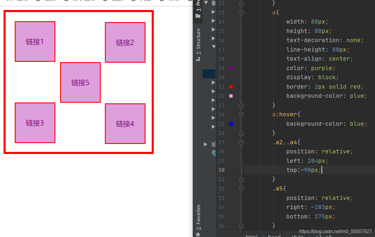
(1)相对定位-relative
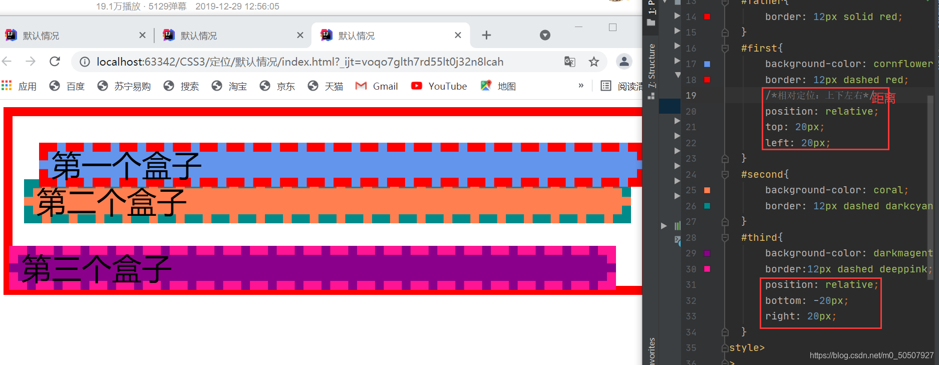
position: relative;/*相对定位 上下左右*/
top: 20px;
left: 20px;
bottom: -20px;
right: 20px;
相对于原来的位置,进行指定的偏移,相对定位的话,它仍然在标准文档流中,原来的位置会被保留。
<head>
    <meta charset="UTF-8">
    <title>Title</title>
    <style>
        #box{
            width: 290px;
            height: 276px;
            padding: 20px;
            border: 5px solid red;
        }
        a{
            width: 88px;
            height: 88px;
            text-decoration: none;
            line-height: 88px;
            text-align: center;
            color: purple;
            display: block;
            border: 2px solid red;
            background-color: plum;
        }
        a:hover{
            background-color: blue;
        }
        .a2,.a4{
            position: relative;
            left: 204px;
            top:-90px;
        }
        .a5{
            position: relative;
            right: -103px;
            bottom: 275px;
        }
    </style>
</head>

<body id="box">
<a href="#" class="a1">链接1</a>
<a href="#" class="a2">链接2</a>
<a href="#" class="a3">链接3</a>
<a href="#" class="a4">链接4</a>
<a href="#" class="a5">链接5</a>
</body>
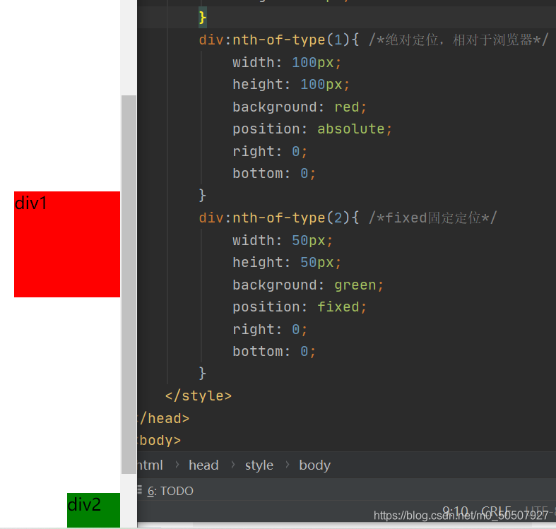
(2)绝对定位-absolute
定位:基于xxx定位。上下左右

1、没有父级元素定位的前提下,相对于浏览器定位

2、假设父级元素存在定位,我们通常会相对于父级元素进行偏移

3、在父级元素范围内

总结:相对于父级或浏览器的位置,进行指定的偏移,绝对定位的话,它不在标准文档流中,原来的位置不会被保留

(3)固定定位-fixed
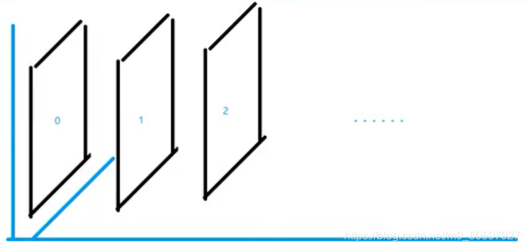
(4)z-index
图层
当元素之间重叠的时候, z-index 较大的元素会覆盖较小的元素在上层进行显示
z-index:默认是0,最高无限~999
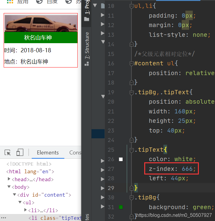
<head>
    <meta charset="UTF-8">
    <title>Title</title>
    <link rel="stylesheet" href="style.css">
</head>
<body>
<div id="content">
    <ul>
        <li><img src="images/背景.png" alt=""></li>
        <li class="tipText">秋名山车神</li>
        <li class="tipBg"></li>
        <li>时间:2018-08-18</li>
        <li>地点:秋名山车神</li>
    </ul>
</div>
</body>

#content{
    width: 160px;
    padding: 0px;
    margin: 0px;
    overflow: hidden;
    font-size: 12px;
    line-height: 25px;
    border: 1px solid red;
}
ul,li{
    padding: 0px;
    margin: 0px;
    list-style: none;
}
/*父级元素相对定位*/
#content ul{
    position: relative;
}
.tipBg,.tipText{
    position: absolute;
    width: 160px;
    height: 25px;
    top: 40px;
}
.tipText{
    color: white;
    z-index: 666;
    left: 44px;
}
.tipBg{
    background: green;
    opacity: 0.5;/*变透明*/
}
七,总结


 扫一扫
扫一扫


 3万+
3万+

 被折叠的 条评论
为什么被折叠?
被折叠的 条评论
为什么被折叠?
 到【灌水乐园】发言


