


 本文介绍了HTML5和CSS3的新特性,包括HTML5的语义化标签、多媒体标签、input类型以及表单属性,详细讲解了CSS3的选择器、盒子模型、模糊效果、计算盒子宽度等功能,并探讨了它们的兼容性和应用场景。
下面的这些东西,用到了可以去菜鸟教程查,不用刻意去记
这些新特性都有兼容性问题,IE9+版本到浏览器才支持
1.HTML5的新特性
1.语义化标签

2.多媒体标签
方便在页面中嵌入音频和视频,不用再使用flash及浏览器插件
1.视频标签:<video>
支持三种视频格式,尽量使用:mp4格式
注意:
谷歌禁止了音频和视频的自动播放,视频解决方案-muted
control属性,不同浏览器中样式不一样,所以一般在javascript中设置
通常设置:
1.自动播放,(不使用controls控件)
2.循环播放
3.宽高大小

  video {
      width: 100%;
  }
<video src="info/mi.mp4" controls="controls" autoplay="autoplay" muted="muted" loop="loop" poster="images/produce.png"></video>
<!-- 等价于上方写法 -->
<video src="info/mi.mp4" controls autoplay muted loop></video>
<!--了解下方写法:mp4不行,下一行ogg格式,一行行扫描,直到找到可用格式即可-->
<video controls="controls">
<source src="info/mi.mp4" type="video/mp4">
<source src="info/mi.ogg" type="video/ogg">
您的浏览器暂不支持<video>标签播放视频
</video> 2.音频标签:<audio>
支持三种音频格式,尽量使用:mp3格式
谷歌禁止了音频和视频的自动播放,音频-js解决

<audio src="info/music.mp3" controls="controls" autoplay="autoplay" loop="loop"></audio>
<!-- 等价于上方写法 -->
<audio src="info/music.mp3" controls autoplay loop ></audio>

<!--了解:mp3不行,下一行ogg格式,一行行扫描,直到找到可用格式即可-->
   <audio controls="controls">
  <source src="info/mi.mp3" type="audio/mpeg">
  <source src="info/mi.ogg" type="audio/ogg">
  您的浏览器暂不支持<audio>标签播放视频
  </audio>
3.input-类型type
验证的时候,必须添加到form表单域中
重点记忆:number,search,tel

<!-- 验证的时候,必须添加到form表单域中 -->
<form action="">
    <ul>
        <li>邮箱email:<input type="email" /></li>
        <li>网址url:<input type="url" /></li>
        <li>日期time:<input type="time" /></li>
        <li>日期date:<input type="date" /></li>
        <li>数量number:<input type="number" /></li>
        <li>手机号码tel:<input type="tel" /></li>
        <li>搜索search:<input type="search" /></li>
        <li>颜色color:<input type="color" /></li>
        <li><input type="submit" value="提交"/></li>
    </ul>
</form>
4.表单属性
验证的时候,必须添加到form表单域中
重点记忆:placeholder,multiple
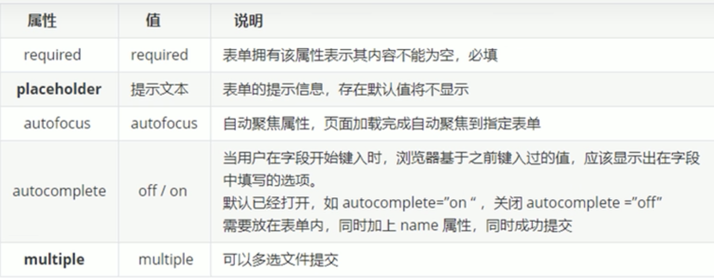
<form action="">
    <input type="search" name="" id="" required="required" placeholder="搜你想搜一下" autofocus="autofocus" autocomplete="off" multiple="multiple">
    <input type="submit" value="search">
    <!-- 等价于上方写法 -->
    <input type="search" name="" id="" required placeholder="搜你想搜一下" autofocus autocomplete="off" multiple>
    <input type="submit" value="search">
</form>
可以通过 伪元素,修改placeholder里边的字体颜色:
/* ::伪元素 */
input::placeholder {
  color: pink;
}
2.CSS3新特性
1.选择器
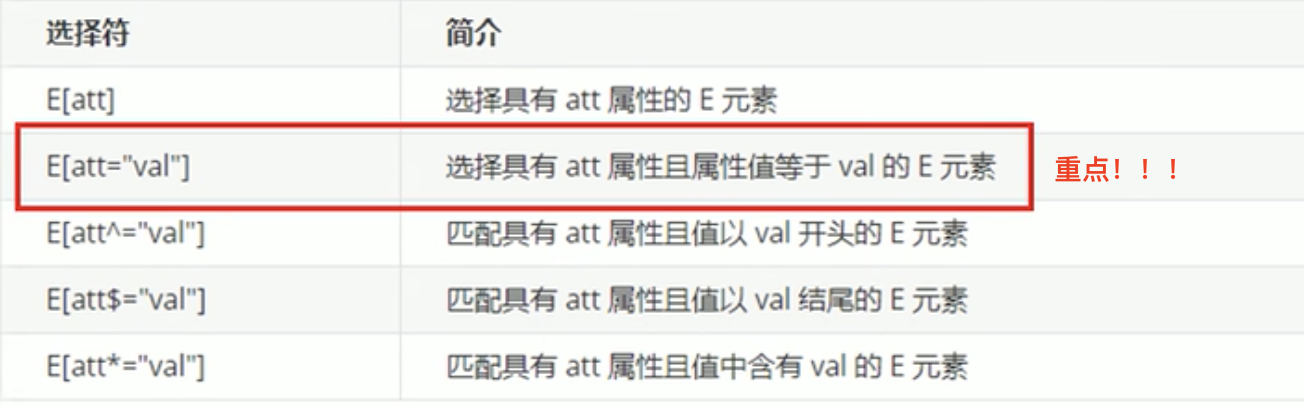
1.属性选择器
可以根据元素特定的属性来选择元素。可以不用借助 .类/id选择器。
权重:类选择器,属性选择器,伪类选择器,权重都是10
[属性选择器]:权重10;div标签选择器:权重1;所以div[class^=icon]:权重11
<style>
/* 属性选择器 */
/* 选择:必须是 input ,同时具有 value属性 的那个标签 */
input[value] {
color: palevioletred;
}
/* 选择:必须是 input ,同时 type属性值=text 的那个标签 */
input[type=text] {
color: pink;
}
/* 选择:必须是div,同时具有 class属性=icon……开头的值” 的多个标签 */
div[class^=icon] {
color: red;
}
/* 选择:必须是section,同时具有 class属性=……data结尾的值” 的多个标签 */
section[class$=data] {
color: purple;
}
/* 选择:必须是section,同时具有 class属性=含有……的值” 的多个标签 */
section[class*=ico] {
text-decoration: underline;
}
</style>
</head>
<body>
<h5>1.利用:“属性名value”,区别两个input标签,单独设置css样式</h5>
<input type="text" value="请输入">
<input type="text">
<h5>2.利用:“属性名=值”,区别input标签均有type属性,但值不同,来区别多个input标签,单独设置css样式</h5>
<input type="text" name="" id="">
<input type="password" name="" id="">
<h5>3.利用:“属性名=值(以……^开头)”,区别多个div标签,单独设置css样式</h5>
<div class="icon1">1</div>
<div class="icon2">2</div>
<div class="icon3">3</div>
<div class="icon4">4</div>
<div class="icon5">5</div>
<div class="nonono">我的class属性不是icon开头的</div>
<h5>4.利用:“属性名=值(以……$结尾)”,区别多个相同标签,单独设置css样式</h5>
<h5>5.利用:“属性名=值(含有*……)”,区别多个相同标签,单独设置css样式</h5>
<section class="icon1-data">演员</section>
<section class="icon2-data">晚安</section>
<section class="icon3-ico">模特</section>
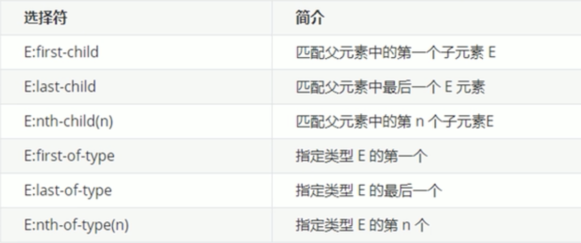
</body>2.结构伪类选择器
根据“文档结构”来选择元素
常用于:根据父级选择里边的子元素
section div:nth-of-type(1) ----权重:12 (:nth-of-type(1)---伪类权重10,标签选择器1+1)
/* 伪类选择器 */

  /* 1.选择ul里边的第一个孩子---li */
  ul li:first-child {
      background-color: pink;
  }
  /* 效果同上 */
  ul li:first-of-type {
      background-color: pink;

  }

  /* 同上:简写,
  注意❗️❗️❗️:最好不要简写,因为有时有问题:li中嵌套别的标签,可能出现错误(所有li中的小标签也更改样式) */
  /* ul :first-child {
      background-color: pink;
  } */

  /* 2.选择ul里边的最后一个孩子---li */
  ul li:last-child {
      background-color: palegreen;
  }
  /* 同上 */
  ul li:last-of-type {
      background-color: palegreen;
  }
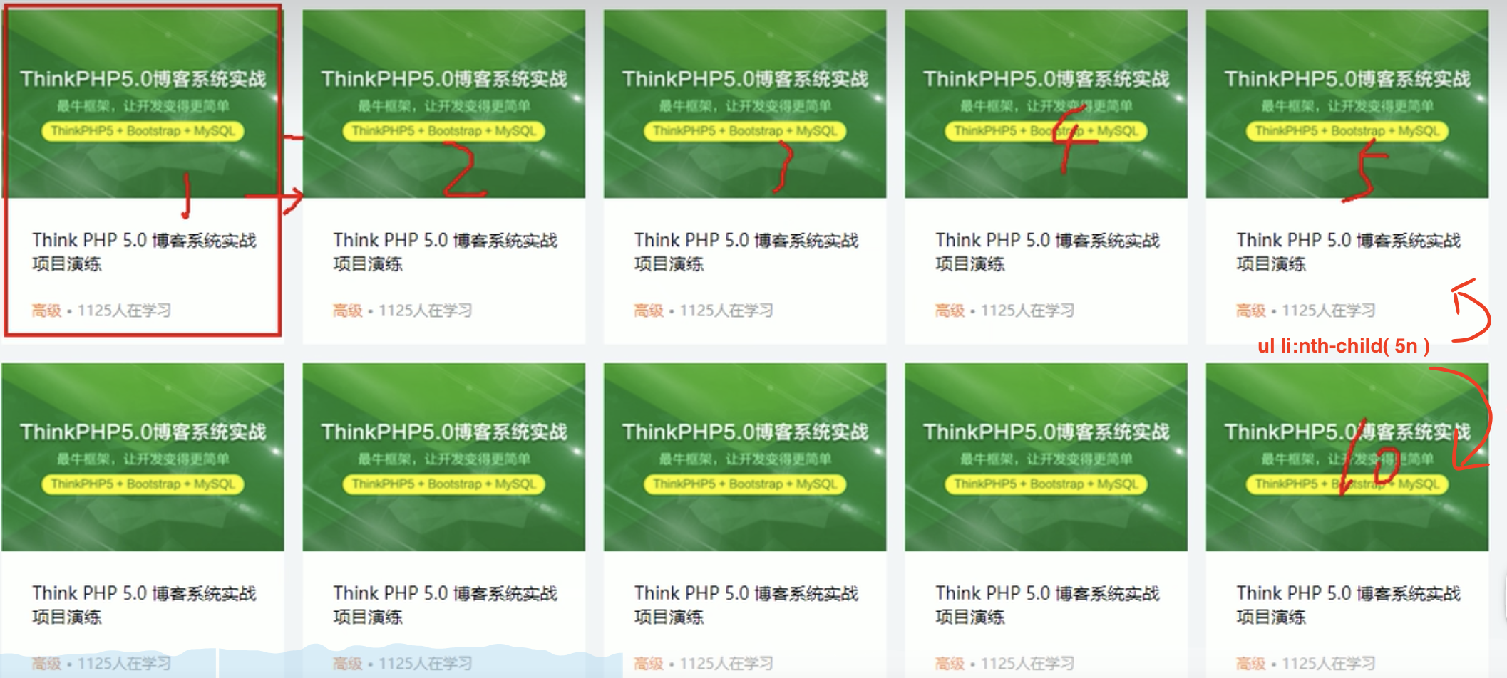
- E:nth-child(n):
n可以是:
数字(第n个子元素,n 从1开始),
关键字(even偶数,odd基数),
公式(从0开始计算,但 第0个 和 超出子元素个数的 会被忽略)
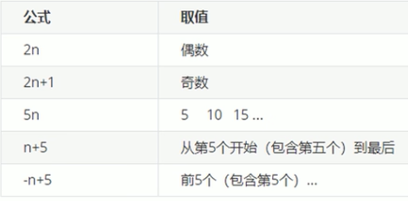
/* 3.选择ul里边:第n个 / 多个特定的的子元素---li*/
  /* n可以是:数字(第n个子元素,n 从1开始),
             关键字(even偶数,odd基数),
             公式(从0开始计算,但 第0个 和 超出子元素个数的 会被忽略)*/

  /* 1.数字:选择ul里边的第三个孩子---li */
  ul li:nth-child(3) {
      background-color: peru;
  }
  /* 同上 */
  ul li:nth-of-type(3) {
      background-color: palegreen;
  }

  /* 2.关键字:*/
  /* ******隔行变色效果-----法一  ******/
  选择ul里边的 “偶数行” 的子元素---li*/
  ul li:nth-child(even) {
      background-color: pink;
  }
  /*   “奇数行” */
    ul li:nth-child(odd) {
      background-color: skyblue;
  }

  /* 3.公式:选择所有子元素 ,n:从0开始,每次加1。(❗️只能是n)*/
  ol li:nth-child(n) {
      background-color: skyblue;
  }


  /* ****隔行变色效果------法二 ******/
  /* 奇数行 */
  ol li:nth-child(2n+1) {
      background-color: rgb(34, 144, 187);
  }

  /* 偶数行 */
  ol li:nth-child(2n) {
      background-color: skyblue;
  }


  /* 5的倍数行 ----应用:每行最后一个float的li不需要margin-right:0;*/
  ol li:nth-child(5n) {
      background-color: skyblue;
  }
  /* 从第5个到最后一个 */
  ol li:nth-child(n+5) {
      background-color: skyblue;
  }
  /*   前5个--第1个到第5个 */
  ol li:nth-child(-n+5) {
      background-color: skyblue;
  }
- 隔行变色效果
2n:偶数行= even
2n+1:奇数行=odd
5n应用:
- -child 与 -of-type 二者区别:
E:nth-child(n): 【执行时:先看 nth-child(n),后看前边的 E】
会把所有子元素统一排序(不区分子元素是<p><div>……),再根据排好序号,检索对应序号是否是E的类型,是-改变样式,否-无效设置样式
E:nth-of-type(n): 【执行时:先看 E,后看 nth-child(n)】
会把指定E标签的子元素盒子排序(区分子元素是<p><div>……),再根据E的排列,选择对应的序号
<style>
/* nth-child() 与nth-of-type()的区别 */
/* nth-child()无效!*/
section div:nth-child(1) {
background-color: powderblue;
}
/* nth-of-type(1)有效!*/
section div:nth-of-type(1) {
background-color: powderblue;
}
</style>
<section>
<p>pppppp</p>
<div>divdivdivdiv111111</div>
<div>divdivdivdiv222222</div>
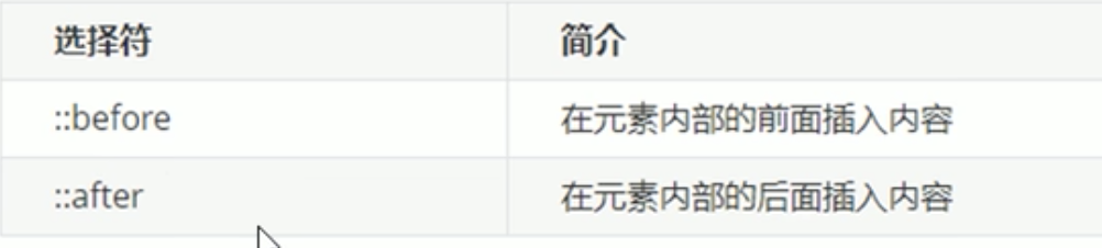
</section>3.伪元素选择器(重点)
利用CSS创建新的标签元素,不需要HTML标签,从而简化html代码
div::before----权重:2 (::before---伪元素权重11,标签选择器1)
- 应用场景:1.CSS创建新的标签元素:
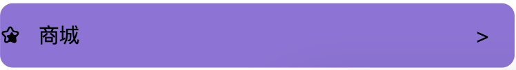
效果如上,代码如下:
 <style>
    /* 伪元素选择器 */
    div {
        position: relative;
        width: 400px;
        height: 50px;
        line-height: 50px;
        background-color: mediumpurple;
      	border-radius: 10px;

    }

    div::before {
        /* 必写属性❗️❗️❗️ */
        content: '\100cc';
      	/* 从iconfont中引入图片,要写font-family,否则图片显示异常 */
        font-family: iconfont;
        /* 因为是行内元素,所以宽高需display */
        display: inline-block;
        width: 30px;
        height: 30px;
        /* background-color: magenta; */
    }

    div::after {
        /* 必写属性❗️❗️❗️ */
        content: '>';
        position: absolute;
        right: 10px;
        /* 因为是行内元素,所以宽高需display,若有position则直接设宽高即可 */
        /* display: inline-block; */
        width: 20px;
        height: 20px;
        /* background-color: rgb(122, 239, 145); */
    }
 </style>
</head>
<body>
  <div>商城</div>
</body>
效果如上,代码如下:
<style>
  /* 轮播图片 */
.pic img {
    width: 100%;
}

.pic::before {
    content: '';
    position: absolute;
    top: 0;
    left: 0;
    /* 隐藏遮罩 */
    display: none;
    width: 840px;
    height: 628px;
    background: rgba(0, 0, 0, .3) url(images/radio.png) no-repeat center;
}

/* 当鼠标经过图片,内部遮罩层显示出来 */
.pic:hover::before {
    /* 显示 */
    display: block;
}
</style>
  <h4>如果使用:伪元素---则省去遮罩盒子的代码!!!</h4>
  <div class="pic">
      <img src="images/produce.png" alt="">
</div>- 应用场景:2.伪元素清除浮动(之前文章中写过,链接:CSS样式_优快云博客)
2.CSS盒子模型
如果盒子指定了宽高,那么给padding会撑开盒子,以前我们宽高都是减去padding的值,现在有了这个属性,就不用再减去了。
这个强大的属性:box-sizing
| 属性值: | content-box (默认) 盒子大小=width+padding+margin | border-box 盒子大小=width 前提:padding和border ≥ width |
/* CSS3盒子---给定 width 加 padding后 盒子大小 */
/*运行代码后,box1明显大于box2*/
.box1{
  /* padding会撑开盒子 */
  /* 盒子宽度=width+border+padding */
  box-sizing: border-content;
  width: 100px;
  height: 100px;
  background-color: pink;
  border: 10px solid red;
  padding: 10px;
}
.box2{
  /* padding不会撑开盒子 */
  /* 盒子宽度=width */
  box-sizing: border-box;
  width: 100px;
  height: 100px;
  background-color: pink;
  border: 10px solid red;
  padding: 10px;
}
<div class="box1">border-cintent</div>
<div class="box2">border-box</div>3.图片变模糊
CSS3滤镜属性:filter---作用:将模糊或颜色偏移等效果应用于元素。
语法:filter:函数();
属性值(之一):filter:blur(5px); (blur是一个函数,作用:模糊处理,数值越大越模糊)
/* 图片模糊 */
.mohu {
    filter: blur(3px);
}
/* 鼠标经过时,图片清晰 */
.mohu:hover {
    filter:blur(0px);
}
4.计算盒子宽度width:calc函数
语法:width:calc(100%-80px); --永远比父盒子小80px
括号内进行计算:+ - * / 来计算,❗️❗️❗️❗️❗️运算符两侧加空格,否则-无效
.son {
    /* son永远比father的width 少30px */
    /* ❗️❗️❗️❗️❗️此处运算符两侧加空格,否则-无效 */
    width: calc(100% - 30px);
    height: 100px;
    background-color: pink;
}
5.CSS3过渡:
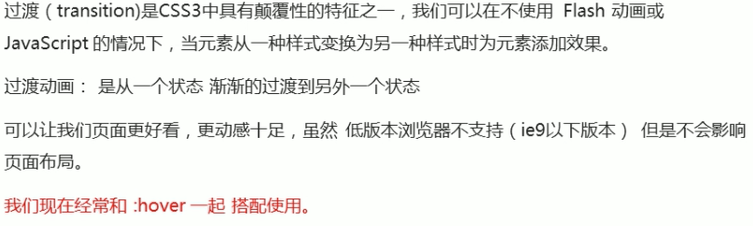
属性语法:transition:要过渡的属性 花费时间 运动曲线 何时开始; (最后两个可以省略) (配合:hover使用)
改变多个属性,逗号隔开;或者 第一个参数写:all
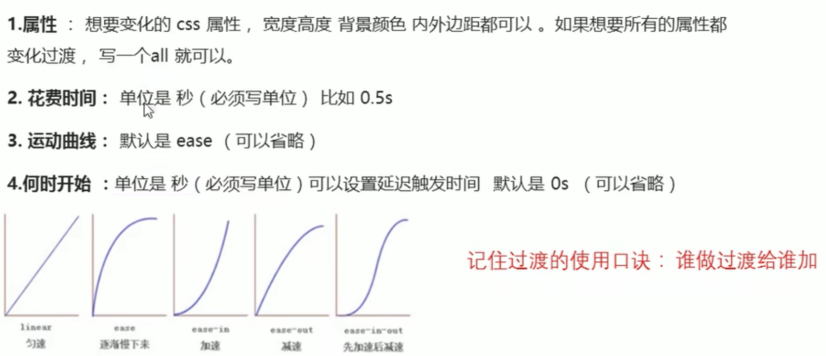
/* transition:要过渡的属性 花费时间 运动曲线 何时开始;
(最后两个可以省略)  */
.change {
  width: 100px;
  height: 100px;
  background-color: pink;
  /* 改变多个属性,逗号隔开; 或者
  改变多个属性,第一个写:all */
  /* 下面两个效果一样 */
  transition: width .5s ease 0s,height .5s ease 0s;
  transition: width .5s,height .5s;
  /* 最常用 */
  transition: all .5s;
}

.change:hover {
  width: 300px;
  height: 500px;
  background-color: skyblue;
}- 过渡案例--进度条:
未获得焦点时效果:
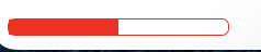
鼠标悬停后效果:
.bar {
  margin: 10px;
  width: 150px;
  height: 10px;
  border: 1px solid red ;
  border-radius: 5px;
}


.bar_in {
  width: 50%;
  height: 100%;
  background-color: red;
  transition: all 0.5s;
}


.bar:hover .bar_in {
  width: 100%;
}
<div class="bar">
<div class="bar_in"></div>
</div>6.元素整体透明度(包括内部内容透明)(配合js的交互效果时使用)
属性:opacity
属性值:0-1之间的数字,1:完全不透明;0:完全透明
注意:透明包括内部文字、图片
7.广义HTML5----H5
H5 = HTML5+CSS3+javascript


 扫一扫
扫一扫


 被折叠的 条评论
为什么被折叠?
被折叠的 条评论
为什么被折叠?
 到【灌水乐园】发言


