


是前年初学python时画的很简单的折线图,最近要写毕业论文了又拿出来重新修改修改。这个横坐标不太符合论文作图的要求,大家可以根据自己的需求改改。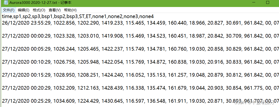
原始数据格式↑
代码↓
from matplotlib import pyplot as plt
import pandas as pd

root = 'I:/22.3.18'

font2 = {'family': 'Times New Roman',
         'weight': 'normal',
         'size': 22, }

font = {'family': 'Arial',
        'weight': 'normal',
        'size': 20}

df = pd.read_csv(root + '/数据/neph/Aurora3000 2020-12-27.txt')
df['time'] = pd.to_datetime(df['time'], format='%d/%m/%Y %H:%M:%S')
fig = plt.figure(figsize=(20, 10), dpi=100)

data_x2 = [i.strftime('%H/%M') for i in df['time']]
plt.gcf().autofmt_xdate()

ax1 = fig.add_subplot(2, 1, 1)
ax1.plot(range(len(df['time'])), df['sp1'], color='black', label='δ$_{sp,neph,700}$', linewidth=3)
ax1.plot(range(len(df['time'])), df['sp2'], color='springgreen', label='δ$_{sp,neph,550}$', linewidth=3)
ax1.plot(range(len(df['time'])), df['sp3'], color='r', label='δ$_{sp,neph,450}$', linewidth=3)

ax1.legend(loc='upper left', ncol=3, fontsize=15, frameon=False)
ax1.set_ylabel('δ$_{sp,neph}$(Mm$^{-1}$)', font2)
ax1.set_ylim(500, 1750)
ax1.xaxis.set_major_formatter(plt.NullFormatter())
ax1.tick_params(labelsize=17, direction='in', width=3, length=5, top=True, right=True)
ax1.spines['top'].set_linewidth(3)
ax1.spines['right'].set_linewidth(3)
ax1.spines['left'].set_linewidth(3)
ax1.spines['bottom'].set_linewidth(3)
ax1.set_xticks(range(len(df['time']))[::24])


#######################################################################

ax2 = fig.add_subplot(2, 1, 2)
ax2.plot(df['bsp1'], color='r', label='δ$_{hbsp,neph,700}$', linewidth=3, )
ax2.plot(df['bsp2'], color='springgreen', label='δ$_{hbsp,neph,550}$', linewidth=3)
ax2.plot(df['bsp3'], color='blue', label='δ$_{hbsp,neph,450}$', linewidth=3)

ax2.legend(loc='upper left', ncol=3, fontsize=15, frameon=False)
ax2.set_ylabel('δ$_{hbsp,neph}$(Mm$^{-1}$)', font2)
#ax2.yaxis.set_label_position('right')  #设置y轴标签在右边呜呼(多图时候根据实情调整)
ax2.set_ylim(50, 200)
ax2.xaxis.set_major_formatter(plt.NullFormatter())
ax2.tick_params(labelsize=17, direction='in', width=3, length=5, top=True, right=True, pad=8)
ax2.spines['top'].set_linewidth(3)
ax2.spines['right'].set_linewidth(3)
ax2.spines['left'].set_linewidth(3)
ax2.spines['bottom'].set_linewidth(3)
ax2.set_xticks(range(len(df['time']))[::24])
ax2.set_xticklabels(data_x2[::24], fontsize=14)  #这个24需要和上面set_xticks的数值一致,数值越大代表时间间隔越大

plt.xlabel('Time(2020/12/27)', font2) # x轴名称

plt.savefig(root+'/图/浊度neph/2020_12_27.jpg')
plt.show()
画出来大概就是这样:
之前还画过好几个子图放在一起的,代码里面有行注释写的把y轴放右边就可以灵活的用于这种情况↓但是这个12子图导师说太丑已经被枪毙了😓


 被折叠的 条评论
为什么被折叠?
被折叠的 条评论
为什么被折叠?
 到【灌水乐园】发言


