


对flex布局的复习:
flex中有四大概念:
1)容器如果给一个div设置了display:flex;那么这个div就是一个容器。
2)项目容器中的直接子元素叫项目
3)主轴默认情况下,项目是在主轴上进行排列的,从主轴的开始位置开始
4)交叉轴和主轴垂直的那个轴就是交叉轴
接着就是flex布局的属性:
flex中又12个属性,其中有六个属性是对容器设置的;
容器相关的6大属性:
1) flex-direaction 设置主轴的方向
2) flex-wrap如果项目足够多时,是否换行3) flex-flow是上面两个属性的简写
4 ) justify-content处理主轴上的富空间5)align-items设置项目在交叉轴上的位置
6 )align-content如果有多根主轴,多根主轴的摆放位置
除了容器的6大属性,就是项目相关的6大属性:
1 ) order设置项目在主轴上的排列顺序
2) flex-grow如果有富余空间,设置项目生长的因子
3) flex-shrink如果项目在主轴上装不下,设置项目的缩小因子(这个基本上不用)
4) flex-basis设置项目在主轴的占据大小
5) align-self self自己的意思设置某个项目在交叉轴上的位置6 )flex是一个复合属性
flex:flex-grow flex-shrink flex-basis基本上后面面两个属性不写flex来代替flex-grow。 flex:1;===>flex-grow : 1;
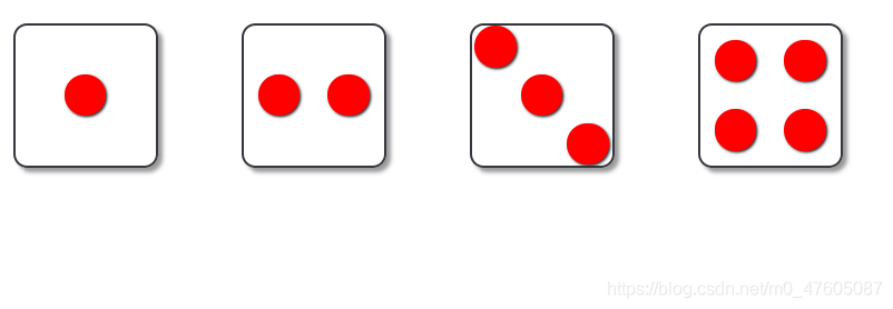
下面是关于flex布局的骰子案例:
<!DOCTYPE html>
<html lang="en">
<head>
    <meta charset="UTF-8">
    <title>Document</title>
    <style>
        *{ margin: 0; padding: 0; }
        .wrap{  display: flex; }
        .container{
            border: 2px solid rgb(52, 55, 61);
            width: 100px;
            height: 100px;
            border-radius: 10px;
            margin: 30px;
            box-shadow: 3px 3px 3px 0px #999;

            display: flex;
        }
        .item{
            width: 30px;
            height: 30px;
            border-radius: 50%;
            background-color: red;
            box-shadow: 1px 1px 2px 0px rgb(38, 38, 43);
        }
        /* 一点 */
        .one{
            justify-content: center;
            align-items: center;
        }
        /* 二点 */
        /* .two{
            flex-direction: column;
            justify-content: space-around;
            align-items: center;
        } */

        .two{
            justify-content: space-around;
            align-items: center;
        }
        .three{
            justify-content: space-around;
            align-items: center;
        }
        .three div:first-child{
            align-self: flex-start;
        }
        .three div:last-child{
            align-self: flex-end;
        }

        /* 四点 */
        .four div{
            display: flex;
            flex-wrap: wrap;
            justify-content: space-around;
            align-items: center;
        }
    </style>

</head>
<body>
    <div class="wrap">
        <!-- 一点 -->
        <div class="container one">
            <div class="item"></div>
        </div>
        <!-- 二点 -->
        <div class="container two">
            <div class="item"></div>
            <div class="item"></div>
        </div>
        <!-- 三点 -->
        <div class="container three">
            <div class="item"></div>
            <div class="item"></div>
            <div class="item"></div>
        </div>
        <!-- 四点 -->
        <div class="container four">
            <div>
                <div class="item four_first"></div>
                <div class="item four_second"></div>
            </div>
            <div>
                <div class="item four_three"></div>
                <div class="item four_four"></div>
            </div>
        </div>

    </div>
</body>
</html>


 扫一扫
扫一扫


 559
559

 被折叠的 条评论
为什么被折叠?
被折叠的 条评论
为什么被折叠?
 到【灌水乐园】发言


