


-
一. 相关函数介绍
-
1. matplotlib.pyplot.scatter()专门用于绘制散点图
scatter(x, y, s=None, c=None, marker=None, cmap=None, norm=None, vmin=None, vmax=None, alpha=None, linewidths=None, verts=None, edgecolors=None, hold=None, data=None, **kwargs)
参数详解:
- x,y:输入数据,也可以是list, array_like,shape(n,)
- s:点的大小 标量或array_like,shape(n,),可选 ,大小以点数^ 2。默认是`rcParams ['lines.markersize'] ** 2`。
- c:点的颜色 顺序或颜色顺序,可选,默认:'b'-blue, 还有'c'-cyan, 'g'-green, 'k'-black, 'm'-meganta, 'r'-red, 'w'-white, 'y'-yellow
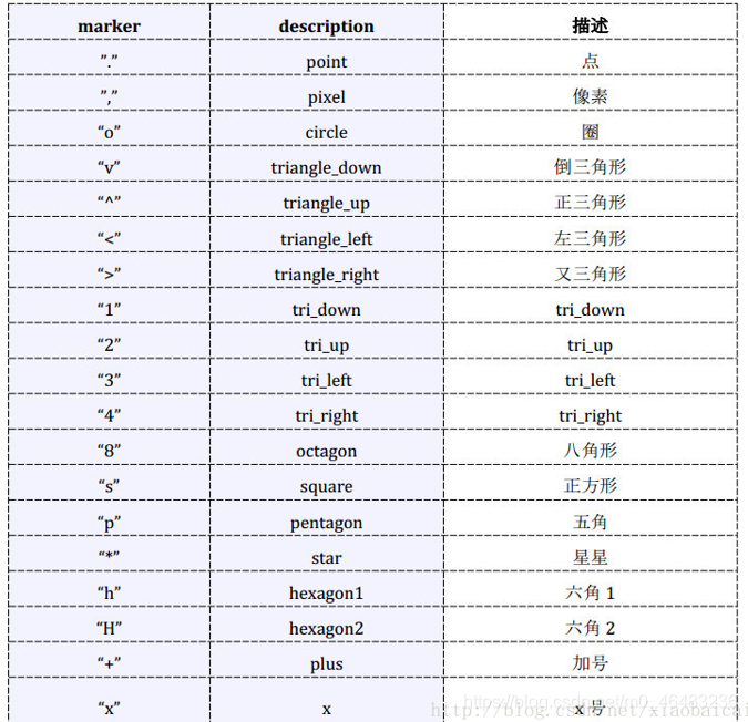
- marker:点的形状 ,可选,默认值:'o'-circle圈,详见附录
- cmap:`〜matplotlib.colors.Colormap`,可选,默认:无 一个`〜matplotlib.colors.Colormap`实例或注册名称。
- norm:`〜matplotlib.colors.Normalize`,可选,默认:无 `〜matplotlib.colors.Normalize`实例用于缩放亮度数据为0,1。
- vmin,vmax:标量,可选,默认值:无 `vmin`和`vmax`与`norm`结合使用来标准化亮度数据。如果其中任何一个都是`无',那么最小和最大使用颜色数组。
- alpha:标量,可选,默认值:无 alpha混合值,介于0(透明)和1(不透明)之间,
- linewidths:标量或array_like,可选,默认值:无 如果无,则默认为(lines.linewidth,)。
- verts:(x,y)的序列,可选 如果`marker`为None,这些顶点将用于构建标记。标记的中心位于在(0,0)为标准化单位。
- edgecolors :颜色或颜色顺序,可选,默认值:无 如果无,则默认为'face' ,如果'face',边缘颜色将永远是相同的脸色。
-
2. matplotlib.pyplot.title()用于设置图像标题
参数详解:
- fontsize设置字体大小,默认12,可选参数 [‘xx-small’, ‘x-small’, ‘small’, ‘medium’, ‘large’,‘x-large’, ‘xx-large’]
- fontweight设置字体粗细,可选参数 [‘light’, ‘normal’, ‘medium’, ‘semibold’, ‘bold’, ‘heavy’, ‘black’]
- fontstyle设置字体类型,可选参数[ ‘normal’ | ‘italic’ | ‘oblique’ ],italic斜体,oblique倾斜
- loc设置字体位置,可选参数:'left' 'right' 'center'
- verticalalignment设置水平对齐方式 ,可选参数 : ‘center’ , ‘top’ , ‘bottom’ , ‘baseline’
- horizontalalignment设置垂直对齐方式,可选参数:left,right,center
- rotation 设置字体旋转角度 ,可选参数为:vertical,horizontal 也可以为数字
- alpha透明度,参数值0至1之间
- backgroundcolor标题背景颜色
- bbox给标题增加外框 ,常用参数如下:boxstyle方框外形 facecolor(简写fc)背景颜色 edgecolor(简写ec)边框线条颜色 edgewidth边框线条大小
-
3. matplotlib.pyplot.legend()设置图例 在轴上方显示一个图例
常用参数:
- loc:图例摆放的位置
- ncol:图例列数,它的值决定了图例一共有多少列
- label:如果需要完全控制图例中的内容可以不写plot中的label,写在legend中
# legend()方式1
plt.scatter(x1,y1, label='point1')
plt.scatter(x2,y2, label='point2')
plt.legend()

# legend()方式2
plt.scatter(x1,y1)
plt.scatter(x2,y2)
plt.legend(['point1','point2'])-
4. matplotlib.pyplot.xlabel()设置横轴
-
5. matplotlib.pyplot.ylabel()设置纵轴
-
6. matplotlib.pyplot.xlim()设置横轴范围
-
7. matplotlib.pyplot.ylim()设置纵轴范围
-
8. matplotlib.pyplot.savefig()保存图片
-
9. matplotlib.pyplot.plot() 绘制经过点的曲线。
-
10. matplotlib.pyplot.show() 显示图像
-
11. matplotlib.pyplot.imshow() 接收一张图像,只是画出该图,并不会立刻显示出来,负责对图像进行处理,并显示其格式,但是不能显示。
-
二. 代码实例:
-
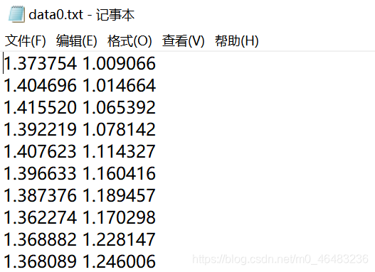
1. 数据格式
如下,现将其可视化
-
2. 代码:
# -*- coding: utf-8 -*-
import numpy as np
import matplotlib.pyplot as plt
from matplotlib.font_manager import FontProperties
font = FontProperties(fname=r"C:\Windows\Fonts\simhei.ttf", size=14)
data_path0 = './数据集/data0.txt'
data_path8 = './数据集/data8.txt'
def read_data(data_path):
with open(data_path,'r',encoding='utf-8') as f:
lines = f.readlines()
x_list = []
y_list = []
for line in lines:
seg = line.split()
if seg !=[]:
x_list.append(float(seg[0]))
y_list.append(float(seg[1]))
f.close()
return x_list, y_list
x_list0, y_list0 = read_data(data_path0)
x_list8, y_list8 = read_data(data_path8)
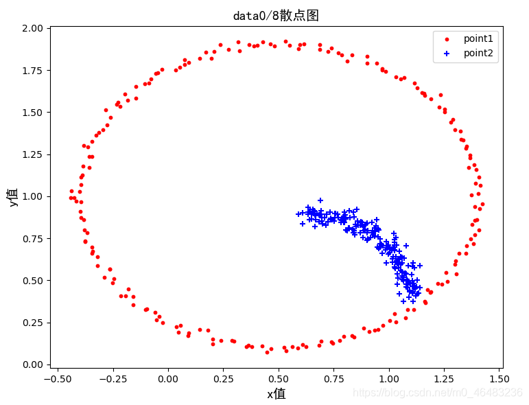
plt.title(u'data0/8散点图',FontProperties=font,loc='center')
plt.scatter(x_list0, y_list0, s=10, c='r', marker='o',label='point1')
plt.scatter(x_list8, y_list8, s=30, c='b', marker='+',label='point2')
plt.xlabel(u'x值',FontProperties=font)
plt.ylabel(u'y值',FontProperties=font)
plt.legend()
plt.show()
plt.savefig('0.png')
-
3. 结果:
-
4. 注意:
如果数据点精度过高,比如精确到小数点后6位,可能此时所有的数据点就会重复在一起,图上只能显示一个总的数据点,这种情况下,可以通过设置x轴和y轴的刻度范围,来使得所有点都能分别显示出来。
plt.xlim(min(x_list)-0.000001,max(x_list)+0.000001)#确定横轴坐标范围
plt.ylim(min(y_list)-0.000001,max(y_list)+0.000001)#确定纵轴坐标范围
参考:
https://www.cnblogs.com/shuaishuaidefeizhu/p/11359826.html
https://blog.youkuaiyun.com/xiaobaicai4552/article/details/79065990
https://www.cnblogs.com/linblogs/p/9642031.html
https://blog.youkuaiyun.com/TeFuirnever/article/details/88945563


 被折叠的 条评论
为什么被折叠?
被折叠的 条评论
为什么被折叠?
 到【灌水乐园】发言


