


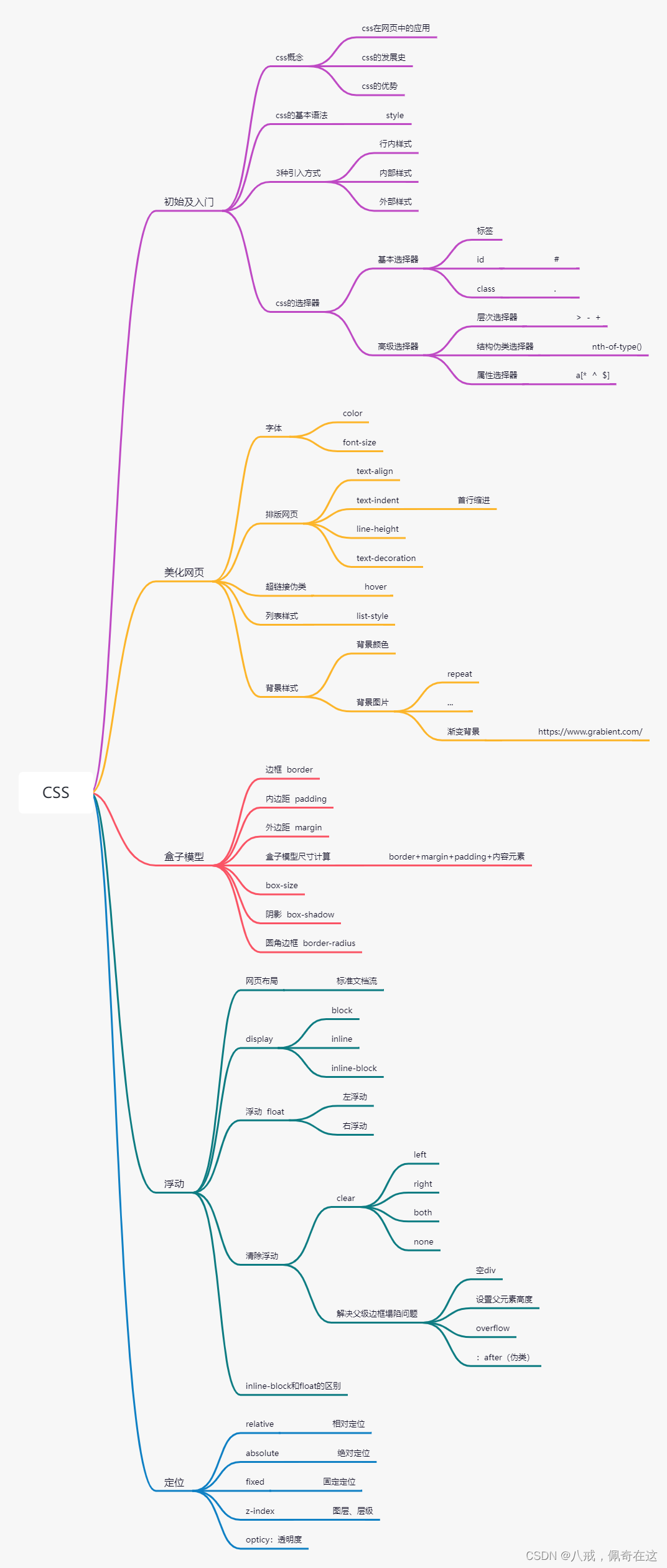
 本文详细介绍了CSS的基础知识,包括CSS的定义、发展历史、快速入门及三种导入方式。接着深入探讨了选择器的使用,如基本选择器、层次选择器和属性选择器。文章还讲解了如何美化网页,涉及字体、文本样式、阴影、超链接和背景等。此外,详细阐述了盒子模型、浮动和定位的概念,以及如何创建简单的网页动画。最后,总结了CSS在网页设计中的重要性和应用。
1.什么是CSS
如何学习
1.css是什么
2.css怎么用(快速入门)
3.css选择器(重点+难点)
4.美化网页(文字、阴影、超链接、列表、渐变…)
5.盒子模型
6.浮动
7.定位
8.网页动画(特写)
1.1什么是CSS
Cascading Style Sheet层叠级联样式表
CSS:表现(美化网页)
1.2发展史
CSS1.0
CSS2.0 DIV(块)+CSS,HTML与CSS结构分离的思想,网页变得简单,SEO
CSS2.1 浮动、定位
CSS3.0 圆角、阴影、动画…浏览器兼容性~
1.3快速入门
建议使用这种规范
css的优势:
1.内容和表现分离
2.网页结构表现统一,可以实现复用
3.样式十分的丰富
4.建议使用独立于html的css文件
5.利用SEO,容易被搜索引擎收录!
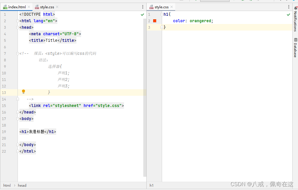
1.4CSS的三种导入方式
<!DOCTYPE html>
<html lang="en">
<head>
    <meta charset="UTF-8">
    <title>Title</title>

<!-- 内部样式 -->
  <style>
    h1{
      color: green;
    }
  </style>

<!--  外部样式  -->
    <link rel="stylesheet" href="css/style.css">
</head>
<body>

<!--优先级:就近原则(谁离这个标签近,谁的优先级就高)-->

<!--行内样式:在标签元素中,编写一个style属性,编写样式即可 -->
<h1 style="color: red">我是标题</h1>
</body>
</html>
扩展:外部样式两种写法
-
链接式:(html)
<!-- 外部样式 --> <link rel="stylesheet" href="css/style.css"> -
导入式:(@import是CSS2.1特有的,慢慢不用了)
<!-- 导入式 -->
  <style>
    @import url(css/style.css);
  </style>
2.选择器
作用:选择页面上的某一个或者某一类元素
最重要的基本选择器和属性选择器(css、js、vue都会用到)
2.1基本选择器
1.标签选择器 :选择一类标签 标签{}
<!DOCTYPE html>
<html lang="en">
<head>
    <meta charset="UTF-8">
    <title>Title</title>

  <style>
/*  标签选择器,会选择到页面上所有的这个标签的元素 */
    h1{
      color: #671414;
      background: #b69191;
      border-radius: 20px;
    }
    p{
      font-size: 80px;
    }
  </style>
</head>
<body>

<h1>学Java</h1>
<h1>学Java</h1>
<p>p标签</p>

</body>
</html>
2.类选择器 class :选中所有class属性一致的标签,跨标签 .类名{}
<!DOCTYPE html>
<html lang="en">
<head>
    <meta charset="UTF-8">
    <title>Title</title>

  <style>/*类选择器的格式    。class的名称{}
          好处:可以多个标签归类,是同一个class,可以复用
  */
    .one{
      color: #266cd4;
    }
    .two{
      color: #620c67;
    }
  </style>
</head>
<body>

<h1 class="one">标题一</h1>
<h1 class="two">标题二</h1>
<h1>标题三</h1>

<p class="one">P标签</p>


</body>
</html>
3.Id选择器 :全局唯一·! #id名{}
<!DOCTYPE html>
<html lang="en">
<head>
    <meta charset="UTF-8">
    <title>Title</title>

    <style>/*   id选择器的格式:#id名称{}    id必须保证全局唯一
                优先级:
                不遵循就近原则,固定的
                id选择器>class选择器>标签选择器
     */
      #one{
          color: #22d91c;
      }
    .two{
        color: #c912b0;
    }
    h1{
        color: #3030d5;
    }
    </style>
</head>
<body>

<h1 id="one" class="two">标题一</h1>
<h1 class="two">标题二</h1>
<h1 class="two">标题三</h1>
<h1>标题四</h1>
<h1>标题五</h1>

</body>
</html>
2.2层次选择器
1.后代选择器:在某个元素的后面 祖爷爷 爷爷 爸爸 儿子
/*后代选择器*/
body p{
  background: #0f050d;
}
2.子选择器:一代 儿子
body>p{
  background: #f7231f;
}
3.相邻兄弟选择器:同辈
/* 相邻兄弟选择器 ,只有一个,相邻(向下)*/
.active + p{
  background: #171af7;
}
4.通用选择器:当前选中元素的向下的所有兄弟元素
/*通用选择器,当前选中元素的向下的所有兄弟元素*/
.active~p{
  background: #f714ce;
}
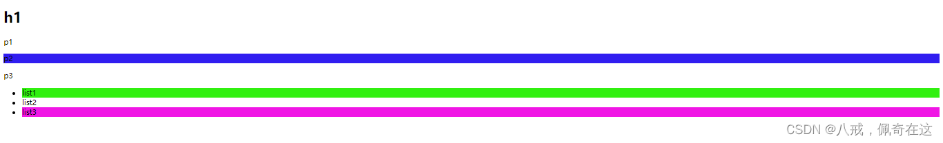
2.3结构伪类选择器
伪类:条件(鼠标停留会有活动)
/*ul的第一个元素*/
ul li:first-child{
    background: #31f010;
}

/*ul的最后一个元素*/
ul li:last-child{
    background: #f015e5;
}

/*选择p1    定位到父元素,选中当前元素的第一个元素*/
/*选择当前p元素的父级元素的第一个,并且是当前元素才生效!,顺序*/
p:nth-child(1){
    background: #0f050d;
}

/*选中父元素下的,p元素的第二个元素!类型*/
p:nth-of-type(2){
     background: #301df0;
}
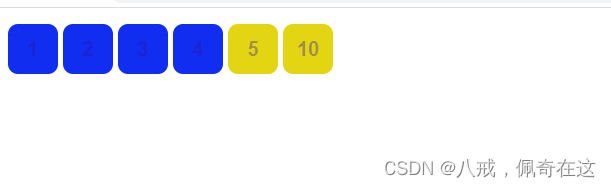
2.4属性选择器(常用)
<!DOCTYPE html>
<html lang="en">
<head>
    <meta charset="UTF-8">
    <title>Title</title>

    <style>
      .demo a{
          float: left;
          display: block;
          height: 50px;
          width: 50px;
          border-radius: 10px;
          background: #112df0;
          text-align: center;
          text-decoration: none;
          color: rgba(43,17,158,0.36);
          /*往右偏移5px*/
          margin-right: 5px;
        /* 字体粗细  字体大小/行高  字体*/
          font:bold 20px/50px Arial;
      }

      /*存在id属性的元素     a[]{}*/
      /*属性名       属性名=属性值(正则表达式)*/
      /*= 绝对等于        *=  包含*/
      /*^=  以这个开头     $=以这个结尾*/
      /*a[id]{*/
      /*    background: yellow;*/
      /*}*/
      /*id=first的元素*/
      /*a[id=first]{*/
      /*    background: green;*/
      /*}*/

      /*class中有links的元素*/
      /*a[class*=links]{*/
      /*    background: red;*/
      /*}*/

      /*a[href^=http]{*/
      /*    background: #671414;*/
      /*}*/
      a[href$=jpg]{
          background: #e4d513;
      }

    </style>

</head>
<body>

<p class="demo">

  <a href="https://www.baidu.com" class="links item first" id="first">1</a>
  <a href="https://blog.youkuaiyun.com/m0_46152474?spm=1010.2135.3001.5343" class="links item active" target="_blank" title="test">2</a>
  <a href="image/123.html" class="links item">3</a>
  <a href="image/123.png" class="links item">4</a>
  <a href="image/123.jpg" class="links item">5</a>
  <a href="abcd.jpg" class="links item last">10</a>

</p>

</body>
</html>
3.美化网页
3.1为什么要美化
1.有效的传递页面信息
2.美化网页,页面漂亮才能吸引用户
3.凸显页面的主题
4.提高用户的体验
span标签:要重点突出的字,使用span套起来(后期用div)
<!DOCTYPE html>
<html lang="en">
<head>
    <meta charset="UTF-8">
    <title>Title</title>
    <style>
      #txt{
        font-size: 50px;
      }
    </style>
</head>
<body>
      欢迎学习 <span id="txt">Java</span> 课程

</body>
</html>
3.2字体风格
<!--    font-family:     字体-->
<!--    font-size:      字体大小-->
<!--    font-weight:    字体粗细-->
<!--    color:          字体颜色-->
    <style>
      body{
          font-family: "Arial Black",行书;
          color: chocolate;
      }
      h1{
          font-size: 50px;
      }
      .p1{
          font-weight:bolder;
      }
    </style>

<!--  font:字体风格 字体粗细 字体大小 字体  -->
    <style>
      p{
        font:oblique bolder 30px "楷体";
      }
    </style>
3.3文本样式
1.颜色 color:RGB,RGBA
2.文本对齐的方式 text-align: center
3.首行缩进 text-indent: 2em
4.行高 line-height
5.装饰 text-decoration
6.文本图片水平对齐 vertical-align:middle
<!DOCTYPE html>
<html lang="en">
<head>
    <meta charset="UTF-8">
    <title>Title</title>
<!--    颜色:   单词
                RGB   0~F
                RGBA  A:0~1
        text-align:排版,居中
        text-indent: 2em;首行缩进
        height: 100px;
        line-height: 100px;
            行高 和 块的高度一致,就可以上下居中
-->
    <style>
      h1{
        color: #0000FF;
        text-align: center;
      }
      .p1{
        text-indent: 2em;
      }
      .p3{
        background: #0ace10;
        height: 100px;
        line-height: 100px;
      }
      /*超链接去下划线*/
      a{
        text-decoration: none;
      }
    </style>
</head>
<body>
<a href="">123</a>
<h1>故事介绍</h1>

<p class="p1">
  平静安详的元泱境界,每隔333年,总会有一个神秘而恐怖的异常生物重生,它就是魁拔!魁拔的每一次出现,都会给元泱境界带来巨大的灾难!即便是天界的神族,也在劫难逃。在天地两界各种力量的全力打击下,魁拔一次次被消灭,但又总是按333年的周期重新出现。魁拔纪元1664年,天神经过精确测算后,在第六代魁拔苏醒前一刻对其进行毁灭性打击。但谁都没有想到,由于一个差错导致新一代魁拔成功地逃脱了致命一击。很快,天界魁拔司和地界神圣联盟均探测到了魁拔依然生还的迹象。因此,找到魁拔,彻底消灭魁拔,再一次成了各地热血勇士的终极目标。
</p>
<p>
  在偏远的兽国窝窝乡,蛮大人和蛮吉每天为取得象征成功和光荣的妖侠纹耀而刻苦修炼,却把他们生活的村庄搅得鸡犬不宁。村民们绞尽脑汁把他们赶走。一天,消灭魁拔的征兵令突然传到窝窝乡,村长趁机怂恿蛮大人和蛮吉从军参战。然而,在这个一切都凭纹耀说话的世界,仅凭蛮大人现有的一块杂牌纹耀,不要说参军,就连住店的资格都没有。受尽歧视的蛮吉和蛮大人决定,混上那艘即将启程去消灭魁拔的巨型战舰,直接挑战魁拔,用热血换取至高的荣誉。
</p>
<p class="p3">
  The eight thousand mountains and rivers slowly,do not meet again, also do not know each other.
</p>
</body>
</html>
3.4阴影
/*text-shadow:阴影颜色,水平偏移,垂直偏移,偏移半径*/
#price{
    text-shadow: #f015e5 5px 5px 2px;
}
3.5超链接伪类
正常情况下,a,a:hover
<!DOCTYPE html>
<html lang="en">
<head>
    <meta charset="UTF-8">
    <title>Title</title>
    <style>
        /*默认的颜色*/
        a{
            text-decoration: none;
            color: #0f050d;
        }
        /*鼠标悬浮的状态(只需要记住:a:hover)*/
        a:hover{
            color: orange;
            font-size: 35px;
        }
        /*鼠标按住未释放的状态*/
        a:active{
            color: #00FF00;
        }
        /*鼠标点击过后的状态*/
        a:visited{
            color: dimgrey;
        }
        /*text-shadow:阴影颜色,水平偏移,垂直偏移,偏移半径*/
        #price{
            text-shadow: #f015e5 5px 5px 2px;
        }
    </style>
</head>
<body>

<a href="#">
  <img src="image/兰博基尼.jpg" alt="">
</a>
<p>
    <a href="#">兰博基尼</a>
</p>
<p>
    <a href="">出品:肖某</a>
</p>
<p id="price">
    ¥99万
</p>

</body>
</html>
3.6列表
/*ul li
list-style: none    去掉圆点
            circle  空心圆
            decimal 有序数字
            square  正方形
*/
ul{
    background: #b69191;
}
ul li{
    height: 30px;
    list-style: none;
    text-indent: 1em;
}
3.7背景
背景颜色
背景图片
<style>
  div{
    width:1112px;
    height: 462px;
    border:1px solid red;
    /*默认是全部平铺的      repeat  */
    background-image: url("image/未来.jpg");
  }
  .div1{
    background-repeat: repeat-x;
  }
  .div2{
    background-repeat: repeat-y;
  }
  .div3{
    background-repeat: no-repeat;
  }
</style>
练习:
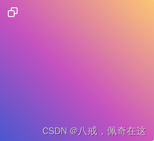
3.8渐变
在这找现成的:https://www.grabient.com/
background-color: #4158D0;
background-image: linear-gradient(43deg, #4158D0 0%, #C850C0 46%, #FFCC70 100%);
4.盒子模型
4.1什么是盒子模型
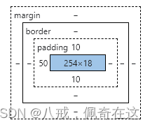
margin:外边距
padding:内边距
border:边框
4.2边框
1.边框的粗细
2.边框的样式
3.边框的颜色
<style>
  /*body总有一个默认的外边距margin
  h1,ul,body{
    margin: 0;
    padding: 0;
    text-decoration: none;
  }
  */
  /*border:粗细,样式,颜色*/
  #box{
    width: 300px;
    border: 3px solid red;
    text-align:center;
  }
  h2{
    font-size: 20px;
    text-align:center;
    color: red;
    background: #b69191;
  }
  form{
    background-color: #00FF00;
  }
  div:nth-of-type(1) input{
    border: 4px dashed #0000FF;
  }
</style>
4.3内外边距
盒子的计算方式:你这个盒子到底多大?
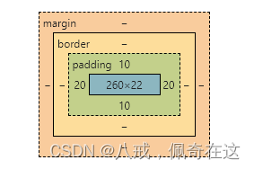
margin+border+padding+内容宽度
<style>
  /*margin:0                  上下左右
           0 auto             上下    左右
           0px 1px 2px 3px    上   下   左   右
  */
  #box{
    width: 300px;
    border: 3px solid red;
    margin: 0 auto;
  }
  h2{
    font-size: 20px;
    text-align:center;
    color: red;
    background: #b69191;
  }
  form{
    background-color: #00FF00;
  }
  input{
    border: 1px solid #000000;
  }
  div:nth-of-type(1){
    padding:10px 20px;
  }
</style>
4.4圆角边框
<!--  border-radius: 左上  右上  右下  左下 ,顺时针方向
        圆圈:   圆角=半径
 -->
<style>
    div{
        width:100px;
        height: 100px;
        border: 10px solid red;
        border-radius: 50px 30px 15px 5px;
    }
</style>
4.5盒子阴影
<!DOCTYPE html>
<html lang="en">
<head>
    <meta charset="UTF-8">
    <title>Title</title>
<!--    margin: 0 auto;   居中
      要求  : 块元素,块元素有固定宽度
-->
    <style>
      div{
          /*margin: 0 auto;*/
          /*width:278px;*/
          /*height: 154px;*/
          border: 10px solid red;
      }
      img{
          box-shadow: 12px 12px 100px yellow;
      }
    </style>
</head>
<body>

<div style="margin: 0 auto;width:278px">
<img src="image/气质少女.jpg" alt="">
</div>
</body>
</html>
5.浮动
5.1块级元素和行内元素
块级元素:独占一行
h1~h6 p div 列表...
行内元素:不独占一行
span a img strong...
行内元素可以被包含在块级元素中,反之则不可以~
5.2 display
<!--  block   块元素
      inline  行内元素
      inline-block  是块元素,但是可以内联,在一行
      none
-->
    <style>
      div{
        width:100px;
        height:100px;
        border: 1px solid red;
        display: inline;
      }
      span{
        width:100px;
        height:100px;
        border: 1px solid red;
        display: inline-block;
      }
    </style>
1、这个也是一直实现行内元素排列的方式,但是我们很多情况都是用float
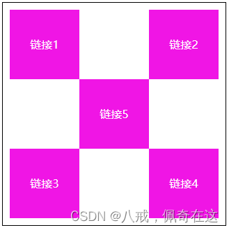
5.3 float
1.左右浮动 float left、right
div{
    margin: 10px;
    padding: 5px;
    border: 10px solid #000000;
}
.one{
    border: 1px dashed #0000FF;
    float: right;
    display: inline-block;

}
.two{
    border: 1px dashed #0000FF;
    display: inline-block;
    clear: both;
}
.three{
    border: 1px dashed #0000FF;
    float: right;
    display: inline-block;
}
.four{
    border: 1px dashed #0000FF;
    font-size: 25px;
    line-height: 75px;
    display: inline-block;
    float: right;
    clear: both;
}
5.4父级边框塌陷的问题
clear
/*  clear:  left    左侧不允许有浮动
            right   右侧不允许有浮动
            both    两侧不允许有元素浮动
            none
*/
解决方案:
1.增加父级元素的高度
#father{
    border: 1px solid #000000;
    height: 800px;
}
2.增加一个空的div标签,清除浮动
<div class="clear"></div>

.clear{
    clear: both;
    margin: 0;
    padding: 0;
}
3.overflow
在父级元素中增加一个overflow:hidden;
4.父类添加一个伪类:after
#father:after{
    content:'' ;
    display: block;
    clear:both;
}
小结:
1.浮动元素后面增加空的div;
简单,代码中尽量避免空div
2.设置父级元素的高度;
简单,元素假设有了固定的高度,就会被限制
3.overflow
下拉的一些场景避免使用
4.父类添加一个伪类:after(推荐)
写法稍微复杂一点,但是没有副作用,推荐使用
5.5对比
-
display
方向不可控制
-
float
浮动起来的话会脱离标准文档流,所以要解决父级边框塌陷的问题
6.定位
6.1相对定位
<style>
    body{
        padding: 20px;
    }
  div{
    margin: 10px;
    padding: 5px;
    font-size: 15px;
    line-height: 25px;
  }
  #father{
    border: 1px solid #0f050d;
    padding: 0;
  }
  #first{
    background-color: #671414;
    border: 1px dashed #171af7;
    position: relative;/*相对定位:上下左右*/
    top:-20px;
    left:20px;
  }
  #second{
    background-color: #31f010;
    border: 1px dashed #ff0000;
  }
  #third{
    background-color: #620c67;
    border: 1px dashed #671414;
    position: relative;
    bottom: -10px;
    right: 10px;
  }
</style>
相对定位:position:relative;
相对于原位置进行指定的偏移,相对定位的话,它仍然在标准文档流中,原来的位置会被保留
top:-20px;
bottom: -10px;
left:20px;
right: 10px;
练习相对偏移:
6.2绝对定位
绝对定位:position: absolute;
相对于父级或者浏览器的位置进行指定的偏移,绝对定位的话,它不在标准文档流中,原来的位置不会被保留
1.没有父级元素定位的前提下,相对于浏览器定位
2.假设父级元素存在定位,我们通常会相对于父级元素进行偏移
3.在父级范围内移动
<!DOCTYPE html>
<html lang="en">
<head>
  <meta charset="UTF-8">
  <title>Title</title>

  <style>
    body{
      padding: 20px;
    }
    div{
      margin: 10px;
      padding: 5px;
      font-size: 15px;
      line-height: 25px;
    }
    #father{
      border: 1px solid #0f050d;
      padding: 0;
      position: relative;
    }
    #first{
      background-color: #671414;
      border: 1px dashed #171af7;
    }
    #second{
      background-color: #31f010;
      border: 1px dashed #ff0000;
      position: absolute;
      left: 100px;
      top: -10px;
    }
    #third{
      background-color: #620c67;
      border: 1px dashed #671414;
    }
  </style>
</head>
<body>

<div id="father">
  <div id="first">第一个盒子</div>
  <div id="second">第二个盒子</div>
  <div id="third">第三个盒子</div>
</div>

</body>
</html>
6.3固定定位 fixed
<!DOCTYPE html>
<html lang="en">
<head>
    <meta charset="UTF-8">
    <title>Title</title>
    <style>
      body{
        height: 1000px;
      }
      div:nth-of-type(1){/* 绝对定位:相对于浏览器 */
        width: 100px;
        height: 100px;
        background-color: red;
        position: absolute;
        right: 0;
        bottom: 0;
      }
      div:nth-of-type(2){/* fixed,固定定位  */
        width: 50px;
        height: 50px;
        background-color: yellow;
        position: fixed;
        right: 0;
        bottom: 0;
      }
    </style>
</head>
<body>

<div>div1</div>
<div>div2</div>

</body>
</html>
6.4 z-index
图层~
z-index: 0; 默认是0,最高无限 999
<!DOCTYPE html>
<html lang="en">
<head>
    <meta charset="UTF-8">
    <title>Title</title>
    <link rel="stylesheet" href="css/style.css">
</head>
<body>

<div id="content">
  <ul>
    <li><img src="image/黑客.jpg" alt=""></li>
    <li class="tipText">学习css</li>
    <li class="tipBg"></li>
    <li>时间:2099-12-31</li>
    <li>地点:太阳一号基地</li>
  </ul>
</div>

</body>
</html>
opacity: 0.5;/背景透明度/
#content{
    margin: 0;
    padding: 0;
    border: 1px solid #000000;
    width: 300px;
    font-size: 15px;
    line-height: 30px;
    overflow: hidden;
}
ul,li{
    margin: 0;
    padding: 0;
    list-style: none;
 }
/*父级元素相对定位*/
#content ul{
    position: relative;
}
.tipText,.tipBg{
    position: absolute;
    width: 278px;
    height: 30px;
    top: 125px;
}
.tipText{
    color: white;
    z-index: 999;
}
.tipBg{
    background-color: #000000;
    opacity: 0.5;/*背景透明度*/
}
7.动画
css写的比较基本,大部分用JavaScript写,后面讲到介绍
8.总结


 扫一扫
扫一扫


 被折叠的 条评论
为什么被折叠?
被折叠的 条评论
为什么被折叠?
 到【灌水乐园】发言


