


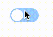
最终效果图
实现逻辑
一、switch容器
// html

	<div className="dumbo-switch"></div>

// css

	.dumbo-switch {
  	height: 22px;
  	width: 44px;
  	border: 1px solid;
  	border-radius: 100px;
  	border: 1px solid #cccccc;
  	cursor: pointer;
	}
二、switch inner

// html

// css
.dumbo-switch {
  height: 22px;
  width: 44px;
  border-radius: 100px;
  background: #1890ff;
  position: relative;

  &::after {
    position: absolute;
    background: #ffffff;
    content: '';
    box-sizing: border-box;
    border-radius: 100%;
    width: 18px;
    height: 18px;
    top: 2px;
    box-shadow: 0 2px 4px #00230b33;
  }
}

.dumbo-switch--default {
  opacity: 0.4;
  cursor: not-allowed;
  &::after {
    left: 2px;
  }
}
三、switch 选中状态

// html

  <div className="dumbo-switch dumbo-switch--checked"></div>

// css
.dumbo-switch {
  height: 22px;
  width: 44px;
  border-radius: 100px;
  background: #1890ff;
  position: relative;

  &::after {
    position: absolute;
    background: #ffffff;
    content: '';
    box-sizing: border-box;
    border-radius: 100%;
    width: 18px;
    height: 18px;
    top: 2px;
    box-shadow: 0 2px 4px #00230b33;
    transition: all 0.3s ease-in-out;
  }
}

.dumbo-switch--checked {
  opacity: 1;
  cursor: pointer;
  &::after {
    left: calc(100% - 20px);
  }
}
四、抽取 props 参数
- checked
- onChange
- disabled
import React from 'react';
import classnames from 'classnames';
import './index.less';

export interface IButton {
    checked: boolean;
    onChange: (checked: boolean) => void;
    disabled: boolean;
}

export default function Switch(props: IButton) {
    const { checked, onChange, disabled } = props;
    return (
        <div
            onClick={() => {
               if (!disabled) {
                    onChange(!checked)
                }
            }}
            className={classnames("dumbo-switch", {
                'dumbo-switch--default': !checked,
                'dumbo-switch--checked': checked,
                'dumbo-switch--disabled': disabled
            })}>

        </div>
    )
}
React 代码
import React from 'react';
import classnames from 'classnames';
import './index.less';

export interface IButton {
    checked: boolean;
    onChange: (checked: boolean) => void;
    disabled?: boolean;
}

export default function Switch(props: IButton) {
    const { checked, onChange, disabled = false } = props;
    return (
        <div
            onClick={() => {
                if (!disabled) {
                    onChange(!checked)
                }
            }}
            className={classnames("dumbo-switch", {
                'dumbo-switch--default': !checked,
                'dumbo-switch--checked': checked,
                'dumbo-switch--disabled': disabled
            })}>

        </div>
    )
}
.dumbo-switch {
  height: 22px;
  width: 44px;
  border-radius: 100px;
  background: #1890ff;
  position: relative;

  &::after {
    position: absolute;
    background: #ffffff;
    content: '';
    box-sizing: border-box;
    border-radius: 100%;
    width: 18px;
    height: 18px;
    top: 2px;
    box-shadow: 0 2px 4px #00230b33;
    transition: all 0.3s ease-in-out;
  }
}

.dumbo-switch--default {
  opacity: 0.4;
  &::after {
    left: 2px;
  }
}

.dumbo-switch--checked {
  opacity: 1;
  cursor: pointer;
  &::after {
    left: calc(100% - 20px);
  }
}

.dumbo-switch--disabled {
  cursor: not-allowed;
  opacity: 0.4;
}
调用方式
export const Default = ({ ...props }) => {
    const [visible, setVisible] = useState(false);
    return <div>
        <Switch checked={visible} onChange={setVisible} />
    </div>
}


 扫一扫
扫一扫


 770
770

 被折叠的 条评论
为什么被折叠?
被折叠的 条评论
为什么被折叠?
 到【灌水乐园】发言


