


 当Echarts图表数据过多导致显示不清晰时,可以利用dataZoom组件进行缩放查看。通过配置yAxis的min和max属性以及dataZoom的start和end参数,能实现更精细的数据浏览体验。例如设置为inside类型的数据缩放,并自定义轴标签格式。
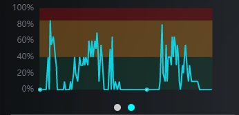
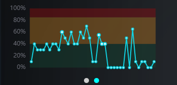
图表渲染数据很多 看不明显,可以采用echarts的 dataZoom属性
yAxis: [
          {
            type: 'value',
            min: 'dataMin',
            max: 'dataMax',
            splitLine: false,
            axisLabel: {
              color: '#ccc', //刻度线标签颜色
              formatter: function(value, index) {
                return value.toFixed(2)
              },
            },
          },
        ],
        dataZoom: [
          {
            type: 'inside',
            start: 0,
            end: 100,
          },
        ],
        series: [
          {
            type: 'line',
            color: '#11d1e1',
            // smooth: true, //设置折线图平滑
            data: [],
          },
        ],
具体配置参考官网 https://echarts.apache.org/zh/api.html#%2Fsearch%2FdataZoom


 6166
6166

 被折叠的 条评论
为什么被折叠?
被折叠的 条评论
为什么被折叠?
 到【灌水乐园】发言


