


 本文介绍了一款适用于微信小程序的动态按钮样式,该按钮具备多种颜色渐变效果及动画,通过CSS实现独特的立体视觉效果,适合提升应用界面的美观度。
推荐一款超好看的微信小程序按钮样式,多种颜色, 动画,立体感:
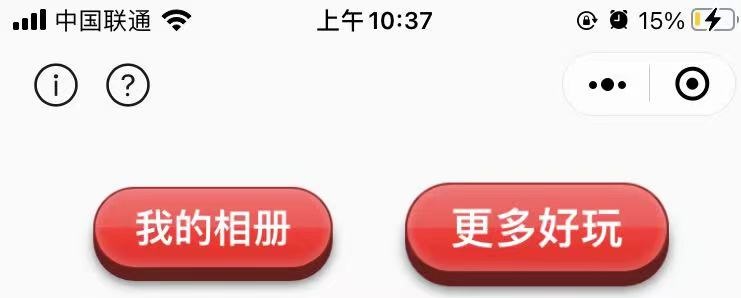
其他颜色+动画效果:
/** button **/
.button1 {
position: relative;
display: inline-block;
min-width: 140rpx;
padding: 10px 40rpx;
margin: 0px 40rpx;
z-index: 2;

background-color: #990000;
background-image: -webkit-gradient(linear,
left top,
left bottom,
color-stop(0, rgb(242, 112, 112)),
color-stop(0.49, rgb(238, 84, 84)),
color-stop(0.5, rgb(240, 54, 54)),
color-stop(1, rgb(219, 26, 26)));

}

.b1hover {
top: 4px;
box-shadow: inset 0px 4px 5px rgba(255, 255, 255, 0.4),
inset 0px -1px 5px rgba(255, 255, 255, 0.2),
0px 2px 0px #661e1e,
0px 4px 5px rgba(0, 0, 0, 0.5);
}

@keyframes btna {
0% {
transform: scale(0.95)
}

50% {
transform: scale(1.1)
}

100% {
transform: scale(0.95)
}
}

.button1:nth-child(2) {
animation-delay: 1s;
}
代码如下:
/** button **/
.button1 {
position: relative;
display: inline-block;
min-width: 140rpx;
padding: 10px 40rpx;
margin: 0px 40rpx;
z-index: 2;

background-color: #990000;
background-image: -webkit-gradient(linear,
left top,
left bottom,
color-stop(0, rgb(242, 112, 112)),
color-stop(0.49, rgb(238, 84, 84)),
color-stop(0.5, rgb(240, 54, 54)),
color-stop(1, rgb(219, 26, 26)));

}

.b1hover {
top: 4px;
box-shadow: inset 0px 4px 5px rgba(255, 255, 255, 0.4),
inset 0px -1px 5px rgba(255, 255, 255, 0.2),
0px 2px 0px #661e1e,
0px 4px 5px rgba(0, 0, 0, 0.5);
}

@keyframes btna {
0% {
transform: scale(0.95)
}

50% {
transform: scale(1.1)
}

100% {
transform: scale(0.95)
}
}

.button1:nth-child(2) {
animation-delay: 1s;
}


 扫一扫
扫一扫


 307
307

 被折叠的 条评论
为什么被折叠?
被折叠的 条评论
为什么被折叠?
 到【灌水乐园】发言


