


文章目录
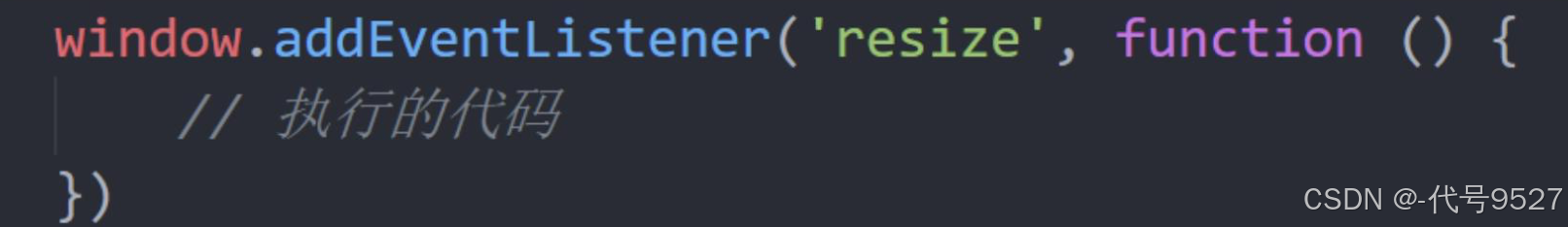
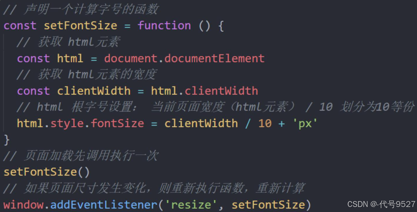
1、页面尺寸事件
- 作用:会在窗口尺寸改变的时候触发事件
- 事件:resize
- 示例:
2、元素尺寸与位置
在滚动事件中,我们是指定了滚动的距离,但最方便是实现页面滚动到某个元素,就可以做某些事, 也就是说,如果能通过JS的方式,得到这个元素在页面中的位置
2.1 获取元素宽高(不包含边框)
获取元素的可见部分宽高(不包含边框border,margin,滚动条等,但包括padding),用DOM对象的clientWidth和clientHeight属性获取,示意图:
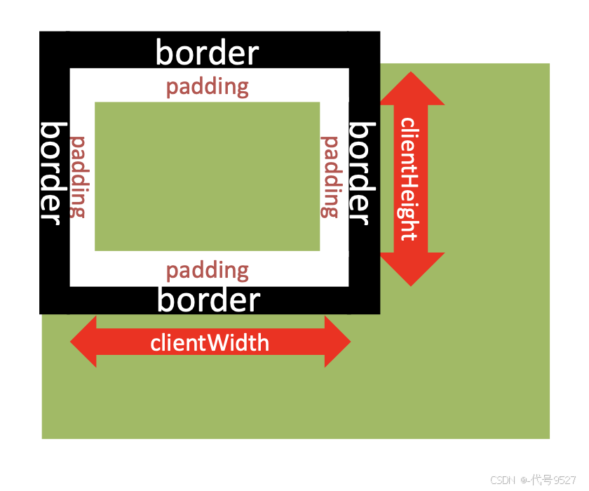
如下,div盒子自身的宽是200,再加上padding是10,两个,就是220
<head>
    <meta charset="UTF-8">
    <meta name="viewport" content="width=device-width, initial-scale=1.0">
    <title>Document</title>
    <style>
        div {
            width: 200px;
            height: 200px;
            background-color: gold;
            padding: 10px;
        }
    </style>
</head>

<body>
    <div></div>
    <script>
        const div = document.querySelector('div')
        console.log(div.clientWidth)    //220
    </script>
</body>
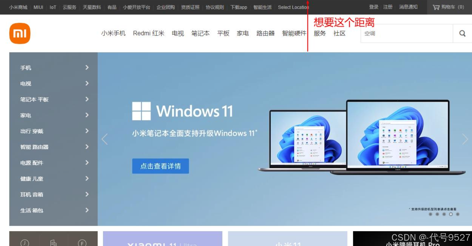
再比如:检测屏幕宽度,也就是html对象的clientWidth属性
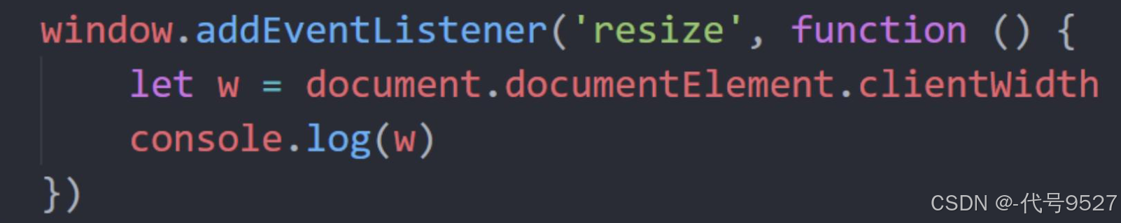
分析 flexible.js 的源码,就用到了这个元素宽高属性
2.2 获取元素宽高(包含边框)
获取元素的自身宽高,且包含padding、border、滚动条等 ⇒ offsetWidth和offsetHeight,数值型,只读,此外,获取的是可视宽高, 如果盒子是隐藏的,那获取的结果是0
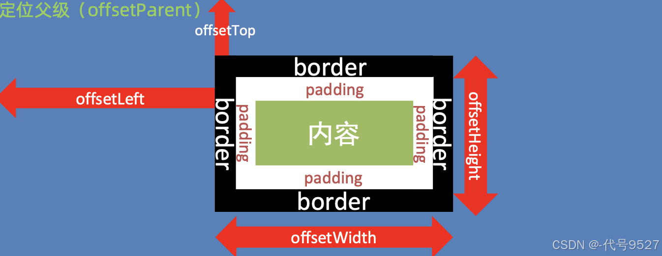
2.3 获取元素位置
如上图,获取元素距离自己带有定位的父级元素的左、上距离,用offsetLeft和offsetTop,同样的,做为一个位置或者距离,它们是只读属性
<head>
    <meta charset="UTF-8">
    <meta name="viewport" content="width=device-width, initial-scale=1.0">
    <title>Document</title>
    <style>
        div {
            width: 200px;
            height: 200px;
            background-color: gold;
            /* 元素外边距100像素 */
            margin: 100px;
        }
</head>

<body>
    <div>
    </div>

    <script>
        const div = document.querySelector('div')
        console.log(div.offsetLeft)   //108
    </script>
</body>
108,是因为body有一个8px的外边距,100 + 8 = 108

关于这个带有定位的父级的理解:
<head>
    <meta charset="UTF-8">
    <meta name="viewport" content="width=device-width, initial-scale=1.0">
    <title>Document</title>
    <style>
        div {
            width: 200px;
            height: 200px;
            background-color: gold;
            /* 元素外边距100像素 */
            margin: 100px;
        }

        p {
            width: 100px;
            height: 100px;
            background-color: purple;
            margin: 50px;
        }
    </style>
</head>

<body>
    <div>
        <p></p>
    </div>

    <script>
        const p = document.querySelector('p')
        console.log(p.offsetLeft)    //158
    </script>
</body>
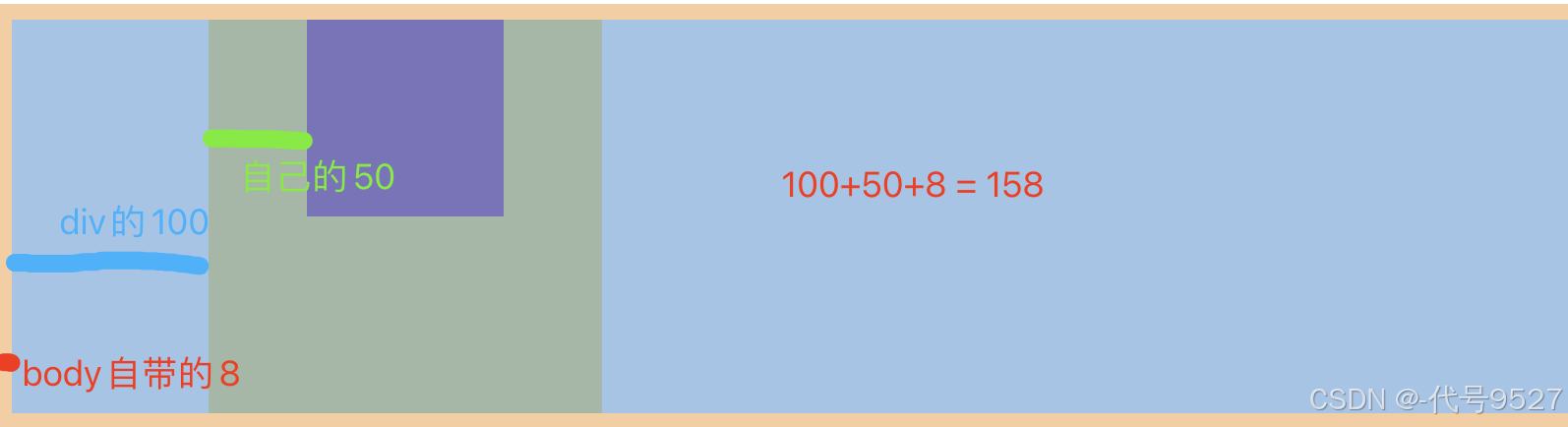
p标签的offsetLeft是100 + 50 + 8 = 158,这是因为p标签的父级没有定位
改一下代码:给p标签的父级div加一个相对定位:
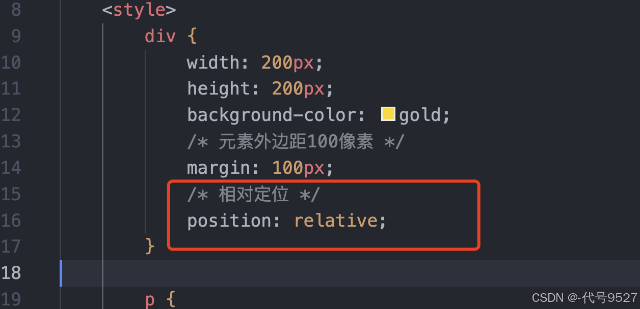
此时,p标签的offsetLeft就是50:
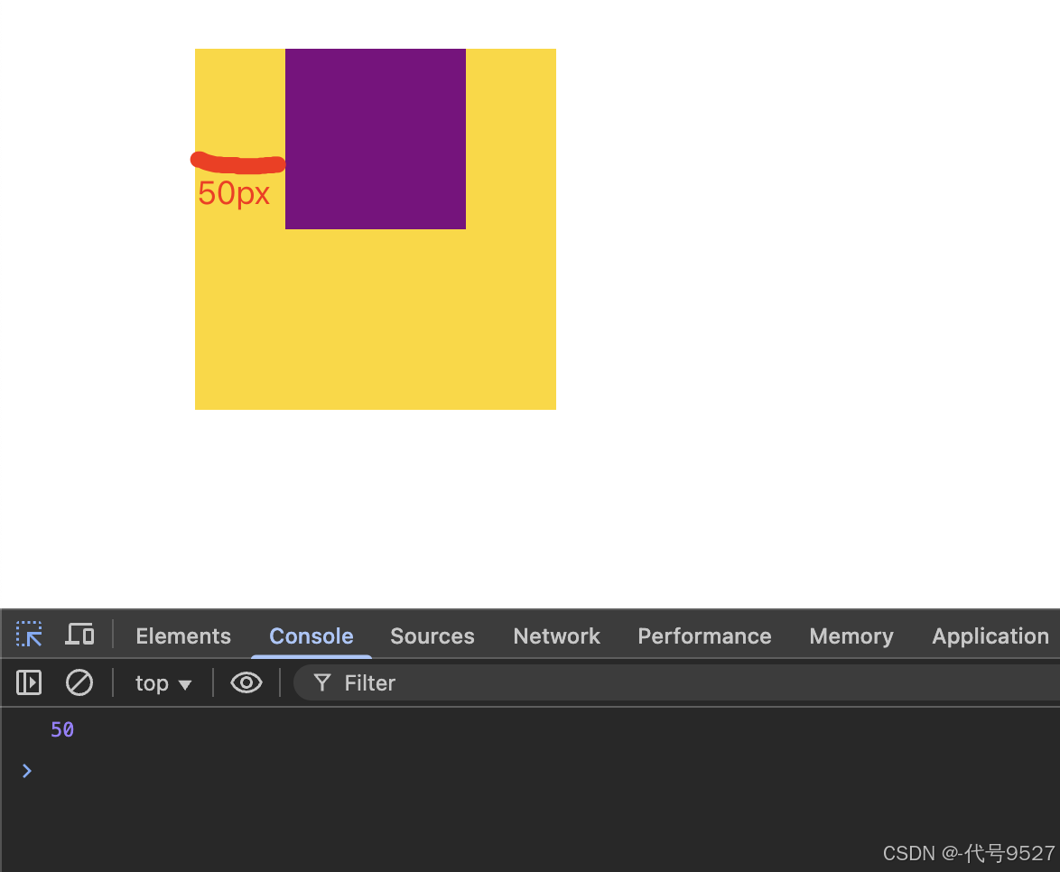
也就是说,offsetLeft这组属性值,受父级的影响,父级有定位,直接算距离,父级没有定位,往上找,直到找到最近的一个有定位的祖先元素,再开始算这个距离
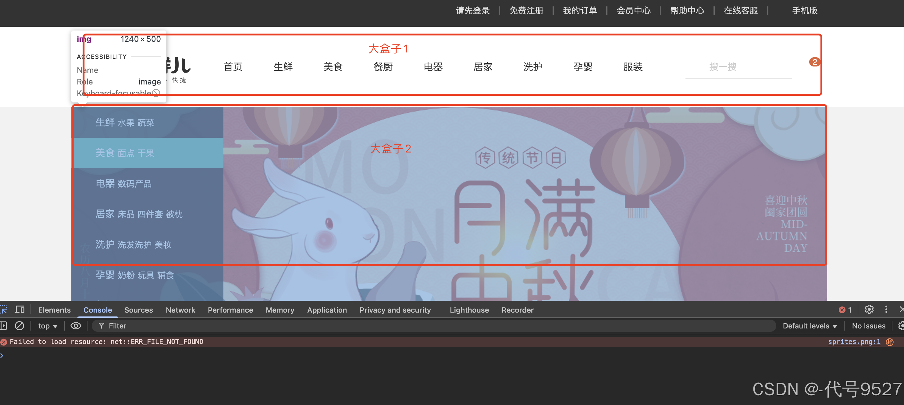
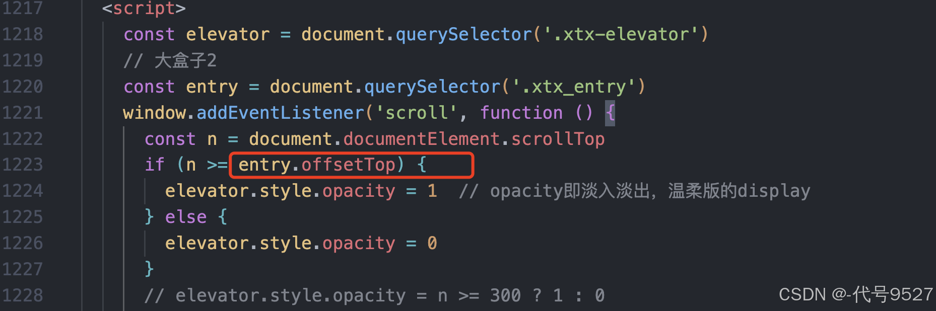
最后,实际开发中不用纠结这个的计算,比如上面这个页面,我们要加事件:页面滑动到大盒子2的顶部的时候,就出现电梯导航栏,这种大盒子的父级一般都是body,是独立的,直接获取offsetLeft就行:
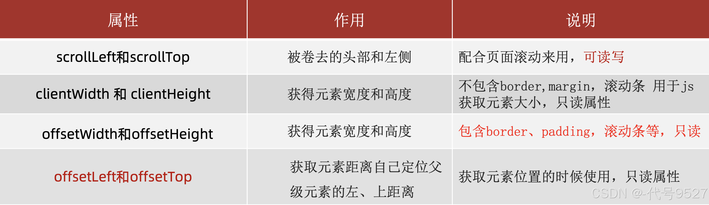
2.4 属性值区别总结
2.5 getBoundingClientRect方法
返回元素的大小及其相对于视口的位置:
element.getBoundingClientRect()
视口,即页面可视区:
<head>
    <meta charset="UTF-8">
    <meta name="viewport" content="width=device-width, initial-scale=1.0">
    <title>Document</title>
    <style>
        div {
            width: 200px;
            height: 200px;
            background-color: purple;
            margin: 100px;
        }
    </style>
</head>

<body>
    <div></div>
    <script>
        const div = document.querySelector('div')
        const offset = div.getBoundingClientRect()
        console.dir(offset)
    </script>
</body>
此时,top是100,合理:
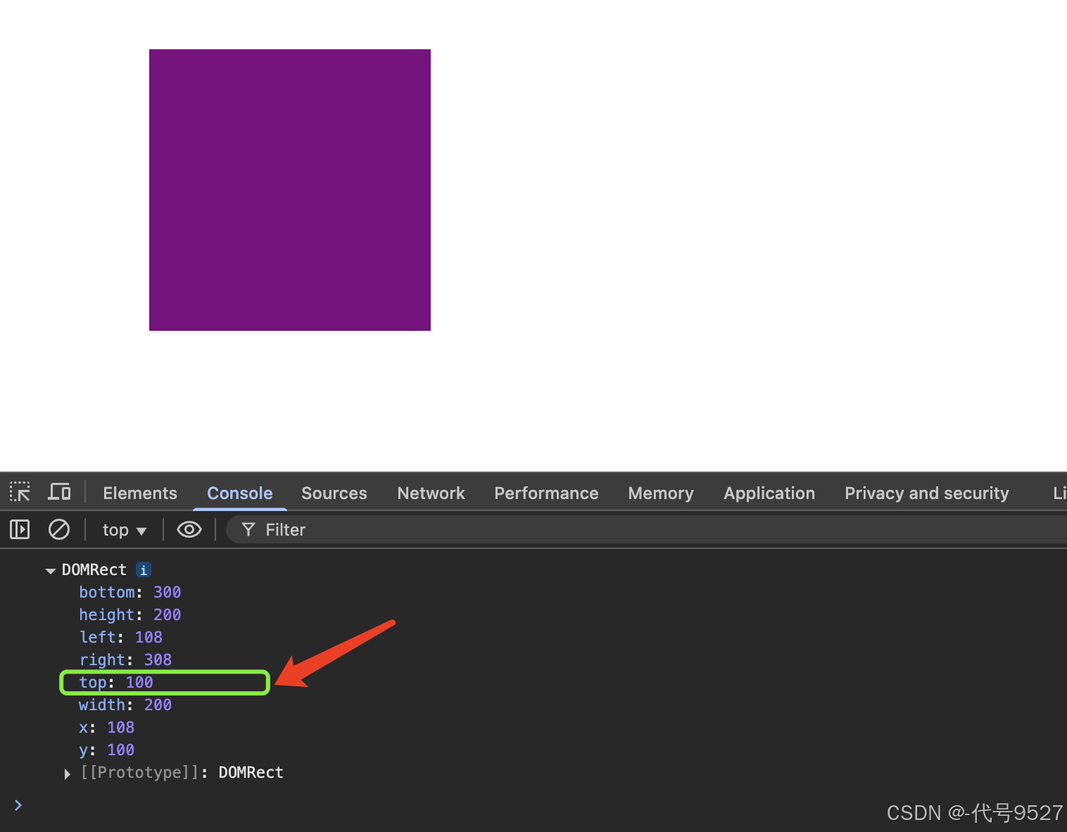
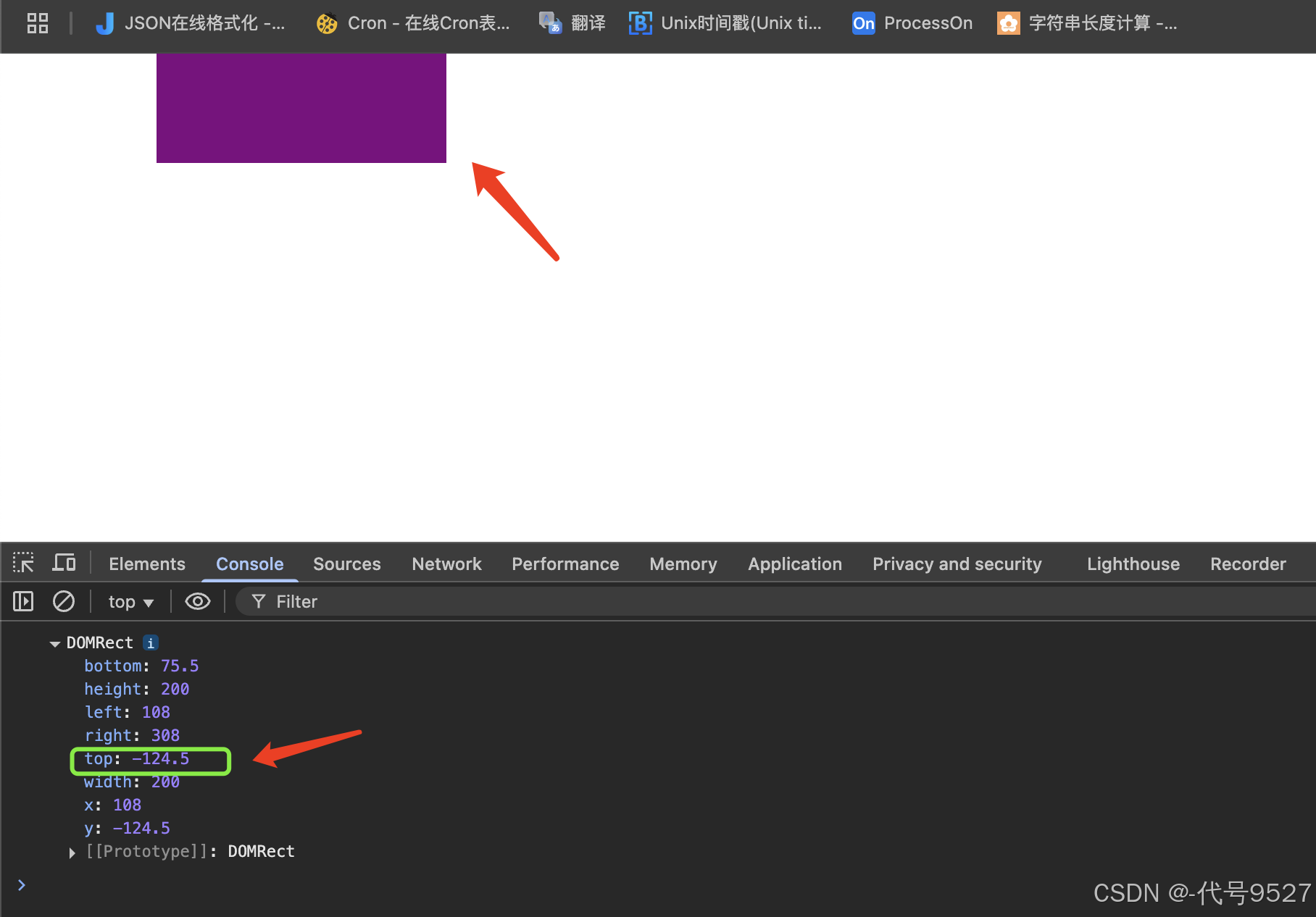
修改一下,调大html页面高度,让页面出现滚动栏,并把紫色盒子向上滑,只漏出小部分在浏览器可视框范围,刷新浏览器,发现top成了-124.5,这就是相对于视口的位置的理解,也是这个方法的返回值和前面offsetTop的区别:
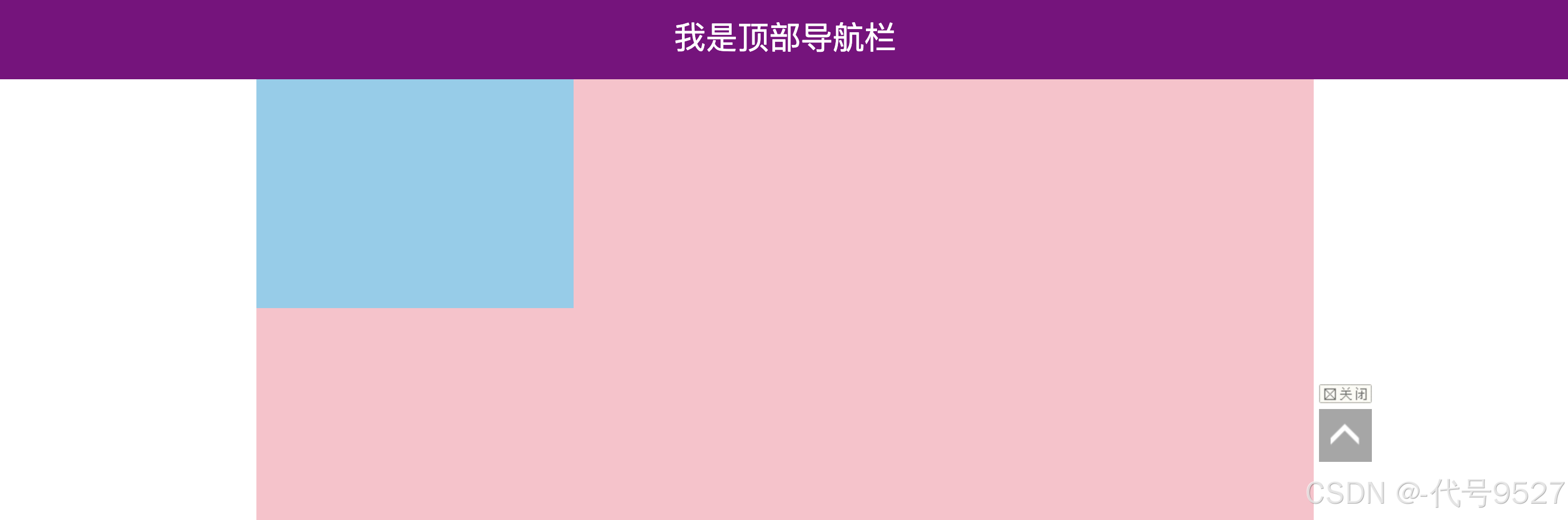
3、案例:仿京东固定导航栏
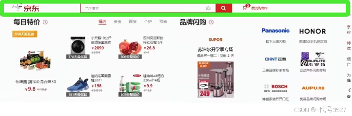
需求:当页面滚动到秒杀模块,导航栏自动滑入,否则滑出,像上图中的这个绿色京东导航栏,写一个模拟页面:
<!DOCTYPE html>
<html lang="en">
<head>
<meta charset="UTF-8">
<meta http-equiv="X-UA-Compatible" content="IE=edge">
<meta name="viewport" content="width=device-width, initial-scale=1.0">
<title>Document</title>
<style>
* {
margin: 0;
padding: 0;
box-sizing: border-box;
}
.content {
overflow: hidden;
width: 1000px;
height: 3000px;
background-color: pink;
margin: 0 auto;
}
.backtop {
display: block;
width: 50px;
left: 50%;
margin: 0 0 0 505px;
position: fixed;
bottom: 60px;
z-index: 100;
}
.backtop a {
height: 50px;
width: 50px;
background: url(./images/bg2.png) 0 -600px no-repeat;
opacity: 0.35;
overflow: hidden;
display: block;
text-indent: -999em;
cursor: pointer;
}
.header {
position: fixed;
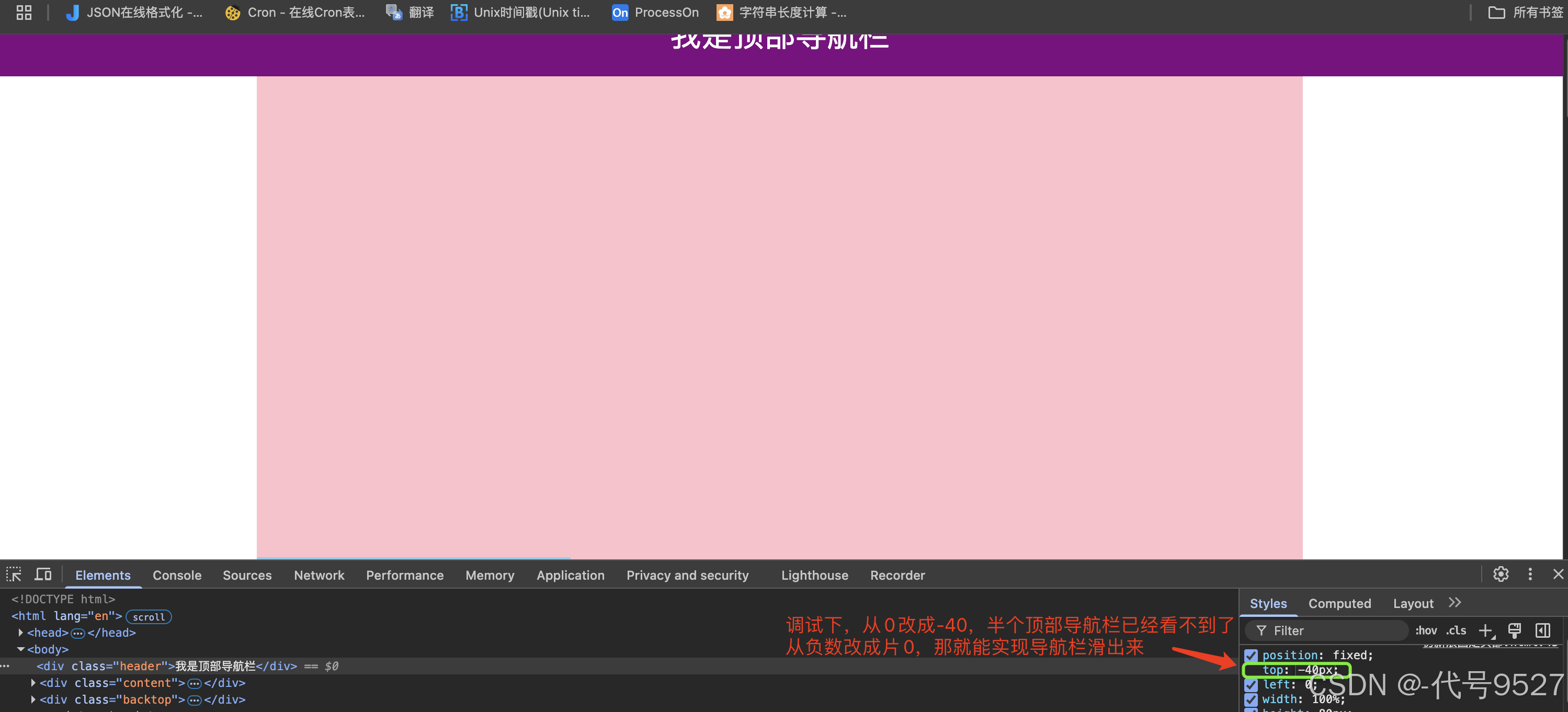
/* top是0,在顶部,top是负数,就不在页面显示了 */
top: -80px;
left: 0;
width: 100%;
height: 80px;
background-color: purple;
text-align: center;
color: #fff;
line-height: 80px;
font-size: 30px;
transition: all .3s;
}
.sk {
width: 300px;
height: 300px;
background-color: skyblue;
margin-top: 500px;
}
</style>
</head>
<body>
<div class="header">我是顶部导航栏</div>
<div class="content">
<div class="sk">秒杀模块</div>
</div>
<div class="backtop">
<img src="./images/close2.png" alt="">
<a href="javascript:;"></a>
</div>
<script>
// 页面滚动事件
window.addEventListener('scroll', function () {
// 页面滚动到秒杀模块,就更新头部导航栏的css的top值
// 即:当页面被卷去的头部 >= 秒杀模块的位置的offsetTop
const sk = document.querySelector('.sk')
const head = document.querySelector('.header')
// html页面被卷去的距离
const n = document.documentElement.scrollTop
head.style.top = n >= sk.offsetTop ? 0 : '-80px'
})
const backTop = document.querySelector('.backtop')
backTop.addEventListener('click', function () {
// html页面被卷去的距离为0,即返回顶部
document.documentElement.scrollTop = 0
})
</script>
</body>
</html>
效果:一旦滑动到蓝色的秒杀模块位置,就出现紫色导航栏,点击返回顶部按钮,直接回到最开始


 扫一扫
扫一扫


 被折叠的 条评论
为什么被折叠?
被折叠的 条评论
为什么被折叠?
 到【灌水乐园】发言


