


本文介绍了一种简单的实现主题思路
1. Demo文件结构
|____src
| |____styles           # 页面样式
| | |____core.scss
| |____themes           # 主题变量
| | |____default.scss
| | |____dark.scss
| | |____blue.scss
| |____entry.js         # 打包入口
|____webpack.config.js
|____package.json
2. 页面样式与主题变量
/* src/styles/core.scss */
body {
  background-color: $primary;
}
.text {
  color: $text-color;
  border: 2px solid $border-color;
}


/* src/themes/default.scss */
$primary: #17a2b8 !default;
$text-color: #212529 !default;
$border-color: #6c757d !default;


/* src/themes/blue.scss */
$primary: #007bff;


/* src/themes/default.scss */
$primary: #343a40;
$text-color: #f8f9fa;
$border-color: #e9ecef;
3. 入口文件
// import './themes/default.scss'
// import './themes/blue.scss'
// import './themes/dark.scss'

// 样式注入
const themes = require.context('./themes', false, /\.scss$/)
themes.keys().map(themes)

const span = document.createElement('span')
span.classList.add('text')
span.innerHTML = '文字'
document.body.appendChild(span)

const themeNames = ['', 'blue', 'dark']
const themeSwitchDiv = document.createElement('div')
themeNames.forEach(name => {
  const btn = document.createElement('button')
  btn.innerHTML = name || 'default'
  btn.addEventListener('click', () => {
    document.documentElement.dataset.theme = name
  })
  themeSwitchDiv.appendChild(btn)
})
document.body.appendChild(themeSwitchDiv)
4. webpack打包配置
const HtmlWebpackPlugin = require('html-webpack-plugin')
const { CleanWebpackPlugin } = require('clean-webpack-plugin')
const MiniCssExtractPlugin = require('mini-css-extract-plugin')

const path = require('path')
const themePath = path.resolve(__dirname, 'src/themes')
const styleCorePath = path.join('src', 'styles', 'core.scss')

const getFilename = filepath => path.parse(filepath).name

module.exports = {
  mode: 'production',
  entry: { main: './src/entry.js' },
  plugins: [
    // 打包时清理输出文件夹
    new CleanWebpackPlugin(),
    // 样式提取到 .css 文件中
    new MiniCssExtractPlugin(),
    // 创建 HTML 文件
    new HtmlWebpackPlugin({ title: '主题风格' })
  ],
  module: {
    rules: [
      {
        test: /\.scss$/,
        use: [
          // 'style-loader',
          { loader: MiniCssExtractPlugin.loader },
          'css-loader',
          {
            loader: 'sass-loader',
            options: {
              additionalData: (content, loaderContext) => {
                const { resourcePath, rootContext } = loaderContext
                const relativePath = path.relative(rootContext, resourcePath)
                if (relativePath.includes(path.join('src', 'themes'))) {
                  const importText = '@import "../styles/core.scss";'
                  // 在尾部引入样式
                  if (relativePath.includes('default.scss')) {
                    content += importText
                  } else {
                    // 非默认主题设置作用域
                    const name = getFilename(relativePath)
                    content += `:root[data-theme=${name}]{${importText}}`
                  }
                }
                return content
              }
            }
          }
        ]
      }
    ]
  }
}
5. css打包结果
:root[data-theme=blue] body{background-color:#007bff}:root[data-theme=blue] .text{color:#212529;border:2px solid #6c757d}
:root[data-theme=dark] body{background-color:#343a40}:root[data-theme=dark] .text{color:#f8f9fa;border:2px solid #e9ecef}
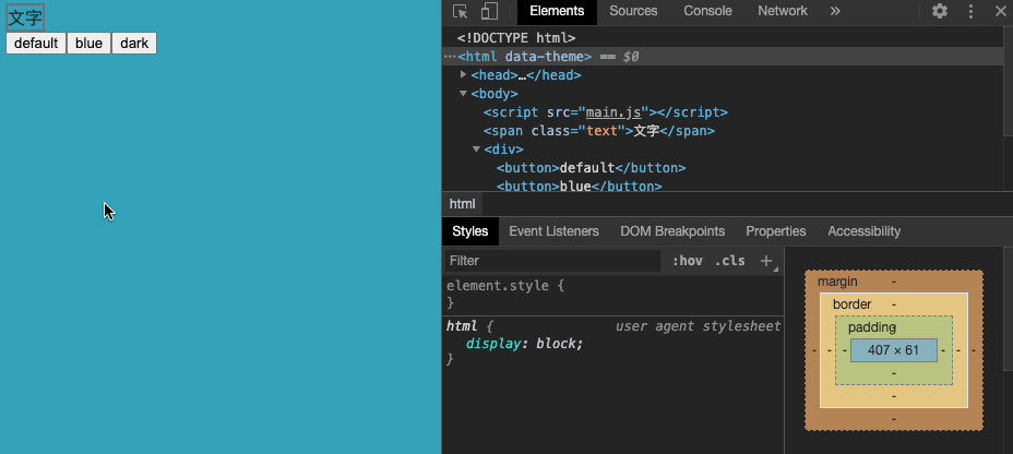
body{background-color:#17a2b8}.text{color:#212529;border:2px solid #6c757d}6. 效果展示
7. 总结
此方法使用了Scss变量的方式进行主题切换,使用根节点的data-theme作为主题样式的作用域。但是可以从打包出来的样式发现,当样式表规模达到一定时,打出来的css样式就会因为有多种主题而非常巨大,为用户加载带来困难。


 扫一扫
扫一扫


 2144
2144

 被折叠的 条评论
为什么被折叠?
被折叠的 条评论
为什么被折叠?
 到【灌水乐园】发言


