


1. 在style.scss里面封装样式
// 进度条(横向或圆形)
  // *$type:1=>'横向';2=>'圆形',noColor=>'初始颜色', yesColor=>'过去的颜色'*
@mixin progress($type:2, $height: 5, $noColor: #ffb386, $yesColor: #ccc, $width:70, $top: 0.2, $right: 1, $paddingTop: 6, $border: 5) {
  overflow: hidden;
  @if ($type == 2) {
    .wrap, .circle, .percent {
      position: absolute;
      width: 2rem;
      height: 2rem;
      border-radius: 50%;
    }
    section {
      width: 2rem;
      height: 2rem;
      position: relative;
      margin: 2rem;
      .wrap {
        top:0;
        left:0;
        background-color:#ccc;
        .circle {
          box-sizing: border-box;
          -webkit-box-sizing: border-box;
          -ms-box-sizing: border-box;
          -moz-box-sizing: border-box;
          -o-box-sizing: border-box;
          border: 1px solid #ccc;
          clip: rect(0,2rem,2rem,1rem);
        }
        .clip-auto {
          clip:rect(auto, auto, auto, auto)
        }
        .percent{
          box-sizing: border-box;
          -webkit-box-sizing:border-box;
          -ms-box-sizing:border-box;
          -moz-box-sizing:border-box;
          -o-box-sizing:border-box;
          top:-1px;
          left:-1px;
        }
        .left {
          border:0.1rem solid #ff6300;
          clip: rect(0,1rem,2rem,0);
        }
        .right {
          border:0.1rem solid #FF6300;
          clip: rect(0,2rem,2rem,1rem);
        }
        .wth0{
          width:0;
        }
        .num{
          position: absolute;
          box-sizing: border-box;
          -webkit-box-sizing:border-box;
          -ms-box-sizing:border-box;
          -moz-box-sizing:border-box;
          -o-box-sizing:border-box;
          width:1.8rem;
          height:1.8rem;
          line-height:1.8rem;
          text-align: center;
          font-size: 0.5rem;
          left:0.1rem;
          top:0.1rem;
          border-radius: 50%;
          color:#FF6300;
          background: white;
          z-index: 1;
        }
      }
    }
  } @else {
    .progress_info1{
      position: relative;
      padding:#{$paddingTop}px 0 0 0;
      overflow: hidden;
      .progress_box1{
        position: relative;
        overflow:hidden;
        border-radius:#{$height}px;
        height:#{$height}px;
        background: #ccc;
        .box1{
          @include position;
          background: linear-gradient(to right, $noColor 20%, $yesColor);
          filter: progid:DXImageTransform.Microsoft.gradient( startColorstr='$noColor', endColorstr='$yesColor',GradientType=1 );
        }
      }
    }
  }
}
2. 在build => utils.js里面修改配置
scss: generateLoaders('sass').concat(
      {
        loader: 'sass-resources-loader',
        options: {
          resources: path.resolve(__dirname, '../src/assets/css/style.scss')
        }
      }),
3. 在主页面里面引用
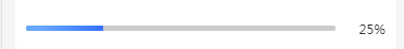
a. 横向进度条:
<div class="progress_info1">
      <div class="progress_box1">
        <div class="box1" :style="{width: +items.progress +'%'}"></div>
      </div>
      <span class="progress_value">{{+items.progress ? +items.progress : 0}}%</span>
    </div>

在css里面调用样式:

@include progress(1, 5, rgba(104,168,255,1), rgba(55,111,255,1));
效果如下:
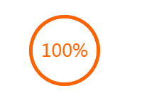
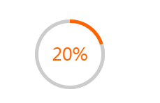
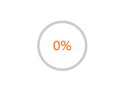
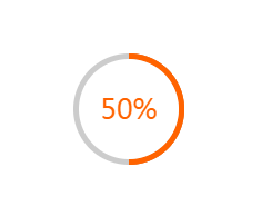
b. 圆形进度条:
css:
@include progress(2, 5, rgba(104,168,255,1), rgba(55,111,255,1));data里面定义:
data () {
      return {
        percent: 100
      }
    }
html:
<section>
			<div class="wrap">
				<div :class="['circle', {'clip-auto': percent > 50}]">
					<div class="percent left" :style="'-webkit-transform:rotate('+ (percent * 3.6) +'deg);'"></div>
					<div :class="['percent', 'right', {'wth0': percent < 50}]"></div>
				</div>
				<div class="num">
					<span>{{percent}}</span>%
				</div>
			</div>
		</section>
效果如下:


 扫一扫
扫一扫


 被折叠的 条评论
为什么被折叠?
被折叠的 条评论
为什么被折叠?
 到【灌水乐园】发言


