


方法1:
|
1
2
3
4
5
6
7
8
9
10
11
12
13
14
|
.parent { width:800px; height:500px; border:2px solid #000; position:relative;} .child { width:200px; height:200px; margin: auto; position: absolute; top: 0; left: 0; bottom: 0; right: 0; background-color: red;} |
方法2:
|
1
2
3
4
5
6
7
8
9
10
11
12
13
14
|
.parent { width:800px; height:500px; border:2px solid #000; display:table-cell; vertical-align:middle; text-align: center; } .child { width:200px; height:200px; display:inline-block; background-color: red; } |
方法3:
|
1
2
3
4
5
6
7
8
9
10
11
12
13
|
.parent { width:800px; height:500px; border:2px solid #000; display:flex; justify-content:center; align-items:center; } .child { width:200px; height:200px; background-color: red; } |
方法4:
|
1
2
3
4
5
6
7
8
9
10
11
12
13
14
15
16
17
18
|
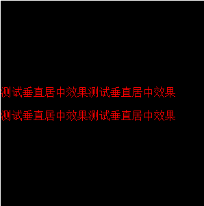
.parent { width:800px; height:500px; border:2px solid #000; position:relative; } .child { width:300px; height:200px; margin:auto; position:absolute;/*设定水平和垂直偏移父元素的50%,再根据实际长度将子元素上左挪回一半大小*/ left:50%; top:50%; margin-left: -150px; margin-top:-100px; background-color: red; }一、行高(line-height)法如果要垂直居中的只有一行或几个文字,那它的制作最为简单,只要让文字的行高和容器的高度相同即可,比如: 这段代码可以达到让文字在段落中垂直居中的效果。 二、内边距(padding)法另一种方法和行高法很相似,它同样适合一行或几行文字垂直居中,原理就是利用padding将内容垂直居中,比如: 这段代码的效果和line-height法差不多。 三、模拟表格法将容器设置为display:table,然后将子元素也就是要垂直居中显示的元素设置为display:table-cell,然后加上vertical-align:middle来实现。 html结构如下: <div id="wrapper">
<div id="cell">
<p>测试垂直居中效果测试垂直居中效果</p>
<p>测试垂直居中效果测试垂直居中效果</p>
</div>
</div>
css代码:
实现如图所示: 遗憾的是IE7及以下不支持。 四、CSS3的transform来实现css代码如下:
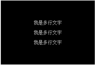
五:css3的box方法实现水平垂直居中html代码: css代码: 结果如图:
|


 扫一扫
扫一扫


 529
529

 被折叠的 条评论
为什么被折叠?
被折叠的 条评论
为什么被折叠?
 到【灌水乐园】发言


