


目录
1.hello Seaborn
import pandas as pd
pd.plotting.register_matplotlib_converters()
import matplotlib.pyplot as plt
%matplotlib inline
import seaborn as sns
print("Setup Complete")
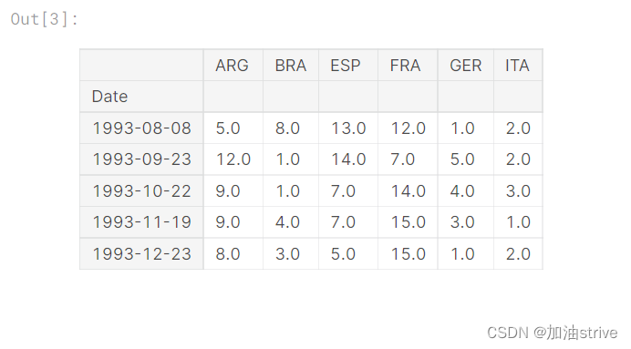
fifa_filepath 数据集的文件路径。
index_col=“Date” 我们将index_col的值设置为第一列的名称
(“Date”,在Excel中打开时在文件的单元格A1中找到)。
parse_dates=True将每行标签理解为日期
(而不是数字或其他具有不同含义的文本)。
# Path of the file to read
fifa_filepath = "../input/fifa.csv"

# Read the file into a variable fifa_data
fifa_data = pd.read_csv(fifa_filepath, index_col="Date", parse_dates=True)
Examine the data
# Print the first 5 rows of the data
fifa_data.head()
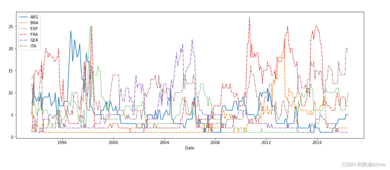
Plot the data
# Set the width and height of the figure
plt.figure(figsize=(16,6))

# Line chart showing how FIFA rankings evolved over time
sns.lineplot(data=fifa_data)
2.Line Charts
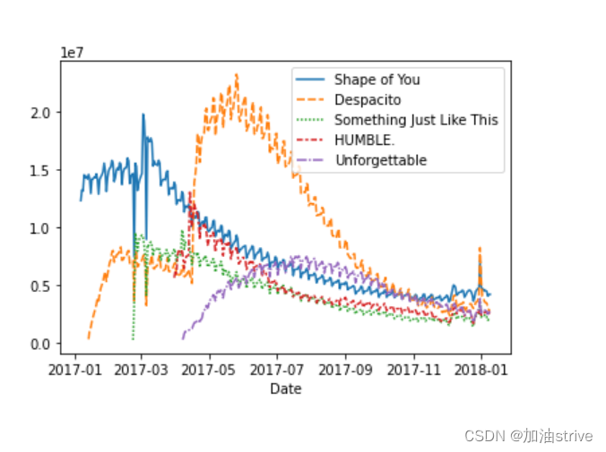
展示一段时间内的数据趋势
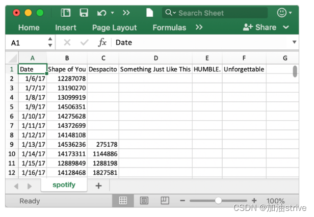
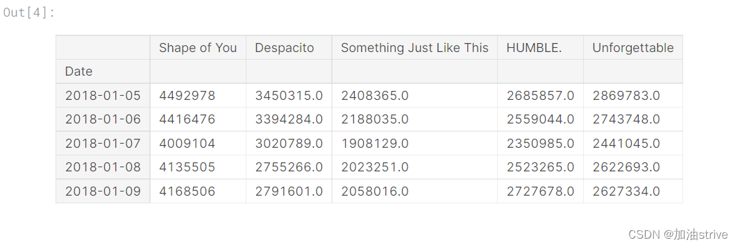
本教程的数据集跟踪音乐流服务Spotify上的全球每日流。我们专注于2017年和2018年的五首流行歌曲:

Load the data
# Path of the file to read
spotify_filepath = "../input/spotify.csv"

# Read the file into a variable spotify_data
spotify_data = pd.read_csv(spotify_filepath, index_col="Date", parse_dates=True)
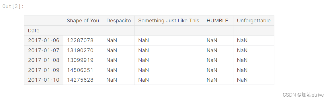
Examine the data
# Print the first 5 rows of the data
spotify_data.head()
# Print the last five rows of the data
spotify_data.tail()
# Line chart showing daily global streams of each song
sns.lineplot(data=spotify_data)
如上所述,代码行相对较短,有两个主要部分:
sns.linepl
 最低0.47元/天 解锁文章


 645
645

 被折叠的 条评论
为什么被折叠?
被折叠的 条评论
为什么被折叠?
 到【灌水乐园】发言


