


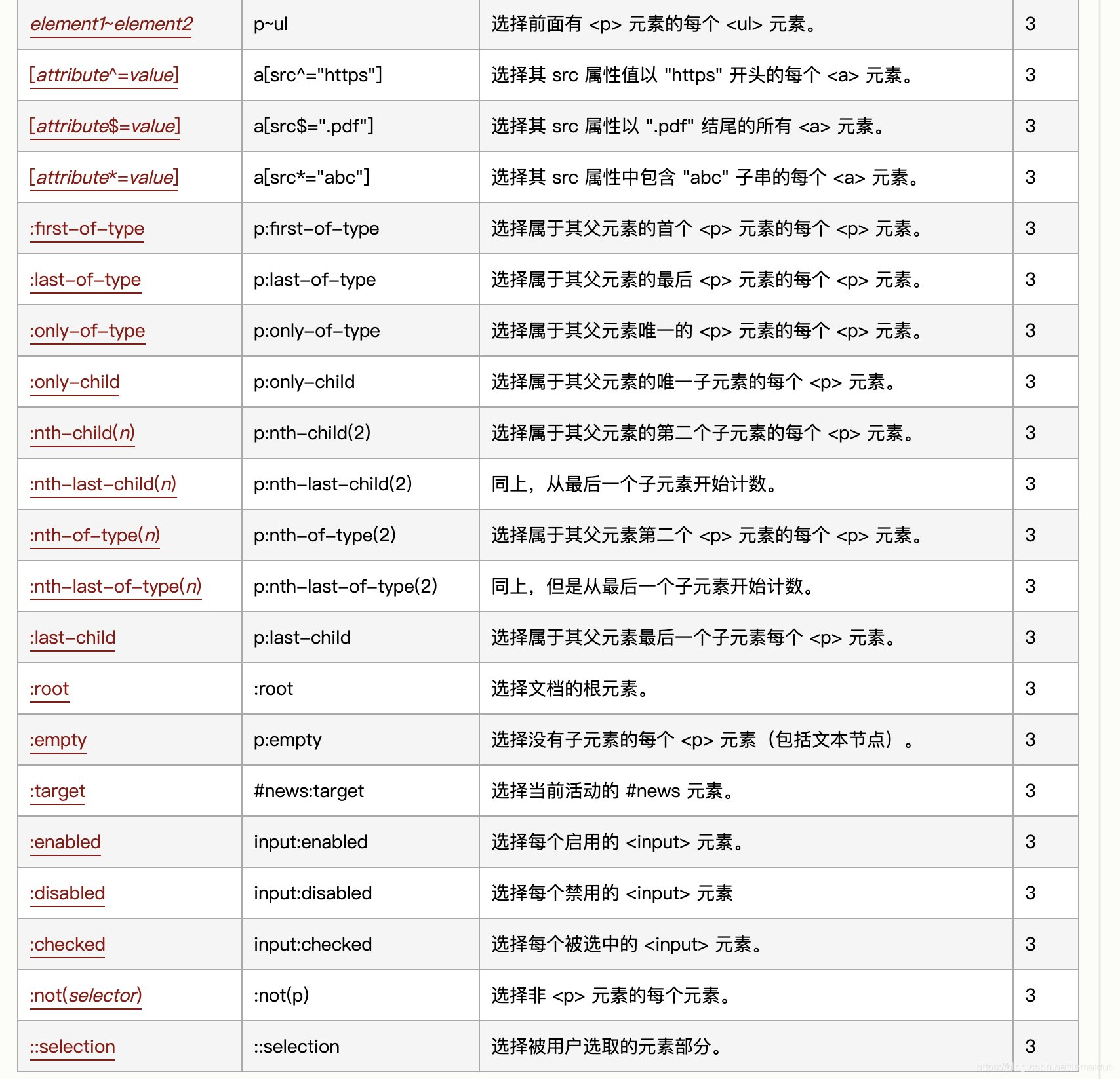
CSS3选择器
border-radius圆角边框
// 两个参数 8个值
border-radius:10px 20px 30px 40px / 10px 20px 30px 40px  //左上角开始
border-radius:10px 20px  //对角线 // 两个参数 8个值
border-radius:5%;
border-radius:50%;
shadow 阴影
盒子阴影
//一参:横向偏移
//二参:纵向偏移
//三参:模糊度
//四参:颜色
//五参:内置阴影
box-shadow:1px 1px 3px red insert
配置多个阴影
box-shadow:1px 1px 3px red,2px 3px 4px yellow
文字阴影
//一参:横向偏移
//二参:纵向偏移
//三参:模糊度
//四参:颜色
test-shadow:1px 1px 3px red
配置多个阴影
test-shadow:1px 1px 3px red,2px 3px 4px yellow
gradients渐变
css3定义了两种类型的渐变
线性渐变:Linear Gradients
径向渐变:Radial Gradients
线性渐变Linear Gradients
direction:
	to top(0deg)
	to right(90deg)
	to left top
background-image:linear-gradient(direction,color-stop1,color-stop2,...)
径向渐变:Radial Gradients
/*
* 中心:(at centerX centerY)以左上角为参考点 单位是 px/%
* size:
* 	最近边 closest-side
* 	最远边 farthest-side
* 	最近角 closest-corner
* 	最远角 farthest-corner
* shape(形状): ellipse(椭圆) /circle(圆)   默认为椭圆
*
*/
background-image:radial-gradient(center,shape,size,start-color,...,last-color)
background-image:radial-gradient(closest-coener circle at 20% 20%,blue,yellow)
TransForm 2D
CSS3属性是用函数定义的:translate() , scale(), rotate() ,skew()
格式:
transform:函数名(X轴,Y轴)
函数名介绍
translate :水平和垂直方向移动
rotate: 旋转 默认顺时针
scale: 缩放
skew:倾斜
//transform: translate(X,Y)
 transform: translate(30px)
//transform: rotate(nDeg)
transform: rotate(30deg)
//transform:scale(X,Y)
transform:scale(.7,.3)
//transform:skew(Xdeg,Ydeg)
transform:skew(30deg,50deg)
TransForm 3D
比2D 多了一个Z轴
perspective 透视(呈现出伪3D效果)
tranform:translate3d(x,y,z)
tranform:translateX(x)
tranform:translateY(y)
tranform:translateZ(z)
tranform:scale3d(x,y,z)
tranform:scaleX(x)
tranform:scaleY(y)
tranform:scaleZ(z)
tranform:rotate3d(x,y,z)
tranform:rotateX(x)
tranform:rotateY(y)
tranform:rotateZ(z)
transition 过渡
transition CSS 属性是 transition-property(属性名),transition-duration(过渡总时间),transition-timing-function(过渡方式) 和 transition-delay (延迟时间)的一个简写属性。
transition-property(属性名): none | all | property
transition-duration(过渡总时间): s | ms
transition-timing-function(过渡方式):见下
transition-delay (延迟时间): s | ms
/* Apply to 1 property */
/* property name | duration */
transition: margin-right 4s;

/* property name | duration | delay */
transition: margin-right 4s 1s;

/* property name | duration | timing function */
transition: margin-right 4s ease-in-out;

/* property name | duration | timing function | delay */
transition: margin-right 4s ease-in-out 1s;

/* Apply to 2 properties */
transition: margin-right 4s, color 1s;

/* Apply to all changed properties */
transition: all 0.5s ease-out;

/* Global values */
transition: inherit;
transition: initial;
transition: unset;
transition-timing-function过渡属性–变化加速度曲线
transition-timing-function: ease 默认值,先慢加速最后慢结束
transition-timing-function: ease-in 慢速开始 加速效果
transition-timing-function: ease-out 慢速结束 减速效果
transition-timing-function: ease-in-out 慢速开始和结束,先加速后减速效果
transition-timing-function: linear 匀速
transition-timing-function: cubic-bezier(0.1, 0.7, 1.0, 0.1)
transition-timing-function: step-start
transition-timing-function: step-end
transition-timing-function: steps(4, end)

transition-timing-function: ease, step-start, cubic-bezier(0.1, 0.7, 1.0, 0.1)

transition-timing-function: inherit
@keyframes 动画
语法
@keyframes name{
	from | 0%{ css 样式}
	percent { css 样式}
	to | 100%{ css 样式}
}
animation属性 :调用由@keyframes定义的动画,设置动画属性、时间、次数等
语法
//简写
animation : name duration timing-function delay iteration-count direction

animation-name: ;动画名称
animation-duration: s| ms;一个周期的时间
animation-timing-function: ; 规定动画的速度变化类型
animation-delay: s | ms; 延时时间
animation-iteration-count: 数值 | infinite
animation-direction: normal (默认,正常播放)| alternate (轮流播放,奇正偶反)
animation-fill-mode:none(默认) | forwards (停留在最后一帧)
animation-play-state:running(默认) |  paused 动画正在运行还是暂停
@media 媒体查询
用法如下
@media screen and (max-width: 960px) {
    body {
        background-color: yellow;
    }
}
@media screen and (max-width: 480px) {
    body {
        background-color: lightpink;
    }
}
颜色
rgba
一个是rgba(rgb为颜色值,a为透明度)
hsla
h:色相”,“s:饱和度”,“l:亮度”,“a:透明度”


 扫一扫
扫一扫


 被折叠的 条评论
为什么被折叠?
被折叠的 条评论
为什么被折叠?
 到【灌水乐园】发言


