


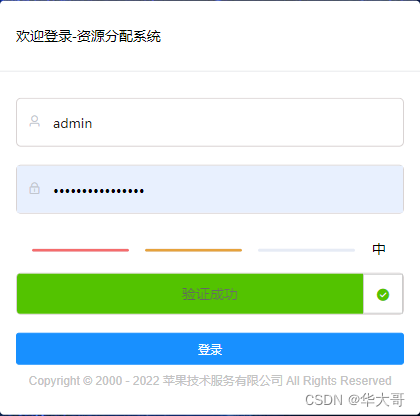
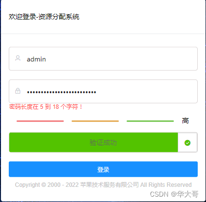
我们知道验证码的目的 是为了验证到底是人还是机器。
我这里写的只是模仿了样式,并没有进行那些复杂的操作,所以并不安全(不能判断人还是机器),下面看效果:
一、新建文件logi.vue,把密码强度和拖动滑块加入form表单中,代码如下:
            <div class="progress-bar_wrap">
              <password-strength v-model="loginForm.password" style="padding-top: 10px;" />
            </div>

            <el-form-item prop="isLock">
              <slider-verify-code v-model="loginForm.isLock" @change="handlerLock" />
            </el-form-item>

            <!-异常信息展示-->

             <div style="margin-bottom: 10px;">
              <el-alert
                id="account_error_message"
                center
                show-icon
                type="error"
              />
            </div>
2,密码强度和拖动组件代码如下:
密码强度组件:
<template>
  <div id="container" style="margin-bottom: 16px">
    <el-row>
      <el-col :span="6" :offset="1">
        <el-progress
          :percentage="onePercentage"
          :color="oneCustomColors"
          :format="oneFormat"
          :stroke-width="3"
        />
      </el-col>
      <el-col :span="6" :offset="1">
        <el-progress
          :percentage="twoPercentage"
          :color="twoCustomColors"
          :format="twoFormat"
          :stroke-width="3"
        />
      </el-col>
      <el-col :span="6" :offset="1">
        <el-progress
          :percentage="ThreePercentage"
          :color="ThreeCustomColors"
          :format="ThreeFormat"
          :stroke-width="3"
        />
      </el-col>
      <el-col :span="2" :offset="1" style="line-height: 15px;">
        {{ content }}
      </el-col>
    </el-row>
  </div>
</template>

<script>
export default {
  name: 'PasswordStrength',
  model: {
    event: 'change',
    prop: 'passwordStr'
  },
  props: {
    // 密码
    passwordStr: {
      type: [String, Boolean, Number, Object],
      required: true,
      default: ''
    }
  },
  data() {
    return {
      content: '',
      onePercentage: 0,
      twoPercentage: 0,
      ThreePercentage: 0,
      oneCustomColors: [
        { color: '#f56c6c', percentage: 100 }
      ],
      twoCustomColors: [
        { color: '#e6a23c', percentage: 100 }
      ],
      ThreeCustomColors: [
        { color: '#67c23a', percentage: 100 }
      ]
    }
  },
  watch: {
    passwordStr(newValue) {
      const mode = this.checkPasswordStrength(newValue)
      // 逻辑处理
      this.handelPasswordPercent(mode)
    }
  },
  mounted() {
    this.setPasswordStr(this.passwordStr)
  },
  methods: {
    oneFormat() {
      return ''
    },
    twoFormat() {
      return ''
    },
    ThreeFormat() {
      return ''
    },
    // 密码强度验证
    checkPasswordStrength(value) {
      let mode = 0
      // 正则表达式验证符合要求的
      if (value.length < 1) return mode
      if (/\d/.test(value)) mode++ // 数字
      if (/[a-z]/.test(value)) mode++ // 小写
      if (/[A-Z]/.test(value)) mode++ // 大写
      if (/\W/.test(value)) mode++ // 特殊字符
      return mode
    },
    setPasswordStr(newValue) {
      const mode = this.checkPasswordStrength(newValue)
      this.handelPasswordPercent(mode)
    },
    handelPasswordPercent(mode) {
      // 逻辑处理
      switch (mode) {
        // 初始化状态
        case 0:
          this.content = ''
          this.onePercentage = 0
          this.twoPercentage = 0
          this.ThreePercentage = 0
          break
        case 1:
          this.content = '弱'
          this.onePercentage = 100
          this.twoPercentage = 0
          this.ThreePercentage = 0
          break
        case 2:
          this.content = '中'
          this.onePercentage = 100
          this.twoPercentage = 100
          this.ThreePercentage = 0
          break
        case 3:
          this.content = '中'
          this.onePercentage = 100
          this.twoPercentage = 100
          this.ThreePercentage = 0
          break
        default:
          this.content = '高'
          this.onePercentage = 100
          this.twoPercentage = 100
          this.ThreePercentage = 100
          break
      }
    }
  }
}
</script>

<style>
.el-progress__text {
  display: none;
}

.el-progress-bar {
  padding-right: 0px;
  margin: 0px;
}
</style>
拖动滑块 组件代码:
<template>
<div class="drag" :style="style">
<div class="background" />
<div class="text shadow" onselectstart="return false" :style="{ color: textColor }">
<slot name="content">
{{ content }}
</slot>
</div>
<div class="slider" :style="{height,width:sliderWidth}">
<slot v-if="icon" name="icon">
<i :class="icon" />
</slot>
<slot v-else name="icon">
>>
</slot>
</div>
</div>
</template>
<script>
const debounce = (function() {
let timer = 0
return function(callback, ms) {
clearTimeout(timer)
timer = setTimeout(callback, ms)
}
})()
export default {
name: 'SliderVerifyCode',
model: {
event: 'change',
prop: 'isLock'
},
props: {
isLock: { // 解锁状态
type: [String, Boolean, Number, Object],
required: true,
default: false
},
icon: { // 滑块图标
type: [String],
default: 'el-icon-d-arrow-right'
},
activeValue: { // 滑块解锁后的值
type: [String, Boolean, Number, Object],
default: true
},
inactiveValue: { // 滑块解锁前的值
type: [String, Boolean, Number, Object],
default: false
},
content: { // 滑块的文字
type: [String],
default: '请向右拖动滑块'
},
height: { // 高度
type: [String],
default: '40px'
},
sliderWidth: { // 滑块宽度
type: [String],
default: '40px'
},
background: { // 高度
type: [String],
default: '#e8e8e8'
},
textColor: { // 滑块的文字颜色
type: [String],
default: '#777'
}
},
computed: {
style() {
const { height, background } = this
return { height, 'line-height': height, background }
},
resize() {
return document.body.clientWidth
}
},
watch: {
isLock(data) { // 重置样式
!data && this.init()
}
},
mounted() {
this.init()
window.onresize = () => {
debounce(() => {
this.init()
}, 120)
}
},
methods: {
/**
* 定义一个获取DOM元素的方法-选择器
*/
selector(selector) {
return document.querySelector(selector)
},
/**
* 初始化
*/
init() {
const box = this.selector('.drag') // 容器
const background = this.selector('.background') // 背景
const text = this.selector('.text') // 文字
const slider = this.selector('.slider')// 滑块
const distance = (box === null ? 0 : box.offsetWidth - slider.offsetWidth)// 滑动成功的宽度(距离)
let success = this.inactiveValue// 是否通过验证的标志
if (slider === null) return
// 初始化的时候 清除所有属性
slider.style.transition = null
background.style.transition = null
slider.style.left = 0 + 'px'
background.style.width = 0 + 'px'
text.innerHTML = this.content
slider.innerHTML = '<i class="el-icon-d-arrow-right"></i>'
slider.style.color = '#3fcd26'
// 二、给滑块注册鼠标按下事件
slider.onmousedown = (event) => {
// 1.鼠标按下之前必须清除掉后面设置的过渡属性
slider.style.transition = null
background.style.transition = null
// 说明:clientX 事件属性会返回当事件被触发时,鼠标指针向对于浏览器页面(或客户区)的水平坐标。
// 2.当滑块位于初始位置时,得到鼠标按下时的水平位置
const ev = event || window.event
const downX = ev.clientX
// 三、给文档注册鼠标移动事件
document.onmousemove = (e) => {
const evt = e || window.event// 是为了更好的兼容IE浏览器和非ie浏览器。在ie浏览器中,window.event是全局变量,在非ie中,就需要自己传入一个参数来获取event啦,所以就有了var e = e||window.event
// 1.获取鼠标移动后的水平位置
const moveX = evt.clientX
// 2.得到鼠标水平位置的偏移量(鼠标移动时的位置 - 鼠标按下时的位置)
let offsetX = moveX - downX
// 3.在这里判断一下:鼠标水平移动的距离 与 滑动成功的距离 之间的关系
if (offsetX > distance) {
offsetX = distance// 如果滑过了终点,就将它停留在终点位置
} else if (offsetX < 0) {
offsetX = 0// 如果滑到了起点的左侧,就将它重置为起点位置
}
// 4.根据鼠标移动的距离来动态设置滑块的偏移量和背景颜色的宽度
slider.style.left = offsetX + 'px'
background.style.width = offsetX + 'px'
// 如果鼠标的水平移动距离 = 滑动成功的宽度
if (offsetX == distance) {
// 1.设置滑动成功后的样式
text.innerHTML = '验证成功'
text.style.color = '#53C300'
slider.innerHTML = '<i class="el-icon-success"></i>'
slider.style.color = '#53C300'
// 2.设置滑动成功后的状态
success = this.activeValue
// 成功后,清除掉鼠标按下事件和移动事件(因为移动时并不会涉及到鼠标松开事件)
slider.onmousedown = null
document.onmousemove = null
// 3.成功解锁后的回调函数
setTimeout(() => {
this.$emit('change', this.activeValue)
}, 100)
}
}
// 四、给文档注册鼠标松开事件
document.onmouseup = () => {
// 如果鼠标松开时,滑到了终点,则验证通过
if (success == this.activeValue) return true
// 反之,则将滑块复位(设置了1s的属性过渡效果)
slider.style.left = 0
background.style.width = 0
slider.style.transition = 'left 1s ease'
background.style.transition = 'width 1s ease'
// 只要鼠标松开了,说明此时不需要拖动滑块了,那么就清除鼠标移动和松开事件。
document.onmousemove = null
document.onmouseup = null
}
}
/* 移动端 */
// 二、给滑块注册鼠标按下事件
slider.ontouchstart = (event) => {
const touch = event.changedTouches[0]
// 1.鼠标按下之前必须清除掉后面设置的过渡属性
slider.style.transition = null
background.style.transition = null
// 说明:clientX 事件属性会返回当事件被触发时,鼠标指针向对于浏览器页面(或客户区)的水平坐标。
// 2.当滑块位于初始位置时,得到鼠标按下时的水平位置
const downX = touch.pageX
// 三、给文档注册鼠标移动事件
document.ontouchmove = (e) => {
const tev = e.changedTouches[0]
// 1.获取鼠标移动后的水平位置
const moveX = tev.pageX
// 2.得到鼠标水平位置的偏移量(鼠标移动时的位置 - 鼠标按下时的位置)
let offsetX = moveX - downX
// 3.在这里判断一下:鼠标水平移动的距离 与 滑动成功的距离 之间的关系
if (offsetX > distance) {
offsetX = distance// 如果滑过了终点,就将它停留在终点位置
} else if (offsetX < 0) {
offsetX = 0// 如果滑到了起点的左侧,就将它重置为起点位置
}
// 4.根据鼠标移动的距离来动态设置滑块的偏移量和背景颜色的宽度
slider.style.left = offsetX + 'px'
background.style.width = offsetX + 'px'
// 如果鼠标的水平移动距离 = 滑动成功的宽度
if (offsetX == distance) {
// 1.设置滑动成功后的样式
text.innerHTML = '验证成功'
text.style.color = '#53C300'
slider.innerHTML = '√'
slider.style.color = '#53C300'
// 2.设置滑动成功后的状态
success = this.activeValue
// 成功后,清除掉鼠标按下事件和移动事件(因为移动时并不会涉及到鼠标松开事件)
slider.ontouchstart = null
document.ontouchmove = null
// 3.成功解锁后的回调函数
setTimeout(() => {
this.$emit('change', this.activeValue)
// console.log('解锁成功');
}, 100)
}
}
// 四、给文档注册鼠标松开事件
document.ontouchend = () => {
// 如果鼠标松开时,滑到了终点,则验证通过
if (success == this.activeValue) return true
// 反之,则将滑块复位(设置了1s的属性过渡效果)
slider.style.left = 0
background.style.width = 0
slider.style.transition = 'left 1s ease'
background.style.transition = 'width 1s ease'
// 只要鼠标松开了,说明此时不需要拖动滑块了,那么就清除鼠标移动和松开事件。
document.ontouchmove = null
document.ontouchend = null
}
}
}
}
}
</script>
<style scoped lang="scss">
* {
margin: 0px;
padding: 0px;
font-family: "微软雅黑";
box-sizing: border-box;
}
.drag {
height: 2.5rem;
line-height: 2.5rem;
background-color: #e8e8e8;
position: relative;
margin: 0 auto;
border-radius: 3px;
}
.background {
width: 2.5rem;
height: 100%;
position: absolute;
background-color: #53C300;
border-radius: 3px 0 0 3px;
}
.text {
position: absolute;
width: 100%;
height: 100%;
text-align: center;
user-select: none;
}
.slider {
width: 2.5rem;
height: 2.375rem;
position: absolute;
border: 1px solid #ccc;
cursor: move;
font-family: "宋体";
text-align: center;
background-color: #fff;
user-select: none;
color: #666;
}
.shadow {
text-align: center;
background: -webkit-gradient(linear, left top, right top, color-stop(0, #4d4d4d), color-stop(.2, #5d5d5d),
color-stop(.4, #6d6d6d), color-stop(.5, white), color-stop(.6, #6d6d6d), color-stop(.8, #5d5d5d), color-stop(1, #4d4d4d));
-webkit-background-clip: text;
-webkit-text-fill-color: transparent;
-webkit-animation: animate 3s infinite;
}
@-webkit-keyframes animate {
from {
background-position: -80px;
}
to {
background-position: 80px;
}
}
@keyframes animate {
from {
background-position: -80px;
}
to {
background-position: 80px;
}
}
</style>
把以上2个组件引入到form表单里面。在表单提交的时候在validate里面验证即可:
rules: {
        isLock: [
          { validator: checkStatus, trigger: 'blur' }
        ]
      },
验证器的代码如下:
const checkStatus = (rule, value, callback) => {
if (!value) {
return callback(new Error('滑动失败'))
} else {
if (this.loginForm.user=== '' || this.loginForm.password === '' ||
!this.loginForm.user|| !this.loginForm.password) {
setTimeout(() => {
this.loginForm.isLock = false
this.$refs.loginForm.validateField('user')
this.$refs.loginForm.validateField('password')
return callback(new Error('登录失败'))
}, 1)
}
callback()
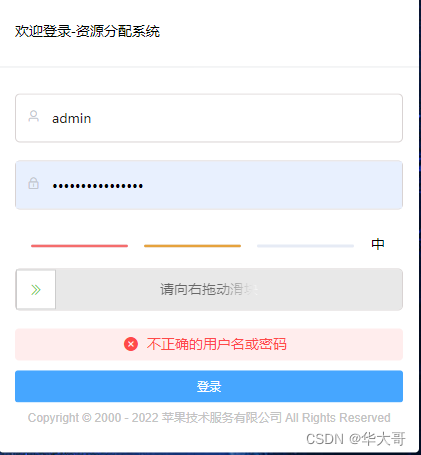
}注意的是如果验证失败,滑动条需要复原:
在你的表单提交方法里面验证失败加上下面的代码:
把失败的消息message 返回显示
$('#account_error_message').css('display', '')
$('#account_error_message .el-alert__content').text(message )
在滑动到最右边后可以向服务器请求获取一个随机码,并验证后,在表单提交后进一步验证即可


 扫一扫
扫一扫


 494
494

 被折叠的 条评论
为什么被折叠?
被折叠的 条评论
为什么被折叠?
 到【灌水乐园】发言


