 创意导航与毛玻璃效果


 本文介绍了使用CSS3实现的两种创意导航条设计和平滑的毛玻璃背景效果。包括平行四边形和梯形导航条的制作方法,以及如何利用filter属性创建毛玻璃效果。
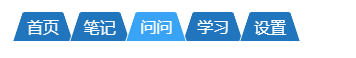
一、平行四边导航条
效果图:

代码:
<!DOCTYPE html>
<html>

	<head>
		<meta charset="UTF-8">
		<title></title>
		<style>
			.rhomboid li {
				list-style: none;
				position: relative;
				display: inline-block;
				padding: 10px 15px;
				color: #fff;
				cursor: pointer;
			}

			.rhomboid li::after {
				content: '';
				position: absolute;
				left: 0;
				right: 0;
				bottom: 0;
				top: 0;
				border-radius: 5px;
				z-index: -1;
				background: #2175BC;
				transform: skewX(-25deg);
			}

			.rhomboid li:hover::after {
				background: #39a3f5;
			}
		</style>
	</head>

	<body>
		<ul class='rhomboid'>
			<li>首页</li>
			<li>笔记</li>
			<li>问问</li>
			<li>学习</li>
			<li>设置</li>
		</ul>
	</body>

</html>
实现思路: 使用css3 的 2D变形中的 skew() 倾斜属性,让伪元素倾斜而不是li倾斜,是为了让li的文本正常显示。
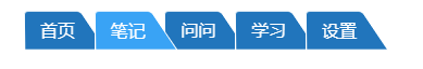
二、梯形导航条
效果图:
代码:
<!DOCTYPE html>
<html>

	<head>
		<meta charset="UTF-8">
		<title></title>
		<style>
			.rhomboid li {
				list-style: none;
				position: relative;
				display: inline-block;
				padding: 20px 15px 5px 15px;
				margin-left: -10px;
				color: #fff;
				cursor: pointer;
			}

			.rhomboid li::after {
				content: '';
				position: absolute;
				top: 0;
				bottom: 0;
				left: 0;
				right: 0;
				z-index: -1;
				background: #2175BC;
				border: 1px solid #fff;
				border-top-right-radius: 8px;
				border-top-left-radius: 8px;
				transform: perspective(0.5em) rotateX(5deg);
				transform-origin: bottom;
			}

			.rhomboid li:hover::after {
				background: #39a3f5;
			}
		</style>
	</head>

	<body>
		<ul class='rhomboid'>
			<li>首页</li>
			<li>笔记</li>
			<li>问问</li>
			<li>学习</li>
			<li>设置</li>
		</ul>
	</body>

</html>
实现思路: 使用css3 3D 变形中的 perspective()、rotateX()、transform-origin。
perspective(): 用于设置用户和元素3D空间Z平面之间的距离,值越小,用户与3D空间Z平面距离越近,视觉效果会明显;反之,值越大,用户与3D空间Z平面距离越远,视觉效果越小。
rotateX(): 3D空间上X轴的旋转
tansform-origin: 指定元素的旋转中心点位置,可以控制梯形倾斜。值为bottom,不倾斜;值为left,左倾斜;值为right,右倾斜。
如:
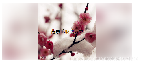
三、毛玻璃效果
效果图:
代码:
<!DOCTYPE html>
<html>

	<head>

		<meta charset="UTF-8">
		<title></title>
		<style>
			.rascal {
				position: relative;
				background: rgba(255, 255, 255, 0.3);
				overflow: hidden;
				/*这里是去除模糊带来的溢出阴影*/
				height: 200px;
				width: 450px;
			}

			.rascal::after {
				z-index: -1;
				content: '';
				position: absolute;
				top: 0;
				bottom: 0;
				left: 0;
				right: 0;
				background: url(img/timg.jpg) no-repeat;
				background-size: cover;
				filter: blur(20px);
			}

			.rascal div {
				display: flex;
				justify-content: center;
				align-items: center;
				height: 100%;
				width: 200px;
				margin: 0 auto;
				background: url(img/timg.jpg) no-repeat;
				background-size: cover;
			}
		</style>

	</head>

	<body>
		<div class='rascal'>
			<div>背景毛玻璃效果</div>
		</div>
	</body>

</html>
实现思路: 使用css3中的fiter滤镜,滤镜中的blur()用于将图片高斯模糊,值越大模糊效果越明显。伪元素模糊不会影响其他元素。


 扫一扫
扫一扫


 到【灌水乐园】发言


