


 本文介绍了使用matplotlib库创建柱状图的详细步骤,包括单列、并列、三列、四列和五列柱状图的实现,通过示例展示不同类型的柱状图效果。
matpltlib画图之柱状图
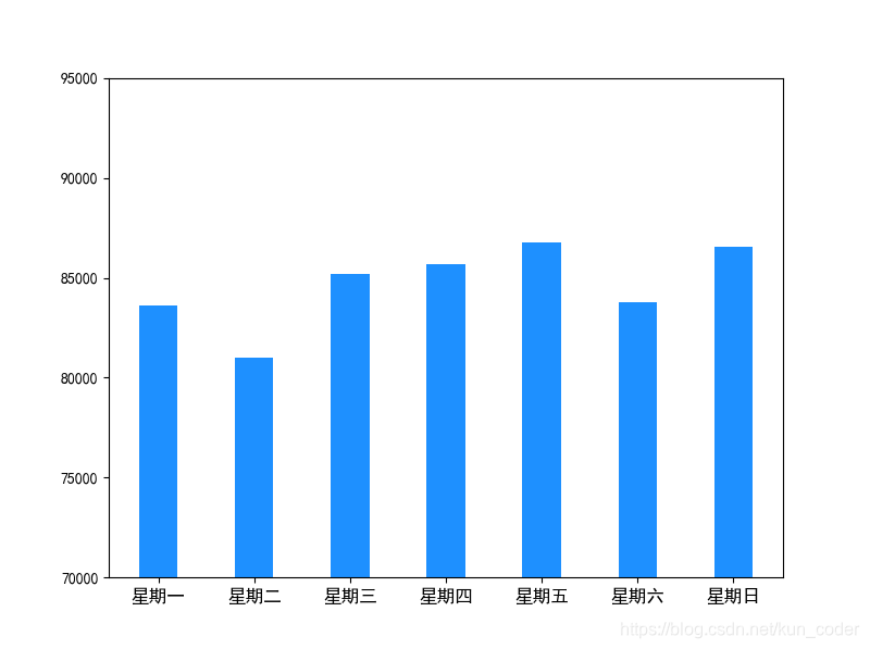
1. 单列柱状图
import matplotlib.pyplot as plt
import matplotlib as mpl
import numpy as np

mpl.rcParams["font.sans-serif"] = ["SimHei"]
mpl.rcParams["axes.unicode_minus"] = False
plt.figure(figsize=(8,6))
x = np.arange(7)
y1 = [83602, 80999, 85180, 85658, 86760, 83775, 86534]
plt.ylim((70000, 95000))
my_y_ticks = np.arange(70000, 95000.01,5000)
plt.yticks(my_y_ticks)
plt.xticks((0,1,2,3,4,5,6,7),('星期一','星期二','星期三','星期四','星期五','星期六','星期日'),size=12)
plt.bar(x,y1,width=0.4,color='dodgerblue')

plt.show()
运行效果如下:
2. 并列柱状图
import numpy as np
import matplotlib.pyplot as plt
import matplotlib as mpl
import seaborn as sns

# sns.set(color_codes=True)
mpl.rcParams["font.sans-serif"] = ["SimHei"]
mpl.rcParams["axes.unicode_minus"] = False

# 柱高信息
Y = [286, 56, 42, 51, 85]
Y1 = [116, 56, 92, 249, 582]
X = np.arange(len(Y))

bar_width = 0.25
tick_label = ['Comments rated 1', 'Comments rated 2', 'Comments rated 3', 'Comments rated 4', 'Comments rated 5', 'F']
fig1 = plt.figure(facecolor='white',figsize=(10,6))
# 显示每个柱的具体高度
for x, y in zip(X, Y):
    plt.text(x + 0.005, y + 0.005, '%.f' % y, ha='center', va='bottom')

for x, y1 in zip(X, Y1):
    plt.text(x + 0.24, y1 + 0.005, '%.f' % y1, ha='center', va='bottom')

# 绘制柱状图
plt.bar(X, Y, bar_width, align="center", color="red", label="unpurchased", alpha=0.5)
plt.bar(X + bar_width, Y1, bar_width, color="purple", align="center",
        label="purchased", alpha=0.5)

plt.xlabel("Comments rated")
plt.ylabel("Comments count")
# plt.title('Picture Name')

plt.xticks(X + bar_width / 2, tick_label)
# 显示图例
plt.legend()
plt.show()
fig1.savefig('result1.jpg', dpi=1000)
运行效果如下:

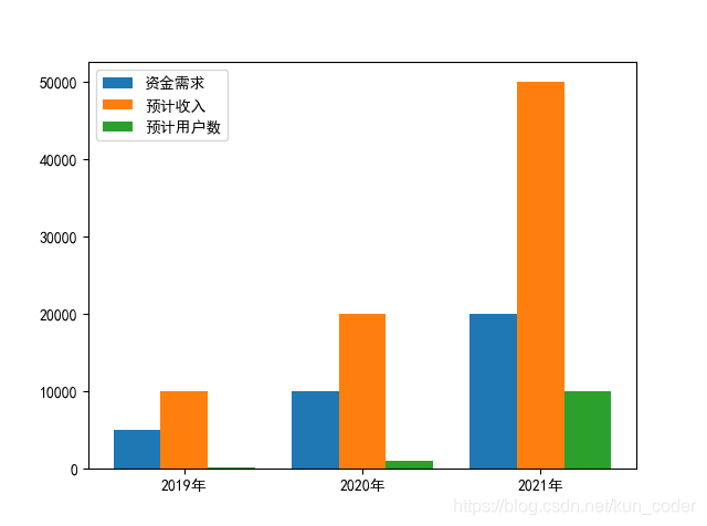
3. 三列柱状图
import numpy as np
import matplotlib as mpl
import matplotlib.pyplot as plt
mpl.rcParams["font.sans-serif"] = ["SimHei"]
mpl.rcParams["axes.unicode_minus"] = False
size = 3

x = np.arange(size)

a = np.array([5000,10000,20000])

b = np.array([10000,20000,50000])

c = np.array([100,1000,10000])

total_width, n = 0.8, 3

width = total_width / n

x = x - (total_width - width) / 2

plt.bar(x, a, width=width, label='资金需求')

plt.bar(x + width, b, width=width, label='预计收入')

plt.bar(x + 2 * width, c, width=width, label='预计用户数')

plt.xticks((0.0, 1.0, 2.0), ('2019年', '2020年', '2021年'))
plt.legend()
plt.show()
运行效果如下:
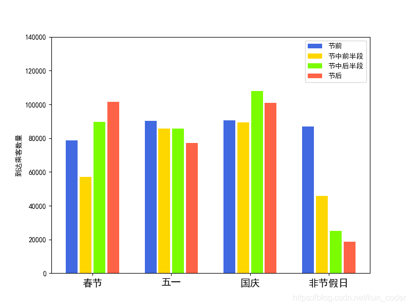
4. 四列柱状图
import matplotlib.pyplot as plt
import matplotlib as mpl
import numpy as np

mpl.rcParams["font.sans-serif"] = ["SimHei"]
mpl.rcParams["axes.unicode_minus"] = False
plt.figure(figsize=(8,6))
x = np.arange(4)
y1 = [78526, 90335, 90560, 86760]
y2 = [57149, 85823, 89354, 45660]
y3 = [89510, 85649, 107851, 25151]
y4 = [101517, 77286, 100832, 18556]

plt.ylim((0, 140000))
my_y_ticks = np.arange(0, 140000.01,20000)
plt.yticks(my_y_ticks)
plt.xticks((0.0, 1.0, 2.0, 3.0), ('春节', '五一', '国庆', '非节假日'), size=14)

total_width,n=0.7,4
width=total_width/n
x=x-(total_width-width)/2
plt.bar(x,y1,width=0.15,label='节前', color='royalblue')
plt.bar(x+width,y2,width=0.15,label='节中前半段',color='gold')
plt.bar(x+2*width,y3,width=0.15,label='节中后半段',color='lawngreen')
plt.bar(x+3*width,y4,width=0.15,label='节后',color='tomato')

plt.ylabel("到达乘客数量")
plt.legend()

plt.show()
运行效果如下:
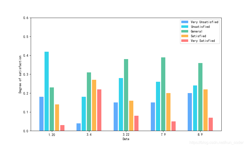
5. 五列柱状图
import matplotlib.pyplot as plt
import matplotlib as mpl
import numpy as np

mpl.rcParams["font.sans-serif"] = ["SimHei"]
mpl.rcParams["axes.unicode_minus"] = False

x = np.arange(5)
y1 = [0.18, 0.04, 0.15, 0.15, 0.20]
y2 = [0.42, 0.18, 0.28, 0.26, 0.24]
y3 = [0.23, 0.31, 0.38, 0.39, 0.36]
y4 = [0.14, 0.27, 0.16, 0.20, 0.22]
y5 = [0.03, 0.22, 0.08, 0.05, 0.07]

total_width, n = 0.7, 5
width = total_width / n
x = x - (total_width - width) / 2
plt.figure(figsize=(10, 6))
plt.ylim((0, 0.6))
my_y_ticks = np.arange(0, 0.6000000001, 0.1)
plt.yticks(my_y_ticks)
plt.bar(x, y1, width=0.8*width, color='#60ACFC', label='Very Unsatisfied')
plt.bar(x + width, y2, width=0.8*width, color='#32D3EB', label='Unsatisfied')
plt.bar(x + 2 * width, y3, width=0.8*width, color='#5BC49F', label='General')
plt.bar(x + 3 * width, y4, width=0.8*width, color='#FEB64D', label='Satisfied')
plt.bar(x + 4 * width, y5, width=0.8*width, color='#FF7C7C', label='Very Satisfied')

plt.xticks((0, 1, 2, 3, 4), ('1.20', '3.4', '3.22', '7.9', '8.9'))

plt.xlabel("Date")

plt.ylabel("Degree of satisfaction")

plt.legend()

plt.show()
运行效果如下:
 谢谢观看,有问题评论区留言!
欢迎加群:620139909


 3779
3779

 被折叠的 条评论
为什么被折叠?
被折叠的 条评论
为什么被折叠?
 到【灌水乐园】发言


