


 本文详细介绍CSS3中边框和阴影的高级用法,包括圆角边框、盒阴影及边框图片的设置方法。文章通过实例展示了如何利用border-radius属性实现圆角效果,以及box-shadow属性添加阴影,包括阴影的位置、模糊、扩展和颜色设置。
CSS3边框
新的CSS3边框属性
| 属性 | 作用 |
|---|---|
| border-image | 设置所有 border-image-*- 属性的简写属性 |
| border-radius | 设置所有四个 border-*-radius 属性的简写属性 |
| box-shadow | 向方框添加一个或多个阴影 |
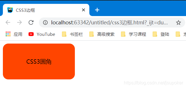
CSS3 圆角边框
<!DOCTYPE html>
<html lang="en">
<head>
    <meta charset="UTF-8">
    <title>CSS3边框</title>
    <style>
        #test{
            width: 200px;
            height: 100px;
            border-radius: 15px;

            background-color: orangered;
            text-align: center;
            line-height: 100px;
        }
    </style>
</head>
<body>
<div id="test">CSS3圆角</div>
</body>
</html>
单独设置各个圆角 >
| 属性 | 作用 |
|---|---|
| border-bottom-left-radius | 左下角 |
| border-bottom-right-radius | 右下角 |
| border-top-left-radius | 左上角 |
| border-top-right-radius | 右上角 |
<!DOCTYPE html>
<html lang="en">
<head>
    <meta charset="UTF-8">
    <title>CSS3边框</title>
    <style>
        #test{
            width: 200px;
            height: 100px;
            border-radius: 15px;

            background-color: orangered;
            text-align: center;
            line-height: 100px;
            float: left;
        }
        #b1{
            width: 200px;
            height: 100px;
            border-top-left-radius: 15px;

            background-color: #e63946;
            text-align: center;
            line-height: 100px;
            float: left;
        }
        #b2{
            width: 200px;
            height: 100px;
            border-top-right-radius: 15px;

            background-color: #fca311;
            text-align: center;
            line-height: 100px;
            float: left;
        }
        #b3{
            width: 200px;
            height: 100px;
            border-bottom-left-radius: 15px;

            background-color: #6930c3;
            text-align: center;
            line-height: 100px;
            float: left;
        }
        #b4{
            width: 200px;
            height: 100px;
            border-bottom-right-radius: 15px;

            background-color: #4361ee;
            text-align: center;
            line-height: 100px;
            float: left;
        }
    </style>
</head>
<body>
<div id="test">CSS3圆角</div>
<br>
<div id="b1"></div>
<br>
<div id="b2"></div>
<br>
<div id="b3"></div>
<br>
<div id="b4"></div>
</body>
</html>
上下错位显示是br标签,不然挤在一行上看不清楚
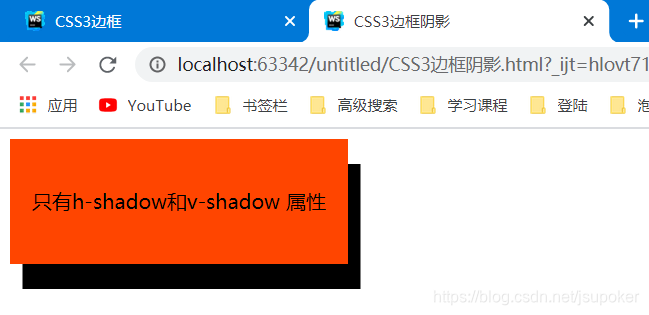
CSS3 盒阴影
语法: box-shadow: h-shadow v-shadow blur spread color inset;
| 属性 | 解释 |
|---|---|
| h-shadow | 必需的。水平阴影的位置。允许负值 |
| v-shadow | 必需的。垂直阴影的位置。允许负值 |
| blur | 可选。模糊距离 |
| spread | 可选。阴影的大小 |
| color | 可选。阴影的颜色。在CSS颜色值寻找颜色值的完整列表 |
| inset | 可选。从外层的阴影(开始时)改变阴影内侧阴影 |
只有h-shadow和v-shadow 属性:
<!DOCTYPE html>
<html lang="en">
<head>
    <meta charset="UTF-8">
    <title>CSS3边框阴影</title>
    <style>
        #test{
            width: 270px;
            height: 100px;
            box-shadow:10px 20px;

            background-color: orangered;
            text-align: center;
            line-height: 100px;
        }
    </style>
</head>
<body>
<div id="test">只有h-shadow和v-shadow 属性</div>
</body>
</html>
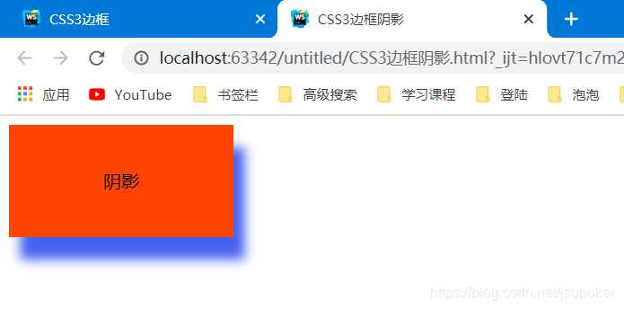
增加一个color属性:
<style>
        #test{
            width: 200px;
            height: 100px;
            box-shadow: #4361ee 10px 20px;

            background-color: orangered;
            text-align: center;
            line-height: 100px;
        }
    </style>
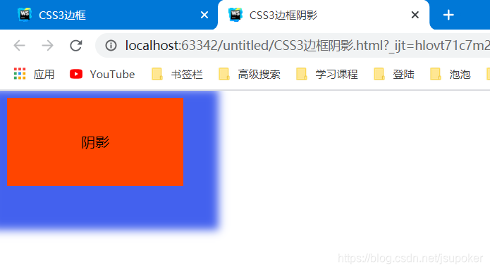
增加一个blur属性:
    <style>
        #test{
            width: 200px;
            height: 100px;
            box-shadow: #4361ee 10px 20px 10px;

            background-color: orangered;
            text-align: center;
            line-height: 100px;
        }
    </style>
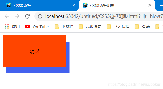
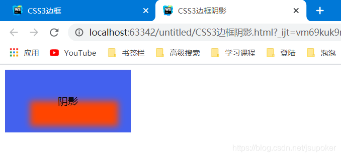
增加一个spread属性:
    <style>
        #test{
            width: 200px;
            height: 100px;
            box-shadow: #4361ee 10px 20px 10px 30px;

            background-color: orangered;
            text-align: center;
            line-height: 100px;
        }
    </style>
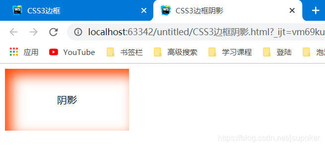
inset属性:
inset属性是内阴影,在阴影的效果前,加上inset即可转变成内阴影
    <style>
        #test{
            width: 200px;
            height: 100px;
            box-shadow:inset #4361ee 10px 20px 10px 30px;

            background-color: orangered;
            text-align: center;
            line-height: 100px;
        }
    </style>
    <style>
        #test{
            width: 200px;
            height: 100px;
            box-shadow:inset orangered 10px 10px 20px;

            background-color: white;
            text-align: center;
            line-height: 100px;
        }
    </style>


 扫一扫
扫一扫


 377
377

 被折叠的 条评论
为什么被折叠?
被折叠的 条评论
为什么被折叠?
 到【灌水乐园】发言


