


 本文详细介绍了Qt Quick中的DropShadow和InnerShadow两种阴影效果,包括它们的特点、使用方法及源码分析。通过示例展示了阴影效果,并提供了对应的QML代码,帮助理解如何在Qt应用中实现阴影效果。
Qt Quick提供了两种阴影效果:
- DropShow,阴影。这个元素会根据源图像,产生一个彩色的、模糊的新图像,把这个新图像放在源图像后面,给人一种源图像从背景上凸出来的效果。
- InnerShadow,内阴影。这个元素会根据源图像,产生一个彩色的、模糊的新图像,与 DropShadow不同的是,新图像会放在源图像里面。
效果
下面是我设计的示例效果。
首先是 DropShadow :
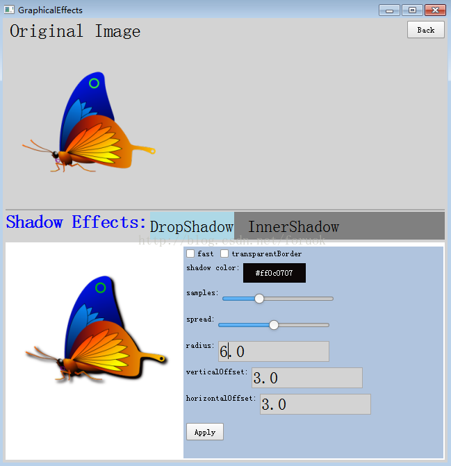
图1 阴影效果
然后是内阴影效果:
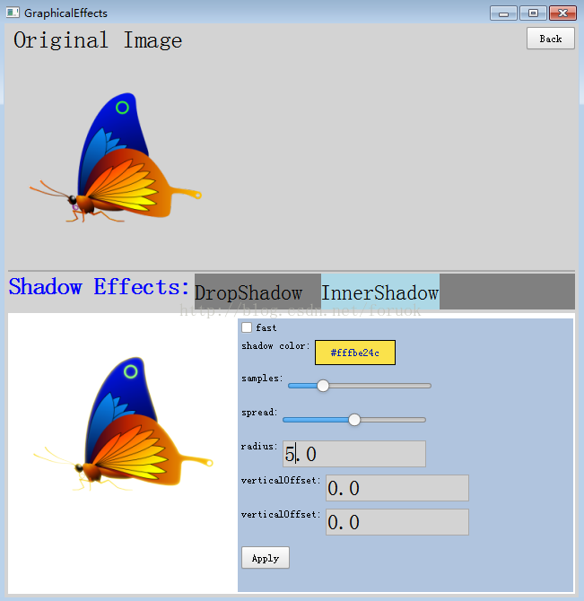
图2 内阴影效果
源码分析
如图1所示,界面被分为三部分。
最上面的是源图像。
源图像下面(即中间)是一个列表,你可以点击 DropShadow 和 InnerShadow 两个子项,切换不同的阴影效果。每种阴影效果都对应一个 qml 文档,当你点击这些子项时,对应的 qml 文档动态加载。
阴影示例界面
这个示例界面框架其实与“Qt Quick里的图形效果——颜色(Color)”是一致的,只是我把 ListView 从原来的竖向改为了横向。对应的 DropShadowExample.qml 内容如下:
import QtQuick 2.2import QtQuick.Controls 1.2Rectangle { id: example; signal back(); anchors.fill: parent; Text { id: origLabel; x: 10; y: 4; font.pointSize: 20; text: "Original Image"; } Button { anchors.right: parent.right; anchors.top: parent.top; anchors.margins: 4; text: "Back"; onClicked: example.back(); } Image { id: origImage; width: 240; height: 240; anchors.left: parent.left; anchors.top: origLabel.bottom; anchors.margins: 4; source: "butterfly.png"; sourceSize: Qt.size(240, 240); smooth: true; } Rectangle{ anchors.left: parent.left; anchors.leftMargin: 4; anchors.right: parent.right; anchors.rightMargin: 4; anchors.top: origImage.bottom; height: 2; border.width: 1; border.color: "darkgray"; } Text { id: effectsLabel; anchors.top: origImage.bottom; anchors.margins: 4; anchors.left: parent.left; font.pointSize: 20; font.bold: true; text: "Shadow Effects:"; color: "blue"; } Rectangle { id: shadowEffects; anchors.left: effectsLabel.right; anchors.leftMargin: 4; anchors.top: effectsLabel.top; anchors.right: parent.right; anchors.rightMargin: 4; height: 40; color: "gray"; ListView { anchors.fill: parent; clip: true; focus: true; orientation: ListView.Horizontal; spacing: 20; delegate: Text { id: wrapper; height: 40; verticalAlignment: Text.AlignVCenter; text: name; font.pointSize: 18; Keys.onEnterPressed: { event.accepted = true; effectControl.source = example; } Keys.onReturnPressed: { event.accepted = true; effectControl.source = example; } MouseArea { anchors.fill: parent; onClicked: { wrapper.ListView.view.currentIndex = index; effectControl.source = example; } } } highlight: Rectangle {  最低0.47元/天 解锁文章


 扫一扫
扫一扫


 468
468

 被折叠的 条评论
为什么被折叠?
被折叠的 条评论
为什么被折叠?
 到【灌水乐园】发言


