


更新
发现了一个好用的组件了 DataV!!动图更酷炫了
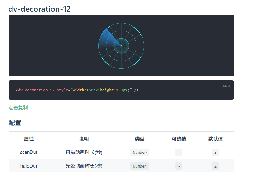
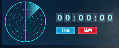
1. 效果图,需求
- 动态的雷达图
- 同时包含计时功能
- 可以通过按钮,控制【开始】【暂停】【重置】

2. 雷达图 重点代码
此处通过 css3 animation的效果实现的 雷达旋转
具体的 animation属性功能
JS
// 控制样式
const changeAnimation = computed(() => {
   // 此处就是通过动态样式来控制 雷达的效果
  return isStart.value ? 'radar-running' : isEnd.value ? 'radar-end' : 'radar-paused';
});
</script>
CSS
只保留了感觉重要的代码,如果想看全部的,可以直接滑动最下面查看
介绍类名:
- radar :绘画出雷达地图的底图的
- ::before: 控制右下角三个亮点的 【animation: blips 5s infinite;】对应 @keyframes blips 动画
- ::after: 控制雷达动画的,【animation: radar-beam 5s infinite;】对应 @keyframes radar-beam 动画
控制动画
//开始-running , 暂停:paused
animation-play-state: running;
<style lang="less" scoped>

.radar {
  background: radial-gradient(transparent 70%, #00ecff 69%, #00ecff 70%, transparent 70%),
    repeating-radial-gradient(
      rgba(32, 255, 77, 0) 5.8%,
      rgba(32, 255, 77, 0) 18%,
      #00ecff 18.6%,
      rgba(32, 255, 77, 0) 18.9%
    ),
    // 横线
    linear-gradient(
        0deg,
        rgba(32, 255, 77, 0) 49.5%,
        #00ecff 50%,
        #00ecff 50%,
        rgba(32, 255, 77, 0) 50.2%
      ),
    // 竖线
    linear-gradient(
        90deg,
        rgba(32, 255, 77, 0) 49.5%,
        #00ecff 50%,
        #00ecff 50%,
        rgba(32, 255, 77, 0) 50.2%
      );
}
.radar:before {
  animation: blips 5s infinite; //类名:blips ,周期:5,频率无限次:infinite
  animation-timing-function: linear;
  animation-delay: 1.4s;
}
.radar:after {
  animation: radar-beam 5s infinite; //类名:radar-beam,周期:5,频率无限次:infinite
  animation-timing-function: linear;
  transform-origin: bottom right;
  border-radius: 100% 0 0 0;
}
// 开始时状态
.radar-running:before,
.radar-running:after {
  animation-play-state: running; //开始-running , 暂停:paused
}
// 暂停时状态
.radar-paused:before,
.radar-paused:after {
  animation-play-state: paused; //开始-running , 暂停:paused
}
// 暂停时状态
.radar-end:before,
.radar-end:after {
  animation: slide-out 1s forwards; //设置新的slide-out 类名,重新定义起始值
}
</style>
3. 计时器 重点代码
JS
// 格式化
const formatTime = (milliseconds) => {
  const seconds = Math.floor((milliseconds / 1000) % 60);
  const minutes = Math.floor((milliseconds / (1000 * 60)) % 60);
  const hours = Math.floor((milliseconds / (1000 * 60 * 60)) % 24);
  const time = `${String(hours).padStart(2, '0')}:${String(minutes).padStart(2, '0')}:${String(
    seconds
  ).padStart(2, '0')}`;

  // 将所有的数字转为一个一个数组
  // 例如: 12:30:56 转换为 ['1','2',':','3','0',':','5','6']
  let result = time.split(/(?<=[\d])|(?=[\d])/).filter((item) => item !== '');
  // 转换为所需格式
  let formattedResult = result.flatMap((item) => {
    // 如果是数字,拆分成单个字符
    return /\d/.test(item) ? item.split('') : item;
  });
  return formattedResult;
};
4.雷达页 全部代码
tip:Stopwatch.vue 是计时器的页面
<!-- 雷达 -->
<template>
<div class="radar-page">
<div class="radar" :class="changeAnimation"></div>
<div class="time-box">
<Stopwatch ref="changeTime"></Stopwatch>
<el-button @click="startRadar" class="open-button">{{ isStart ? '暂停' : '开始' }}</el-button>
<el-button @click="endRadar" :disabled="isStart" class="end-button">结束</el-button>
</div>
</div>
</template>
<script setup>
import { ref, onMounted, computed } from 'vue';
import Stopwatch from './stopwatch.vue';
import { cloneDeep } from 'lodash-es';
const props = defineProps({
data: {
type: Object,
default: () => {}
}
});
const isStart = ref(false);
const isEnd = ref(false);
const changeTime = ref(null);
// 开始巡检
const startRadar = () => {
isStart.value = !isStart.value;
isEnd.value = false;
if (isStart.value) {
changeTime.value.startTimer();
} else {
changeTime.value.pauseTimer();
}
};
// 结束巡检
const endRadar = () => {
isStart.value = false;
isEnd.value = true;
changeTime.value.resetTimer();
};
// 控制样式
const changeAnimation = computed(() => {
return isStart.value ? 'radar-running' : isEnd.value ? 'radar-end' : 'radar-paused';
});
onMounted(() => {});
</script>
<style lang="less" scoped>
.radar-page {
display: flex;
justify-content: space-between;
align-items: center;
width: 100%;
}
.radar {
background: radial-gradient(transparent 70%, #00ecff 69%, #00ecff 70%, transparent 70%),
repeating-radial-gradient(
rgba(32, 255, 77, 0) 5.8%,
rgba(32, 255, 77, 0) 18%,
#00ecff 18.6%,
rgba(32, 255, 77, 0) 18.9%
),
// 横线
linear-gradient(
0deg,
rgba(32, 255, 77, 0) 49.5%,
#00ecff 50%,
#00ecff 50%,
rgba(32, 255, 77, 0) 50.2%
),
// 竖线
linear-gradient(
90deg,
rgba(32, 255, 77, 0) 49.5%,
#00ecff 50%,
#00ecff 50%,
rgba(32, 255, 77, 0) 50.2%
);
width: 380px;
height: 380px;
max-height: 450px;
max-width: 450px;
position: relative;
left: 0;
top: 0;
border-radius: 50%;
border: 5px solid #00ecff;
overflow: hidden;
}
.radar:before {
content: ' ';
display: block;
position: absolute;
width: 100%;
height: 100%;
border-radius: 50%;
animation: blips 5s infinite;
animation-timing-function: linear;
animation-delay: 1.4s;
}
.radar:after {
content: ' ';
display: block;
background-image: linear-gradient(44deg, rgba(0, 255, 51, 0) 50%, #58ebf6 100%);
width: 50%;
height: 50%;
position: absolute;
top: 0;
left: 0;
animation: radar-beam 5s infinite; //类名:radar-beam,周期:5,频率无限次:infinite
animation-timing-function: linear;
transform-origin: bottom right;
border-radius: 100% 0 0 0;
}
// 开始时状态
.radar-running:before,
.radar-running:after {
animation-play-state: running; //开始-running , 暂停:paused
}
// 暂停时状态
.radar-paused:before,
.radar-paused:after {
animation-play-state: paused; //开始-running , 暂停:paused
}
// 暂停时状态
.radar-end:before,
.radar-end:after {
animation: slide-out 1s forwards; //设置新的slide-out 类名,重新定义起始值
}
@keyframes radar-beam {
0% {
transform: rotate(45deg);
}
100% {
transform: rotate(360deg);
}
}
@keyframes blips {
14% {
background: radial-gradient(
2vmin circle at 75% 70%,
#ffffff 10%,
#00ecff 30%,
rgba(255, 255, 255, 0) 100%
);
}
14.0002% {
background: radial-gradient(
2vmin circle at 75% 70%,
#ffffff 10%,
#00ecff 30%,
rgba(255, 255, 255, 0) 100%
),
radial-gradient(
2vmin circle at 63% 72%,
#ffffff 10%,
#00ecff 30%,
rgba(255, 255, 255, 0) 100%
);
}
25% {
background: radial-gradient(
2vmin circle at 75% 70%,
#ffffff 10%,
#00ecff 30%,
rgba(255, 255, 255, 0) 100%
),
radial-gradient(
2vmin circle at 63% 72%,
#ffffff 10%,
#00ecff 30%,
rgba(255, 255, 255, 0) 100%
),
radial-gradient(
2vmin circle at 56% 86%,
#ffffff 10%,
#00ecff 30%,
rgba(255, 255, 255, 0) 100%
);
}
26% {
background: radial-gradient(
2vmin circle at 75% 70%,
#ffffff 10%,
#00ecff 30%,
rgba(255, 255, 255, 0) 100%
),
radial-gradient(
2vmin circle at 63% 72%,
#ffffff 10%,
#00ecff 30%,
rgba(255, 255, 255, 0) 100%
),
radial-gradient(
2vmin circle at 56% 86%,
#ffffff 10%,
#00ecff 30%,
rgba(255, 255, 255, 0) 100%
);
opacity: 1;
}
100% {
background: radial-gradient(
2vmin circle at 75% 70%,
#ffffff 10%,
#00ecff 30%,
rgba(255, 255, 255, 0) 100%
),
radial-gradient(
2vmin circle at 63% 72%,
#ffffff 10%,
#00ecff 30%,
rgba(255, 255, 255, 0) 100%
),
radial-gradient(
2vmin circle at 56% 86%,
#ffffff 10%,
#00ecff 30%,
rgba(255, 255, 255, 0) 100%
);
opacity: 0;
}
}
// 控制暂停
@keyframes slide-out {
from {
transform: rotate(45deg);
}
to {
transform: rotate(45deg);
}
}
.time-box {
.open-button {
border-radius: 4.81px;
box-shadow: inset 0px 0px 28.83px 0px rgba(210, 247, 255, 0.7);
background: rgb(0, 144, 209);
color: rgb(255, 255, 255);
font-size: 38px;
width: 180px;
height: 70px;
}
.end-button {
border-radius: 4.81px;
box-shadow: inset 0px 0px 28.83px 0px rgba(255, 225, 225, 0.7);
background: rgb(216, 0, 26);
color: rgb(255, 255, 255);
font-size: 38px;
width: 180px;
height: 70px;
}
}
</style>
5. 计时器页 全部代码
<template>
  <div class="timer">
    <li class="time-box" v-for="(item, index) in formatTime(elapsedTime)" :key="index">
      <span class="time-style">
        {{ item }}
      </span>
    </li>
  </div>
</template>

<script setup>
import { ref, watch } from 'vue';

const isRunning = ref(false); // 是否正在计时
const elapsedTime = ref(0); // 已耗时(以毫秒为单位)
let intervalId = null; // setInterval的ID

// 格式化
const formatTime = (milliseconds) => {
  const seconds = Math.floor((milliseconds / 1000) % 60);
  const minutes = Math.floor((milliseconds / (1000 * 60)) % 60);
  const hours = Math.floor((milliseconds / (1000 * 60 * 60)) % 24);
  const time = `${String(hours).padStart(2, '0')}:${String(minutes).padStart(2, '0')}:${String(
    seconds
  ).padStart(2, '0')}`;

  // 将所有的数字转为一个一个数组
  // 例如: 12:30:56 转换为 ['1','2',':','3','0',':','5','6']
  let result = time.split(/(?<=[\d])|(?=[\d])/).filter((item) => item !== '');
  // 转换为所需格式
  let formattedResult = result.flatMap((item) => {
    // 如果是数字,拆分成单个字符
    return /\d/.test(item) ? item.split('') : item;
  });
  return formattedResult;
};

// 启动计时器
const startTimer = () => {
  if (isRunning.value) return; // 如果已经在计时,直接返回
  isRunning.value = true; // 更新状态为“正在计时”
  intervalId = setInterval(() => {
    elapsedTime.value += 1000; // 每秒累加1000毫秒
  }, 1000);
};

// 暂停计时器
const pauseTimer = () => {
  isRunning.value = false; // 更新状态为“暂停”
  clearInterval(intervalId); // 清除计时器
};

// 重置计时器
const resetTimer = () => {
  isRunning.value = false; // 更新状态为“已重置”
  clearInterval(intervalId); // 清除计时器
  elapsedTime.value = 0; // 将已耗时设置为0
};
defineExpose({ startTimer, pauseTimer, resetTimer });
</script>

<style scoped>
.timer {
  display: flex;
  align-items: center;
  justify-content: space-between;
  margin: 30px 0 40px 0;
  .time-box {
    background: rgba(210, 219, 253, 0.1);
    /* background-image: url(./svgs/num-bg.png); */
    background-repeat: no-repeat;
    background-size: 100% 100%;
    list-style: none;
    padding: 5px 10px;
    box-sizing: border-box;
    margin: 0 5px;
    height: 90px;
    display: flex;
    align-items: center;
    .time-style {
      background: linear-gradient(180deg, rgb(0, 247, 255), rgb(213, 254, 255), rgb(0, 247, 255));
      -webkit-background-clip: text;
      -webkit-text-fill-color: transparent;
      background-clip: text;
      text-fill-color: transparent;
      font-family: D-DIN;
      font-size: 70px;
      font-weight: 700;
    }
    .time-text {
      font-size: 40px;
    }
    .time-hour {
      font-size: 28px;
    }
    .time-number {
      font-size: 72px;
    }
  }
}
</style>


 扫一扫
扫一扫


 1096
1096

 被折叠的 条评论
为什么被折叠?
被折叠的 条评论
为什么被折叠?
 到【灌水乐园】发言


