


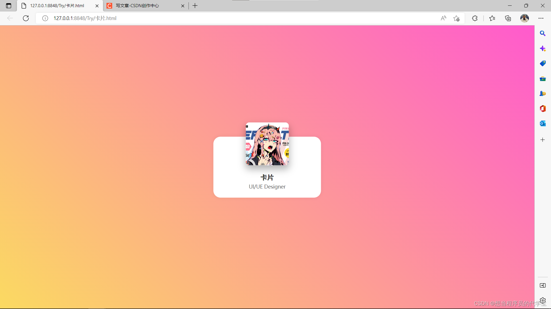
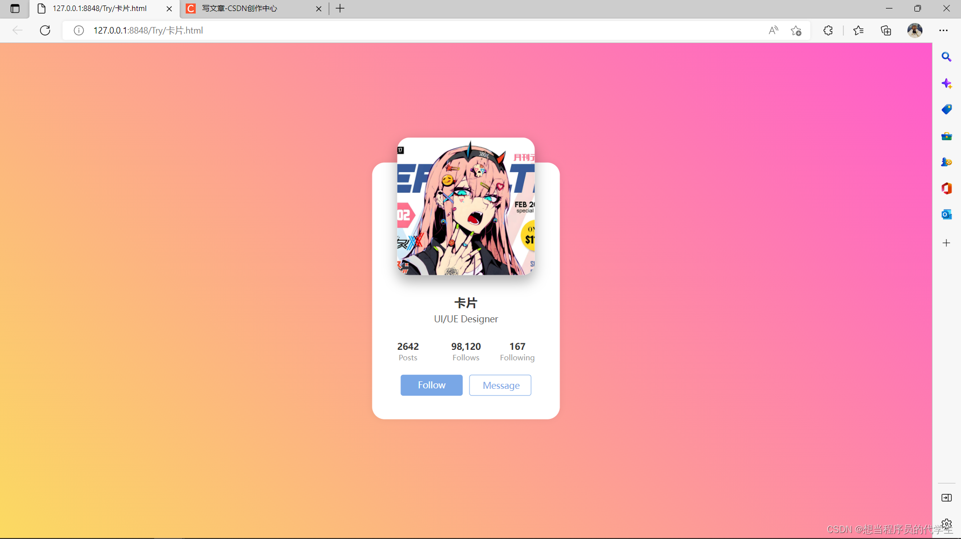
 本文介绍了一个使用HTML和CSS实现的卡片悬停效果案例。当鼠标悬停在卡片上时,卡片会展开显示更多信息,包括图片放大和个人统计信息等。通过简单的布局调整和过渡动画实现了动态效果。
运行静态效果
动态效果(鼠标进入图片区域会出现以下效果)
HTML代码段
<!DOCTYPE html>
<html>
<head>
<meta charset="utf-8">
<link href="css/card.css" rel="stylesheet" type="text/css"/>
<title></title>
</head>
<body>
<div class="container">
<div class="box">
<div class="profile"><img src="img/card.jpg"/></div>
<div class="info">
<h3>卡片</h3>
<p>UI/UE Designer</p>
<div class="user-info">
<div class="left">
<div class="item">
<div class="post-num">2642</div>
<div class="post">Posts</div>
</div>
</div>
<div class="center">
<div class="item">
<div class="follows-num">98,120</div>
<div class="follows">Follows</div>
</div>
</div>
<div class="right">
<div class="item">
<div class="following-num">167</div>
<div class="following">Following</div>
</div>
</div>
</div>
<div class="btn">
<div class="btn-follow">Follow</div>
<div class="btn-msg">Message</div>
</div>
</div>
</div>
</div>
</body>
</html>
Css代码段
*{
margin: 0;
padding: 0;
box-sizing: border-box;
}
body{
width: 100vw;
height: 100vh;
/* background-image: linear-gradient(to right top,#d16ba5,#c777b9,#ba83ca,#aa8fd8,#9a9ae1,#8aa7ec,#79b3f4,#69bff8,#52cffe,#41dfff,#46eefa,#5ffbf1); */
background: linear-gradient(45deg,#fbda61,#ff5acd);
}
.container{
position: absolute;
transform: translate(-50%,-50%);
top: 50%;
left: 50%;
}
.box{
width: 300px;
height: 170px;
border-radius: 20px;
background-color: #fff;
box-shadow: 0 0 10px 1px #0000000d;
transition: all .3s;
}
.box .profile{
width: 100%;
display: flex;
justify-content: center;
position: relative;
top: -40px;
}
.box .profile img{
width: 120px;
height: 120px;
border-radius: 10px;
box-shadow: 0 10px 20px 1px rgba(0 0 0 / 0.3);
transition: all .5s;
}
.box .info{
height: 70px;
position: relative;
top: -20px;
text-align: center;
padding: 0 40px;
overflow: hidden;
transition: all .2s;
}
.box .info h3{
color: #333;
margin-bottom: 5px;
}
.box .info p{
font-size: 14px;
color: #666;
margin-bottom: 25px;
}
.info .user-info{
display: flex;
justify-content: space-between;
}
.info .user-info > div{
position: relative;
width: 33.33%;
}
.info .user-info > div > .item > div:first-child{
color: #333;
font-size: 14px;
font-weight: 700;
}
.info .user-info > div > .item > div:last-child{
color: #999;
font-size: 12px;
}
.left .item{
position: absolute;
left: 0;
}
.right .item{
position: absolute;
right: 0;
}
.info .btn{
display: flex;
justify-content: space-around;
margin-top: 20px;
}
.info .btn > div{
width: 45%;
padding: 6px 20px;
border-radius: 4px;
font-size: 14px;
cursor: pointer;
}
.info .btn .btn-follow{
background-color: #79a7e6;
color: #fff;
}
.info .btn .btn-msg{
border: 1px solid #78a7e6;
color: #79a7e6;
}
.box:hover{
height: 410px;
}
.box:hover .profile img{
width: 220px;
height: 220px;
border-radius: 20px;
}
.box:hover .info{
height: 200px;
margin-top: 10px;
}
仅供学习讨论,禁止用于商业用途
在校大学生欢迎各位指导,感谢点赞


 扫一扫
扫一扫


 2006
2006

 被折叠的 条评论
为什么被折叠?
被折叠的 条评论
为什么被折叠?
 到【灌水乐园】发言


