


matplotlib简单绘图
注意:
- 使用Jupyter notebook时,在每个单元格运行后,图表被重置,因此对于更复杂的图表,你必须将所有的绘图命令放在单个的notebook单元格中。
fig = plt.figure(figsize = (8, 6))

# 绘制2*2图形,选择第一个
ax1 = fig.add_subplot(2, 2, 1)
ax2 = fig.add_subplot(2, 2, 2)
ax3 = fig.add_subplot(2, 2, 3)

plt.plot(np.random.randn(50).cumsum(), 'k--')
ax1.hist(np.random.randn(100), bins = 20, color = 'k', alpha = 0.3)
ax2.scatter(np.random.randn(50), np.random.randn(50))
out: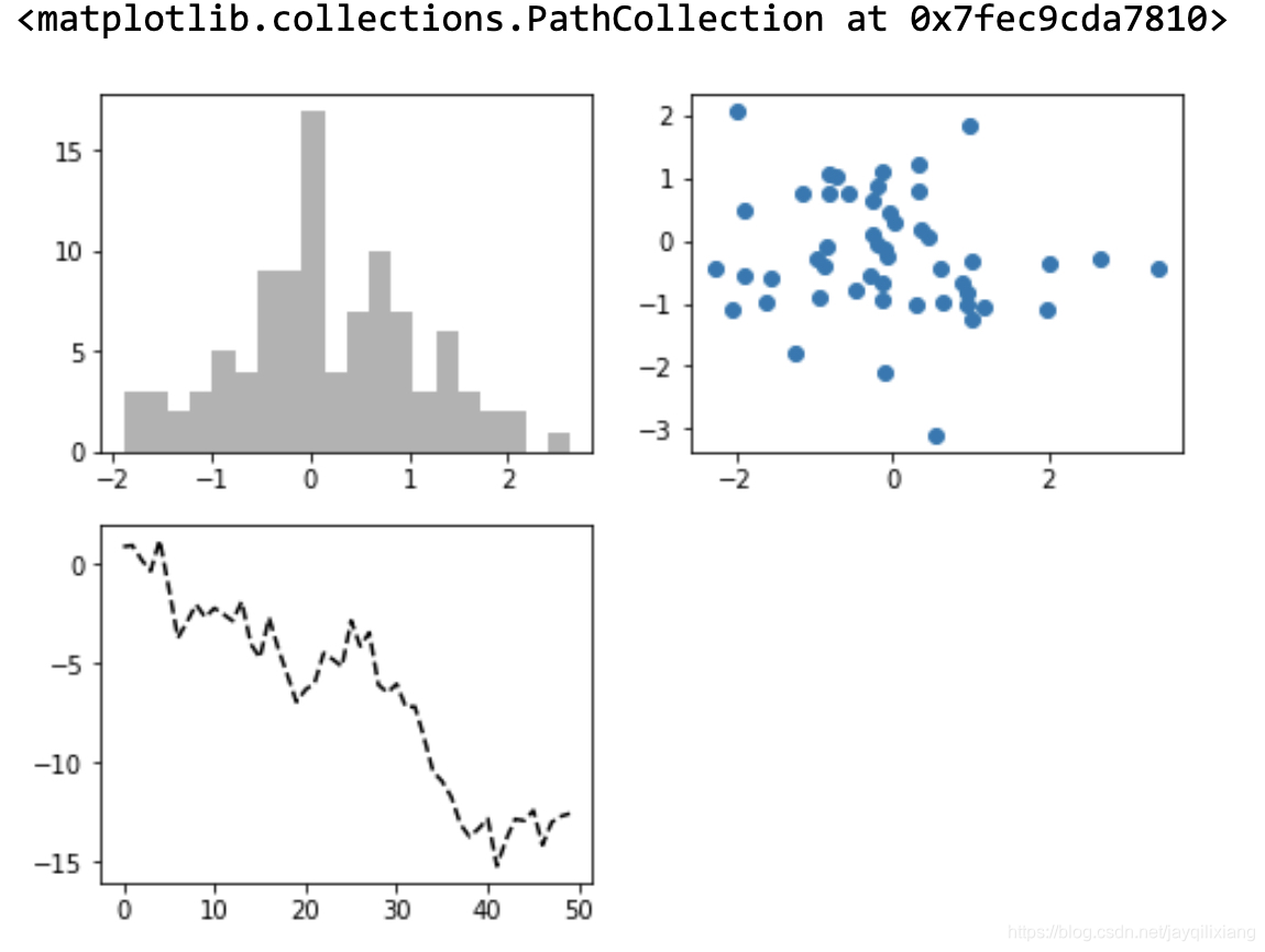
数组axes
- 数组axes可以像二维数组那样方便地进行索引,例如,axes[0, 1]。你也可以通过使用sharex和sharey来表明子图分别拥有相同的x轴或y轴。
- 当你在相同的比例下进行数据对比时,sharex和sharey会非常有用;此外,matplotlib还可以独立地缩放图像的界限。
fig2, axes = plt.subplots(2, 3, figsize = (12, 8), sharex = True, sharey = True)

for i in range(axes.shape[0]):
    for j in range(axes.shape[1]):
        axes[i][j].hist(np.random.randn(500), bins = 50, color = 'k', alpha = 0.3)

plt.subplots_adjust(wspace = 0, hspace = 0)
plt.legend(loc = 'best')
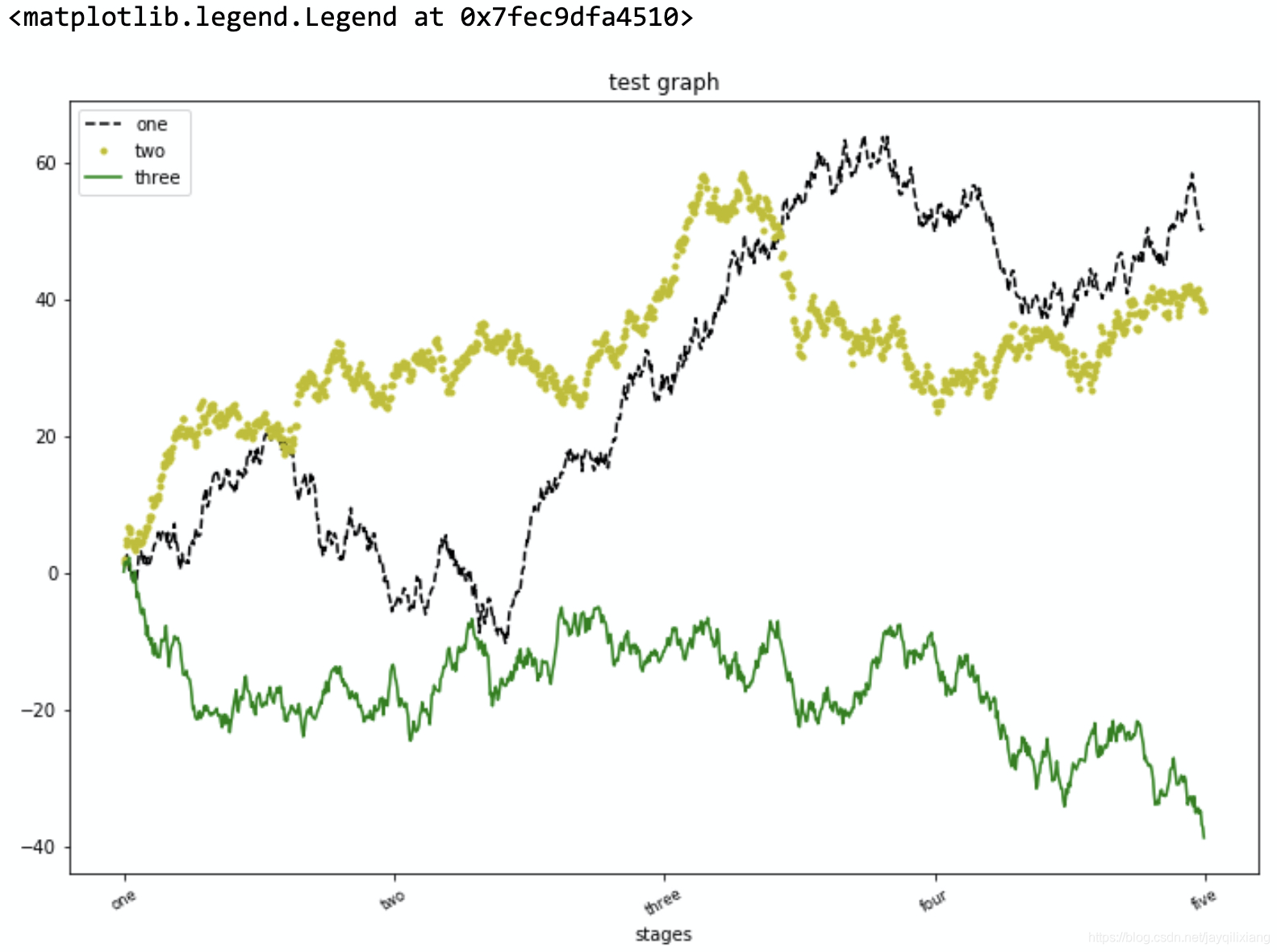
fig = plt.figure(figsize = (12, 8))

ax1 = fig.add_subplot(1, 1, 1)
ax1.plot(np.random.randn(1000).cumsum(), 'k--', label = 'one')
ax1.plot(np.random.randn(1000).cumsum(), 'y.', label = 'two')
ax1.plot(np.random.randn(1000).cumsum(), 'g', label = 'three')

# 设置轴刻度
ticks = ax1.set_xticks([0, 250, 500, 750, 1000])
# 设置刻度标签
labels = ax1.set_xticklabels(['one', 'two', 'three', 'four', 'five'], rotation = 30, fontsize = 'small')

ax1.set_title('test graph')
ax1.set_xlabel('stages')
ax1.legend(loc = 'best')
保存图片
plt.savefig('figpath.png', dpi = 400, bbox_inches = 'tight')
pandas与seaborn绘图
默认折线图
# subplots参数代表将每一列分开绘图
df.plot(subplots = True, sharex = True, sharey = True, figsize = (12, 8), title = 'test', sort_columns = True)
柱状图
# Series
fig, axes = plt.subplots(2, 1, figsize = (12, 8))
data = pd.Series(np.random.randn(16), index = list('abcdefghijklmnop'))
data.plot.bar(ax = axes[0], color = 'k', alpha = 0.7)
# data.plot.barh(ax = axes[0], color = 'k')
s.value_counts().plot.bar()

# dataframe
df.plot.bar()
# 堆叠柱状图
df.plot.barh(stacked = True, alpha = 0.5)
# 转化为交叉表
tmp = pd.crosstab(df1['c'], df1['d'])
# 标准化,确保每一行的和为1
tmp_pcts = tmp.div(tmp.sum(1), axis = 0)
tmp_pcts.plot.bar()
直方图与密度图
s.plot.hist(bins = 50)
s.plot.density()
sns.distplot(data, bins = 50, color = 'k')
sns.barplot(x = 'c', y = 'd', data = df, hue = 'time', orient = 'h')
# 更改调色板
sns.set(style = 'whitegrid')
散点图
sns.regplot('col1', 'col2', data = df)
# 散点图矩阵
sns.pairplot(data, diag_kind = 'kde', plot_kws = {'alpha': 0.2})
分面网格和分类数据
sns.factorplot(x = 'day', y = 'tip', hue = 'time', col = 'smoker', kind = 'bar', data = tips[tips.tip < 1])

sns.factorplot(x = 'day', y = 'tip', row = 'time', col = 'smoker', kind = 'box', data = tips[tips.tip < 1])


 536
536

 被折叠的 条评论
为什么被折叠?
被折叠的 条评论
为什么被折叠?
 到【灌水乐园】发言


