 ReactNative组件详解


 本文深入讲解ReactNative中关键组件的使用方法,包括View、ScrollView、Image、Text、TextInput、FlatList、SectionList和TouchableOpacity的属性、样式及示例代码,为开发者提供全面的组件参考。
React Native组件参考文档
文章目录
View
属性模板
<View style={styles.container}></View>
样式模板
container:{
        // 宽度
        // width:375,
        // 高度
        height:669,

        // 主轴方向  enum('row', 'column')
        flexDirection:'row',
        // 主轴对齐 enum('center','flex-start','flex-end','space-around','space-between',  baseline')
        justifyContent:'flex-start',
        // 侧轴对齐 enum('center','flex-start','flex-end','stretch'  baseline')
        alignItems:'flex-start',
        //换行 enum('nowrap',  'wrap', 'wrap-reverse');
        flexWrap:'wrap',

        /* 子盒子属性 */
        // 等比放大
        //flexGrow: 0,
        // 等比缩小
        //flexShrink: 1,
        // 侧轴固定长度 number或'auto';  'auto'表示跟随width
        //flexBasis: 'auto',
        // 子盒子侧轴对齐 enum('auto', 'center','flex-start','flex-end','stretch'  baseline'); auto表示继承父元素的
        //alignSelf: 'auto',


        // 背景颜色
        backgroundColor:'#F8F8F8',

        // 边框样式 enum('solid', 'dotted', 'dashed')
        borderStyle:'solid',

        //  边框厚度
        borderWidth:2,
        // borderTopWidth: 2,
        // borderRightWidth: 2,
        // borderBottomWidth: 2,
        // borderLeftWidth: 2,

        // 边框颜色
        borderColor:'#A8A8A8',
        // borderTopColor: 'red',
        // borderRightColor: 'red',
        // borderBottomColor: 'red',
        // borderLeftColor: 'red',

        //  边框圆角
        borderRadius:0,
        // borderTopLeftRadius: 0,
        // borderTopRightRadius: 0,
        // borderBottomLeftRadius: 0,
        // borderBottomRightRadius: 0,

        //内边距
        padding: 0,
        // paddingTop: 0,
        // paddingBottom: 0,
        // paddingLeft: 0,
        // paddingRight: 0,

        //外边距
        margin: 0,
        // marginTop: 0,
        // marginBottom: 0,
        // marginLeft: 0,
        // marginRight: 0,

        // 阴影(仅限于IOS, Android请使用第三方插件)
        // shadowOffset: {width: 0, height: 0},
        // shadowColor: 'black',
        // shadowOpacity: 1,
        // shadowRadius: 5

        // 背景透明度(包括边框) number
        opacity:1,

        // 内容溢出处理 enum('visible', 'hidden')
        overflow:'hidden'
    	// 翻转页面时是否可见 enum('visible', 'hidden')
        backfaceVisibility:'visible',
    }
示例
示例代码
import React, { Component } from 'react';
import {StyleSheet, View, Text,Image, FlatList } from 'react-native';

const Dimensions = require('Dimensions');
//窗口宽度
let {width} = Dimensions.get('window');
// 子盒子固定的外边距
const itemPadding = 20;
// 子盒子的边框厚度
const itemBorderWidth = 2;

class ViewDemo extends Component{
    render(){
        return (
            <View style={styles.container}>
                <View style={styles.item1}>
                </View>
                <View style={styles.item1}>
                </View>
                <View style={styles.item1}>
                </View>
                <View style={styles.item1}>
                </View>
                <View style={styles.item1}>
                </View>
                <View style={styles.item1}>
                </View>
                <View style={styles.item1}>

                </View>

            </View>
        );
    }
}
const styles = StyleSheet.create({
    container:{
        // 宽度
        width:width,
        // 高度
        height:800,

        // 主轴方向  enum('row', 'column')
        flexDirection:'row',
        // 主轴对齐 enum('center','flex-start','flex-end','space-around','space-between',  baseline')
        justifyContent:'flex-start',
        // 侧轴对齐 enum('center','flex-start','flex-end','stretch'  baseline')
        alignItems:'flex-start',
        //换行 enum('nowrap',  'wrap', 'wrap-reverse');
        flexWrap:'wrap',


        // 背景颜色
        backgroundColor:'#F8F8F8',
        // 边框样式 enum('solid', 'dotted', 'dashed')
        borderStyle:'solid',
        //  边框厚度
        borderWidth:2,
        // 边框颜色
        borderColor:'#A8A8A8',
        //  边框圆角
        borderRadius:0,
        //内边距
        padding: 0,
        //外边距
        margin: 0,
        // 内容溢出处理 enum('visible', 'hidden')
        overflow:'hidden'
    },

    item1:{
       // 宽度
       width:(width - 3*itemPadding - 6*itemBorderWidth)/3,
       // 高度
       height:200,

       // 背景颜色
       backgroundColor:'#F8F8F8',
       // 边框样式 enum('solid', 'dotted', 'dashed')
       borderStyle:'solid',
       //  边框厚度
       borderWidth:itemBorderWidth,
       // 边框颜色
       borderColor:'blue',
       marginTop: itemPadding,
       marginLeft: itemPadding,

    },

});

export default ViewDemo;
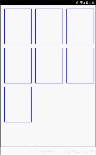
示例效果图
ScrollView
属性模板
<ScrollView
    // contentContainerStyle={styles.scrollviewStyle}
    // 水平或垂直滑动
    // horizontal={true}
    //是否分页,滚动条会停在滚动视图的尺寸的整数倍位置
    pagingEnabled={false}

    // (Android不支持)滚动视图的时候,是否要隐藏软键盘 enum('none', "interactive", 'on-drag')
    // keyboardDismissMode={'on-drag'}
    // 点击视图,是否隐藏软键盘 enum('always', 'never', 'handled')
    keyboardShouldPersistTaps={'always'}
    //滚动动画开始时调用此函数
    onMomentumScrollStart={(e)=>{}}
    // 滚动动画结束时调用此函数
    onMomentumScrollEnd={(e)=>{}}
    // 在滚动的过程中,每帧最多调用一次此回调函数
    onScroll={(e)=>{}}
    // (Android不支持)scroll事件被调用的频率(单位是每秒事件数量)
    // scrollEventThrottle={100}
    //是否显示水平方向的滚动条
    showsHorizontalScrollIndicator={true}
    //是否显示垂直方向的滚动条
    showsVerticalScrollIndicator={true}

    //组件大小改变时调用
    onContentSizeChange={this._changeContentSize}
    //禁止or开启滚动
    //scrollEnabled={false}
    >
</ScrollView>
样式模板
scrollviewStyle:{
        //翻页时是否可见 enum('visible', 'hidden')
        // backfaceVisibility:'visible',

        //宽度(在水平滚动时无效)
        width:375,
        //高度(在垂直滚动时无效)
        // height:500,

        //背景色
        backgroundColor:'#F8F8F8',

        //外边距
        margin: 100,
        // marginTop: 100,
        // marginLeft: 100,
        // marginLeft: 100,
        // marginBottom: 100,

        // Flex布局(当样式属性为contentContainerStyle有效)
        // flexDirection: 'column',
        // justifyContent:'flex-start',
        // alignItems: 'center',

        //边框厚度
        borderWidth:2,
        // borderTopWidth number
        // borderRightWidth number
        // borderBottomWidth number
        // borderLeftWidth number

        //边框颜色
        borderColor:'#A8A8A8',
        // borderTopColor string
        // borderRightColor string
        // borderBottomColor string
        // borderLeftColor string
        // 边框圆角
        borderRadius: 10,
        // borderTopLeftRadius number
        // borderTopRightRadius number
        // borderBottomLeftRadius number
        // borderBottomRightRadius number

        //边框样式 enum('solid', 'dotted', 'dashed')
        borderStyle: 'solid',

        //透明度
        opacity:0.8,
        // 溢出处理 enum('visible', 'hidden')
        // overflow:'hidden',
    }
示例1
示例1代码
import React, { Component } from 'react';
import {StyleSheet, View, Text,TextInput, ScrollView } from 'react-native';

let data = [1,2,3,4,5,6,7,8,9,10,11,12,13,14];

class ScrollViewDemo extends Component{

    render(){
        return (
            <View style={{flex:1, backgroundColor:'yellow'}}>
                <ScrollView
                style={styles.scrollviewStyle}
                // contentContainerStyle={styles.scrollviewStyle}
                >
                    {data.map((value, index, dataArr)=>{
                        return (<Text key={index} style={styles.textStyle}>{value}</Text>);
                    })}
                </ScrollView>
            </View>
        );

    }


}

const styles = StyleSheet.create({
    scrollviewStyle:{

        //宽度(在水平滚动时无效)
        width:375,
        //高度(在垂直滚动时无效)
        // height:500,
        //背景色
        backgroundColor:'#F8F8F8',
        //外边距
        margin: 100,

        // Flex布局(当样式属性为contentContainerStyle有效)
        // flexDirection: 'column',
        // justifyContent:'flex-start',
        // alignItems: 'center',

        //边框厚度
        borderWidth:2,

        //边框颜色
        borderColor:'#A8A8A8',
        // 边框圆角
        borderRadius: 10,
        //边框样式 enum('solid', 'dotted', 'dashed')
        borderStyle: 'solid',

        //透明度
        opacity:0.8,

    },
    textStyle:{
        width:'auto',
        height:100,
        fontSize: 30,
    }
});
export default ScrollViewDemo;
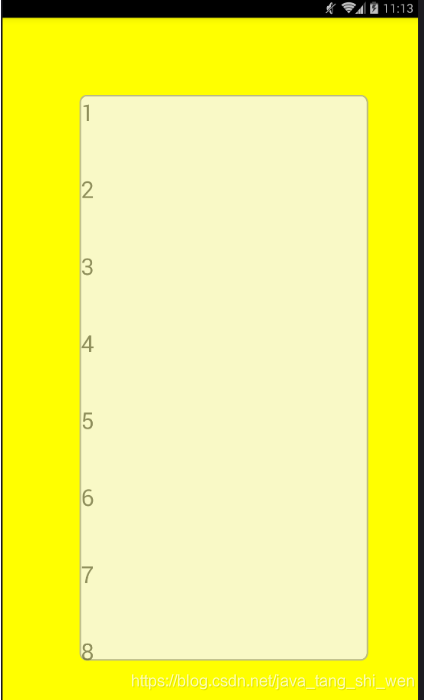
示例1效果图
当**style={styles.scrollviewStyle}**时:
并且外层的View固定,ScrollView可滑动,如图
当**contentContainerStyle={styles.scrollviewStyle}**时(官方推荐做法):
flexDirection: 'column',
justifyContent:'flex-start',
alignItems: 'center',
上述样式才能生效,并且外层的View可滑动,ScrollView固定不动,如下图:
示例2-横向滑动应用
示例2代码
import React, { Component } from 'react';
import {StyleSheet, View, Text, Image, ScrollView } from 'react-native';
import {scrollViewImage} from './resources/imgs/Images';
const Dimensions = require('Dimensions');
let {width} = Dimensions.get('window');
let pages = require('./pages.json');
let imglength = 5;
export default class ScrollViewDemo extends Component {
constructor(props) {
super(props);
this.state = {
currentPage:0
};
}
//只有在createClass()中存在
// getDefaultProps(){
// return (
// {pagesData:pages.data}
// );
// }
//es6的写法:
static defaultProps = {
duration:3000
}
//组件加载后调用定时器
componentDidMount(){
let scrollveiw = this.refs.scrollveiw;
this.timer = setInterval(()=>{
let scrollview = this.refs.scrollview;
console.log('start to count time');
//使图片滚动起来
let nextPage = this.state.currentPage+1;
if(nextPage >= imglength){
nextPage=0;
}
scrollview.scrollTo( {x:nextPage*width, y:0, animated:true});
this.setState({currentPage:nextPage});
}, this.props.duration);
}
// 组件卸载前必先清除定时器
componentWillUnmount(){
console.log('clear timer');
this.timer && clearInterval(this.timer);
}
render() {
return (
<View style={styles.container}>
<ScrollView ref='scrollview'
// 水平显示
horizontal={true}
// 不显示滑动条
showsHorizontalScrollIndicator={false}
//自动分页
pagingEnabled={true}
//当一帧滚动结束
onMomentumScrollEnd={(e)=>this.onAnimationEnd(e)}
>
{/* 显示所有的图片 */}
{this.renderAllImgs()}
</ScrollView>
{/* 显示轮播页面底栏 */}
<View style={styles.pagebarStyle}>
{/* 显示所有原点 */}
{this.renderAllCircles()}
</View>
</View>
);
}
renderAllImgs(){
return pages.map((page)=>{
return(
<Image key={page.index} source={scrollViewImage[page.img]} style={styles.imgStyle} ></Image>
);
});
}
renderAllCircles(){
let obj = this;
return pages.map((page)=>{
let style = (page.index == obj.state.currentPage)?{color:'#c1c'}:{color:'white'};
return(
<Text key={page.index} style={[styles.circleStyle,style]}>•</Text>
);
});
}
onAnimationEnd(e){
// console.log(e); //e 是SyntheticEvent
// console.log(e.nativeEvent); 输出如下:
// {target: 17, responderIgnoreScroll: true, velocity: {…}, layoutMeasurement: {…}, contentSize: {…}, …}
// contentInset: {right: 0, left: 0, bottom: 0, top: 0}
// contentOffset: {y: 0, x: 1350} //y, x表示显示的内容所在的坐标
// contentSize: {height: 200, width: 2250} //表示scrollview的长宽
// layoutMeasurement: {height: 200, width: 450} //页面的尺寸
//计算出当前页,修改状态
console.log(Math.floor(e.nativeEvent.contentOffset.x/width));
let cur = Math.floor(e.nativeEvent.contentOffset.x/width);
this.setState({currentPage:cur});
}
}
const styles = StyleSheet.create({
container:{
marginTop:0
},
imgStyle:{
width:width,
height:200,
},
pagebarStyle:{
width:width,
height:20,
backgroundColor:'rgba(0,0,0,0.1)',
position:'absolute',
bottom:0,
flexDirection: 'row',
alignItems: 'center', //对于文字,alignItems必须结合lineHeigth才有效
justifyContent:'center'
},
circleStyle:{
fontSize:30,
lineHeight:40,
color: '#fcfcfc'
}
});
示例2效果图

Image
属性模板
<Image
    style={styles.imageStyle}
    source={require('../demo/resources/imgs/scrollView/img_01.png')}
    >

</Image>
样式模板
imageStyle:{
        //指定宽高
        width:width,
        height: 150,

        //翻页是否可见
        // backfaceVisibility: enum('visible', 'hidden')
        // 背景颜色
        backgroundColor: '#a8a8a8',

        //边框圆角
        // borderRadius: 0,
        // borderTopLeftRadius: 0,
        // borderTopRightRadius: 0,
        // borderBottomLeftRadius: 0,
        // borderBottomRightRadius: 0,
        //边框厚度
        borderWidth: 1,
        // 边框颜色
        borderColor: '#a8a8a8',
        // 透明度
        // opacity: number
        // 溢出处理 enum('visible', 'hidden')
        overflow: 'hidden',
        //图片填充模式 enum('cover', 'contain', 'stretch', 'repeat', 'center')
        resizeMode:'cover',
    }
示例
Text
属性模板
-
numberOfLines 文本行数限制,添加后超过限制行数文本会在末尾默认以…的形式省略。
-
ellipsizeMode 设置文本缩略格式,配合numberOfLines使用(Android下只有tail有效),values:
tail:在末尾…省略(默认值)
clip:在末尾切割,直接切割字符无省略符
head:在前面…省略
middle:在中间…省略
-
onPress 点击事件
<Text
    // 行数限制
    numberOfLines={1}
    style={styles.textStyle}>
    Hello, this is Jacy.
</Text>
样式模板
textStyle:{
        /*继承View组件的所有Style*/
    // 字体颜色
        color:'black',
    // 字体大小
        fontSize:30,
    // 字体名称
    // fontFamily:'SimSun',
    // 字体风格 enum('normal','italic')
      fontStyle:'normal',
    // 字体粗细 enum('normal','bold','100','200')
        fontWeight:'normal',
    // 行高
        lineHeight:40,
    // 设置阴影效果
        textShadowOffset:{width:0,height:0},
    // 阴影效果圆角
        textShadowRadius:0,
    // 阴影效果的颜色
        textShadowColor:'#4D4D4D',


    // 文本对齐方式 enum('auto','left','right','center','justify')
        textAlign:'left',
    // 文本垂直对齐方式 enum('auto','top','bottom','center'); 不支持iOS,只支持Android
        textAlignVertical:'center',


    // 横线位置 enum('none','underline','line-through','underline line-through')
        // textDecorationLine:'underline line-through',

    /* 不支持Android */
    // 线的风格 enum('solid','double','dotted','dashed'); 只支持IOS, 不支持Android
        // textDecorationStyle:'solid',
    // 线的颜色; 只支持IOS, 不支持Android
        // textDecorationColor:'#c3c',
    // 文本方向 enum('auto','ltr','rtl');  只支持IOS, 不支持Android
        // writingDirection:'auto',
    // 字符间距; 只支持iOS,不支持Android
        // letterSpacing:30,
    }
示例
示例代码
import React, { Component } from 'react';
import {StyleSheet, View, Text,Image, FlatList } from 'react-native';

const Dimensions = require('Dimensions');
//窗口宽度
let {width} = Dimensions.get('window');

class TextDemo extends Component{
    render(){
        return(
            <View style={styles.container}>
                <Text
                // 行数限制
                numberOfLines={2}
                // 省略号的位置(Android下只有tail有效)
                ellipsizeMode='tail'
                style={[styles.textStyle1, styles.textStyle]}>
                鹅鹅鹅鹅鹅鹅鹅鹅鹅鹅鹅鹅鹅鹅鹅鹅鹅鹅鹅鹅鹅鹅鹅鹅
                鹅鹅鹅鹅鹅鹅鹅鹅鹅鹅鹅鹅鹅鹅鹅鹅鹅鹅鹅鹅鹅鹅鹅鹅
                鹅鹅鹅鹅鹅鹅鹅鹅鹅鹅鹅鹅鹅鹅鹅鹅鹅鹅鹅鹅鹅鹅鹅鹅
                </Text>
                <Text style={[styles.textStyle2, styles.textStyle]}>
                曲项向天歌
                </Text>
                <Text style={[styles.textStyle3, styles.textStyle]}>
                白毛浮绿水
                </Text>
                <Text style={[styles.textStyle4, styles.textStyle]}>
                红掌拨清波
                </Text>
            </View>
        );
    }
}

const styles = StyleSheet.create({


    container:{
        // 宽度
        width:width,
        // 高度
        height:800,

        // 主轴方向  enum('row', 'column')
        flexDirection:'column',
        // 主轴对齐 enum('center','flex-start','flex-end','space-around','space-between',  baseline')
        justifyContent:'flex-start',
        // 侧轴对齐 enum('center','flex-start','flex-end','stretch'  baseline')
        alignItems:'flex-start',

        // 背景颜色
        backgroundColor:'#cccccc',
    },

    textStyle:{
        borderWidth:1,
        borderColor: '#00003f',
        width:375,
        color:'black',
        fontSize:30,
    },


    textStyle1:{
    // 字体粗细 enum('normal','bold','100','200')
        fontWeight:'normal',
    // 行高
        lineHeight:40,
    },

    // 加粗效果
    textStyle2:{
    // 字体粗细 enum('normal','bold','100','200')
        fontWeight:'bold',
    // 行高
        lineHeight:60,
    // 文本对齐方式 enum('auto','left','right','center','justify')
        textAlign:'center',
    },
    // 阴影效果
    textStyle3:{
    // 字体粗细 enum('normal','bold','100','200')
        fontWeight:'normal',
    // 行高
        lineHeight:60,
    // 设置阴影效果
        textShadowOffset:{width:10,height:10},
    // 阴影效果圆角
        textShadowRadius:10,
    // 阴影效果的颜色
        textShadowColor:'#4D4D4D',
    // 文本对齐方式 enum('auto','left','right','center','justify')
        textAlign:'center',
    },

    // 横线效果
    textStyle4:{
    // 字体粗细 enum('normal','bold','100','200')
        fontWeight:'normal',
    // 行高
        lineHeight:60,
    // 文本对齐方式 enum('auto','left','right','center','justify')
        textAlign:'center',

    // 横线位置 enum('none','underline','line-through','underline line-through')
        textDecorationLine:'underline line-through',

    },
});

export default TextDemo;
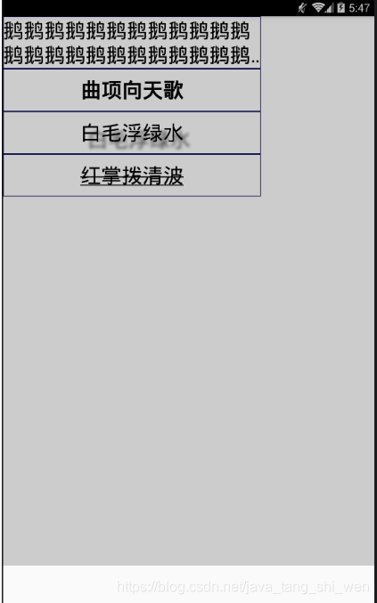
示例效果图
TextInput
属性模板
<TextInput
style={styles.inputStyle}

// 默认显示信息,当有输入的时候该值会被清除
placeholder={'placeholder'}
// 设置默认信息颜色(placeholer)
placeholderTextColor={"#A8A8A8"}
// 设置是否为密码安全输入框 ,默认为false
secureTextEntry={false}
// 键盘类型 enum(default , 'numeric', 'email-address');
keyboard={'email-address'}
// 可以限制文本输入框最大的输入字符长度
maxLength={16}
// 设置可以输入多行文字,默认为false(表示无论文本输入多少,都是单行显示)
multiline={false}


// 设置文本框是否可以编辑,默认为true,可以进行编辑
// editable={false}
//是否自动聚焦
autoFocus={true}
// 右侧清空按钮 (Android不支持,IOS支持)
// clearButtonMode={true}
/* 监听方法 */
onBlur={()=>{}}
onChange={({ nativeEvent: { eventCount, target, text} })=>{} }
onChangeText={(text)=>{}}
onEndEditing={()=>{}}
onFocus={({ nativeEvent: { target } })=>{}}
onLayout={ ({nativeEvent: {layout: {x, y, width, height}, target } })=>{}}
onSubmitEditing={()=>{}}


/>
样式模板
inputStyle:{
        width:width/2,
        height:40,

        //字体大小
        fontSize:30,
        //字体颜色
        color:'#000',

        // 背景颜色
        backgroundColor:'#F8F8F8',

        // 边框样式 enum('solid', 'dotted', 'dashed')
        borderStyle:'solid',

        //  边框厚度
        borderWidth:2,
        // borderTopWidth: 2,
        // borderRightWidth: 2,
        // borderBottomWidth: 2,
        // borderLeftWidth: 2,

        // 边框颜色
        borderColor:'#A8A8A8',
        // borderTopColor: 'red',
        // borderRightColor: 'red',
        // borderBottomColor: 'red',
        // borderLeftColor: 'red',

        //  边框圆角
        borderRadius:5,
        // borderTopLeftRadius: 0,
        // borderTopRightRadius: 0,
        // borderBottomLeftRadius: 0,
        // borderBottomRightRadius: 0,

        //内边距
        padding: 0,
        // paddingTop: 0,
        // paddingBottom: 0,
        // paddingLeft: 0,
        // paddingRight: 0,

        //外边距
        margin: 10,
        // marginTop: 0,
        // marginBottom: 0,
        // marginLeft: 0,
        // marginRight: 0,
    }
FlatList
属性模板
<FlatList
    //数据源(数组)
    data={testData}
    //渲染列表数据
    renderItem={this._renderItem}
    //分割线
    ItemSeparatorComponent={()=><View style={{borderBottomWidth:1,borderBottomColor:'#A8A8A8'}}></View>}
    //无数据时加载组件
    ListEmptyComponent={this._listEmptyComponent}
    //头部组件
    ListHeaderComponent={this._listHeaderComponent}
    //尾部组件
    ListFooterComponent={this._listFooterComponent}

    /* 上拉刷新并加载数据 */
    // 等待加载出现加载的符号
    refreshing = {this.state.isRefreshing}
    //上拉刷新
    onRefresh = {this._onRefresh}
    //当距离未加载内容与可见内容距离比小于0.1时触发onEndReached
    onEndReachedThreshold = {0.1}
    //上拉加载数据
    onEndReached = {this._endReached}

    //首屏渲染的数据量,不会在滑动中被卸载
    initialNumToRender = {6}

    //默认true是垂直布局
    horizontal = {false}
    // 水平布局的列的数量
    numColumns = {3}
    />
样式模板
无
示例
示例代码
import React, { Component } from 'react';
import {StyleSheet, View, Text, FlatList } from 'react-native';

const Dimensions = require('Dimensions');
//窗口宽度
let {width} = Dimensions.get('window');

let testData = require('./100data.json');


class FlatListDemo extends Component{
    constructor(props){
        super(props);
        this.state = {isRefreshing:false};
        this._listHeaderComponent = this._listHeaderComponent.bind(this);
        this._listFooterComponent = this._listFooterComponent.bind(this);
        this._listEmptyComponent = this._listEmptyComponent.bind(this);
        this._renderItem = this._renderItem.bind(this);
        this._onRefresh = this._onRefresh.bind(this);
        this._endReached = this._endReached.bind(this);
    }
    render(){
        return(
            <View style={styles.container}>
                <FlatList
                //数据源(数组)
                data={testData}
                //渲染列表数据
                renderItem={this._renderItem}
                //分割线
                ItemSeparatorComponent={()=><View style={{borderBottomWidth:1,borderBottomColor:'#A8A8A8'}}></View>}
                //无数据时加载组件
                ListEmptyComponent={this._listEmptyComponent}
                //头部组件
                ListHeaderComponent={this._listHeaderComponent}
                //尾部组件
                ListFooterComponent={this._listFooterComponent}

                /* 上拉刷新并加载数据 */
                // 等待加载出现加载的符号
                refreshing = {this.state.isRefreshing}
                //上拉刷新
                onRefresh = {this._onRefresh}
                //当距离未加载内容与可见内容距离比小于0.1时触发onEndReached
                onEndReachedThreshold = {0.1}
                //上拉加载数据
                onEndReached = {this._endReached}

                //首屏渲染的数据量,不会在滑动中被卸载
                initialNumToRender = {6}

                //默认true是垂直布局
                horizontal = {false}
                // 水平布局的列的数量
                numColumns = {3}
                />

            </View>
        );
    }

    _listHeaderComponent(){
        return (
            <View style={styles.headerfooterStyle}>
                <Text style={styles.textStyle}>-header-</Text>
            </View>
        )
    }
    _listFooterComponent(){
        return (
            <View style={styles.headerfooterStyle}>
                <Text style={styles.textStyle}>-footer-</Text>
            </View>
        )
    }

    _listEmptyComponent(){
        return (
            <View style={styles.emptyStyle}>
                <Text style={styles.textStyle}>暂无数据</Text>
            </View>
        )
    }

    _renderItem(item){
        return(
            <View key={item.index} style={styles.rowStyle}>
                <Text style={styles.textStyle}>{item.index}</Text>
            </View>
        );
    }


    // 刷新
    _onRefresh(){

    }

    //到达后
    _endReached(){
        //修改状态,显示加载效果组件
        this.setState({
            isRefreshing:true
        });
    }

}

const styles = StyleSheet.create({


    container:{
        // 宽度
        width:width,
        // 高度
        height:800,

        // 主轴方向  enum('row', 'column')
        flexDirection:'column',
        // 主轴对齐 enum('center','flex-start','flex-end','space-around','space-between',  baseline')
        justifyContent:'flex-start',
        // 侧轴对齐 enum('center','flex-start','flex-end','stretch'  baseline')
        alignItems:'flex-start',

        // 背景颜色
        backgroundColor:'#cccccc',
    },
    textStyle:{
        color:'black',
        fontSize:30,
    },
    rowStyle:{
        width:width/3,
        height:100,

        flexDirection:'row',
        justifyContent:'center',
        backgroundColor:'#fff000'
    },
    headerfooterStyle:{
        width:width,
        height:50,

        flexDirection:'row',
        justifyContent:'center',
        backgroundColor:'green'
    },
    emptyStyle:{
        width:width,
        height:50,

        flexDirection:'row',
        justifyContent:'center',
    }


});

export default FlatListDemo;
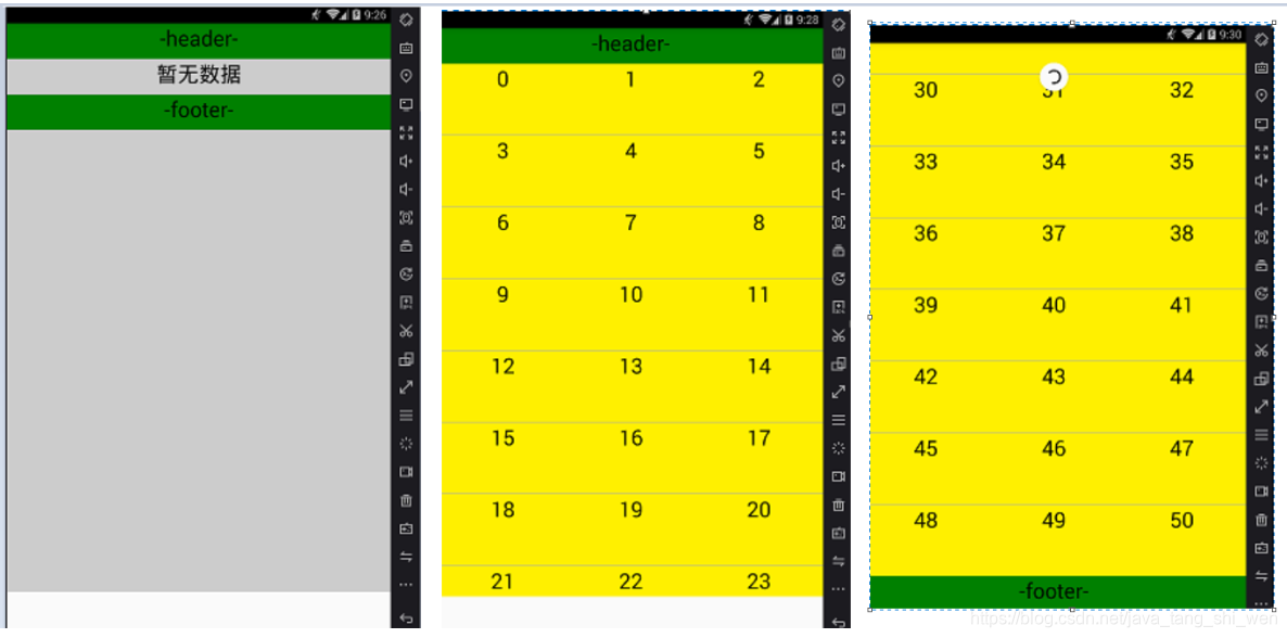
示例效果图
SectionList
属性模板
<SectionList
                    sections={sections}
                    renderSectionHeader={this._renderSectionHeader}
                    renderItem={this._renderItem}
                    //列表头部组件
                    ListHeaderComponent={() => <View style={}></View>}
                    //列表尾部组件
                    ListFooterComponent={() => <View style={}></View>}
                    //空列表时显示组件
                    // ListEmptyComponent

                    /************** */
                    //指定一开始渲染的元素数量,最好刚刚够填满一个屏幕
                    initialNumToRender={10}
                    //此函数用于为给定的item生成一个不重复的key。
                    keyExtractor={(item, index) => index}
                    //section的头尾组件
                    // renderSectionFooter
                    // renderSectionHeader

                    //除list外的数据,用以其他目的
                    // extraData

                    // 同时设置4个属性,上拉刷新
                    refreshing={true}
                    onRefresh={()=>{}}
                    //加载符号下移200
                    progressViewOffset={200}
                    onEndReached={()=>{alert('完毕');}}
                    onEndReachedThreshold={0.1}

                    //section分割符
                    SectionSeparatorComponent={()=><View style={{borderWidth:1}}></View>}
                    //子项目分割符
                    ItemSeparatorComponent={()=><View><Text></Text></View>}

                />
样式模板
无
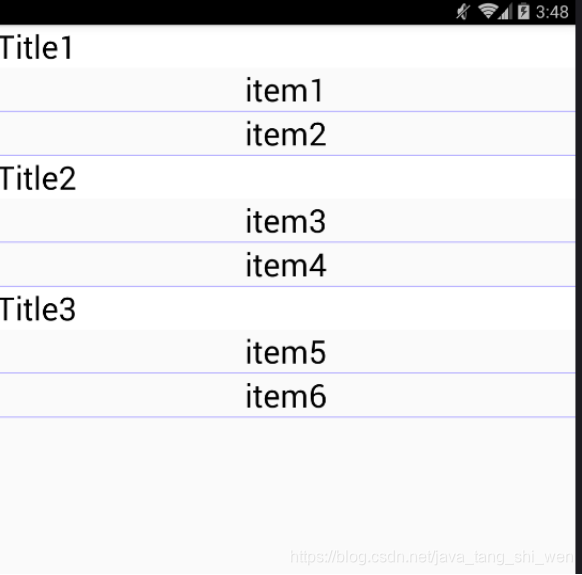
示例1
示例代码
import React, {Component} from 'react';
import {StyleSheet, View, Text, Image, SectionList} from 'react-native';

class SessionListDemo extends Component{
    constructor(props){
        super(props);
        this.state = {};
    }
    render(){
        return(
            <View>
                <SectionList
                    //渲染子项目
                    renderItem={({ item, index, section }) => {
                        // console.log(item);   //section中的data数组的一子项
                        // console.log(index);  //数组下标
                        // console.log(section);//sections数组的一子项
                        return(<Text key={index} style={styles.itemStyle}>{item}</Text>);
                    }}

                    //渲染Section头
                    renderSectionHeader={({ section: { title } }) => (
                        <Text style={styles.titleStyle}>{title}</Text>
                    )}
                    //Section
                    sections={[
                        { title: "Title1", data: ["item1", "item2"] },
                        { title: "Title2", data: ["item3", "item4"] },
                        { title: "Title3", data: ["item5", "item6"] }
                    ]}
                    //为同类的item生成一个不重复的key
                    keyExtractor={(item, index) => item + index}
                    />
            </View>
        );
    }
}
const styles = StyleSheet.create({
    titleStyle:{
        backgroundColor:'white',
        width:'auto',
        color:'black',
        fontSize:30,
        lineHeight:40,

    },
    itemStyle:{
        borderBottomWidth:1,
        borderColor: '#afa8ff',
        width:'auto',
        color:'black',
        fontSize:30,
        lineHeight:40,
        textAlign:'center'
    },
});
export default SessionListDemo;
示例效果图
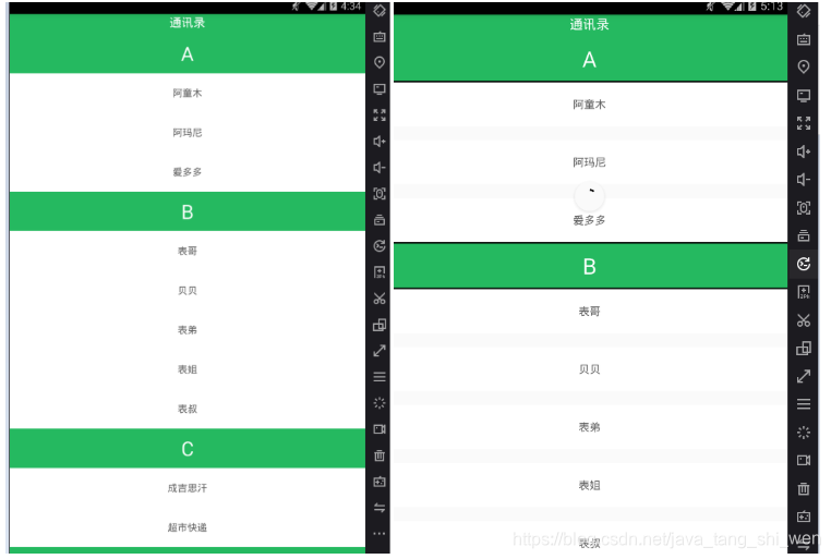
示例2
示例代码
import React, {Component} from 'react';
import {StyleSheet, View, Text, Image, SectionList} from 'react-native';
let sections = [
    { key: "A", data: [{ title: "阿童木" }, { title: "阿玛尼" }, { title: "爱多多" }] },
    { key: "B", data: [{ title: "表哥" }, { title: "贝贝" }, { title: "表弟" }, { title: "表姐" }, { title: "表叔" }] },
    { key: "C", data: [{ title: "成吉思汗" }, { title: "超市快递" }] },
    { key: "W", data: [{ title: "王磊" }, { title: "王者荣耀" }, { title: "往事不能回味" },{ title: "王小磊" }, { title: "王中磊" }, { title: "王大磊" }] },
  ];


class SessionListDemo2 extends Component{
    constructor(props){
        super(props);
        this.state = {};
        this._renderSectionHeader = this._renderSectionHeader.bind(this);
        this._renderItem = this._renderItem.bind(this);
    }
    render(){
        return(
            <View style={{ flex: 1 }}>
                <SectionList
                    sections={sections}
                    renderSectionHeader={this._renderSectionHeader}
                    renderItem={this._renderItem}
                    //列表头部组件
                    ListHeaderComponent={() => <View style={styles.listHFStyle}><Text style={styles.textHFStyle}>通讯录</Text></View>}
                    //列表尾部组件
                    ListFooterComponent={() => <View style={styles.listHFStyle}><Text style={styles.textHFStyle}>通讯录尾部</Text></View>}
                    //空列表时显示组件
                    // ListEmptyComponent

                    /******对应效果图2******** */
                    //指定一开始渲染的元素数量,最好刚刚够填满一个屏幕
                    initialNumToRender={10}
                    //此函数用于为给定的item生成一个不重复的key。
                    keyExtractor={(item, index) => index}
                    //section的头尾组件
                    // renderSectionFooter
                    // renderSectionHeader

                    //除list外的数据,用以其他目的
                    // extraData

                    // 同时设置4个属性,上拉刷新
                    refreshing={true}
                    onRefresh={()=>{}}
                    //加载符号下移200
                    progressViewOffset={200}
                    onEndReached={()=>{alert('完毕');}}
                    onEndReachedThreshold={0.1}

                    //section分割符
                    SectionSeparatorComponent={()=><View style={{borderWidth:1}}></View>}
                    //子项目分割符
                    ItemSeparatorComponent={()=><View><Text></Text></View>}

                />

            </View>
        );
    }
    _renderSectionHeader({section:{key}}){
        return(
            <Text style={styles.headStyle}>{key}</Text>
        );
    }
    _renderItem({index, item, section}){
        return(
            <Text style={styles.itemStyle}>{item.title}</Text>
        );
    }
}
const styles = StyleSheet.create({

    headStyle:{
        height: 60,
        textAlign:'center',
        textAlignVertical: 'center',
        backgroundColor: "#25B960",
        color: '#ffffff',
        fontSize: 30,

    },
    itemStyle:{
        height: 60,
        textAlign:'center',
        textAlignVertical: 'center',
        backgroundColor: "#ffffff",
        color: '#5C5C5C',
        fontSize: 15
    },

    listHFStyle: {
        backgroundColor: '#25B960',
        alignItems: 'center',
        height: 30
    },
    textHFStyle:{
        fontSize: 18,
        color: '#ffffff'
    },

});
export default SessionListDemo2;
示例效果图
TouchableOpacity
属性模板
<TouchableOpacity
    //不透明度:默认0.2
    //activeOpacity={0.2}
    //按下操作
    onPress={this._onPressButton}>
</TouchableOpacity>
样式模板
示例
参考:透明响应视图例子
import React, { Component } from 'react'
import {
  AppRegistry,
  StyleSheet,
  TouchableOpacity,
  Text,
  View,
} from 'react-native'

class App extends Component {
  constructor(props) {
    super(props)
    this.state = { count: 0 }
  }

  onPress = () => {
    this.setState({
      count: this.state.count+1
    })
  }

 render() {
   return (
     <View style={styles.container}>
       <TouchableOpacity
         style={styles.button}
         onPress={this.onPress}
       >
         <Text> Touch Here </Text>
       </TouchableOpacity>
       <View style={[styles.countContainer]}>
         <Text style={[styles.countText]}>
            { this.state.count !== 0 ? this.state.count: null}
          </Text>
        </View>
      </View>
    )
  }
}

const styles = StyleSheet.create({
  container: {
    flex: 1,
    justifyContent: 'center',
    paddingHorizontal: 10
  },
  button: {
    alignItems: 'center',
    backgroundColor: '#DDDDDD',
    padding: 10
  },
  countContainer: {
    alignItems: 'center',
    padding: 10
  },
  countText: {
    color: '#FF00FF'
  }
})

AppRegistry.registerComponent('App', () => App)


 扫一扫
扫一扫


 2127
2127

 被折叠的 条评论
为什么被折叠?
被折叠的 条评论
为什么被折叠?
 到【灌水乐园】发言


