


7.1 1.CSS链接的美化
美化CSS链接可以通过多种方式来实现,具体取决于你想要的视觉效果。以下是几种常见的美化CSS链接的方式,包括基本样式、悬停效果和交互动画等。
1. 基本链接美化
首先,为链接元素 (<a>) 设置一些基础样式,如颜色、文本装饰等。
a {

    color: 007BFF; / 蓝色文本 /

    text-decoration: none; / 移除下划线 /

    font-weight: bold; / 加粗 /

}


/ 悬停时改变颜色 /

a:hover {

    color: 0056b3; / 深蓝色 /

    text-decoration: underline; / 悬停时添加下划线 /

}
2. 按钮式链接
链接可以设计成按钮的形式,给用户更多的点击感。
a.button {

    display: inline-block;

    padding: 10px 20px;

    background-color: 28a745; / 绿色背景 /

    color: white;

    text-decoration: none;

    border-radius: 5px;

    transition: background-color 0.3s ease;

}


a.button:hover {

    background-color: 218838; / 悬停时的背景色 /

}
3. 下划线动画效果
你可以为链接添加一个有趣的悬停动画,比如从左到右的下划线动画。
a {

    position: relative;

    color: 333;

    text-decoration: none;

}


a::after {

    content: '';

    position: absolute;

    width: 100%;

    height: 2px;

    bottom: 0;

    left: 0;

    background-color: ff5733; / 橙色下划线 /

    visibility: hidden;

    transform: scaleX(0);

    transition: all 0.3s ease-in-out;

}


a:hover::after {

    visibility: visible;

    transform: scaleX(1);

}
4. 渐变色链接
为链接应用渐变色,让其更具视觉冲击力。
a {

    background: linear-gradient(to right, FF416C, FF4B2B); / 渐变背景 /

    webkit-background-clip: text;

    webkit-text-fill-color: transparent;

    text-decoration: none;

}


a:hover {

    opacity: 0.8; / 悬停时稍微淡化 /

}
5. 动态的悬停效果
链接可以添加一些动态效果,例如变大、缩小、背景颜色变化等。
a {

    color: 1e90ff;

    text-decoration: none;

    transition: transform 0.2s, color 0.2s;

}


a:hover {

    transform: scale(1.1); / 悬停时稍微放大 /

    color: ff4500; / 悬停时颜色变化 /

}
这些是几种常见的美化链接的方式。可以根据设计需求进行调整,例如颜色、字体、边框、动画效果等。
7.2 2.CSS列表的美化
美化CSS列表(无序列表 <ul> 和有序列表 <ol>)可以通过不同的方式来实现,包括自定义项目符号、为列表项添加边框、间距和交互效果等。以下是几种常见的美化列表的方法:
1. 基础列表美化
为列表设置基础样式,如项目符号样式、字体、行距等。
ul {

    list-style-type: square; / 项目符号类型为方块 /

    padding-left: 20px; / 增加左侧内边距 /

    font-family: 'Arial', sans-serif;

    line-height: 1.6; / 行距 /

}


ol {

    list-style-type: decimal; / 项目符号为数字 /

    padding-left: 20px;

    font-family: 'Arial', sans-serif;

}


ul li, ol li {

    margin-bottom: 10px; / 列表项之间的间距 /

}
2. 自定义项目符号(Icon)
你可以使用图片或字体图标替代默认的项目符号。
<ul class="custom-list">

    <li>Item 1</li>

    <li>Item 2</li>

    <li>Item 3</li>

</ul>
css

.custom-list {

    list-style: none; / 移除默认项目符号 /

    padding-left: 0;

}


.custom-list li {

    margin-bottom: 10px;

    position: relative;

    padding-left: 25px;

}


.custom-list li::before {

    content: '\2022'; / Unicode字符:• /

    position: absolute;

    left: 0;

    color: ff5733; / 自定义符号颜色 /

    font-size: 20px; / 符号大小 /

    line-height: 1;

}
3. 带有背景颜色的列表
为列表项添加背景颜色,使它们更加突出。
ul.styled-list li {

    background-color: f0f0f0; / 列表项背景色 /

    border-radius: 5px; / 圆角边框 /

    padding: 10px;

    margin-bottom: 5px;

    transition: background-color 0.3s ease;

}


ul.styled-list li:hover {

    background-color: d0d0d0; / 悬停时改变背景色 /

}
4. 带有边框的列表
为列表项添加边框,可以增强列表的层次感。
ul.bordered-list {

    list-style-type: none;

    padding: 0;

}


ul.bordered-list li {

    padding: 15px;

    border: 1px solid ddd; / 边框颜色 /

    margin-bottom: 10px;

    border-radius: 5px; / 圆角 /

    transition: transform 0.2s ease-in-out;

}


ul.bordered-list li:hover {

    transform: scale(1.05); / 悬停时放大 /

}
5. 水平排列的列表
可以让列表项水平排列,常用于导航菜单或标签。
<ul class="horizontal-list">

    <li><a href="">Home</a></li>

    <li><a href="">About</a></li>

    <li><a href="">Services</a></li>

    <li><a href="">Contact</a></li>

</ul>
css

.horizontal-list {

    list-style: none; / 移除项目符号 /

    padding: 0;

    display: flex; / 使用Flex布局 /

    justify-content: space-around; / 列表项均匀分布 /

}


.horizontal-list li {

    margin: 0 10px;

}


.horizontal-list li a {

    text-decoration: none;

    color: 007bff;

    padding: 10px 20px;

    border-radius: 5px;

    transition: background-color 0.3s ease;

}


.horizontal-list li a:hover {

    background-color: 0056b3; / 悬停时的背景色 /

    color: white;

}
6. 卡片风格的列表
卡片风格的列表看起来现代,适合展示复杂的信息,如文章、产品等。
ul.card-list {

    list-style-type: none;

    padding: 0;

}


ul.card-list li {

    background-color: fff;

    border: 1px solid ddd;

    border-radius: 10px;

    padding: 20px;

    margin-bottom: 15px;

    box-shadow: 0 2px 5px rgba(0,0,0,0.1);

    transition: box-shadow 0.3s ease;

}


ul.card-list li:hover {

    box-shadow: 0 5px 15px rgba(0,0,0,0.2); / 悬停时的阴影效果 /

}


ul.card-list li h3 {

    margin: 0;

    color: 333;

}


ul.card-list li p {

    color: 666;

}
7. 带编号的有序列表
自定义有序列表的编号样式,例如使用大号、彩色的数字。
ol.custom-ordered-list {

    counter-reset: li; / 重置列表项计数 /

    list-style: none; / 移除默认编号 /

    padding-left: 0;

}


ol.custom-ordered-list li {

    counter-increment: li; / 增加计数 /

    margin-bottom: 20px;

    position: relative;

    padding-left: 40px;

}


ol.custom-ordered-list li::before {

    content: counter(li) ". "; / 使用计数 /

    position: absolute;

    left: 0;

    font-size: 24px;

    font-weight: bold;

    color: ff5733; / 自定义编号颜色 /

}
8. 悬停动画效果的列表
通过悬停时添加动画,让列表更加生动。
ul.animated-list {

    list-style: none;

    padding: 0;

}


ul.animated-list li {

    padding: 10px;

    margin-bottom: 10px;

    background-color: f9f9f9;

    transition: transform 0.2s ease, background-color 0.3s ease;

}


ul.animated-list li:hover {

    transform: translateX(10px); / 悬停时列表项向右移动 /

    background-color: e9e9e9;

}
通过这些不同的方法,可以将列表设计得更具吸引力和交互性,根据具体的需求和风格自由调整。
7.3 3.CSS表格的美化
美化CSS表格可以通过多种方式来提升其视觉效果,使其更具吸引力和可读性。以下是一些常见的美化表格的方法:
1. 基础表格样式
首先,设置表格的基本样式,包括边框、内边距和字体等。
table {

    width: 100%;

    border-collapse: collapse; / 合并边框 /

    font-family: Arial, sans-serif;

}


th, td {

    border: 1px solid ddd; / 边框样式 /

    padding: 12px; / 内边距 /

    text-align: left; / 左对齐 /

}


th {

    background-color: f2f2f2; / 表头背景色 /

    color: 333; / 表头文字颜色 /
}
2. 悬停效果
为表格行添加悬停效果,提升用户体验。
tr:hover {

    background-color: f5f5f5; / 悬停时的背景色 /

}
3. 交替行颜色
为表格的奇数和偶数行设置不同的背景色,以增强可读性。
    background-color: f9f9f9; / 奇tr:nth-child(odd) {数行背景色 /

}


tr:nth-child(even) {

    background-color: ffffff; / 偶数行背景色 /

}
4. 圆角和阴影
为表格和单元格添加圆角和阴影效果,使其看起来更现代。
table {

    border-radius: 8px; / 圆角 /

    box-shadow: 0 2px 10px rgba(0, 0, 0, 0.1); / 阴影效果 /

    overflow: hidden; / 防止圆角效果 /

}
5. 自定义表头
为表头设置不同的样式,使其更突出。
th {

    background-color: 4CAF50; / 自定义表头颜色 /

    color: white; / 字体颜色 /

    font-size: 16px; / 字体大小 /

    text-transform: uppercase; / 全部大写 /

}
6. 带有图标的表格
为某些列添加图标,增强视觉效果。
td.icon-cell {

    position: relative;

    padding-left: 30px; / 留出空间放置图标 /

}


td.icon-cell::before {

    content: '\1F4C8'; / 使用Unicode字符或图标 /

    position: absolute;

    left: 5px; / 图标位置 /

    font-size: 20px;

}
7. 响应式表格
使用媒体查询使表格在小屏幕设备上更友好。
@media (max-width: 600px) {

    table {

        display: block;

        overflow-x: auto; / 允许横向滚动 /

        white-space: nowrap; / 防止换行 /

    }

}
8. 按钮式单元格
将某些单元格设计成按钮样式。
td.button-cell {

    text-align: center; / 中间对齐 /

}


td.button-cell a {

    display: inline-block;

    padding: 10px 15px;

    background-color: 007BFF; / 按钮背景色 /

    color: white; / 按钮文字颜色 /

    text-decoration: none; / 移除下划线 /

    border-radius: 5px; / 圆角 /

    transition: background-color 0.3s;

}


td.button-cell a:hover {

    background-color: 0056b3; / 悬停时的背景色 /

}
9. 表格标题
为表格添加标题,使其更加清晰。
table caption {

    font-size: 24px; / 标题字体大小 /

    margin: 10px 0; / 标题上下间距 /

    text-align: left; / 左对齐 /

}
这些样式可以组合使用,根据具体需求调整颜色、字体、间距等,打造出符合设计需求的美观表格。
7.4 4.多媒体的添加与美化
美化和添加多媒体元素(如图片、视频和音频)可以提升网页的视觉吸引力和用户体验。以下是一些常见的方式:
1. 图片的添加与美化
使用CSS设置图片的大小、边框和阴影等。
<img src="image.jpg" alt="描述" class="responsive-image">
css

.responsive-image {

    width: 100%; / 自适应宽度 /

    height: auto; / 自动高度 /

    border-radius: 10px; / 圆角 /

    box-shadow: 0 2px 10px rgba(0, 0, 0, 0.1); / 阴影 /

}
2. 背景图片
为元素设置背景图片,并添加一些样式。
.section {

    background-image: url('background.jpg');

    background-size: cover; / 填充整个区域 /

    background-position: center; / 居中 /

    padding: 50px; / 内边距 /

    color: white; / 文字颜色 /

}
3. 视频的添加与美化
通过HTML5 <video> 标签嵌入视频,并使用CSS美化。
<video class="responsive-video" controls>

    <source src="video.mp4" type="video/mp4">

    Your browser does not support the video tag.

</video>
css

.responsive-video {

    width: 100%; / 自适应宽度 /

    border-radius: 10px; / 圆角 /

    box-shadow: 0 2px 10px rgba(0, 0, 0, 0.1); / 阴影 /

}
4. 音频的添加
使用HTML5 <audio> 标签嵌入音频。
<audio controls>

    <source src="audio.mp3" type="audio/mpeg">

    Your browser does not support the audio tag.

</audio>
5. 幻灯片展示
使用CSS和JavaScript实现图片幻灯片效果。
<div class="slider">

    <div class="slides">

        <img src="slide1.jpg" class="slide">

        <img src="slide2.jpg" class="slide">

        <img src="slide3.jpg" class="slide">

    </div>

</div>
css

.slider {

    position: relative;

    overflow: hidden;

}


.slides {

    display: flex; / 横向排列 /

    transition: transform 0.5s ease; / 动画效果 /

}


.slide {

    min-width: 100%; / 每张幻灯片宽度为100% /

    border-radius: 10px; / 圆角 /

}
6. 图标和字体图标
使用Font Awesome等图标库添加美观的图标。
<link rel="stylesheet" href="https://cdnjs.cloudflare.com/ajax/libs/font-awesome/6.0.0-beta3/css/all.min.css">

<i class="fas fa-camera"></i>
7. 图像库
使用CSS网格布局创建图像库。
<div class="gallery">

    <img src="img1.jpg" alt="Image 1">

    <img src="img2.jpg" alt="Image 2">

    <img src="img3.jpg" alt="Image 3">

</div>
css

.gallery {

    display: grid;

    grid-template-columns: repeat(auto-fill, minmax(200px, 1fr)); / 自动填充 /

    gap: 10px; / 间距 /

}


.gallery img {

    width: 100%;

    border-radius: 5px; / 圆角 /

}
8. 响应式设计
确保所有多媒体元素在不同设备上表现良好。
@media (max-width: 600px) {

    .responsive-image, .responsive-video {

        width: 100%;

        height: auto;

    }

}
通过这些方法,可以有效地添加和美化多媒体元素,从而增强网页的整体视觉效果和用户体验。根据具体需求进行调整和优化。
1
<!DOCTYPE html>
<html>
<head>
<meta charset="utf-8" />
<title>利用CSS和多媒体美化页面</title>
</head>
<body>
<center>
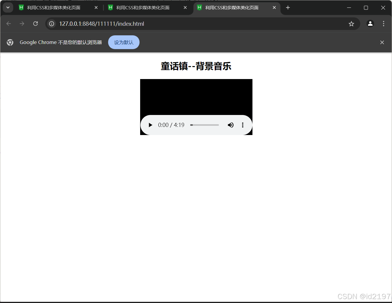
<h2>童话镇--背景音乐</h2>
<!-- <bgsound src="media/童话镇.mp3"></bgsound> -->
<embed src="media/童话镇.mp3"></embed>
</center>
</body>
</html>
<!DOCTYPE html>
<html>
<head>
<meta charset="utf-8" />
<title>利用CSS和多媒体美化页面</title>
</head>
<body>
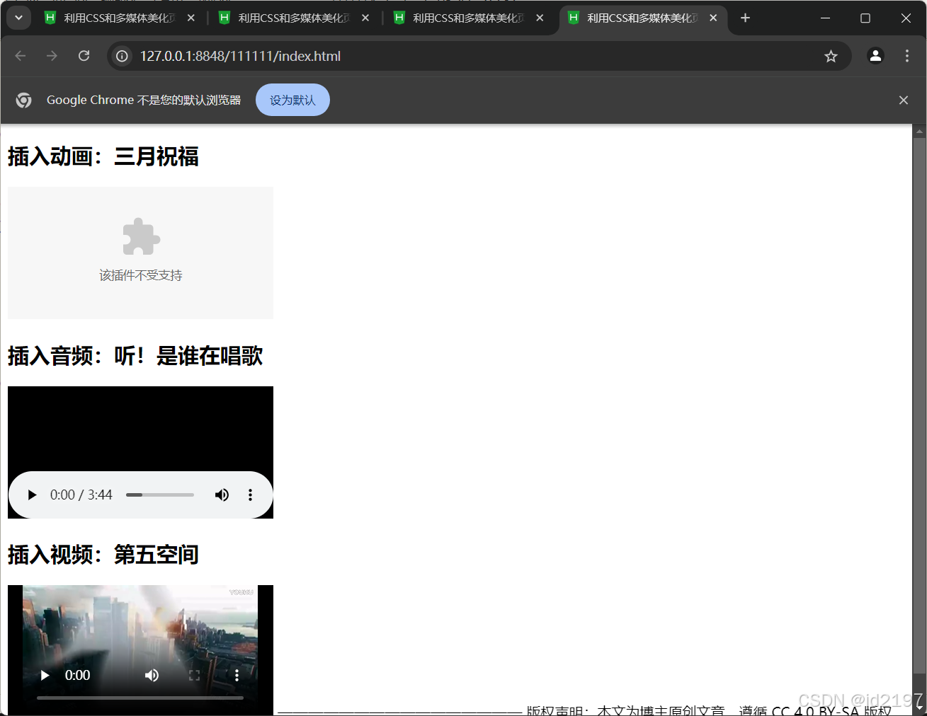
<h2>插入动画:三月祝福</h2>
<embed src="media/阳春三月.swf"></embed>
<h2>插入音频:听!是谁在唱歌</h2>
<embed src="media/听!是谁在唱歌.mp3"></embed>
<h2>插入视频:第五空间</h2>
<embed src="media/第五空间.mp4"></embed>
</body>
</html>
<!DOCTYPE html>
<html>
<head>
<meta charset="utf-8" />
<title>利用CSS和多媒体美化页面</title>
</head>
<body>
<center>
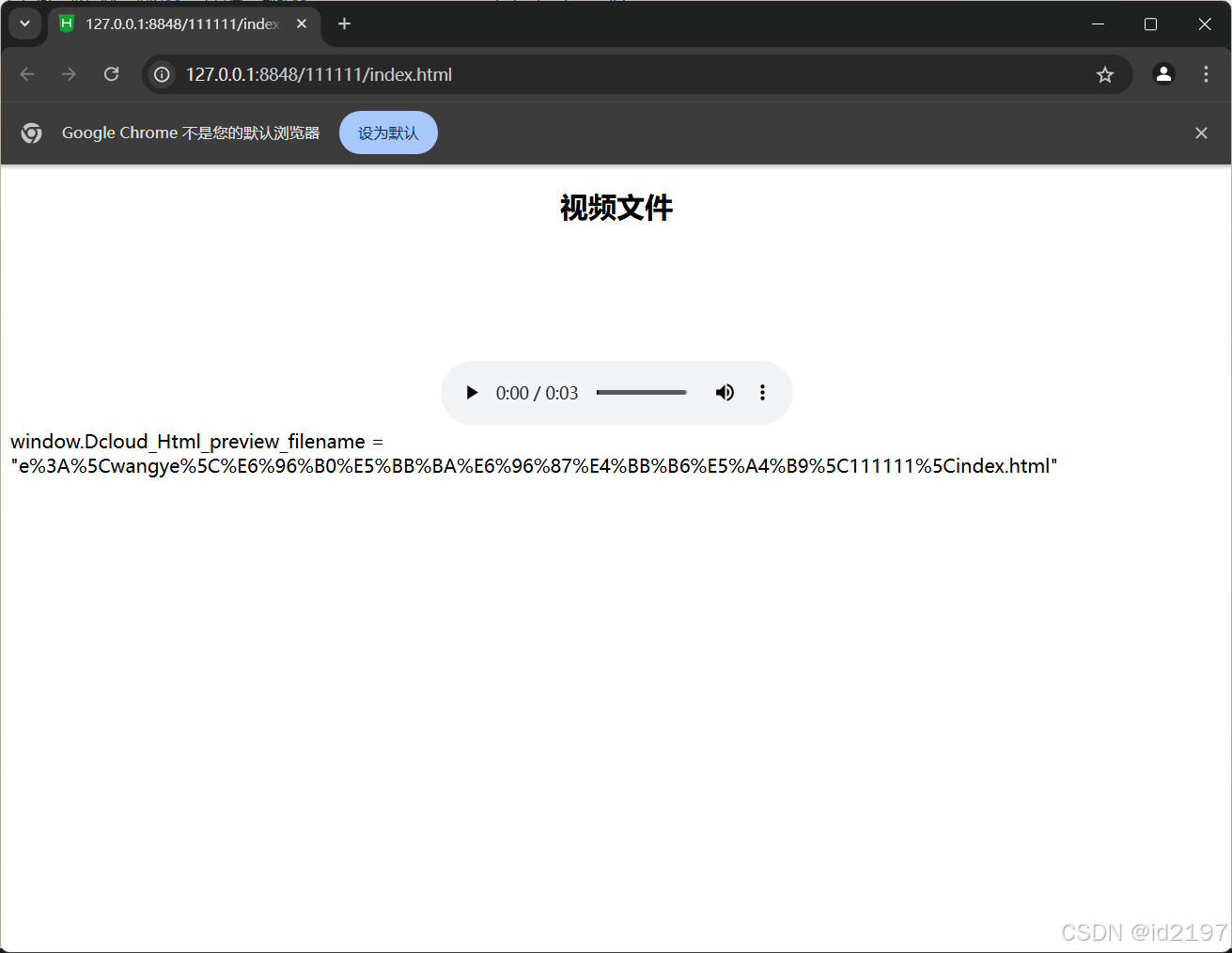
<h2>视频文件</h2>
<video src="media/movie.ogg" controls="controls"></video>
</center>
</body>
</html
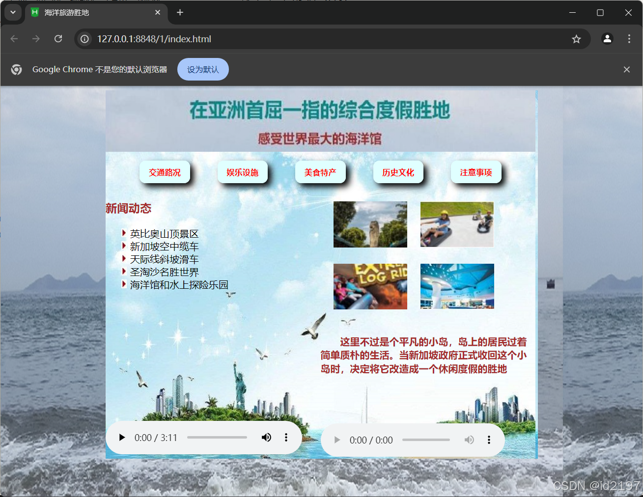
7.5综合案例
<!DOCTYPE html>
<html>
	<head>
		<meta charset="utf-8" />
		<title>海洋旅游胜地</title>
		<style type="text/css">
			body{
				background-image: url(img/bg-0.jpg);
			}
			.all{
				margin: 0px auto;
				width: 704px;
				height: 600px;
				background-image: url(img/bg.jpg);
			}
			.top{
				width: 700px;
				height: 100px;
				background-image: url(img/top.jpg);
			}
			.menu{
				width: 700px;
				height: 60px;
				text-align: center;
			}
			.left,.right{
				width: 350px;
				height: 440px;
				float: left;
			}
			a{
				font-size: 13px;
				font-weight: 700;
				text-decoration: none;
				background-color: lightcyan;
				color: red;
				margin: 20px;
				padding: 10px 15px;
				border-radius: 10px;
			}
			a:link,a:visited{
				box-shadow: 6px 6px 10px black;
			}
			a:hover{
				font-size: 14px;
			}
			a:active{
				font-size: 13px;
				box-shadow: -5px -5px 10px black;
			}
			h3{
				color: brown;
			}
			ol{
				list-style-image: url(img/list2.jpg);
				list-style-type: upper-alpha;
			}
			table{
				border-collapse: separate;
				border-spacing: 20px;
			}
			p{
				text-indent: 2em;
				line-height: 22px;
				font-weight: 700;
				color: brown;
			}
		</style>
	</head>
	<body>
		<div class="all">
			<div class="top"></div>
			<div class="menu">
				<br/>
				<a href="#" target="_blank">交通路况</a>
				<a href="#" target="_blank">娱乐设施</a>
				<a href="#" target="_blank">美食特产</a>
				<a href="#" target="_blank">历史文化</a>
				<a href="#" target="_blank">注意事项</a>
			</div>
			<div class="left">
				<h3>新闻动态</h3>
				<ol>
					<li>英比奥山顶景区</li>
					<li>新加坡空中缆车</li>
					<li>天际线斜坡滑车</li>
					<li>圣淘沙名胜世界</li>
					<li>海洋馆和水上探险乐园</li>
				</ol>
				<video src="media/shengtaosha.ogg" width="320px" height="250px" controls="controls"></video>
			</div>
			<div class="right">
				<table>
					<tr>
						<td><img src="img/table1.jpg"/></td>
						<td><img src="img/table2.jpg"/></td>
					</tr>
					<tr>
						<td><img src="img/table3.jpg"/></td>
						<td><img src="img/table4.jpg"/></td>
					</tr>
				</table>
				<p>这里不过是个平凡的小岛,岛上的居民过着简单质朴的生活。当新加坡政府正式收回这个小岛时,决定将它改造成一个休闲度假的胜地</p>
				<br/><br/><br/>
				<audio src="media/铃铛.mp3" controls="controls" loop="loop"></audio>
			</div>
		</div>
	</body>
</html>


 扫一扫
扫一扫


 998
998

 被折叠的 条评论
为什么被折叠?
被折叠的 条评论
为什么被折叠?
 到【灌水乐园】发言


