


 本文介绍了CSS的基础知识,包括CSS简介、引用方法、选择器的使用,如ID、类、标签选择器,以及伪类和伪元素。还讨论了实战中如何避免类选择器覆盖的问题,提出BEM命名规范,并探讨了CSS盒模型。
Day3:CSS基础
详细介绍,可查看网站web 入门 - 学习 Web 开发 | MDN (mozilla.org)
在线编辑器:JS Bin - Collaborative JavaScript Debugging
CSS简介:
基本概念:层叠样式表 — 也就是CSS— 是你在HTML之后应该学习的第二门技术。HTML 用于定义内容的结构和语义,CSS 用于设计风格和布局。比如,您可以使用 CSS 来更改内容的字体、颜色、大小、间距,将内容分为多列,或者添加动画及其他的装饰效果。
CSS的引用:
- 外部样式表
HTML中的代码
<!DOCTYPE html>
<html lang="en">
<head>
<meta charset="utf-8">
<title>CSS的引入</title>
<link rel="stylesheet" href="css/cssImport.css">
</head>
<body>
<p>hello world!</p>
</body>
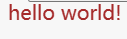
</html>CSS中的代码
p {
  color:brown;
}
效果图
- 内部样式表
HTML中的代码
<!DOCTYPE html>
<html lang="en">
<head>
<meta charset="utf-8">
<title>CSS的引入</title>
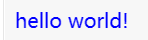
<style>
p {
color:blue;
}
</style>
</head>
<body>
<p>hello world!</p>
</body>
</html>效果图
3.标签中的style
HTML中的代码
<!DOCTYPE html>
<html lang="en">
<head>
<meta charset="utf-8">
<title>CSS的引入</title>
</head>
<body>
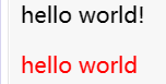
<p>hello world!</p>
<p style="color:red;">hello world</p>
</body>
</html>效果图
CSS的结构
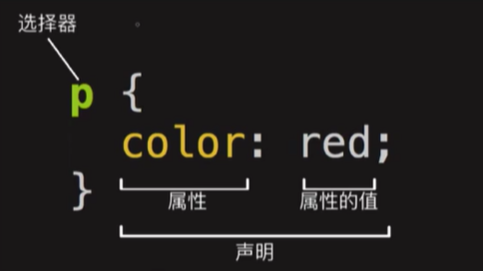
CSS选择器
标签、类和ID选择器
HTML中的代码
<!DOCTYPE html>
<html lang="en">
<head>
  <meta charset="utf-8">
  <title>CSS的引入</title>
  <link rel="stylesheet" href="css/cssImport.css">
</head>
<body>
  <p>段落A</p>
  <p class="paragraph">段落B</p>
  <p class="paragraph extra-para">段落C</p>

  <p id="para">段落D</p>

  <p id="para" class="paragraph">优先级测试</p>
  <p class="paragraph" id="para">优先级测试</p>
</body>
</html>
CSS中的代码
p {
  color:blue;
}
.paragraph {
  color:red;
}
.extra-para {
  font-size:30px;
}
#para {
  color:green;
}
效果图:
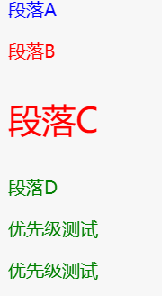
注:根据效果,可以判定优先级:ID>类>标签
标签属性选择器
HTML中的代码
<img
       src="https://img-blog.csdnimg.cn/img_convert/0ca92e885733bc8bfa1b89457381a0ed.png"
  />
CSS中的代码
img[src] {
  width:700px;
  height:300px;
}
效果图
伪类与伪元素
HTML中的代码
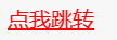
<!-- 第三类 -->
  <!-- 伪类选择器 -->
  <!-- 鼠标悬浮时会改变颜色 -->
  <a href="">点我跳转</a>
CSS中的代码
a:hover {
  color:red;
}
效果图(点击前、点击后)

关系选择器
HTML中的代码
<div>
    <span>Span 1.
      <span>Span 2.</span>
    </span>
  </div>

  <span>Span 3.</span>
CSS中的代码
span {
  background-color:red;
}

div span {
  background-color:DodgerBlue;
}
效果图
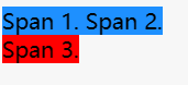
注:这里也可以看出选择器优先级,后代(关系)>标签
实战中的问题:经常使用的类选择器,会由于类名而导致覆盖,为保证可读性如何选择合适的类名?
BEM命名规范
HTML中的代码
 <!-- BEM命名方法 -->
  <div class="article">
    <button class="article__button--primary"></button>
    <button class="article__button--success"></button>
  </div>
  <!-- 第一种方式就是直接将父类名、子类名写在一起,primary表示之前的样式,success表示改变之后的格式 -->


  <div class="article">
    <button class="button--primary"></button>
    <button class="button--success"></button>
  </div>
  <!-- 第二种方式就是使用父子类名的后代选择器 -->
CSS中的代码(上述代码中的第二种方式的后代(关系)选择器)
.article .button-primary {

}
CSS样式
HTML中的代码
<!DOCTYPE html>
<html lang="en">
<head>
  <meta charset="utf-8">
  <title>CSS的引入</title>
  <link rel="stylesheet" href="css/cssImport.css">
</head>
<body>
case 1:文本样式
  <p>this is text</p>
case 2:处理溢出文本
  <p class="ellipse">我要溢出啦啦啦啦</p>

<br/>

case 3:简单动画
  <div class="trans">动画</div>

case 3.1:旋转
  <div class="rotate">旋转</div>

case 4:布局元素
  <div class="box">box</div>

case 5:border属性的其他用法 ->绘制圆
  <div class="circle"></div>

case 6:实现导航栏
<ul>
  <li><a href="xx">主页</a></li>
  <li><a href="xx">课程</a></li>
  <li><a href="xx">其他</a></li>
</ul>

case 7:loading动画
  <div class="loading"></div>
</body>
</html>
CSS中的代码
p {
  /* 辅助框线样式 start*/
  width:200px;
  height:50px;
  border:1px solid #a8a8a8;
  /* 辅助框线样式 end */

  /* 字体居中center,左对齐LEFT,右对齐RIGHT */
  text-align:center;
  /* 设置行间距 */
  line-height:50px;
  /* 字母间距 */
  letter-spacing:4px;
  /* 单词间距 */
  word-spacing:2px;
  /* 设置文字颜色 */
  color: red;
  font-size:20px;
  /* 无衬线字体,即笔画结尾是平滑的字体 */
  font-family:serif;
}

.ellipse {
  width:100px;

  /* 解决溢出问题 */
  white-space:nowrap;
  overflow:hidden;
  text-overflow:ellipsis;
}

.trans {
  width:100px;
  height:100px;
  background:red;
}

.trans {
  width:100px;
  height:100px;
  background:red;
  transition:width 2s;
  /* 增加阴影使画面立体:X轴偏移量,Y轴偏移量,模糊半径,扩散半径和颜色 */
  box-shadow:10px 10px 5px #888888;
}

.trans:hover {
  width:300px;
}

.rotate {
  width:200px;
  height:100px;
  background-color:yellow;
  transform:rotate(7deg);
}

.box {
  width:100px;
  height:100px;

  /* 框 */
  /* border:5px solid green; */
  /* border-bottom:3px dotted #ff0000; */

  /* 圆角框 */
  /* border:5px solid green; */
  /* border-radius:10px; */

  /* 框与文字的距离 */
  border:5px solid green;

  /* padding:25px; */
  /* padding:30px 50px; */
  /* padding:10px 20px 30px 40px; */

  /* 框与页面的距离 */
  /* margin:25px; */
  /* margin:30px 50px; */
  /* margin:10px 20px 30px 50px; */
}

.circle{
  width:100px;
  height:100px;
  border:2px solid green;
  /* border-radius:40px; */
  border-radius:50%;
}


ul {
  /* 设置列表元素的 marker */
  list-style-type:none;
  display:flex;
}

li a {
  /* 用于设置文本的修饰线外观的 */
  text-decoration:none;
  margin:10px;
}


.loading {
  width:35px;
  height:35px;
  border:5px solid rgba(189,189,0.25);
  border-left-color:rgba(3,155,229,1);
  border-top-color:rgba(3,155,229,1);
  border-radius:50%;
  animation:rotate 500ms infinite linear;
}
/* 通过在动画序列中定义关键帧的样式来控制CSS动画序列中的 */
@keyframes rotate {
  from {
    transform:rotate(0)
  }
  to {
    transform:rotate(1turn)
  }
}
效果图:
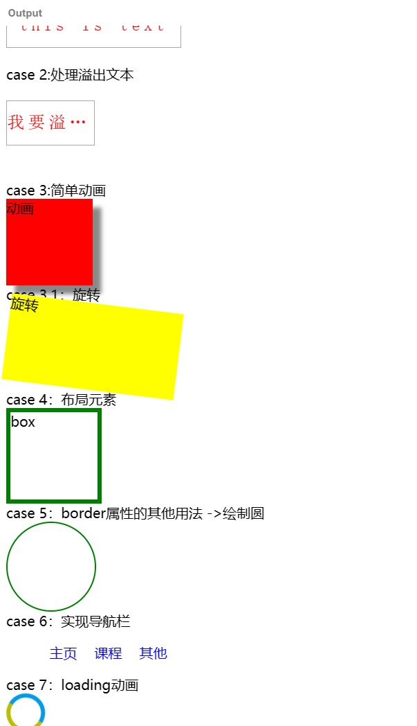
注:case3鼠标悬停时会变长,case7可以实现旋转
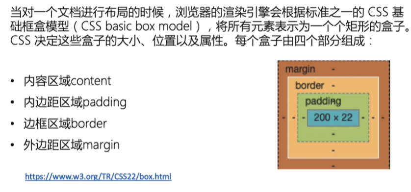
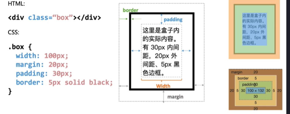
CSS盒模型
下节课课前预习


 扫一扫
扫一扫


 717
717

 被折叠的 条评论
为什么被折叠?
被折叠的 条评论
为什么被折叠?
 到【灌水乐园】发言


