


数据拦截简化数据获取流程
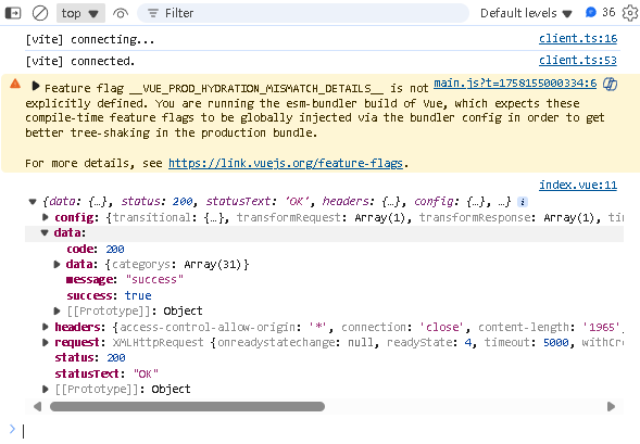
我们可以发现原来我们获取到的数据是这样的情况,里面的东西太多太复杂了,故此我们需要将进行简化。而我们在开发的过程中主要是需要data,code,message。
在src\utils\request.js里面添加这个代码
/**
 * 响应拦截器:
 * 服务器返回数据之后,前端 .then之前被调用
 */
service.interceptors.response.use(response =>{
  const{success , message ,data } =response.data
  if (success){
    return data
  }
  //TODO: 业务请求错误
  return Promise.reject(new Error(message))
})
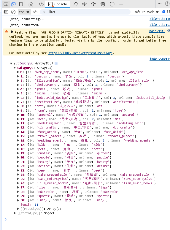
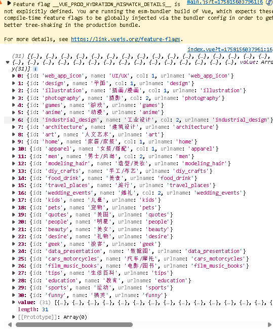
更改完代码后我们可以发现,变成了如下的json数据。
业务组件:移动端navigationBar
首先我们要将mobile里面的调用数据的方法放到去父文件中的index.vue里面。
import { ref } from 'vue';
import {getCategory} from '@/api/category'

const categorys = ref([ ])
const getCategoryData = async () => {
  const { categorys } = await getCategory()
  categorys.value = categorys
  console.log(categorys.value)
}
getCategoryData()
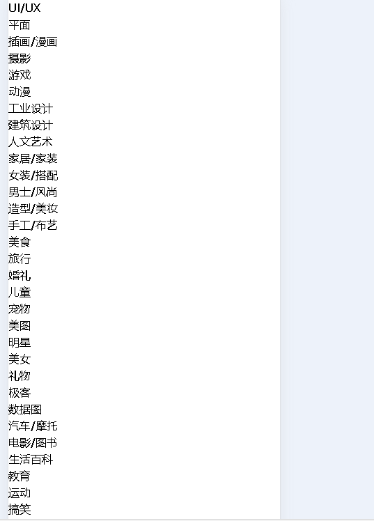
渲染数据
- 首先要在navigation里面修改为以下数据
<template>
  <mobile-navigation-vue v-if="isMobile" :data="categoryData"/>
</template>

<script setup>
import { isMobile } from '@/utils/flexible'
import mobileNavigationVue from './mobile/index.vue'
import { ref } from 'vue';
import {getCategory} from '@/api/category'

const categoryData = ref([ ])
const getCategoryData = async () => {
  const { categorys } = await getCategory()
  categoryData.value = categorys
}
getCategoryData()
</script>

<style scoped lang="scss"></style>
- 然后要在mobile里面渲染数据
<template>
  <div >
    <ul>
      <li v-for="item  in data" :key="item.id">{{ item.name }}</li>
    </ul>
  </div>
</template>
- 最后通过tailwind修改其样式
<template>
  <div class="bg-white sticky top-0 left-0 z-10" >
    <ul class="relative flex overflow-x-auto p-1 text-xs text-zinc-600 overflow-hidden">
      <li v-for="item  in data" :key="item.id" class="shrink-0 px-1.5 py-0.5 z-10 duration-200">{{ item.name }}</li>
    </ul>
  </div>
</template>
动态rem基准值+修正tailwindcss样式
- 在src\utils\flexible.js里面添加动态rem修改方法
/**
 * 动态rem基准值,最大不超过40px
 * 根据用户的屏幕宽度,进行一些计算,把计算出来的值赋值给 html根标签作为fontsize大小
 */
export const useREM =()=>{
    //定义最大的 fontsize
    const MAX_SIZE=40
    //监听 html 文档被解析完成的事件
    document.addEventListener('DOMContentLoaded',() =>{
        //拿到 html 标签
        const html = document.querySelector('html')
        //计算 fontsize,根据屏幕宽度/10
        let fontsize = window.innerWidth/10
        fontsize = fontsize>MAX_SIZE?MAX_SIZE:fontsize
        //赋值给 html
        html.style.fontSize = fontsize+'px'
    })
}
- 在mian.js里面修改
import { createApp } from 'vue'
import App from './App.vue'
import './styles/index.scss'
import router from './router'
import { useREM } from './utils/flexible'

useREM()
createApp(App).use(router).mount('#app')
- 最后修改tailwind.config.js里面的方法
module.exports = {
  //tailwind可以应用的地方
  content: ['./index.html','./src/**/*.{vue,js}'],
  theme: {
    extend: {
      fontSize:{
        xs: ['0.25rem','0.35rem'],
        sm: ['0.35rem','0.45rem'],
        base: ['0.45rem','0.55rem'],
        lg: ['0.55rem','0.65rem'],
        xl: ['0.65rem','0.75rem']
      }
    },
  },
  plugins: [],
}
处理通用组件svg-icon
- 首先我们要构建svg-icon
<template>
  <svg aria-hidden="true">
    <use :xlink:href="symbolId" :class="fillClass" :fill="color" />
  </svg>
</template>

<script setup>
 import { computed } from 'vue'

const props = defineProps({
  // 显示的 svg
  name: {
    type: String,
    required: true
  },
  // svg 图标的颜色
  color: {
    type: String
  },
  // tailwind 指定 svg 颜色的类名
  fillClass: {
    type: String
  }
})
// 真实显示的 svg 图标 (拼接 #icon-)
const symbolId = computed(() => `#icon-${props.name}`)
</script>

<style lang="scss" scoped></style>
- 其次注册svg-icon
import svgIcon from './svg-icon/index.vue'

export default{
    install(app){
        app.component('m-svg-icon',svgIcon)
    }
}
import { createApp } from 'vue'
import App from './App.vue'
import './styles/index.scss'
import router from './router'
import { useREM } from './utils/flexible'
import mLibs from './lib'

useREM()
createApp(App).use(router).use({mLibs}).mount('#app')
- 修改svg-icon占位符
<template>
  <div class="bg-white sticky top-0 left-0 z-10" >
    <ul class="relative flex overflow-x-auto p-1 text-xs text-zinc-600 overflow-hidden">
      <li class="fixed top-0 right-[-1px] h-4 px-1 flex items-center bg-white z-20 shadow-l-white">
        <m-svg-icon class="w-1.5 h-1.5" name="hamburger"></m-svg-icon>
      </li>
      <li v-for="item  in data" :key="item.id" class="shrink-0 px-1.5 py-0.5 z-10 duration-200 last:mr-4">{{ item.name }}</li>
    </ul>
  </div>
</template>
module.exports = {
  //tailwind可以应用的地方
  content: ['./index.html','./src/**/*.{vue,js}'],
  theme: {
    extend: {
      fontSize:{
        xs: ['0.25rem','0.35rem'],
        sm: ['0.35rem','0.45rem'],
        base: ['0.45rem','0.55rem'],
        lg: ['0.55rem','0.65rem'],
        xl: ['0.65rem','0.75rem']
      }
    },
    boxShadow:{
      'l-white':'-10px 0 10px white'
    }
  },
  plugins: [],
}

vite处理svg-icon
无论是vue-cli还是vite默认它们都不会主动导入svg矢量图标,因此我们需要使用一个vite的plugin
- 首先安装vite-plugin-svg-icons到项目中
npm i --save-dev vite-plugin-svg-icons@2.0.1
- 在vite.config.js中注册
......
import { createSvgIconsPlugin } from 'vite-plugin-svg-icons'

// https://vitejs.dev/config/
export default defineConfig({
  plugins: [
    vue(),
    createSvgIconsPlugin({
      // 指定需要缓存的图标文件夹
      iconDirs: [path.resolve(process.cwd(), 'src/assets/icons')],
      // 指定 symbolId 格式
      symbolId: 'icon-[name]'
    })
  ],
  ......
})
- 在main.js里面注册icon图标
// 注册 svg-icons
import 'virtual:svg-icons-register'
slider滑块处理
在src\views\main\components\navigation\mobile\index.vue里面添加代码
<!-- 滑块 -->
      <li ref="sliderTarget"
       :style="sliderStyle"
       class=" absolute h-[22px] bg-zinc-900 rounded-lg duration-200">


<script setup>
import { ref } from 'vue';

  ......

const sliderStyle = ref({
  transform: 'translateX(0px)',
  width:'60px'
})
</script>
处理滑块要想到达目的主要是从以下几个方面考虑
- 选中的item下标:currentCategoryIndex
- 所有item元素:itemRefs
- ul的横向滚动偏离位置:ulScrollLeft
- 最后在currentCategoryIndex发生改变时,获取item下标元素的left和width,计算sliderStyle即可
<template>
  <div class="bg-white sticky top-0 left-0 z-10">
    <ul
      ref="ulTarget"
      class="relative flex overflow-x-auto p-1 text-xs text-zinc-600 overflow-hidden"
    >
      <!-- 滑块 -->
      <li
        ref="sliderTarget"
        :style="sliderStyle"
        class="absolute h-[22px] bg-zinc-900 rounded-lg duration-200"
      ></li>
      <li
        class="fixed top-0 right-[-1px] h-4 px-1 flex items-center bg-white z-20 shadow-l-white"
      >
        <m-svg-icon class="w-1.5 h-1.5" name="hamburger"></m-svg-icon>
      </li>
      <!-- items -->
      <li
        v-for="(item, index) in data"
        :key="item.id"
        class="shrink-0 px-1.5 py-0.5 z-10 duration-200 last:mr-4"
        :class="{
          'text-zinc-100': currentCategoryIndex === index
        }"
        :ref="setItemRef"
        @click="onItemClick(index)"
      >
        {{ item.name }}
      </li>
    </ul>
  </div>
</template>

<script setup>
import { useScroll } from '@vueuse/core'
import { onBeforeUpdate, ref, watch } from 'vue'

// 在vite 构建项目中,我们可以直接使用 defineProps方法
defineProps({
  data: {
    type: Array,
    required: true
  }
})

const sliderStyle = ref({
  transform: 'translateX(0px)',
  width: '60px'
})

//选中 item下标
const currentCategoryIndex = ref(0)

//获取所有的item函数
let itemRefs = []
const setItemRef = (el) => {
  if (el) {
    itemRefs.push(el)
  }
}

//数据改变之后,DON改变之前
onBeforeUpdate(() => {
  itemRefs = []
})

//获取url元素
const ulTarget = ref(null)
//通过vueuse里面的useScroll获取响应式的scroll滚动距离
const { x: ulScrollLeft } = useScroll(ulTarget)

// watch 监听
watch(currentCategoryIndex, (val) => {
  const { left, width } = itemRefs[val].getBoundingClientRect()
  sliderStyle.value = {
    // 滑块的位置 = ul 横向滚动的位置 + 当前元素的 left - ul 的 padding
    transform: `translateX(${ulScrollLeft.value + left - 10}px)`,
    width: width + 'px'
  }
})

// item 点击事件
const onItemClick = (index) => {
  currentCategoryIndex.value = index
}
</script>

<style scoped lang=""></style>
补全category
首先要在src\constants\index.js定义一个常量
//category的本地构建数据
export const ALL_ITEM= {
    id: 'all',
    name: '全部'
}
然后在src\views\main\components\navigation\index.vue里面,添加首个元素
import { ALL_ITEM } from '@/constants';

const categoryData = ref([ ])
const getCategoryData = async () => {
  const { categorys } = await getCategory()
  categoryData.value = categorys
  categoryData.value.unshift(ALL_ITEM)
}
弹出窗口popup
我们点击按钮时候,会有一个弹出窗口popup自低而上弹出,那么这样的一个功能,我们一样可以把它处理为项目的通用组件。以下是popup的能力:
- 当popup展开时,内容视图应该不属于任何一个组件内部,而应该直接被插入到body下面
- popip应该包含两部分内容,一部分是背景蒙板,一部分为内容的包裹容器
- popip应该通过一个双向绑定进行控制展示和隐藏
- popup展示时,滚动应该被锁定
- 内容区域应该接受所有的attrs,并且应该通过插槽让调用方指定其内容
简单导入:
- 在src\libs\popup\index.vue添加一下内容
<template>
    <div>
        <teleport to='body' >
        <!-- 蒙版 -->
         <div>蒙版</div>
        <!-- 内容 -->
         <div>组件</div>
        </teleport>
    </div>
</template>

<script setup>
</script>

<style lang='scss' scoped>

</style>
- 将m-popup注册
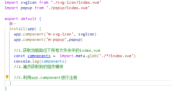
import svgIcon from './svg-icon/index.vue'
import popup from './popup/index.vue'

export default {
  install(app) {
    app.component('m-svg-icon', svgIcon)
    app.component('m-popup',popup)
  }
}
- 将其在src\views\main\components\navigation\mobile\index.vue实现
<template>
  <div class="bg-white sticky top-0 left-0 z-10">
    <ul>
      ......
    </ul>
    <m-popup/>
  </div>
</template>
最终实现
src\views\main\components\navigation\mobile\index.vue
<template>
  <div class="bg-white sticky top-0 left-0 z-10">
    <ul
      ref="ulTarget"
      class="relative flex overflow-x-auto p-1 text-xs text-zinc-600 overflow-hidden"
    >
      <!-- 滑块 -->
      <li
        ref="sliderTarget"
        :style="sliderStyle"
        class="absolute h-[22px] bg-zinc-900 rounded-lg duration-200"
      ></li>
      <!-- 按钮 -->
      <li
        class="fixed top-0 right-[-1px] h-4 px-1 flex items-center bg-white z-20 shadow-l-white"
        @click="onShowPopup"
      >
        <m-svg-icon class="w-1.5 h-1.5" name="hamburger"></m-svg-icon>
      </li>
      <!-- items -->
      <li
        v-for="(item, index) in data"
        :key="item.id"
        class="shrink-0 px-1.5 py-0.5 z-10 duration-200 last:mr-4"
        :class="{
          'text-zinc-100': currentCategoryIndex === index
        }"
        :ref="setItemRef"
        @click="onItemClick(index)"
      >
        {{ item.name }}
      </li>
    </ul>
    <m-popup v-model="isVisable">
      <div>我是内容</div>
    </m-popup>
  </div>
</template>

<script setup>
import { useScroll } from '@vueuse/core'
import { onBeforeUpdate, ref, watch } from 'vue'

// 在vite 构建项目中,我们可以直接使用 defineProps方法
defineProps({
  data: {
    type: Array,
    required: true
  }
})

const sliderStyle = ref({
  transform: 'translateX(0px)',
  width: '52px'
})

//选中 item下标
const currentCategoryIndex = ref(0)

//获取所有的item函数
let itemRefs = []
const setItemRef = (el) => {
  if (el) {
    itemRefs.push(el)
  }
}

//数据改变之后,DON改变之前
onBeforeUpdate(() => {
  itemRefs = []
})

//获取url元素
const ulTarget = ref(null)
//通过vueuse里面的useScroll获取响应式的scroll滚动距离
const { x: ulScrollLeft } = useScroll(ulTarget)

// watch 监听
watch(currentCategoryIndex, (val) => {
  const { left, width } = itemRefs[val].getBoundingClientRect()
  sliderStyle.value = {
    // 滑块的位置 = ul 横向滚动的位置 + 当前元素的 left - ul 的 padding
    transform: `translateX(${ulScrollLeft.value + left - 10}px)`,
    width: width + 'px'
  }
})

// item 点击事件
const onItemClick = (index) => {
  currentCategoryIndex.value = index
}

//控制popup展示
const isVisable = ref(false)
const onShowPopup =() =>{
  isVisable.value=true
}
</script>

<style scoped lang=""></style>
src\libs\popup\index.vue
<template>
    <div >
        <teleport to='body' >
        <!-- 蒙版 -->
         <transition name="fade" v-if="modelValue" @click="emits('update:modelValue',false)">
        <div class="w-screen h-screen bg-zinc-900/80 z-40 fixed top-0 left-0"></div>
         </transition>
        <!-- 内容 -->
        <transition name="popup-down-up">
        <div v-bind="$attrs" class="w-screen bg-white z-60 fixed bottom-0" v-if="modelValue">
            <slot/>
        </div>
        </transition>
        </teleport>
    </div>
</template>

<script setup>
import { ref, watch } from 'vue';
import { useScrollLock } from '@vueuse/core';

const props = defineProps({
    modelValue:{
        required: true,
        type: Boolean
    }
})

const emits =  defineEmits(['update:modelValue'])

//锁定滚动
const isLocked =  useScrollLock(document.body)
watch(
    () => props.modelValue,
    (val) =>{
        isLocked.value = val
    },
    {
        immediate:true
    }
)
</script>

<style lang='scss' scoped>

//fade动画
.fade-enter-active,
.fade-leave-active{
    transition: all 0.3s;
}

//准备进入,离开完成
.fade-enter-from,
.fade-leave-from{
    opacity: 0;
}

.popup-down-up-enter-active,
.popup-down-up-leave-active{
    transition: all 0.3s;

}

.popup-down-up-enter-from,
.popup-down-up-leave-from{
    transform: translateY(100%);
}
</style>
双向数据绑定优化
useVModel可以直接帮我们完成数据间的双向绑定,主要是将项目里面的v-model改为isVisable
<template>
    <div >
        <teleport to='body' >
        <!-- 蒙版 -->
         <transition name="fade" v-if="isVisable" @click="isVisable =false">
        <div class="w-screen h-screen bg-zinc-900/80 z-40 fixed top-0 left-0"></div>
         </transition>
        <!-- 内容 -->
        <transition name="popup-down-up">
        <div v-bind="$attrs" class="w-screen bg-white z-60 fixed bottom-0" v-if="modelValue">
            <slot/>
        </div>
        </transition>
        </teleport>
    </div>
</template>

<script setup>
import { ref, watch } from 'vue';
import { useScrollLock,useVModel } from '@vueuse/core';

const props = defineProps({
    modelValue:{
        required: true,
        type: Boolean
    }
})

defineEmits(['update:modelValue'])

//是一个响应式数据,当isVisable 值发送改变时,会自动触发emit修改modelValue
const isVisable = useVModel(props)

//锁定滚动
const isLocked =  useScrollLock(document.body)
watch(
    isVisable,
    (val) =>{
        isLocked.value = val
    },
    {
        immediate:true
    }
)
</script>

<style lang='scss' scoped>

//fade动画
.fade-enter-active,
.fade-leave-active{
    transition: all 0.3s;
}

//准备进入,离开完成
.fade-enter-from,
.fade-leave-from{
    opacity: 0;
}

.popup-down-up-enter-active,
.popup-down-up-leave-active{
    transition: all 0.3s;

}

.popup-down-up-enter-from,
.popup-down-up-leave-from{
    transform: translateY(100%);
}
</style>
vite通用组件自动化注册
目前我们在项目中已经完成了两个通用组件,将来我们还需要更多的通用组件开发,如果每次开发完成一个通用组件之后,都要手动去注册,未免太麻烦了,所以我们通过vite提供的功能,进行组件自动化注册。
- vite的Glob功能:改功能帮助我们可以在文件系统中导入多个模块
- vue的defineAsyncComponent方法:该方法可以创建一个按需加载的异步组件
基于上面的两个方法,实现组件自动注册
最终代码
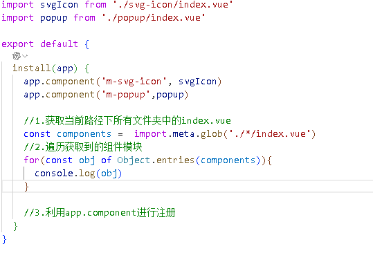
import { defineAsyncComponent } from 'vue'
export default {
install(app) {
//1.获取当前路径下所有文件夹中的index.vue
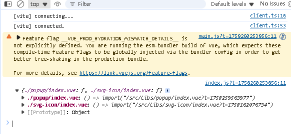
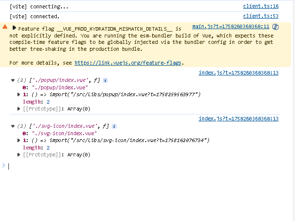
const components = import.meta.glob('./*/index.vue')
//2.遍历获取到的组件模块
for(const [fullPath,fn] of Object.entries(components)){
//3.利用app.component进行注册 ./popup/index.vu分割为popup
const componentName ='m-'+fullPath.replace('./','').split('/')[0]
app.component(componentName,defineAsyncComponent(fn))
}
}
}
最终代码
<template>
  <div class="bg-white sticky top-0 left-0 z-10">
    <ul
      ref="ulTarget"
      class="relative flex overflow-x-auto p-1 text-xs text-zinc-600 overflow-hidden"
    >
      <!-- 滑块 -->
      <li
        ref="sliderTarget"
        :style="sliderStyle"
        class="absolute h-[22px] bg-zinc-900 rounded-lg duration-200"
      ></li>
      <!-- 按钮 -->
      <li
        class="fixed top-0 right-[-1px] h-4 px-1 flex items-center bg-white z-20 shadow-l-white"
        @click="onShowPopup"
      >
        <m-svg-icon class="w-1.5 h-1.5" name="hamburger"></m-svg-icon>
      </li>
      <!-- items -->
      <li
        v-for="(item, index) in data"
        :key="item.id"
        class="shrink-0 px-1.5 py-0.5 z-10 duration-200 last:mr-4"
        :class="{
          'text-zinc-100': currentCategoryIndex === index
        }"
        :ref="setItemRef"
        @click="onItemClick(index)"
      >
        {{ item.name }}
      </li>
    </ul>
    <m-popup v-model="isVisable">
     <menu-vue :categorys="data" @onItemClick="onItemClick"></menu-vue>
    </m-popup>
  </div>
</template>

<script setup>
import { useScroll } from '@vueuse/core'
import { onBeforeUpdate, ref, watch } from 'vue'
import MenuVue from '@/views/main/components/menu/index.vue'

// 在vite 构建项目中,我们可以直接使用 defineProps方法
defineProps({
  data: {
    type: Array,
    required: true
  }
})

const sliderStyle = ref({
  transform: 'translateX(0px)',
  width: '52px'
})

//选中 item下标
const currentCategoryIndex = ref(0)

//获取所有的item函数
let itemRefs = []
const setItemRef = (el) => {
  if (el) {
    itemRefs.push(el)
  }
}

//数据改变之后,DON改变之前
onBeforeUpdate(() => {
  itemRefs = []
})

//获取url元素
const ulTarget = ref(null)
//通过vueuse里面的useScroll获取响应式的scroll滚动距离
const { x: ulScrollLeft } = useScroll(ulTarget)

// watch 监听
watch(currentCategoryIndex, (val) => {
  const { left, width } = itemRefs[val].getBoundingClientRect()
  sliderStyle.value = {
    // 滑块的位置 = ul 横向滚动的位置 + 当前元素的 left - ul 的 padding
    transform: `translateX(${ulScrollLeft.value + left - 10}px)`,
    width: width + 'px'
  }
})

// item 点击事件
const onItemClick = (index) => {
  currentCategoryIndex.value = index
  isVisable.value=false
}

//控制popup展示
const isVisable = ref(false)
const onShowPopup =() =>{
  isVisable.value=true
}
</script>

<style scoped lang=""></style>
<template>
    <div class="py-2 h-[80vh] flex flex-col">
      <h2 class="text-xl text-zinc-900 font-bold mb-2 px-1">所有分类</h2>
      <ul class="overflow-y-scroll">
        <li
          v-for="(item, index) in categorys"
          :key="item.id"
          class="text-lg text-zinc-900 px-1 py-1.5 duration-100 active: bg-zinc-100"
          @click="$emit('onItemClick',index)"
        >
          {{ item.name }}
        </li>
      </ul>
    </div>
  </template>
<script setup>
defineProps({
    categorys:{
        type: Array,
        required:true
    }

})

//推荐使用的item进行注册
defineEmits(['onItemClick'])
</script>

<style lang='scss' scoped>

</style>


 扫一扫
扫一扫


 17万+
17万+

 被折叠的 条评论
为什么被折叠?
被折叠的 条评论
为什么被折叠?
 到【灌水乐园】发言


