


如何处理移动端弹框下页面滑动的问题
我们不需要依靠js来处理,只需要设置简单的css就可以啦
重点:最外层设置absolute定位
代码来了:
<!DOCTYPE html>
<html>
<head>
<meta
name="viewport"
content="width=device-width, initial-scale=1, shrink-to-fit=no"
/>
<style>
.container {
width: 100%;
position: absolute; /* 给最外层元素设置绝对定位,让其内部进行滚动 */
top: 0;
bottom: 0;
right: 0;
left: 0;
overflow-y: scroll;
-webkit-overflow-scrolling: touch; /* 增加弹性 */
user-select: none; /* 移动端一般会设置不可选中 */
}
.con {
width: 100%;
height: 1000px;
text-align: center;
padding-top: 500px;
background: #f94f4f;
}
#dialog {
position: fixed;
top: 0;
bottom: 0;
left: 0;
right: 0;
background: rgba(0, 0, 0, 0.5);
display: none;
justify-content: center;
align-items: center;
}
.wrapper {
width: 280px;
height: 200px;
border-radius: 5px;
background: #fff;
font-size: 16px;
display: flex;
justify-content: center;
align-items: center;
}
</style>
</head>
<body>
<div class="container">
<div class="con">
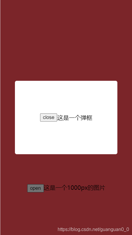
<button onClick="openDialog()">open</button>这是一个1000px的图片
</div>
</div>
<div id="dialog">
<div class="wrapper">
<button onClick="closeDialog()">close</button>这是一个弹框
</div>
</div>
<script>
const openDialog = () => {
document.getElementById("dialog").style.display = "flex";
};
const closeDialog = () => {
document.getElementById("dialog").style.display = "none";
};
</script>
</body>
</html>


 扫一扫
扫一扫


 420
420

 被折叠的 条评论
为什么被折叠?
被折叠的 条评论
为什么被折叠?
 到【灌水乐园】发言


