


 本文展示了如何使用HTML5和CSS3在Web前端构建一个具有流光动画效果的登录页面。通过HBuilder软件,作者详细解释了HTML结构和CSS样式,包括输入框验证、动画效果以及登录按钮的样式设计,最终实现了多色流动光线的视觉效果。
关于使用HTML5+CSS3实现编写流光效果的Web前端登陆页面(多种颜色动画流光效果)
注:实现本次效果全程使用HBuilder软件进行操作和编写
效果图如下: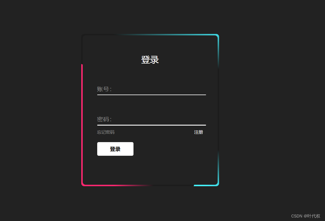
- 首先我们在html页面链入我们的css文件,在页面编写需要的文本框和点击按钮。代码如下:
<!DOCTYPE html> <html> <head> <meta charset="utf-8" /> <title></title> <link rel="stylesheet" href="css/new_file.css" /> </head> <body> <div class="box"> <span class="borderLine"></span> <form> <h2>登录</h2> <div class="inputBox"> <input type="text" required="required" /> <span>账号:</span><i></i> </div> <div class="inputBox"> <input type="password" required="required" /> <span>密码:</span><i></i> </div> <div class="links"> <a href="#">忘记密码</a><a href="#">注册</a> </div> <input type="submit" value="登录"> </form> </div> </body> </html> - 在我们的css文件中要进行底色的设置,代码如下:
/*设置底色*/ *{ margin: 0; padding: 0; font-size: 黑体; box-sizing: border-box; } body{ display: flex; justify-content: center; align-items: center; min-height: 100vh; background: #222; } - 设置登录盒子的大小和颜色
/*设置登录盒子的大小和底色*/ .box{ position:relative; width: 380px; height: 420px; background: #1c1c1c; border-radius: 8px; } - 开启flex布局,换轴
/*开启flex布局,换轴*/ .box form{ position:absolute; inset:4px; background: #222; padding: 50px 40px; border-radius: 8px; z-index: 2; display: flex; flex-direction: column; } - 设置基本文字样式,输入框盒子大小间距
/*标题文字样式,输入框盒子大小间距*/ .box form h2{ color: #fff; font-weight: 500; text-align: center; letter-spacing: 0.lem; } .box form .inputBox{ position: relative; width: 300px; margin-top: 35px; } - 调整输入框样式
/*调整输入框样式*/ .box form .inputBox input{ position: relative; width: 100%; padding: 20px 10px 10px; background: transparent; outline: none; border: none; box-shadow: none; color: #23242; font-size: 1em; letter-spacing: 0.05em; z-index: 10; } - 提示文字的样式
/*提示文字样式*/ .box form .inputBox span{ position: absolute; left: 0; padding: 20px 0px 10px; pointer-events: none; color: #8f8f8f; font-size: 1em; letter-spacing: 0.05em; } - 输入有效值获取焦点时样式
/*输入有效值获取焦点时样式*/ .box form .inputBox input{ transition: 0.5s; } .box form .inputBox span{ transition: 0.5s; } .box form .inputBox input:valid~span, .box form .inputBox input:focus~span{ color: #fff; font-size: 0.75em; transform: translateY(-34px); } - 设置白色下划线,并设置点击穿透
/*设置白色下划线,并设置点击穿透*/ .box form .inputBox i{ position: absolute; left: 0; bottom: 0; width: 100%; height: 2px; background: #fff; border-radius: 4px; overflow: hidden; transition: 0.5s; pointer-events: none; } - 重复一遍输入有效值获取焦点时样式
/*输入有效值获取焦点时样式*/ .box form .inputBox input:valid~i, .box form .inputBox input:focus~i{ height: 44px; } - 开启flex,a链接样式
/*开启flex a链接样式*/ .box form .links{ display: flex; justify-content: space-between; } .box form .links a{ margin: 10px 0; font-size: 0.75em; color: #8f8f8f; text-decoration: none; } - a链接hover时改颜色,注册直接改颜色
/*a链接hover时改颜色,注册直接改颜色*/ .box form .links a:hover, .box form .links a:nth-child(2){ color: #fff; } - 修改登录按钮样式
/*修改登录按钮样式*/ .box form input[type="submit"]{ border: none; outline: none; padding: 9px 25px; background: #fff; cursor: pointer; font-size: 0.9em; border-radius: 4px; font-weight: 600; width: 100px; margin-top: 10px; } - 登录按钮点击时,透明度80%
/*登录按钮点击时,透明度80%*/ .box form input[type="submit"]:active{ opacity: 0.8; } - 写动画,自定义动画,添加动画
/*写动画*/ .borderLine{ position: absolute; top:0; inset:0; } @keyframes animate{ 0%{ transform: rotate(0deg); } 100%{ transform: rotate(360deg); } } /*添加动画*/ .box::before, .box::after, .borderLine::before, .borderLine::after{ content: ""; position: absolute; top:-50%; width: 380px; height: 420px; background:linear-gradient( 0deg,transparent,transparent, #45f3ff,#45f3ff,#45f3ff); z-index: 1; transform-origin: bottom right; animation: animate 6s linear infinite; } - 添加动画延迟,修改为两种颜色
/*添加动画延迟,修改为两种颜色*/ .box::after{ animation-delay: -3s; } .borderLine::before{ background: linear-gradient( 0deg,transparent,transparent, #ff2770,#ff2770,#ff2770); animation-delay: -1.5s; } .borderLine::after{ background: linear-gradient( 0deg,transparent,transparent, #ff2770,#ff2770,#ff2770); animation-delay: -4.5s; } - 最后退出隐藏。
/*退出隐藏*/ .box{ overflow: hidden; } - 总结,我们这次的流光登录页面救写完啦。
- 我特意将整个小项目的步骤都一步一步刨析出来了,你们可以按照代码和注释一步一步的去弄明白。
- 现我分别将HTML页面、CSS页面代码,整合到一起供你们参考。
- HTML代码
<!DOCTYPE html> <html> <head> <meta charset="utf-8" /> <title></title> <link rel="stylesheet" href="css/new_file.css" /> </head> <body> <div class="box"> <span class="borderLine"></span> <form> <h2>登录</h2> <div class="inputBox"> <input type="text" required="required" /> <span>账号:</span><i></i> </div> <div class="inputBox"> <input type="password" required="required" /> <span>密码:</span><i></i> </div> <div class="links"> <a href="#">忘记密码</a><a href="#">注册</a> </div> <input type="submit" value="登录"> </form> </div> </body> </html> - CSS代码
/*设置底色*/
*{
	margin: 0;
	padding: 0;
	font-size: 黑体;
	box-sizing: border-box;
}
body{
	display: flex;
	justify-content: center;
	align-items: center;
	min-height: 100vh;
	background: #222;
}
/*设置登录盒子的大小和底色*/
.box{
	position:relative;
	width: 380px;
	height: 420px;
	background: #1c1c1c;
	border-radius: 8px;
}
/*开启flex布局,换轴*/
.box form{
	position:absolute;
	inset:4px;
	background: #222;
	padding: 50px 40px;
	border-radius: 8px;
	z-index: 2;
	display: flex;
	flex-direction: column;
}
/*标题文字样式,输入框盒子大小间距*/
.box form h2{
	color: #fff;
	font-weight: 500;
	text-align: center;
	letter-spacing: 0.lem;
}
.box form .inputBox{
	position: relative;
	width: 300px;
	margin-top: 35px;
}
/*调整输入框样式*/
.box form .inputBox input{
	position: relative;
	width: 100%;
	padding: 20px 10px 10px;
	background: transparent;
	outline: none;
	border: none;
	box-shadow: none;
	color: #23242;
	font-size: 1em;
	letter-spacing: 0.05em;
	z-index: 10;
}
/*提示文字样式*/
.box form .inputBox span{
	position: absolute;
	left: 0;
	padding: 20px 0px 10px;
	pointer-events: none;
	color: #8f8f8f;
	font-size: 1em;
	letter-spacing: 0.05em;
}
/*输入有效值获取焦点时样式*/
.box form .inputBox input{
	transition: 0.5s;
}
.box form .inputBox span{
	transition: 0.5s;
}
.box form .inputBox input:valid~span,
.box form .inputBox input:focus~span{
	color: #fff;
	font-size: 0.75em;
	transform: translateY(-34px);
}
/*设置白色下划线,并设置点击穿透*/
.box form .inputBox i{
	position: absolute;
	left: 0;
	bottom: 0;
	width: 100%;
	height: 2px;
	background: #fff;
	border-radius: 4px;
	overflow: hidden;
	transition: 0.5s;
	pointer-events: none;
}
/*输入有效值获取焦点时样式*/
.box form .inputBox input:valid~i,
.box form .inputBox input:focus~i{
	height: 44px;
}
/*开启flex a链接样式*/
.box form .links{
	display: flex;
	justify-content: space-between;
}
.box form .links a{
	margin: 10px 0;
	font-size: 0.75em;
	color: #8f8f8f;
	text-decoration: none;
}
/*a链接hover时改颜色,注册直接改颜色*/
.box form .links a:hover,
.box form .links a:nth-child(2){
	color: #fff;
}
/*修改登录按钮样式*/
.box form input[type="submit"]{
	border: none;
	outline: none;
	padding: 9px 25px;
	background: #fff;
	cursor: pointer;
	font-size: 0.9em;
	border-radius: 4px;
	font-weight: 600;
	width: 100px;
	margin-top: 10px;
}
/*登录按钮点击时,透明度80%*/
.box form input[type="submit"]:active{
	opacity: 0.8;
}
/*写动画*/
.borderLine{
	position: absolute;
	top:0;
	inset:0;
}
@keyframes animate{
	0%{
		transform: rotate(0deg);
	}
	100%{
		transform: rotate(360deg);
	}
}
/*添加动画*/
.box::before,
.box::after,
.borderLine::before,
.borderLine::after{
	content: "";
	position: absolute;
	top:-50%;
	width: 380px;
	height: 420px;
	background:linear-gradient(
	0deg,transparent,transparent,
	#45f3ff,#45f3ff,#45f3ff);
	z-index: 1;
	transform-origin: bottom right;
	animation: animate 6s linear infinite;
}
/*添加动画延迟,修改为两种颜色*/
.box::after{
	animation-delay: -3s;
}
.borderLine::before{
	background: linear-gradient(
	0deg,transparent,transparent,
	#ff2770,#ff2770,#ff2770);
	animation-delay: -1.5s;
}
.borderLine::after{
	background: linear-gradient(
	0deg,transparent,transparent,
	#ff2770,#ff2770,#ff2770);
	animation-delay: -4.5s;
}
/*退出隐藏*/
.box{
	overflow: hidden;
}


 扫一扫
扫一扫


 240
240

 被折叠的 条评论
为什么被折叠?
被折叠的 条评论
为什么被折叠?
 到【灌水乐园】发言


