


 本文介绍了基于AVM(Application-View-Model)前端组件化开发模式的滑动单元格组件,该组件兼容Vue和React语法,并支持WebComponents标准。组件通过监听触摸事件实现显示和隐藏按钮的效果,同时提供了详细的组件使用说明和示例代码。此外,还展示了如何在AVM组件库中寻找和使用组件,以及组件的多端适配能力。
AVM(Application-View-Model)前端组件化开发模式基于标准Web Components组件化思想,提供包含虚拟DOM和Runtime的编程框架avm.js以及多端统一编译工具,完全兼容Web Components标准,同时兼容Vue和React语法糖编写代码,编译工具将Vue和React相关语法糖编译转换为avm.js代码。
基于标准 Web Components 组件化思想,兼容 Vue / React 语法特性,通过一次编码,分别编译为 App、小程序代码,实现多端开发。
组件功能介绍
滑动单元格组件原理是主题部分把按钮进行遮挡,按钮通过绝对定位,定位在最右边,通过监听触摸事件(touch),判断滑动的方向和计算滑动的距离以此来判定显示和隐藏按钮。显示和隐藏按钮是通过对主体部分进行css 的transform属性对主体元素进行移动,以达到显示和隐藏按钮的效果。
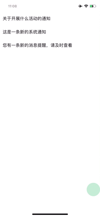
示例展示
组件开发
组件文件
easy-swipe-cell.stml
<template>
	<view class="easy-swipe-cell_container" data-id={itemId} @touchstart="start" @touchmove="move" @touchend="end">
		<view class="easy-swipe-cell_content" :style="itemId == touchIdNow?handleSwipe:'transform:translateX(0px)'">
			<text>{itemContent}</text>
		</view>
		<view class="easy-swipe-cell_btn" id="btn">
			<view class="easy-swipe-cell_btn-item" style="background-color: #ee0a24;" data-id={itemId} data-type='delete' @click="clickItem">
				<text class="easy-swipe-cell_btn-item-label">删除</text>
			</view>
			<view class="easy-swipe-cell_btn-item" style="background-color: #07c160;" data-id={itemId} data-type='read' @click="clickItem">
				<text class="easy-swipe-cell_btn-item-label">已读</text>
			</view>
		</view>
	</view>
</template>
<script>
	export default {
		name: 'easy-swipe-cell',
		props:{
			itemId:String,
			itemContent:String,
			touchIdNow:String
		},
		data() {
			return{
				startX:0, //触摸位置
				endX:0, //结束位置
				moveX: 0, //滑动时的位置
				disX: 0, //移动距离
				handleSwipe: '',//滑动时的效果,动态绑定
				touchId:''
			}
		},
		mounted (){

		},
		methods: {
			start(e){
				// console.log(JSON.stringify(e.detail)+'开始');
				this.data.startX = e.detail.x;
				this.data.touchId = e.currentTarget.dataset.id;
				this.fire('touch',this.data.touchId);
			},
			move(e){
				// console.log(JSON.stringify(e.detail)+'移动');
				let wd=document.getElementById('btn').offsetWidth;
				this.data.moveX = e.detail.x;
				this.data.disX = this.data.startX - this.data.moveX;
				console.log(this.data.disX);
				// 如果是向右滑动或者不滑动,不改变滑块的位置
				if(this.disX < 0 || this.disX == 0) {
					this.data.handleSwipe = "transform:translateX(0px)";
					// 大于0,表示左滑了,此时滑块开始滑动
				}else if (this.disX > 0) {
					//具体滑动距离我取的是 手指偏移距离*5。
					this.data.handleSwipe = "transform:translateX(-" + this.disX*5 + "px)";
					// 最大也只能等于按钮宽度
					if (this.disX*5 >=wd) {
						this.handleSwipe = "transform:translateX(-" +wd+ "px)";
					}
				}
				this.fire('touch',this.data.touchId);
			},
			end(e){
				//console.log(JSON.stringify(e.detail)+'结束');
				let wd=document.getElementById('btn').offsetWidth;
				let endX = e.detail.x;
				this.disX = this.data.startX - endX;
				//如果距离小于按钮一半,强行回到起点
				if ((this.disX*5) < (wd/2)) {
					this.data.handleSwipe = "transform:translateX(0px)";
				}else{
				//大于一半 滑动到最大值
					this.data.handleSwipe = "transform:translateX(-"+wd+ "px)";
				}
				this.fire('touch',this.data.touchId);
			},
			clickItem(e){
				this.data.handleSwipe = "transform:translateX(0px)";
				this.fire('clickBtn',{type:e.currentTarget.dataset.type,id:e.currentTarget.dataset.id});
			}
        }
	}
</script>
<style>
	.easy-swipe-cell_content{
		justify-content: center;
		background-color: #ffffff;
		position: relative;
		width: 100%;
		left: 0;
		right: 0;
		top: 0;
		bottom: 0;
		z-index: 1000;
		transition: 0.6s;
		min-height: 50px;
		padding: 10px;
	}
	.easy-swipe-cell_btn{
		position: absolute;
		right: 0;
		top: 0;
		display: flex;
		flex-flow: row nowrap;
		height: 100%;
		z-index: 1;
	}
	.easy-swipe-cell_btn-item{
		height: 100%;
		justify-content: center;

	}
	.easy-swipe-cell_btn-item-label{
		color: #ffffff;
		font-size: 15px;
		padding: 0 20px;
	}
</style>
组件使用说明
本组件是基于AVM.js开发的多端组件,通常同时适配Android、iOS、小程序、H5 , 具体支持情况还要看每个组件的说明文档。
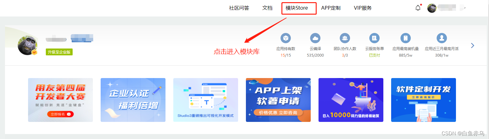
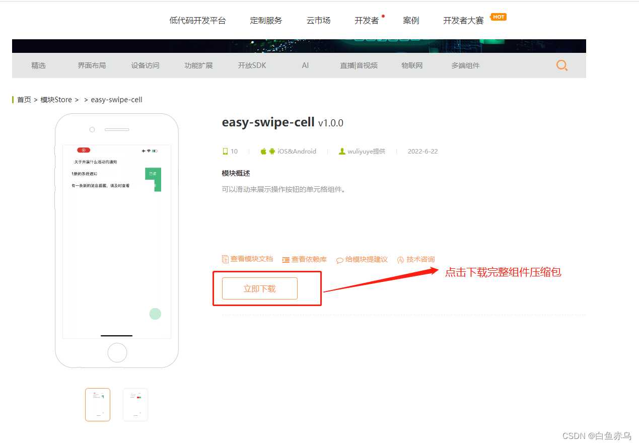
首先需要登录开发平台,http://www.apicloud.com。 通过控制平台右上方的模块Store进入,然后选择AVM组件。
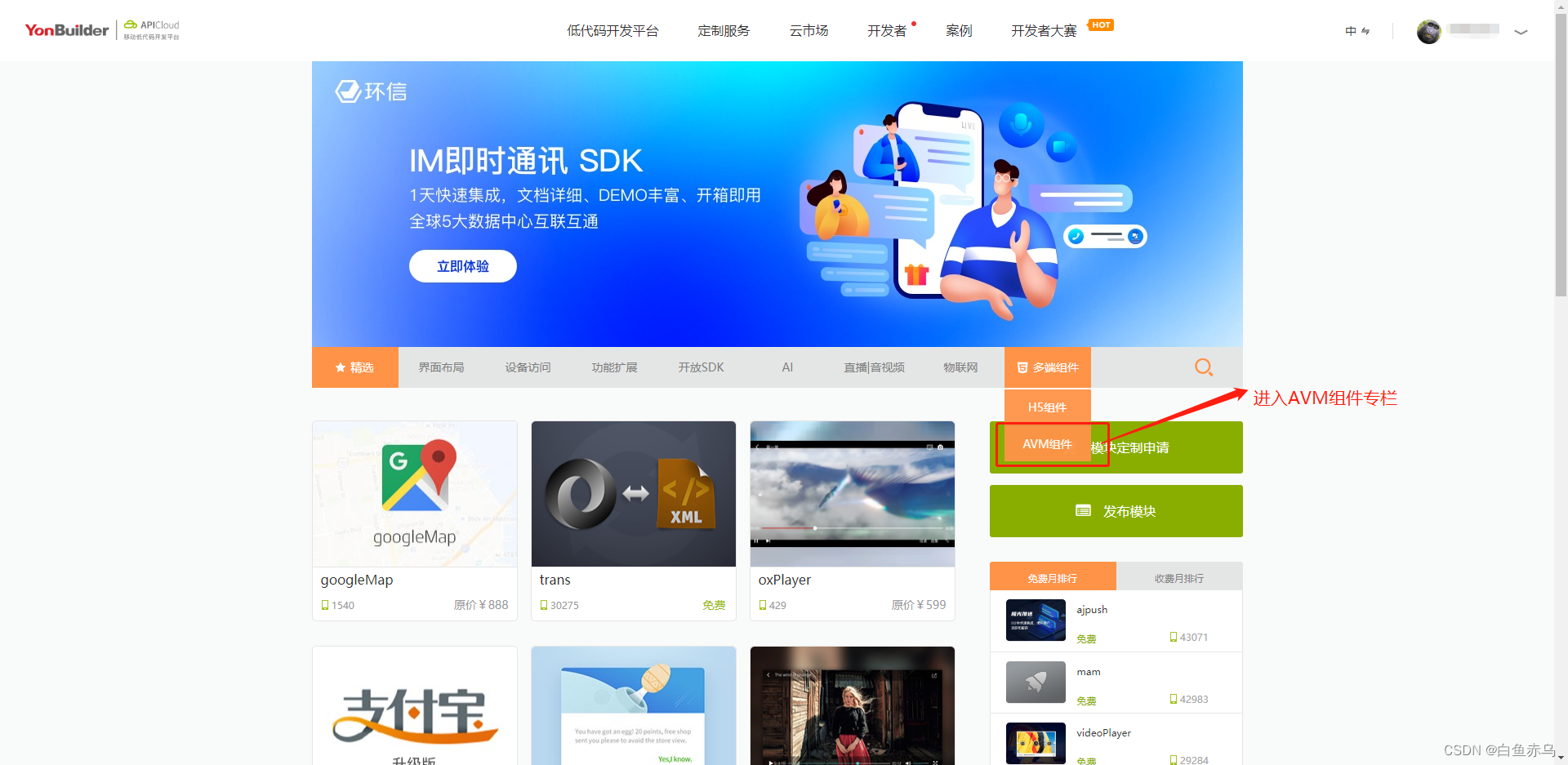
找到对应模块点击进入。
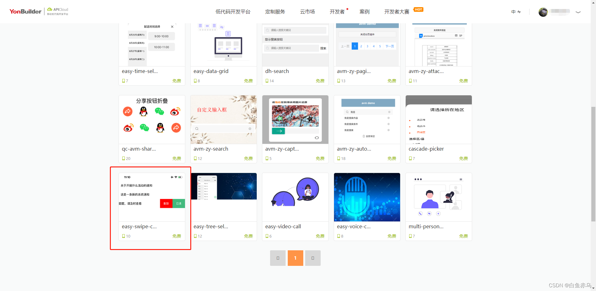
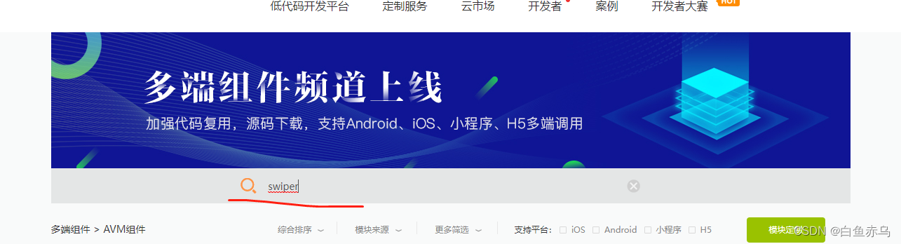
也可通过搜索栏,通过组件名称关键字进行检索。
点击立即下载下载完整的组件安装包。
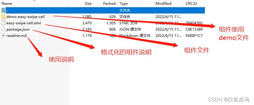
组件压缩包的文件目录如下
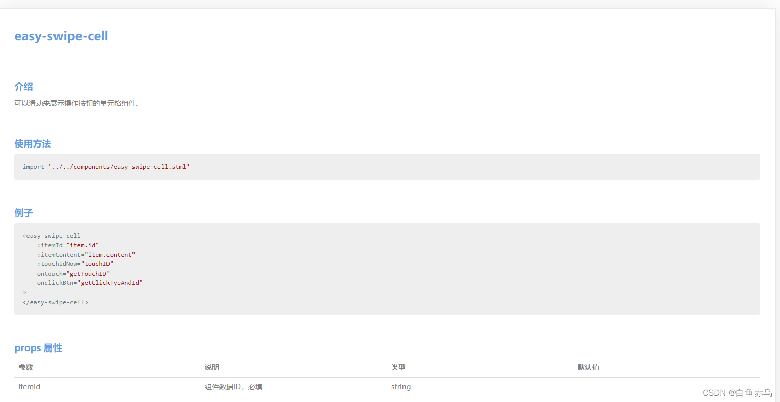
也可通过查看模块文档 来了解模块的具体参数,引用的原生模块,注意事项等。
 具体在项目中的使用步骤是,第一步将压缩文件中的easy-swiper-cell.stml文件拷贝到项目的components目录,通过阅读readme.md 文档和查看demo示例文件 demo-easy-swipe-cell.stml在需要开发的stml文件中,引入组件文件,完成页面的开发。
demo-easy-swipe-cell.stml
<template>
	<scroll-view class="page">
		<safe-area></safe-area>
		<view v-for="(item,index) in list">
			<easy-swipe-cell
				:itemId="item.id"
				:itemContent="item.content"
				:touchIdNow="touchID"
				ontouch="getTouchID"
				onclickBtn="getClickTyeAndId"
			>
			</easy-swipe-cell>
		</view>
	</scroll-view>
</template>
<script>
	import '../../components/easy-swipe-cell.stml'
	export default {
		name: 'demo-easy-swipe-cell',
		apiready(){//like created

		},
		data() {
			return{
				list:[{
					id:'1',
					content:'关于开展什么活动的通知'
				},{
					id:'2',
					content:'这是一条新的系统通知'
				},{
					id:'3',
					content:'您有一条新的消息提醒,请及时查看'
				}],
				touchID:''
			}
		},
		methods: {
			getTouchID(e){
				console.log(JSON.stringify(e));
				this.data.touchID = e.detail;
			},
			getClickTyeAndId(e){
				console.log(JSON.stringify(e));
				api.toast({
					msg:'当前点击的是'+e.detail.type+'按钮,记录ID是'+e.detail.id
				})
			}
		}
	}
</script>
<style>
	.page {
		height: 100%;
	}
</style>
如果在AVM组件库中,没有找到实际项目中需要的组件,可以自己尝试封装组件。


 扫一扫
扫一扫


 5231
5231

 被折叠的 条评论
为什么被折叠?
被折叠的 条评论
为什么被折叠?
 到【灌水乐园】发言


