buttons_tabbar:打造 Flutter 应用中互动性极强的标签栏
在移动应用开发中,标签栏(TabBar)是一个非常常见的组件,它能帮助用户快速切换不同的页面或视图。今天,我要为大家推荐一个出色的 Flutter 开源项目——buttons_tabbar,它不仅可以为你的应用增添美观的视觉效果,还能提供丰富的交互体验。
项目介绍
buttons_tabbar 是一个开源的 Flutter 包,它为开发者提供了一个每个标签指示器都是切换按钮的标签栏。这意味着,用户可以通过点击标签来切换视图,同时每个标签都具有按钮的交互效果,如点击反馈和自定义样式。
项目技术分析
buttons_tabbar 利用 Flutter 的强大特性,如自定义样式、过渡动画等,为开发者提供了一个高度可定制化的标签栏解决方案。其技术特点如下:
- 高度自定义:通过丰富的参数,开发者可以轻松调整标签栏的背景色、边框色、标签样式、图标颜色等。
- 平滑过渡动画:内置了平滑的过渡动画,为用户提供流畅的交互体验。
- 易于集成:只需简单的几步即可将 buttons_tabbar 集成到现有的 Flutter 项目中。
项目及技术应用场景
buttons_tabbar 适用于多种需要标签切换的场景,比如电商应用中的商品分类、新闻应用中的不同频道切换、音乐应用中的播放列表切换等。以下是一些具体的应用场景:
- 电商平台:用户可以在不同的商品分类之间快速切换,查看各类商品。
- 新闻应用:用户可以根据兴趣在不同新闻频道之间切换,比如国际新闻、体育新闻、娱乐新闻等。
- 音乐应用:用户可以在不同的播放列表之间切换,享受个性化的音乐体验。
项目特点
buttons_tabbar 的以下特点使其在同类项目中脱颖而出:
- 每个标签指示器都是切换按钮:这为用户提供了直观的交互体验,增加了应用的互动性。
- 丰富的样式定制:开发者可以轻松定制标签栏的样式,以满足不同应用的设计需求。
- 内置平滑过渡动画:动画效果流畅,提升了用户体验。
- 简单易用:配置简单,参数丰富,易于上手。
以下是 buttons_tabbar 的一些示例效果:
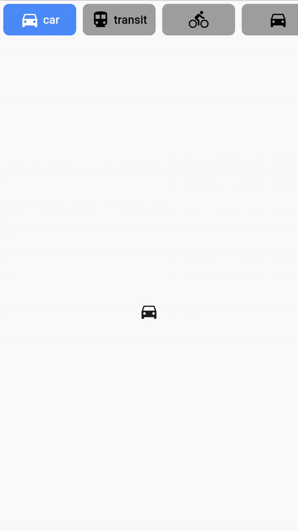
示例 #1
DefaultTabController(
  length: ...,
  child: Column(
    children: <Widget>[
      ButtonsTabBar(
        backgroundColor: Colors.red,
        tabs: ...,
      ),
      Expanded(
        child: TabBarView(
          children: ...,
        ),
      ),
    ],
  ),
)
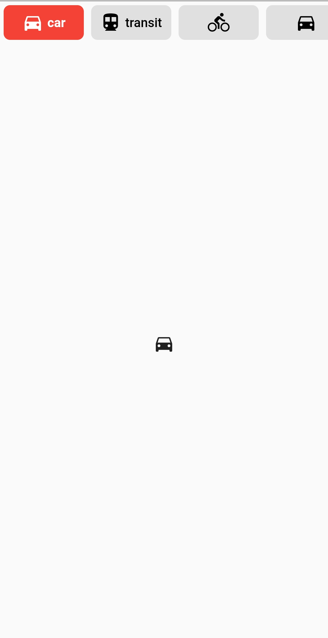
示例 #2
DefaultTabController(
  length: ...,
  child: Column(
    children: <Widget>[
      ButtonsTabBar(
        backgroundColor: Colors.blue[600],
        unselectedBackgroundColor: Colors.white,
        labelStyle: TextStyle(
          color: Colors.white,
          fontWeight: FontWeight.bold,
        ),
        unselectedLabelStyle: TextStyle(
          color: Colors.blue[600],
          fontWeight: FontWeight.bold,
        ),
        borderWidth: 1,
        unselectedBorderColor: Colors.blue[600],
        radius: 100,
        tabs: ...,
      ),
      Expanded(
        child: TabBarView(
          children: ...,
        ),
      ),
    ],
  ),
)
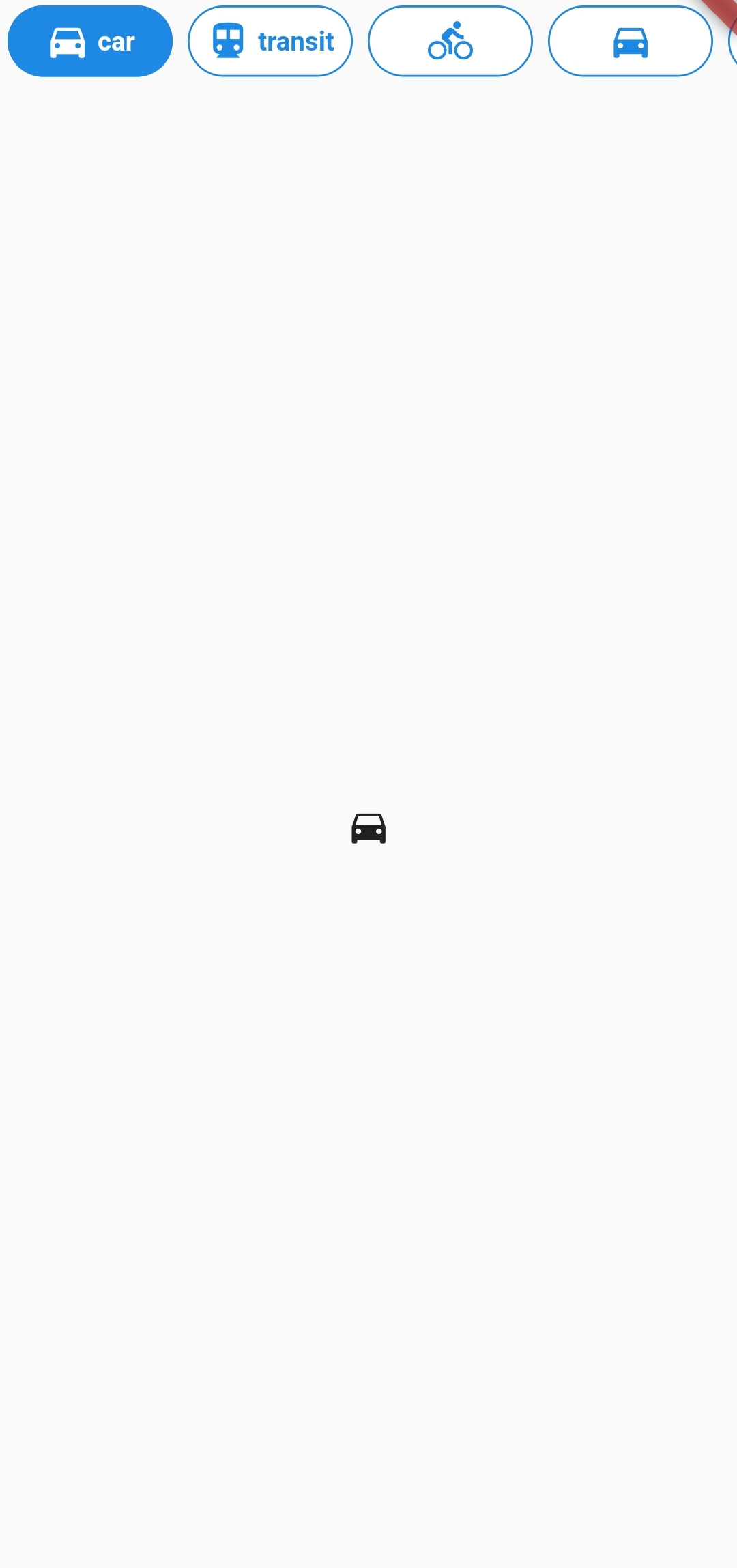
示例 #3
DefaultTabController(
  length: 6,
  child: Column(
    children: <Widget>[
      ButtonsTabBar(
        radius: 12,
        contentPadding: EdgeInsets.symmetric(horizontal: 12),
        borderWidth: 2,
        borderColor: Colors.transparent,
        center: true,
        decoration: BoxDecoration(
          gradient: LinearGradient(
            colors: <Color>[
              Color(0xFF0D47A1),
              Color(0xFF1976D2),
              Color(0xFF42A5F5),
            ],
          ),
        ),
        unselectedLabelStyle: TextStyle(color: Colors.black),
        labelStyle: TextStyle(color: Colors.white),
        height: 56,
        tabs: ...,
      ),
      Expanded(
        child: TabBarView(
          children: ...,
        ),
      ),
    ],
  ),
)
通过以上示例,我们可以看到 buttons_tabbar 的多样性和灵活性。如果你正在寻找一个既能提供丰富样式定制,又能带来流畅交互体验的标签栏解决方案,buttons_tabbar 将是一个不错的选择。赶快将它集成到你的 Flutter 项目中,为用户带来更加出色的使用体验吧!
创作声明:本文部分内容由AI辅助生成(AIGC),仅供参考


