


为了不被社会淘汰,尽管有各种不适应,还是要把鸿蒙项目给做起来,之前的android项目中用了很多的dialog组件,各种信息的输入都用dialog,这几天刚把鸿蒙的UI机制给弄明白,结果弄到dialog这块,傻眼了,太复杂了,看了网上种种,都相当的麻烦,于是求人不如求已,自己想了想弄了个解决方案,抛开别的不谈,个人觉得用起来还是比较的简单易用。
(鸿蒙这种响应式的UI更新机制不知道是哪个神创造的,太T。。。)
本人的解决方案就是把dialog当做UI的一个组件,需要用时显示,不需要时隐藏,代码也很简单,一个UI组件,一个控制类,上代码。
//使用方法很简单:
//在UI页面里
@Entry
@Component
struct DialogTestPage {
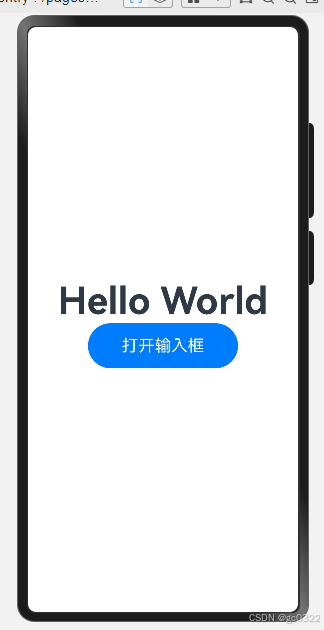
@State message: string = 'Hello World';
@State inputcontrol: InputBoxControl = InputBoxControl.getInstance();//定义控制器
build() {
Stack() {//页面根控件需为stack
//页面需要的控件
//....
//放入dialog组件
InputBox({
control: this.inputcontrol,
onYes: (t: string) => {
//确定按钮回调
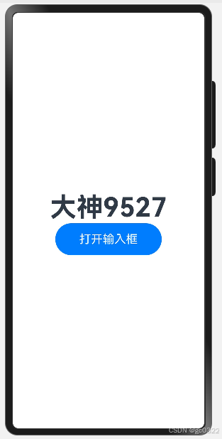
this.message = t;
this.inputcontrol.close();//关闭
},
onNo: (t: string) => {
//取消按钮回调
this.inputcontrol.close();
}
})
}
}完整代码贴上:
Page中使用代码
import { InputBox } from '../dialog/InputBox';
import text from '@ohos.graphics.text';
import { InputBoxControl } from '../dialog/InputBoxControl';
@Entry
@Component
struct DialogTestPage {
@State message: string = 'Hello World';
@State inputcontrol: InputBoxControl = InputBoxControl.getInstance();
build() {
Stack() {
Column() {
Text(this.message)
.id('DialogTestPageHelloWorld')
.fontSize(50)
.fontWeight(FontWeight.Bold)
Button() {
Text('打开输入框').fontSize(22).fontColor(Color.White)
}.width(200).height(60)
.onClick(() => {
//设置点击外面是否关闭
this.inputcontrol.canceledOnTouchOutside=true;
//设置输入框信息
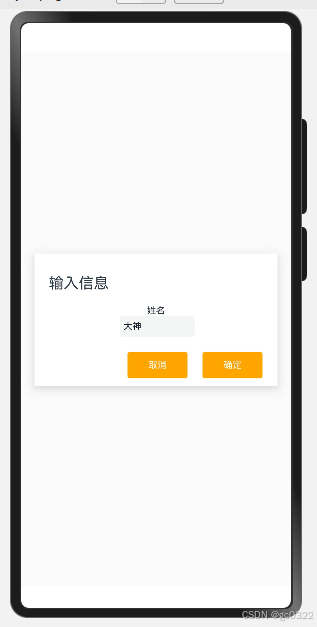
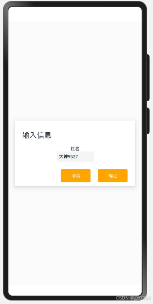
this.inputcontrol.setDialog('输入信息','姓名','大神')
this.inputcontrol.show();
})
}
.width('100%')
InputBox({
control: this.inputcontrol,
onYes: (t: string) => {
//确定按钮回调
this.message = t;
this.inputcontrol.close();
},
onNo: (t: string) => {
//取消按钮回调
this.inputcontrol.close();
}
})
}
.height('100%')
.width('100%')
}
}//InputBox组件封装
import { InputBoxControl } from "./InputBoxControl"
import { hilog } from "@kit.PerformanceAnalysisKit";
@Component
export struct InputBox {
@State control: InputBoxControl = InputBoxControl.getInstance();
build() {
Stack() {
Column() {
Row() {
Text(this.control.title).fontSize(20)
}.width('100%').justifyContent(FlexAlign.Start).margin({ left: 18, top: 18 })
Column() {
Text(this.control.tag).fontSize(12)
TextInput({
text: this.control.value
})
.padding({
left: 5,
top: 0,
bottom: 0,
right: 5
})
.width(100)
.height(28)
.borderRadius(5)
.fontSize(12)
.margin({ left: 3 })
.onChange((t) => {
this.control.value = t;
})
}.margin({ top: 18 })
Row() {
Button() {
Text('取消').fontColor(Color.White).fontSize(12)
}
.width(80)
.height(35)
.backgroundColor(Color.Orange)
.margin({ left: 10 })
.borderRadius(3)
.type(ButtonType.Normal)
.onClick(() => {
this.onNo(this.control.value)
})
Button() {
Text('确定').fontColor(Color.White).fontSize(12)
}
.width(80)
.height(35)
.margin({ left: 20 })
.backgroundColor(Color.Orange)
.borderRadius(3)
.type(ButtonType.Normal)
.onClick(() => {
this.onYes(this.control.value)
hilog.info(0x0000, 'InputDialog', '%{public}s', 'btyes------------');
})
}.margin({ top: 20, right: 20 }).width('100%') //.backgroundColor(Color.Orange)
.justifyContent(FlexAlign.End)
}
.padding(10)
.width('90%')
//.height(100)
.shadow(ShadowStyle.OUTER_DEFAULT_SM)
.borderRadius(2)
.backgroundColor(Color.White)
.onClick((event) => {
//占位事件
})
}
//遮罩层
.backgroundColor('#10c0c0c0')
.zIndex(this.control.isShow ? 100 : 0) //显示为顶层,暂时以100代替
.width('100%')
.height('100%')
.visibility(this.control.isShow ? Visibility.Visible : Visibility.Hidden)
.onClick((event) => {
if (this.control.canceledOnTouchOutside) {
this.control.close()
}
})
}
/**
* yes按钮事件
*/
onYes = (value: string) => {
}
/**
* no按钮事件
*/
onNo = (value: string) => {
}
}//控制器代码
export class InputBoxControl{
private constructor() {
this.init();
}
private static instance: InputBoxControl;
/**
* 创建单例
* @returns
*/
public static getInstance(): InputBoxControl {
if (! InputBoxControl.instance) {
InputBoxControl.instance = new InputBoxControl();
}
return InputBoxControl.instance;
}
private init() {
}
private _title: string = '输入框';
private _tag: string = '输入姓名';
private _value: string = '';//文本输入框初始内容
private _isShow: boolean = false;
/**
* 点击对话框外面是否关闭
*/
private _canceledOnTouchOutside: boolean = false;
public setDialog(title:string,tag:string,value:string){
this.title=title;
this.tag=tag;
this.value=value;
}
public show(){
this._isShow=true;
}
public close(){
this._isShow=false;
}
public set title(value: string) {
this._title = value;
}
public get title(): string {
return this._title;
}
public set tag(value: string) {
this._tag = value;
}
public get tag(): string {
return this._tag;
}
public set value(value: string) {
this._value = value;
}
public get value(): string {
return this._value;
}
public set isShow(value: boolean) {
this._isShow = value;
}
public get isShow(): boolean {
return this._isShow;
}
public set canceledOnTouchOutside(value: boolean) {
this._canceledOnTouchOutside = value;
}
public get canceledOnTouchOutside(): boolean {
return this._canceledOnTouchOutside;
}
}效果基本和android里的差不多了,抛砖引玉,需要更多功能还需要自己构建UI内容及控制器参数。
效果图:


 扫一扫
扫一扫


 被折叠的 条评论
为什么被折叠?
被折叠的 条评论
为什么被折叠?
 到【灌水乐园】发言


