


目录:
1.前期准备知识
2.实操 - 做时钟
3.完整代码
一、前期准备知识
因为旋转都是默认元素中心来旋转,所以,我们可以通过父元素包裹子元素。
通过父元素旋转,然后父带动子元素,到时候可以通过影藏父元素的背景颜色,这样看起来就像子元素在旋转。
<style>

*{
  margin:0;
  padding:0;
}

.sec-wrapper{
  width: 300px;
  height: 300px;
  margin: 100px;
  /* 通过父类的方框来旋转,带动里面子类sec的旋转,就可以模拟时钟针的旋转 */
  animation:run 60s;
  background-color: silver;
}

.sec{
  width: 10px;
  height: 100px;
  background-color: red;
  margin: 0 auto;
}


@keyframes run{
  from{
    transform: rotate(0);
  }

  to{
    transform: rotateZ(360deg);
  }
}
</style>

<body>
  <div class="sec-wrapper">
    <div class="sec">
    </div>
  </div>
</body>

二、实操 - 做时钟
1.先做表盘,和对应的秒针
<style>
/* 1.设置原型表盘 */
.clock{
width: 400px;
height: 400px;
background-color: silver;
margin: 0 auto;
margin-top: 100px;
border-radius: 50%;
position: relative;
}
/* 2.clock下面所有子元素div 都居中.
通过子绝父相,让所有的子元素相对于父类进行居中
*/
.clock > div{
position:absolute;
/* 居中 */
left:0;
right:0;
top:0;
bottom:0;
margin: auto;
}
/*3.设置秒针 */
.sec-wrapper{
width: 90%;
height: 90%;
/* 流畅的转一圈 */
/* animation:run 60s; */
/* 如果想让他一步步,停顿走一格这种节奏用steps
测试的话:10s- 一圈 - 表示一分钟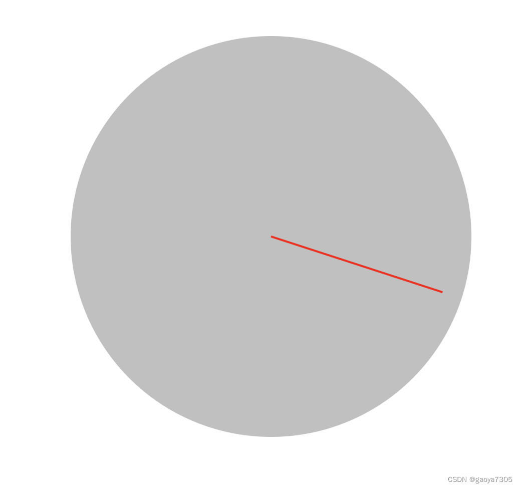
正常是60s 写
*/
/*5.使用动画 */
animation:run 10s steps(60) infinite;
}
.sec{
width: 2px;
height: 50%;
background-color: red;
margin: 0 auto;
}
/* 4.设置旋转动画 */
@keyframes run {
from{
transform:rotate(0)
}
to{
transform: rotateZ(360deg);
}
}
</style>
<body>
  <!-- 表盘 -->
  <div class="clock">
    <!-- 秒针-->
     <div class="sec-wrapper">
      <div class="sec"></div>
    </div>
  </div>
</body>
2.当秒针设置好后,时针和分钟就依次复制秒针的样式,然后做一些修改,他们代码如下:
/* 时钟 */
    .hour-wrapper{
      width: 70%;
      height: 70%;
      /* 10s * 60 * 12
      时钟一直都在动,只不过很微小,所以不能用steps,而是用linear
      */
      animation:run 7200s linear infinite;
    }
    .hour{
      width: 6px;
      height: 50%;
      background-color: black;
      margin: 0 auto;

    }

    /* 分钟 */
    .min-wrapper{
      width: 80%;
      height: 80%;
      /* 60 * 10s */
      animation:run 600s steps(60) infinite;
    }
    .min{
      width: 4px;
      height: 50%;
      background-color: black;
      margin: 0 auto;
    }
  <!-- 时钟 -->
    <div class="hour-wrapper">
      <div class="hour"></div>
    </div>

     <!-- 分针-->
    <div class="min-wrapper">
      <div class="min"></div>
    </div>
3.如果此时我们想给表盘设置背景图片,直接给表盘元素设置background-image,但是很多时候给的图片可能过大,超过了我们的宽高,这时候可以用background-size: cover;来调整。
 /* 1.设置原型表盘 */
    .clock{
      width: 400px;
      height: 400px;
      background-color: silver;
      margin: 0 auto;
      margin-top: 100px;
      border-radius: 50%;
      position: relative;

      /* 背景图片太大,设置下bgsize:cover 铺满 */
      /* background-image: url(./11/bg.png); */
      background-image: url(./11/bg3.jpg);
      background-size: cover;
    }
三、完整代码
<style>
    .clock{
      width: 400px;
      height: 400px;
      margin: 0 auto;
      margin-top: 100px;
      border-radius: 50%;
      position:relative;
      /* 背景图片太大,设置下bgsize:cover 铺满 */
      /* background-image: url(./11/bg.png); */
      background-image: url(./11/bg3.jpg);
      background-size: cover;
    }
    /* clock下面所有子元素div 都居中 */
    .clock > div{
      position:absolute;
      left: 0;
      right: 0;
      bottom: 0;
      top: 0;
      margin:auto;
    }

    /* 时钟 */
    .hour-wrapper{
      width: 70%;
      height: 70%;
      /* 10s * 60 * 12
      时钟一直都在动,只不过很微小,所以不能用steps,而是用linear
      */
      animation:run 7200s linear infinite;
    }
    .hour{
      width: 6px;
      height: 50%;
      background-color: black;
      margin: 0 auto;

    }

    /* 分钟 */
    .min-wrapper{
      width: 80%;
      height: 80%;
      /* 60 * 10s */
      animation:run 600s steps(60) infinite;
    }
    .min{
      width: 4px;
      height: 50%;
      background-color: black;
      margin: 0 auto;
    }

     /* 秒 */
     .sec-wrapper{
      width: 90%;
      height: 90%;
      /* 流畅的转一圈 */
      /* animation:run 60s; */
      /* 如果想让他一步步,停顿走一格这种节奏用steps

      测试的话:10s- 一圈 - 表示一分钟
      正常是60s 写
      */
      animation:run 10s steps(60) infinite;
    }
    .sec{
      width: 2px;
      height: 50%;
      background-color: red;
      margin: 0 auto;
    }

    @keyframes run {
        from{
          transform:rotate(0)
        }
        to{
          transform: rotateZ(360deg);
        }
    }

  </style>
<body>
  <div class="clock">
    <!-- 时钟 -->
    <div class="hour-wrapper">
      <div class="hour"></div>
    </div>

     <!-- 分针-->
    <div class="min-wrapper">
      <div class="min"></div>
    </div>

     <!-- 秒针-->
     <div class="sec-wrapper">
      <div class="sec"></div>
    </div>


  </div>


 扫一扫
扫一扫


 707
707

 被折叠的 条评论
为什么被折叠?
被折叠的 条评论
为什么被折叠?
 到【灌水乐园】发言


