


前言:
本文依旧是关于Vue的一些学习。
正文:
一.VUE按钮
1.按钮类型
按钮有四种类型:主按钮、次按钮、虚线按钮、危险按钮和链接按钮。主按钮在同一个操作区域最多出现一次。
<template>
  <div>
    <a-button type="primary">Primary</a-button>
    <a-button>Default</a-button>
    <a-button type="dashed">Dashed</a-button>
    <a-button type="danger">Danger</a-button>
    <a-button type="link">Link</a-button>
  </div>
</template>
效果:

2.按钮组合:
可以将多个 Button 放入 Button.Group 的容器中。
通过设置 size 为 large small 分别把按钮组合设为大、小尺寸。若不设置 size,则尺寸为中。
<template>
  <div id="components-button-demo-button-group">
    <h4>Basic</h4>
    <a-button-group>
      <a-button>Cancel</a-button>
      <a-button type="primary">OK</a-button>
    </a-button-group>
    <a-button-group>
      <a-button disabled>L</a-button>
      <a-button disabled>M</a-button>
      <a-button disabled>R</a-button>
    </a-button-group>
    <a-button-group>
      <a-button type="primary">L</a-button>
      <a-button>M</a-button>
      <a-button>M</a-button>
      <a-button type="dashed">R</a-button>
    </a-button-group>

    <h4>With Icon</h4>
    <a-button-group>
      <a-button type="primary">
        <a-icon type="left" />Go back
      </a-button>
      <a-button type="primary">
        Go forward<a-icon type="right" />
      </a-button>
    </a-button-group>
    <a-button-group>
      <a-button type="primary" icon="cloud" />
      <a-button type="primary" icon="cloud-download" />
    </a-button-group>
  </div>
</template>
<style>
#components-button-demo-button-group h4 {
  margin: 16px 0;
  font-size: 14px;
  line-height: 1;
  font-weight: normal;
}
#components-button-demo-button-group h4:first-child {
  margin-top: 0;
}
#components-button-demo-button-group .ant-btn-group {
  margin-right: 8px;
}
</style>
效果:

3.不可用状态:
添加 disabled 属性即可让按钮处于不可用状态,同时按钮样式也会改变。
<template>
  <div>
    <a-button type="primary">Primary</a-button>
    <a-button type="primary" disabled>Primary(disabled)</a-button>
    <br />
    <a-button>Default</a-button>
    <a-button disabled>Default(disabled)</a-button>
    <br />
    <a-button type="dashed">Dashed</a-button>
    <a-button type="dashed" disabled>Dashed(disabled)</a-button>
    <br />
    <a-button type="link">Link</a-button>
    <a-button type="link" disabled>Link(disabled)</a-button>
    <div :style="{ padding: '8px 8px 0 8px', background: 'rgb(190, 200, 200)' }">
      <a-button ghost>Ghost</a-button>
      <a-button ghost disabled>Ghost(disabled)</a-button>
    </div>
  </div>
</template>
效果:

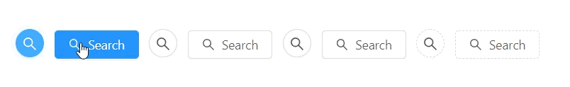
4.图标按钮
当需要在 Button 内嵌入 Icon 时,可以设置 icon 属性,或者直接在 Button 内使用 Icon 组件。
如果想控制 Icon 具体的位置,只能直接使用 Icon 组件,而非 icon 属性。
<template>
  <div>
    <a-button type="primary" shape="circle" icon="search"></a-button>
    <a-button type="primary" icon="search">Search</a-button>
    <a-button shape="circle" icon="search" />
    <a-button icon="search">Search</a-button>
    <a-button shape="circle" icon="search" />
    <a-button icon="search">Search</a-button>
    <a-button type="dashed" shape="circle" icon="search" />
    <a-button type="dashed" icon="search">Search</a-button>
  </div>
</template>
效果:
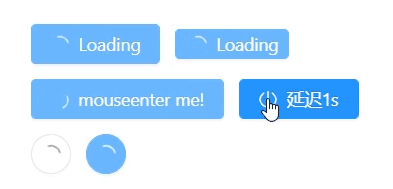
5.加载中状态:
添加 loading 属性即可让按钮处于加载状态,最后两个按钮演示点击后进入加载状态。
<template>
  <div>
    <a-button type="primary" loading>
      Loading
    </a-button>
    <a-button type="primary" size="small" loading>
      Loading
    </a-button>
    <br />
    <a-button type="primary" :loading="loading" @mouseenter="enterLoading">
      mouseenter me!
    </a-button>
    <a-button type="primary" icon="poweroff" :loading="iconLoading" @click="enterIconLoading">
      延迟1s
    </a-button>
    <br />
    <a-button shape="circle" loading />
    <a-button type="primary" shape="circle" loading />
  </div>
</template>
<script>
export default {
  data () {
    return {
      loading: false,
      iconLoading: false,
    }
  },
  methods: {
    enterLoading () {
      this.loading = true
    },
    enterIconLoading () {
      this.iconLoading = { delay: 1000 }
    },
  },
}
</script>
效果:
二.VUE API
属性:推荐顺序为:type -> shape -> size -> loading -> disabled


 扫一扫
扫一扫


 2337
2337

 被折叠的 条评论
为什么被折叠?
被折叠的 条评论
为什么被折叠?
 到【灌水乐园】发言


