


 本文介绍了如何在React和Ant Design中实现表格列宽的拖拽调整,分别演示了使用'react-resizable'库和'@minko-fe/use-antd-resizable-header'库的方法。前者在多列时可能出现卡顿,后者通过延迟调整避免了卡顿,提供了更好的用户体验。文中还提供了详细的代码示例,并讨论了两者的选择和注意事项。
react + antd 实现表格可拖拽列宽
前言: 接到一个需求,需要实现表格的表头可以拖拽调节宽度
实现方式
react-resizable GitHub
首先百度寻找解决方案,很容易的,我们就找到了react-resizable,这个解决方案在antd 3.x 的文档中,表格 Table - Ant Design,但是在更高的版本中没有,如果不是百度,我应该永远找不到.
安装
npm install --save react-resizable
使用
官方提供的代码示例:
import { Table } from 'antd';
import { Resizable } from 'react-resizable';

const ResizeableTitle = props => {
  const { onResize, width, ...restProps } = props;

  if (!width) {
    return <th {...restProps} />;
  }

  return (
    <Resizable
      width={width}
      height={0}
      onResize={onResize}
      draggableOpts={{ enableUserSelectHack: false }}
    >
      <th {...restProps} />
    </Resizable>
  );
};

class Demo extends React.Component {
  state = {
    columns: [
      {
        title: 'Date',
        dataIndex: 'date',
        width: 200,
      },
      {
        title: 'Amount',
        dataIndex: 'amount',
        width: 100,
      },
      {
        title: 'Type',
        dataIndex: 'type',
        width: 100,
      },
      {
        title: 'Note',
        dataIndex: 'note',
        width: 100,
      },
      {
        title: 'Action',
        key: 'action',
        render: () => <a>Delete</a>,
      },
    ],
  };

  components = {
    header: {
      cell: ResizeableTitle,
    },
  };

  data = [
    {
      key: 0,
      date: '2018-02-11',
      amount: 120,
      type: 'income',
      note: 'transfer',
    },
    {
      key: 1,
      date: '2018-03-11',
      amount: 243,
      type: 'income',
      note: 'transfer',
    },
    {
      key: 2,
      date: '2018-04-11',
      amount: 98,
      type: 'income',
      note: 'transfer',
    },
  ];

  handleResize = index => (e, { size }) => {
    this.setState(({ columns }) => {
      const nextColumns = [...columns];
      nextColumns[index] = {
        ...nextColumns[index],
        width: size.width,
      };
      return { columns: nextColumns };
    });
  };

  render() {
    const columns = this.state.columns.map((col, index) => ({
      ...col,
      onHeaderCell: column => ({
        width: column.width,
        onResize: this.handleResize(index),
      }),
    }));

    return <Table bordered components={this.components} columns={columns} dataSource={this.data} />;
  }
}

ReactDOM.render(<Demo />, mountNode);
css样式
#components-table-demo-resizable-column .react-resizable {
  position: relative;
  background-clip: padding-box;
}

#components-table-demo-resizable-column .react-resizable-handle {
  position: absolute;
  width: 10px;
  height: 100%;
  bottom: 0;
  right: -5px;
  cursor: col-resize;
  z-index: 1;
}
css样式需要添加到项目的全局配置中
示例是用class的方式写的,首先我要给他改成函数式组件的形式:
import { Table } from "antd";
import { useState } from "react";
import { Resizable } from 'react-resizable';

const ResizeableTitle = (props:any) => {
    const { onResize, width, ...restProps } = props;

    if (!width) {
      return <th {...restProps} />;
    }

    return (
      <Resizable
        width={width}
        height={0}
        onResize={onResize}
        draggableOpts={{ enableUserSelectHack: false }}
      >
        <th {...restProps} />
      </Resizable>
    );
  };

const initCols = [
    {
      title: 'Date',
      dataIndex: 'date',
      width: 200,
    },
    {
      title: 'Amount',
      dataIndex: 'amount',
      width: 100,
    },
    {
      title: 'Type',
      dataIndex: 'type',
      width: 100,
    },
    {
      title: 'Note',
      dataIndex: 'note',
      width: 100,
    },
    {
      title: 'Action',
      key: 'action',
      render: () => <a>Delete</a>,
    }
]

const TablePage:React.FC = () => {

    const [columns, setColumns] = useState(initCols);

    const data = [
        {
          key: 0,
          date: '2018-02-11',
          amount: 120,
          type: 'income',
          note: 'transfer',
        },
        {
          key: 1,
          date: '2018-03-11',
          amount: 243,
          type: 'income',
          note: 'transfer',
        },
        {
          key: 2,
          date: '2018-04-11',
          amount: 98,
          type: 'income',
          note: 'transfer',
        },
      ]

return <>
        <Table bordered dataSource={data}
         components={
             {
                 header: {
                     cell: ResizeableTitle
                 }
             }
         }
         columns={
            columns.map((col:any, index:number) => {
                return {
                    ...col,
                    onHeaderCell: (column:any) => ({
                        width: column.width,
                        onResize: (e:any, {size}:{size:any}) => {
                            setColumns((columns) => {
                                const nextColumns = [...columns];
                                nextColumns[index] = {
                                    ...nextColumns[index],
                                    width: size.width
                                }
                                return nextColumns;
                            })
                        }
                    })
                }
            })
        }>
        </Table>
    </>
}
export default TablePage;
于是我们便得到一个组件,将以上组件稍加修改,把需要的数据变成属性传递进来,我们便得到一个可复用的,可拖拽列宽的表格.
注意
使用时必须要给column设置width
问题
当表格列很多时,会出现卡顿,不跟鼠标
use-antd-resizable-header Github
在搜索列宽拖拽的解决方案时,在ant-design的github 上看到这个
table组件能否支持拖拽调整列宽(伸缩列)? · Issue #32594 · ant-design/ant-design (github.com)
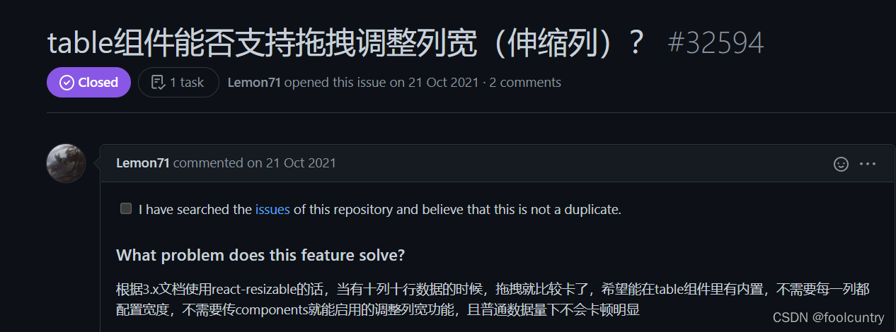
在下方我又看到这个

于是…
安装
yarn add @minko-fe/use-antd-resizable-header
#或者
npm add @minko-fe/use-antd-resizable-header
使用
import useARH from '@minko-fe/use-antd-resizable-header';
import '@minko-fe/use-antd-resizable-header/dist/style.css';

function App() {
  const columns = [];

  const { components, resizableColumns, tableWidth, resetColumns } = useARH({
    columns: useMemo(() => columns, []),
    // 保存拖拽宽度至本地localStorage
    columnsState: {
      persistenceKey: 'localKey',
      persistenceType: 'localStorage',
    },
  });

  return (
    <>
      <Table columns={resizableColumns}
			components={components} dataSource={data}
			scroll={{ x: tableWidth }}></Table>
        <ProTable
            columns={resizableColumns}
            components={components}
            dataSource={data}
            scroll={{ x: tableWidth }}
            ></ProTable>
        <Button onClick={() => resetColumns()}>重置宽度</Button>
    </>
  );
}
使用比较简单,只需要简单替换数据,即可实现动态拖拽
注意
不能给所有的column设置width,最后一列不能设置,否则将不能拖拽
总结
相比较下, react-resizable在多列时会出现卡顿,use-antd-resizable-header因为没有实时调整,而是松开鼠标后调整,就不会显得非常卡顿,而且写的代码更少,所以我选择use-antd-resizable,但其实都还有比较多的扩展可以实现,不过我是搞后端的,所以就这样吧.


 扫一扫
扫一扫


 360
360


 到【灌水乐园】发言


