


视频地址:
https://www.bilibili.com/video/BV1jomdBBE4H/
📋 目录
概述
TextInput 是控件库中的基础文本输入框组件,支持验证、提示、图标、多种尺寸和状态,适用于表单输入、搜索、数据录入等场景。
设计理念
文本输入框采用清晰易用设计,具有以下特点:
- 功能完整:支持多种输入类型、验证、提示等
- 状态清晰:正常、聚焦、错误、禁用、只读等状态明确
- 尺寸多样:支持 small、medium、large 三种尺寸
- 图标支持:支持左侧和右侧图标(文字图标和图片图标)
- 品牌标识:左下角自动包含品牌标识(圆圈红字"PC")
- 主题统一:所有样式配置都在代码中,方便定制
适用场景
- 表单输入:用户名、邮箱、密码等表单字段
- 搜索功能:搜索框、筛选输入
- 数据录入:各种文本数据输入
- 验证输入:需要验证的输入场景
特性
✨ 核心特性
- ✅ 多种输入类型:支持 text、email、number、password、tel、url
- ✅ 标签和提示:支持标签、提示文本、错误提示
- ✅ 图标支持:支持左侧和右侧图标(文字图标和图片图标)
- ✅ 清除按钮:支持显示清除按钮
- ✅ 多种尺寸:支持 small、medium、large 三种尺寸
- ✅ 状态管理:支持禁用、只读、必填等状态
- ✅ 长度限制:支持最大长度限制
- ✅ 验证功能:支持自定义验证函数
- ✅ 品牌标识:自动包含左下角品牌标识
- ✅ 主题配置:所有样式都可通过代码配置
🎨 视觉特点
- 正常状态:白色背景 + 灰色边框
- 聚焦状态:主色边框高亮
- 错误状态:红色边框 + 红色错误提示
- 禁用状态:灰色背景 + 灰色文字 + 灰色边框
- 只读状态:正常样式但不可编辑
快速开始
基础用法
import { TextInput } from '../components/base'

@Entry
@Component
struct MyPage {
  @State inputValue: string = ''

  build() {
    Column({ space: 20 }) {
      // 基础输入框
      TextInput({
        value: $inputValue,
        placeholder: '请输入内容'
      })

      // 带标签的输入框
      TextInput({
        value: $inputValue,
        placeholder: '请输入用户名',
        label: '用户名'
      })

      // 带提示的输入框
      TextInput({
        value: $inputValue,
        placeholder: '请输入邮箱',
        label: '邮箱',
        hint: '请输入有效的邮箱地址'
      })
    }
    .width('100%')
    .height('100%')
    .padding(20)
    .justifyContent(FlexAlign.Center)
  }
}
关于双向绑定
TextInput 使用 @Link 实现双向绑定,需要使用 $variableName 语法:
@State inputValue: string = ''

TextInput({
  value: $inputValue  // 使用 $ 创建双向绑定
})
API 参考
Props
| 属性名 | 类型 | 默认值 | 说明 |
|---|---|---|---|
value | @Link string | - | 输入框值(必需,双向绑定) |
placeholder | string | '请输入' | 占位符文本 |
label | string? | undefined | 标签文本(可选) |
hint | string? | undefined | 提示文本(可选,显示在输入框下方) |
errorMessage | string? | undefined | 错误提示文本(可选,优先级高于 hint) |
inputSize | 'small' | 'medium' | 'large' | 'medium' | 输入框尺寸 |
disabled | boolean | false | 是否禁用 |
readonly | boolean | false | 是否只读 |
required | boolean | false | 是否必填 |
maxLength | number? | undefined | 最大长度 |
type | 'text' | 'email' | 'number' | 'password' | 'tel' | 'url' | 'text' | 输入类型 |
leftIcon | ResourceStr? | undefined | 左侧图片图标(可选) |
leftTextIcon | string? | undefined | 左侧文字图标(可选,优先级高于 leftIcon) |
rightIcon | ResourceStr? | undefined | 右侧图片图标(可选) |
rightTextIcon | string? | undefined | 右侧文字图标(可选,优先级高于 rightIcon) |
showClearButton | boolean | true | 是否显示清除按钮 |
showBrand | boolean | true | 是否显示品牌标识 |
inputWidth | string | number? | undefined | 输入框宽度 |
validator | @BuilderParam (value: string) => ValidationResult? | undefined | 验证函数(可选) |
onChangeBuilder | @BuilderParam (value: string) => void? | undefined | 值变化回调(可选) |
ValidationResult 接口
| 属性名 | 类型 | 说明 |
|---|---|---|
valid | boolean | 验证是否通过 |
message | string? | 验证消息(可选) |
尺寸规格
| 尺寸 | 高度 | 字体大小 | 图标大小 | 内边距(左右) |
|---|---|---|---|---|
small | 32vp | 12vp | 16vp | 12vp |
medium | 40vp | 14vp | 18vp | 14vp |
large | 48vp | 16vp | 20vp | 16vp |
使用示例
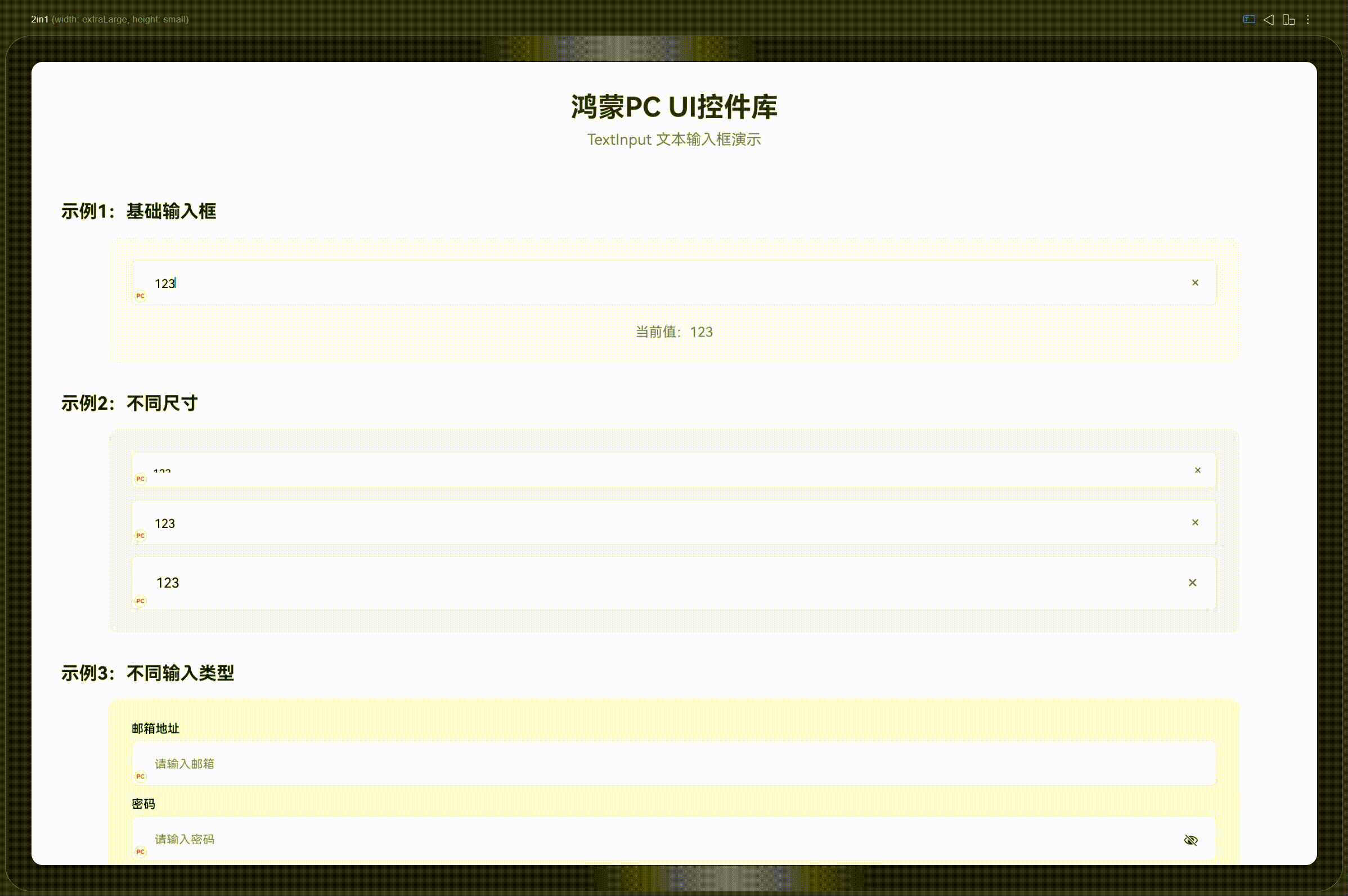
1. 基础输入框
@Entry
@Component
struct InputExample1 {
  @State inputValue: string = ''

  build() {
    Column({ space: 15 }) {
      TextInput({
        value: $inputValue,
        placeholder: '请输入内容'
      })

      Text(`当前值:${this.inputValue || '(空)'}`)
        .fontSize(14)
        .fontColor('#666666')
    }
    .width('100%')
    .height('100%')
    .padding(20)
    .justifyContent(FlexAlign.Center)
  }
}
2. 不同尺寸
@Entry
@Component
struct InputExample2 {
  @State inputValue: string = ''

  build() {
    Column({ space: 15 }) {
      TextInput({
        value: $inputValue,
        placeholder: '小尺寸',
        inputSize: 'small'
      })

      TextInput({
        value: $inputValue,
        placeholder: '中等尺寸(默认)',
        inputSize: 'medium'
      })

      TextInput({
        value: $inputValue,
        placeholder: '大尺寸',
        inputSize: 'large'
      })
    }
    .width('100%')
    .height('100%')
    .padding(20)
    .justifyContent(FlexAlign.Center)
  }
}
3. 不同输入类型
@Entry
@Component
struct InputExample3 {
  @State emailValue: string = ''
  @State passwordValue: string = ''
  @State phoneValue: string = ''

  build() {
    Column({ space: 15 }) {
      TextInput({
        value: $emailValue,
        placeholder: '请输入邮箱',
        type: 'email',
        label: '邮箱地址'
      })

      TextInput({
        value: $passwordValue,
        placeholder: '请输入密码',
        type: 'password',
        label: '密码'
      })

      TextInput({
        value: $phoneValue,
        placeholder: '请输入手机号',
        type: 'tel',
        label: '手机号'
      })
    }
    .width('100%')
    .height('100%')
    .padding(20)
    .justifyContent(FlexAlign.Center)
  }
}
4. 带标签和提示
@Entry
@Component
struct InputExample4 {
  @State usernameValue: string = ''
  @State contentValue: string = ''
  @State errorValue: string = ''

  build() {
    Column({ space: 15 }) {
      TextInput({
        value: $usernameValue,
        placeholder: '请输入用户名',
        label: '用户名',
        hint: '用户名长度为3-20个字符'
      })

      TextInput({
        value: $contentValue,
        placeholder: '请输入内容',
        label: '内容',
        hint: '这是提示信息'
      })

      TextInput({
        value: $errorValue,
        placeholder: '请输入内容',
        label: '内容',
        errorMessage: '输入内容有误,请重新输入'
      })
    }
    .width('100%')
    .height('100%')
    .padding(20)
    .justifyContent(FlexAlign.Center)
  }
}
5. 必填和状态
@Entry
@Component
struct InputExample5 {
  @State requiredValue: string = ''
  @State disabledValue: string = '禁用状态'
  @State readonlyValue: string = '只读状态'

  build() {
    Column({ space: 15 }) {
      TextInput({
        value: $requiredValue,
        placeholder: '请输入内容',
        label: '必填项',
        required: true
      })

      TextInput({
        value: $disabledValue,
        placeholder: '请输入内容',
        label: '禁用状态',
        disabled: true
      })

      TextInput({
        value: $readonlyValue,
        placeholder: '请输入内容',
        label: '只读状态',
        readonly: true
      })
    }
    .width('100%')
    .height('100%')
    .padding(20)
    .justifyContent(FlexAlign.Center)
  }
}
6. 带图标
@Entry
@Component
struct InputExample6 {
  @State usernameValue: string = ''
  @State emailValue: string = ''

  build() {
    Column({ space: 15 }) {
      TextInput({
        value: $usernameValue,
        placeholder: '请输入用户名',
        leftTextIcon: 'U',  // U = User(用户)
        label: '用户名'
      })

      TextInput({
        value: $emailValue,
        placeholder: '请输入邮箱',
        leftTextIcon: '@',
        rightTextIcon: '✓',  // ✓ = Check(确认)
        label: '邮箱'
      })
    }
    .width('100%')
    .height('100%')
    .padding(20)
    .justifyContent(FlexAlign.Center)
  }
}
7. 最大长度限制
@Entry
@Component
struct InputExample7 {
  @State inputValue: string = ''

  build() {
    Column({ space: 15 }) {
      TextInput({
        value: $inputValue,
        placeholder: '最多输入10个字符',
        label: '内容',
        maxLength: 10,
        hint: `已输入 ${this.inputValue.length}/10 个字符`
      })
    }
    .width('100%')
    .height('100%')
    .padding(20)
    .justifyContent(FlexAlign.Center)
  }
}
8. 自定义验证
import { TextInput, ValidationResult } from '../components/base'

@Entry
@Component
struct InputExample8 {
  @State emailValue: string = ''

  // 邮箱验证函数
  @Builder
  validateEmail(value: string): ValidationResult {
    if (!value) {
      return { valid: false, message: '邮箱不能为空' }
    }
    const emailRegex = /^[^\s@]+@[^\s@]+\.[^\s@]+$/
    if (!emailRegex.test(value)) {
      return { valid: false, message: '请输入有效的邮箱地址' }
    }
    return { valid: true }
  }

  build() {
    Column({ space: 15 }) {
      TextInput({
        value: $emailValue,
        placeholder: '请输入邮箱',
        label: '邮箱',
        validator: this.validateEmail
      })
    }
    .width('100%')
    .height('100%')
    .padding(20)
    .justifyContent(FlexAlign.Center)
  }
}
主题配置
TextInput 的所有样式都通过 ComponentTheme 配置,所有配置都在代码中,不依赖JSON文件。
修改默认颜色
import { ComponentTheme } from '../theme/ComponentTheme'

// 修改主色(影响聚焦状态的边框颜色)
ComponentTheme.PRIMARY_COLOR = '#007AFF'

// 修改错误色(影响错误状态的边框和提示颜色)
ComponentTheme.ERROR_COLOR = '#FF3B30'

// 修改边框颜色
ComponentTheme.BORDER_COLOR = '#E5E5E5'

// 修改圆角
ComponentTheme.BORDER_RADIUS = 8
批量配置
import { ComponentTheme } from '../theme/ComponentTheme'

// 使用 setTheme 方法批量配置
ComponentTheme.setTheme({
  primaryColor: '#007AFF',
  errorColor: '#FF3B30',
  borderRadius: 8,
  spacing: 16
})
最佳实践
1. 尺寸选择
推荐:根据使用场景选择尺寸
- small:用于紧凑空间、表格内输入
- medium:默认尺寸,适用于大多数场景
- large:用于重要输入或大屏幕显示
2. 标签和提示
- 标签:用于说明输入框的用途
- 提示文本:提供输入指导或格式要求
- 错误提示:显示验证错误信息
- 必填标识:使用
required属性显示红色星号
3. 输入类型
- text:普通文本输入(默认)
- email:邮箱输入,会触发邮箱键盘
- password:密码输入,自动隐藏输入内容
- number:数字输入,会触发数字键盘
- tel:电话号码输入
- url:URL 输入
4. 图标使用
- 左侧图标:用于标识输入类型(如用户图标、邮箱图标)
- 右侧图标:用于显示状态(如成功图标、错误图标)
- 清除按钮:自动显示在有内容时,方便快速清除
5. 验证功能
- 使用
validator属性进行自定义验证 - 验证函数返回
ValidationResult对象 - 验证失败时显示错误提示
- 可以结合
errorMessage属性显示错误信息
6. 状态管理
- 禁用状态:使用
disabled属性,适用于不可编辑的场景 - 只读状态:使用
readonly属性,适用于仅展示的场景 - 必填状态:使用
required属性,显示红色星号标识
7. 响应式设计
- 使用
inputWidth属性控制输入框宽度 - 在小屏幕上考虑使用 smaller 尺寸
- 保持输入框之间的合理间距
常见问题
Q1: TextInput 和其他输入框有什么区别?
A: TextInput 是基础文本输入框,与其他输入框的区别:
- TextInput:基础文本输入框,支持多种输入类型
- PasswordInput:专门的密码输入框,支持显示/隐藏切换
- NumberInput:数字输入框,支持步进器和范围限制
- SearchInput:搜索输入框,支持清除按钮和历史记录
- TextArea:多行文本输入框,支持字数统计
Q2: 如何实现双向绑定?
A: 使用 @Link 和 $ 语法:
@State inputValue: string = ''

TextInput({
  value: $inputValue  // 使用 $ 创建双向绑定
})
Q3: 如何自定义验证?
A: 使用 validator 属性:
@Builder
validateEmail(value: string): ValidationResult {
  if (!value) {
    return { valid: false, message: '邮箱不能为空' }
  }
  const emailRegex = /^[^\s@]+@[^\s@]+\.[^\s@]+$/
  if (!emailRegex.test(value)) {
    return { valid: false, message: '请输入有效的邮箱地址' }
  }
  return { valid: true }
}

TextInput({
  value: $emailValue,
  validator: this.validateEmail
})
Q4: 如何禁用清除按钮?
A: 设置 showClearButton 为 false:
TextInput({
  value: $inputValue,
  showClearButton: false
})
Q5: 如何控制输入框宽度?
A: 使用 inputWidth 属性:
TextInput({
  value: $inputValue,
  inputWidth: 300  // 固定宽度
})

TextInput({
  value: $inputValue,
  inputWidth: '100%'  // 百分比宽度
})
Q6: 如何监听输入变化?
A: 使用 onChangeBuilder 属性:
@Builder
handleChange(value: string) {
  console.info('输入值变化:', value)
  // 处理输入变化
}

TextInput({
  value: $inputValue,
  onChangeBuilder: this.handleChange
})
总结
TextInput 是控件库中的基础文本输入框组件,具有以下核心特性:
- 功能完整:支持多种输入类型、验证、提示等
- 状态清晰:正常、聚焦、错误、禁用、只读等状态明确
- 尺寸多样:三种尺寸满足不同场景需求
- 图标支持:支持左侧和右侧图标
- 易于使用:简单的 API,开箱即用
- 主题配置:所有样式都可通过代码配置
- 品牌标识:自动包含品牌标识,保持视觉统一
关键要点
- ✅ 使用
$variableName创建双向绑定 - ✅ 使用
label属性添加标签 - ✅ 使用
hint或errorMessage显示提示 - ✅ 使用
type属性选择输入类型 - ✅ 使用
validator属性进行自定义验证 - ✅ 使用
inputSize属性选择合适尺寸 - ✅ 通过
ComponentTheme自定义全局样式
适用场景
- 表单输入
- 搜索功能
- 数据录入
- 验证输入
下一篇预告:PasswordInput(密码输入框)详解
本文档属于《鸿蒙PC UI控件库开发系列文章》第7篇


 扫一扫
扫一扫


 2万+
2万+

 被折叠的 条评论
为什么被折叠?
被折叠的 条评论
为什么被折叠?
 到【灌水乐园】发言


