


系列文章第1篇 | 作者:红目香薰 | 更新时间:2025年
📖 前言
随着鸿蒙PC平台的快速发展,越来越多的开发者开始为PC端开发应用。为了提升开发效率,我们开发了一套完整的、可复用的第三方UI控件库。本系列文章将详细介绍每个控件的使用方法、最佳实践和高级特性。
本文作为系列文章的第一篇,将重点介绍控件库的品牌标识系统,这是整个控件库的核心特性之一。
🎯 什么是品牌标识系统?
品牌标识系统是这套控件库的独特设计,每个控件都会在左下角显示一个独特的标识(圆圈内红色文字,类似 © 符号)。这个设计有以下几个目的:
- 品牌识别:让使用者一眼就能识别出这是来自我们控件库的组件
- 视觉统一:确保所有控件都有一致的视觉特征
- 开源标识:作为开源项目,标识有助于推广和识别
标识样式特点
- 位置:控件左下角
- 样式:圆圈内红色文字
- 默认文字:
"PC"(可自定义) - 默认大小:
16vp(可调整) - 颜色方案:
- 文字颜色:
#FF3B30(红色) - 边框颜色:
#E5E5E5(浅灰色) - 背景颜色:
#FFFFFF(白色)
- 文字颜色:
🚀 快速开始
项目层级
cmd的tree无法显示所有列表,我这里给了个代码的结构。
entry/src/main/ets/
├── components/                    # 控件库主目录
│   ├── common/                    # 通用组件
│   │   ├── BaseComponent.ets      # 基础组件包装器(自动添加品牌标识)
│   │   ├── BrandBadge.ets         # 品牌标识组件(圆圈内红字)
│   │   └── index.ets              # 统一导出文件
│   └── README.md                   # 控件库使用指南
│
├── theme/                          # 主题配置系统
│   ├── BrandTheme.ets             # 品牌标识主题配置
│   ├── ComponentTheme.ets         # 控件库全局主题配置
│   └── README.md                   # 主题配置说明文档
│
├── pages/                          # 页面文件
│   ├── Index.ets                  # 主页面(展示控件示例)
│   └── BrandBadgeDemo.ets         # 品牌标识演示页面
│
├── entryability/                   # 应用入口能力
│   └── EntryAbility.ets           # 应用主入口
│
└── entrybackupability/             # 备份能力
    └── EntryBackupAbility.ets     # 备份入口
安装和引入
首先,将控件库代码复制到你的项目中,然后引入组件:
import { BaseComponent, BrandBadge } from '../components/common'
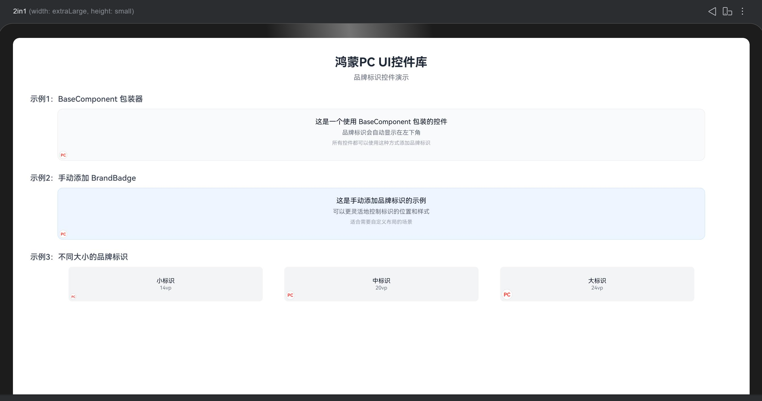
方式一:使用 BaseComponent 包装器(推荐)
BaseComponent 是最简单的使用方式,它会自动为你的控件添加品牌标识:
@Entry
@Component
struct MyPage {
  build() {
    Column() {
      // 使用 BaseComponent 包装你的控件
      BaseComponent({
        brandText: 'PC',           // 标识文字,默认 'PC'
        showBrand: true,            // 是否显示,默认 true
        brandSize: 16,              // 标识大小,默认 16vp
        componentWidth: '100%',     // 组件宽度,默认 '100%'
        componentHeight: 200        // 组件高度,默认 '100%'
      }) {
        // 你的控件内容
        Column({ space: 10 }) {
          Text('我的第一个控件')
            .fontSize(18)
            .fontWeight(FontWeight.Bold)

          Text('这是使用 BaseComponent 包装的控件')
            .fontSize(14)
            .fontColor('#666666')
        }
        .width('100%')
        .height('100%')
        .padding(20)
        .backgroundColor('#F5F5F5')
        .borderRadius(8)
      }
    }
    .width('100%')
    .height('100%')
    .padding(20)
  }
}
优点:
- ✅ 使用简单,一行代码即可
- ✅ 自动处理标识位置
- ✅ 支持统一配置
方式二:手动添加 BrandBadge
如果你需要更灵活的控制,可以手动添加 BrandBadge 组件:
@Entry
@Component
struct MyPage {
  build() {
    Stack({ alignContent: Alignment.BottomStart }) {
      // 你的控件内容
      Column({ space: 10 }) {
        Text('我的第二个控件')
          .fontSize(18)
          .fontWeight(FontWeight.Bold)

        Text('这是手动添加品牌标识的控件')
          .fontSize(14)
          .fontColor('#666666')
      }
      .width('100%')
      .height(200)
      .padding(20)
      .backgroundColor('#EFF6FF')
      .borderRadius(8)

      // 手动添加品牌标识
      BrandBadge({
        text: 'PC',
        badgeSize: 18,
        visible: true,
        textColor: '#FF3B30',
        circleBorderColor: '#E5E5E5',
        circleBackgroundColor: '#FFFFFF'
      })
    }
    .width('100%')
    .height(200)
  }
}
优点:
- ✅ 更灵活的位置控制
- ✅ 可以自定义每个控件的标识样式
- ✅ 适合特殊布局需求
⚙️ 品牌标识配置
核心设计理念
所有配置都在代码中,不依赖任何JSON文件!
这个设计让其他项目引入控件库后,可以直接修改配置,无需修改JSON资源文件,大大提升了灵活性。
配置方式一:直接修改静态属性(推荐)
import { BrandTheme } from '../theme/BrandTheme'

// 在应用启动时(如 EntryAbility.onCreate)修改配置
BrandTheme.BRAND_TEXT = 'HWPC'              // 修改标识文字
BrandTheme.BRAND_TEXT_COLOR = '#FF0000'     // 修改文字颜色
BrandTheme.BRAND_BORDER_COLOR = '#CCCCCC'   // 修改边框颜色
BrandTheme.BRAND_BACKGROUND_COLOR = '#F0F0F0' // 修改背景颜色
BrandTheme.BRAND_SIZE = 20                   // 修改标识大小
配置方式二:批量设置
import { BrandTheme } from '../theme/BrandTheme'

// 批量设置所有配置
BrandTheme.setConfig({
  text: 'HWPC',                    // 标识文字
  size: 18,                        // 标识大小
  textColor: '#FF3B30',            // 文字颜色
  borderColor: '#E5E5E5',          // 边框颜色
  backgroundColor: '#FFFFFF',      // 背景颜色
  textColorDark: '#FF6B6B',        // 暗色模式文字颜色
  borderColorDark: '#4A4A4A',      // 暗色模式边框颜色
  backgroundColorDark: '#1C1C1E'   // 暗色模式背景颜色
})
配置方式三:获取主题颜色(支持暗色模式)
import { BrandTheme } from '../theme/BrandTheme'

// 检测系统主题
const isDark = // 你的主题检测逻辑

// 获取对应主题的颜色
const textColor = BrandTheme.getTextColor(isDark)
const borderColor = BrandTheme.getBorderColor(isDark)
const backgroundColor = BrandTheme.getBackgroundColor(isDark)
🎨 完整配置示例
在应用启动时配置
// EntryAbility.ets
import { BrandTheme } from './theme/BrandTheme'
import { ComponentTheme } from './theme/ComponentTheme'

export default class EntryAbility extends UIAbility {
  onCreate(want: Want, launchParam: AbilityConstant.LaunchParam) {
    // 配置品牌标识
    BrandTheme.setConfig({
      text: 'HWPC',
      size: 18,
      textColor: '#FF3B30',
      borderColor: '#E5E5E5',
      backgroundColor: '#FFFFFF'
    })

    // 配置全局主题
    ComponentTheme.setTheme({
      primaryColor: '#007AFF',
      textPrimary: '#000000',
      backgroundColor: '#FFFFFF',
      borderRadius: 8,
      spacing: 16
    })

    // ... 其他初始化代码
  }
}
📚 API 参考
BrandBadge 组件
属性说明
| 属性名 | 类型 | 默认值 | 说明 |
|---|---|---|---|
text | string | 'PC' | 标识文字 |
badgeSize | number | 16 | 标识大小(vp) |
visible | boolean | true | 是否显示 |
textColor | string | '#FF3B30' | 文字颜色 |
circleBorderColor | string | '#E5E5E5' | 圆圈边框颜色 |
circleBackgroundColor | string | '#FFFFFF' | 圆圈背景颜色 |
使用示例
BrandBadge({
  text: 'PC',
  badgeSize: 18,
  visible: true,
  textColor: '#FF3B30',
  circleBorderColor: '#E5E5E5',
  circleBackgroundColor: '#FFFFFF'
})
BaseComponent 组件
属性说明
| 属性名 | 类型 | 默认值 | 说明 |
|---|---|---|---|
brandText | string | 'PC' | 品牌标识文字 |
showBrand | boolean | true | 是否显示品牌标识 |
brandSize | number | 16 | 品牌标识大小(vp) |
textColor | string | 从 BrandTheme 读取 | 文字颜色 |
badgeBorderColor | string | 从 BrandTheme 读取 | 边框颜色 |
badgeBackgroundColor | string | 从 BrandTheme 读取 | 背景颜色 |
componentWidth | string | number | '100%' | 组件宽度 |
componentHeight | string | number | '100%' | 组件高度 |
使用示例
BaseComponent({
  brandText: 'PC',
  showBrand: true,
  brandSize: 18,
  componentWidth: '100%',
  componentHeight: 200
}) {
  // 你的控件内容
}
BrandTheme 类
静态属性
| 属性名 | 类型 | 默认值 | 说明 |
|---|---|---|---|
BRAND_TEXT | string | 'PC' | 品牌标识文字 |
BRAND_SIZE | number | 16 | 品牌标识大小(vp) |
BRAND_TEXT_COLOR | string | '#FF3B30' | 文字颜色 |
BRAND_BORDER_COLOR | string | '#E5E5E5' | 边框颜色 |
BRAND_BACKGROUND_COLOR | string | '#FFFFFF' | 背景颜色 |
BRAND_TEXT_COLOR_DARK | string | '#FF6B6B' | 暗色模式文字颜色 |
BRAND_BORDER_COLOR_DARK | string | '#4A4A4A' | 暗色模式边框颜色 |
BRAND_BACKGROUND_COLOR_DARK | string | '#1C1C1E' | 暗色模式背景颜色 |
静态方法
// 获取文字颜色(根据主题)
static getTextColor(isDark: boolean = false): string

// 获取边框颜色(根据主题)
static getBorderColor(isDark: boolean = false): string

// 获取背景颜色(根据主题)
static getBackgroundColor(isDark: boolean = false): string

// 批量设置配置
static setConfig(config: BrandConfig): void
💡 最佳实践
1. 统一配置管理
建议在应用启动时统一配置品牌标识,而不是在每个组件中单独设置:
// ✅ 推荐:在 EntryAbility 中统一配置
BrandTheme.BRAND_TEXT = 'HWPC'
BrandTheme.BRAND_SIZE = 18

// ❌ 不推荐:在每个组件中单独设置
BaseComponent({ brandText: 'HWPC', brandSize: 18 }) { ... }
2. 使用 BaseComponent 包装器
对于大多数场景,推荐使用 BaseComponent 包装器,它更简单且统一:
// ✅ 推荐:使用 BaseComponent
BaseComponent() {
  // 你的控件
}

// ⚠️ 仅在需要特殊布局时使用手动方式
Stack() {
  // 你的控件
  BrandBadge()
}
3. 支持暗色模式
如果你的应用支持暗色模式,记得配置暗色模式的颜色:
BrandTheme.setConfig({
  textColor: '#FF3B30',           // 浅色模式
  textColorDark: '#FF6B6B',       // 暗色模式
  borderColor: '#E5E5E5',
  borderColorDark: '#4A4A4A',
  backgroundColor: '#FFFFFF',
  backgroundColorDark: '#1C1C1E'
})
4. 自定义品牌标识文字
你可以将标识文字改为你的品牌名称或项目名称:
// 使用项目名称
BrandTheme.BRAND_TEXT = 'MyApp'

// 使用品牌缩写
BrandTheme.BRAND_TEXT = 'HWPC'

// 使用特殊字符(单字符推荐)
BrandTheme.BRAND_TEXT = '★'
🔍 常见问题
Q1: 如何隐藏品牌标识?
// 方式1:在 BaseComponent 中设置
BaseComponent({ showBrand: false }) {
  // 你的控件
}

// 方式2:在 BrandBadge 中设置
BrandBadge({ visible: false })
Q2: 如何修改标识位置?
品牌标识默认在左下角。如果需要调整位置,可以使用手动方式:
Stack({ alignContent: Alignment.TopEnd }) {  // 改为右上角
  // 你的控件
  BrandBadge()
}
Q3: 如何在不同控件中使用不同大小的标识?
// 方式1:在 BaseComponent 中单独设置
BaseComponent({ brandSize: 20 }) { ... }
BaseComponent({ brandSize: 14 }) { ... }

// 方式2:在 BrandBadge 中单独设置
BrandBadge({ badgeSize: 20 })
BrandBadge({ badgeSize: 14 })
Q4: 配置修改后不生效?
确保在应用启动时(如 EntryAbility.onCreate)修改配置,而不是在组件内部:
// ✅ 正确:在 EntryAbility 中配置
export default class EntryAbility extends UIAbility {
  onCreate(...) {
    BrandTheme.BRAND_TEXT = 'HWPC'
  }
}

// ❌ 错误:在组件内部配置(不推荐)
@Component
struct MyComponent {
  build() {
    BrandTheme.BRAND_TEXT = 'HWPC'  // 不推荐
  }
}
📝 完整示例代码
示例1:基础使用
import { BaseComponent } from '../components/common'

@Entry
@Component
struct Example1 {
  build() {
    Column() {
      BaseComponent({
        componentWidth: '90%',
        componentHeight: 150
      }) {
        Column({ space: 10 }) {
          Text('基础示例')
            .fontSize(20)
            .fontWeight(FontWeight.Bold)

          Text('这是使用 BaseComponent 的基础示例')
            .fontSize(14)
            .fontColor('#666666')
        }
        .width('100%')
        .height('100%')
        .justifyContent(FlexAlign.Center)
        .padding(20)
        .backgroundColor('#F9FAFB')
        .borderRadius(12)
      }
    }
    .width('100%')
    .height('100%')
    .padding(20)
    .justifyContent(FlexAlign.Center)
  }
}
示例2:不同大小的标识
import { BaseComponent } from '../components/common'

@Entry
@Component
struct Example2 {
  build() {
    Row({ space: 20 }) {
      // 小标识
      BaseComponent({
        brandSize: 14,
        componentWidth: '30%',
        componentHeight: 100
      }) {
        Text('小标识')
          .fontSize(16)
      }

      // 中标识
      BaseComponent({
        brandSize: 18,
        componentWidth: '30%',
        componentHeight: 100
      }) {
        Text('中标识')
          .fontSize(16)
      }

      // 大标识
      BaseComponent({
        brandSize: 24,
        componentWidth: '30%',
        componentHeight: 100
      }) {
        Text('大标识')
          .fontSize(16)
      }
    }
    .width('100%')
    .padding(20)
  }
}
示例3:自定义颜色
import { BrandBadge } from '../components/common'

@Entry
@Component
struct Example3 {
  build() {
    Stack({ alignContent: Alignment.BottomStart }) {
      Column() {
        Text('自定义颜色示例')
          .fontSize(18)
          .fontWeight(FontWeight.Bold)
      }
      .width('100%')
      .height(150)
      .padding(20)
      .backgroundColor('#EFF6FF')
      .borderRadius(12)

      // 自定义颜色的品牌标识
      BrandBadge({
        text: 'PC',
        badgeSize: 20,
        textColor: '#007AFF',           // 蓝色文字
        circleBorderColor: '#007AFF',   // 蓝色边框
        circleBackgroundColor: '#E3F2FD' // 浅蓝背景
      })
    }
    .width('90%')
    .height(150)
  }
}
🎯 总结
品牌标识系统是这套鸿蒙PC UI控件库的核心特性之一,它提供了:
- 简单易用:两种使用方式,满足不同需求
- 灵活配置:所有配置都在代码中,方便修改
- 统一视觉:确保所有控件都有一致的品牌标识
- 暗色模式支持:完整的暗色模式配置
在下一篇文章中,我们将介绍控件库的第一个实际控件:PrimaryButton(主要按钮),敬请期待!
下一篇预告:《鸿蒙PC UI控件库 - PrimaryButton 主要按钮详解》
本文是鸿蒙PC UI控件库系列文章的第1篇,后续将陆续发布更多控件的详细教程。


 扫一扫
扫一扫


 被折叠的 条评论
为什么被折叠?
被折叠的 条评论
为什么被折叠?
 到【灌水乐园】发言


