


 本文介绍了在不同屏幕尺寸和布局条件下,如何使用绝对定位、flex布局以及vw和rem单位实现水平垂直居中。涵盖了百分比宽度高度、transform:translate和响应式设计的关键点,包括iPhone6/7的像素转换和移动端1px问题的解决方案。
水平垂直居中
已知宽高:
- absolute + left:50% top:50% + margin-left:-1/2width margin-top:-1/2height
- absolute + left:0 top:0 bottom:0 right:0 + margin:auto
- absolute + left:calc(50%-1/2width) top:calc(50%-1/2height)
未知宽高:
- absolute + left:50% top:50% + transform:translate(-50%, -50%)
- flex
rem布局
关键点:1. vw 随不同屏幕大小px值变化 2. rem 单位根据页面根元素大小变化
iPhone6下屏幕宽度是375px, iPhone7下屏幕宽度是414px:
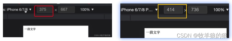
100vw相当于占整个屏幕宽度的100%,所以iPhone6下100vw相当于375px,如果想要根元素font-size是100px, 就要计算出一个对应的根元素的 vw,计算公式:
100vw / 375 = a / 100 => a = 26.6667vw
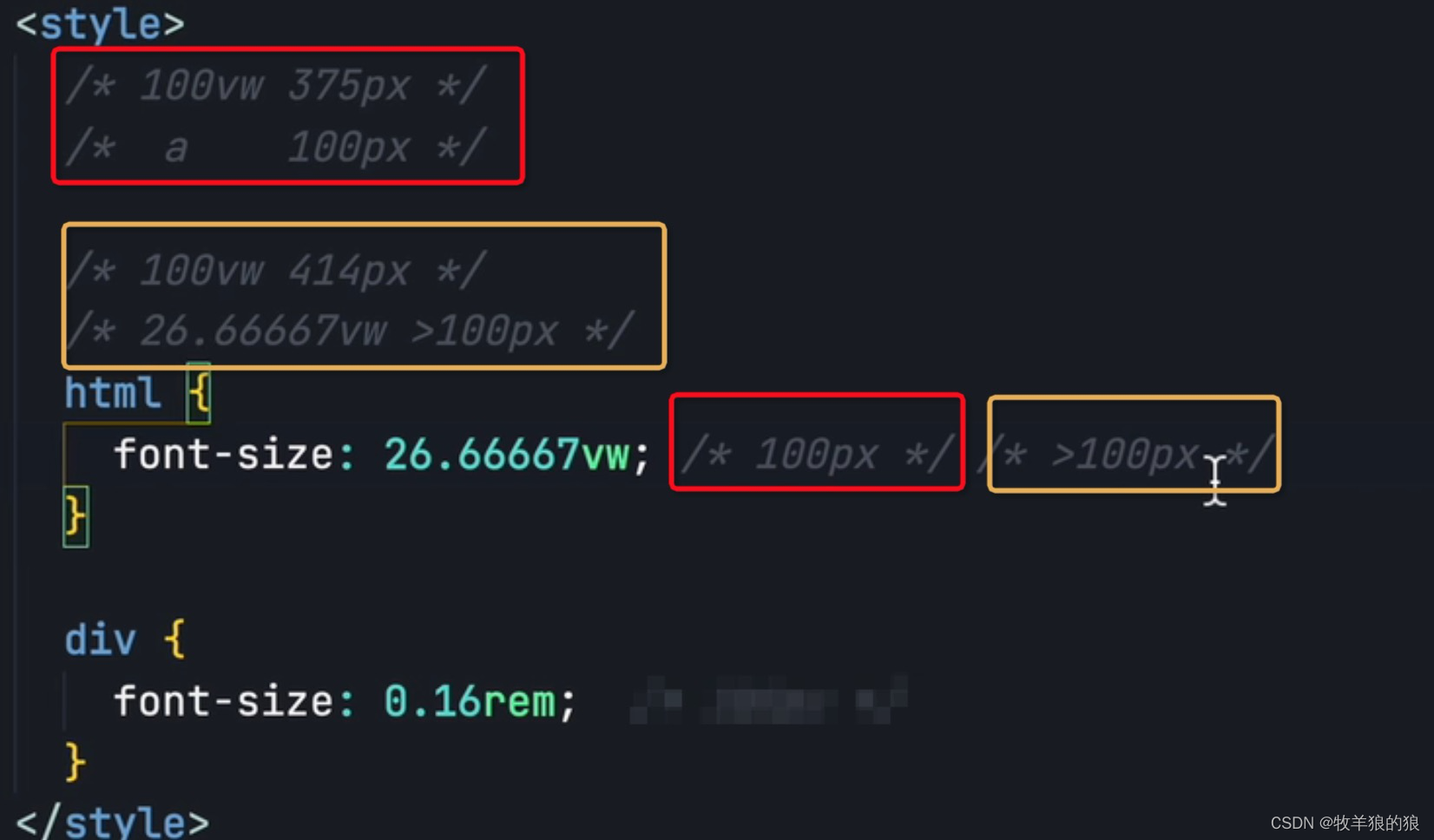
所以,当根元素font-size: 26.66667vw时,相当于根元素100px, 这个时候如果想要页面某个div宽30px,只需要给div宽度设为0.3rem即可。
移动端 1px 像素问题
画三角形
<!DOCTYPE html>
<html lang="en">
<head>
  <title>三角形(箭头向右)</title>
  <style>
    .t1 {
      width: 0;
      height: 0;
      border-left: 20px solid red;
      border-right: 20px solid transparent;
      border-bottom: 20px solid transparent;
      border-top: 20px solid transparent;
    }
  </style>
</head>
<body>
  <div class="t1"></div>
</body>
</html>


 扫一扫
扫一扫


 591
591

 被折叠的 条评论
为什么被折叠?
被折叠的 条评论
为什么被折叠?
 到【灌水乐园】发言


