


QQ: 282397369
开始攻Ribbon,毕竟软件有个象样的界面,还是要拿得出手一点点。
思路就借鉴DevExpress,简化实现,不整太多的不必要环节。
第二个思路就是先实现功能,以后再模块化。
组件实现
先准备初步要用到的组件。
Ribbon
export class TRibbon extends TPageControl {
    btnApp: TButton;
    quickBtns: TButton[];
    constructor(parent: TContainer | null) {
        super(parent);
        this.Font.align = NFontAlign.Left;
        this.Font.Size = 14;
        this.Font.Color = new TColor("#337AB7");
        this.Brush.Color = new TColor("#E5E8EA");
        this.btnApp = new TButton(this);
        this.btnApp.ApplyXml(`boundRect="0, 0, 100, 25" Caption="DrGraph脑图" Font.Color="white" Font.Size="12" glyphPos="Top" Command="Edit.Delete" FillColor="#FF0000"`);
        this.quickBtns = [];
        let delta = 1;
        let left = this.btnApp.Right + delta;
        let quickIcons: string[] = ["FileSave;File.Save", "Undo;Edit.Undo", "Redo;Edit.Redo"];
        for (let i = 0; i < quickIcons.length; ++i) {
            let quickBtn = new TButton(this);
            quickBtn.paintBox = this.paintBox;
            quickBtn.ApplyXml(`boundRect="${left}, 0, 25, 25" onClick="true" Transparent="true" Icon="Icon/24x24/${DrGraph.String.GetStringAt(quickIcons[i], ";", 0)}.png" Command="${DrGraph.String.GetStringAt(quickIcons[i], ";", 1)}"`);
            left += 25 + delta;
        }
        this.Height = 90;
        this.Align = NAlign.Top;
    }

    draw(): boolean {
        if (!this.Enabled)
            return false;
        let ctx: CanvasRenderingContext2D = this.prepareGDI()!;
        this.Brush.Apply(ctx);
        ctx.fillRect(this.absLeft, this.absTop, this.Width, this.Height);
        let activePage = this.ActivePage;
        if (activePage)
            activePage.draw();

        let left = this.absLeft + 200;
        let top = this.absTop + 15;
        let delta = 15;

        this.sheetHeaderRange = []
        let pageIndex = 0;
        this.Font.Apply(ctx);
        this.FSubControls.forEach((control) => {
            let sheet: TTabSheet | null = DrGraph.dynamic_cast(TTabSheet, control);
            if (sheet) {
                let str = sheet.Title;
                let txtWidth = ctx.measureText(str).width;
                if (pageIndex++ == this.ActivePageIndex) {
                    ctx.fillStyle = "white";
                    ctx.fillRect(left, this.absTop - 2, txtWidth + delta * 2, 30);
                	this.Font.Apply(ctx);
                }
                ctx.fillText(str, left + delta, top);
                this.sheetHeaderRange.push(new TPoint(left, txtWidth + delta * 2));
                left += txtWidth + delta * 2;
            }
            let btn: TButton | null = DrGraph.dynamic_cast(TButton, control);
            if (btn)
                btn.draw();
        })
        return true;
    }

    NewTab(caption: string): TRibbonTab {
        let tab = new TRibbonTab(this);
        tab.Title = caption;
        tab.Top = 28;
        tab.Height = this.Height - tab.Top;
        tab.Align = NAlign.Bottom;
        tab.Visible = false;
        return tab;
    }
}
Ribbon主要管理各Tab,增加一个appButton以及多个快捷按钮。
appButton暂以【DrGraph脑图】随便命名
快捷按钮先设置为Save、Undo、Redo
以上后续均应通过配置实现。
RibbonTab
弱化Tab处理,目前先支持单工具栏,后续再实现为多工具栏模式。
export class TRibbonTab extends TTabSheet {
    caption: string = "Noname";
    toolBarPanel: TPanel;

    constructor(parent: TContainer | null) {
        super(parent);
        this.SetBounds(0, 0, 300, 100);
        this.Visible = false;
        this.toolBarPanel = new TToolBar(this);
        this.toolBarPanel.Height = 63;
        this.toolBarPanel.Align = NAlign.Bottom;
        this.Align = NAlign.Client;
    }
}
ToolBar
export class TToolBar extends TPanel {
    constructor(parent: TContainer | null) {
        super(parent);
        this.AutoArrange = true;
    }

    ReAlign() {
        let restRect = this.BoundRect_Screen;
        restRect = restRect.offset(-restRect.left, -restRect.top);
        var helper = new DrCPP.cpp.THelper();
        helper.AlignPos("init", restRect.width, restRect.height);
        this.FSubControls.forEach((control) => {
            if (control.Visible) {
                let pos = helper.AlignPos("append", control.Width, control.Height);
                if (pos >= 0) {
                    control.Top = Math.floor(pos / 10000);
                    control.Left = pos % 10000;
                }
            }
        })
        helper.delete();
        this.FitAll();
    }

    doDraw(ctx: CanvasRenderingContext2D) {
        super.doDraw(ctx);
    }
}
Button
临时凑合,TButton类应该是写得最垃圾,需要大幅度完善。
export class TButton extends TControl {
    caption: string = "";
    icon: string = "";
    mouseOverColor: string = ""
    iconImage: HTMLImageElement | null = null;
    msgHint: string = "";
    checked: boolean = false;
    style: NButtonStyle = NButtonStyle.Default;
    modalResult: NModalResult = NModalResult.None;
    glyphPos: NGlyphPos = NGlyphPos.Left;

    constructor(parent: TContainer | null) {
        super(parent);
        this.Brush.Gradient([0, 0, 100, 50]).AddColorStop("#EEEEEE", "#CCCCCC");
        this.ApplyXml(`"width="100" height="25" mouseOverColor="#FFDDDD" Font.Size="15"`);
    }

    doDraw(ctx: CanvasRenderingContext2D) {
        if (this.Brush.FillStyle != NBrushFillStyle.None) {
            this.Brush.Apply(ctx);
            DrGraph.TCanvas.Rectangle(ctx, this.BoundRect_Screen, DrGraph.DRAW_FILL);
        }
        if (this.isMouseIn && this.mouseOverColor.length) {
            let color = new TColor(this.mouseOverColor);
            ctx.fillStyle = color.toString();
            DrGraph.TCanvas.Rectangle(ctx, this.BoundRect_Screen, DrGraph.DRAW_FILL);
        }
        if (this.checked) {
            this.Brush.Clone().load(`2|${this.absLeft}, ${this.absTop}, ${this.absLeft + this.Width}, ${this.absTop + this.Height}|3|2|2|0,#FBC06E|1,white`) //SetColor("#FBC06E")
                .Apply(ctx);
            DrGraph.TCanvas.Rectangle(ctx, this.BoundRect_Screen.offset(0, -3), DrGraph.DRAW_FILL);
        }

        this.Font.align = NFontAlign.Left;
        this.Font.baseline = NFontBaseline.Middle;
        this.Font.Apply(ctx);
        let glyphRight = 0, showHeight = 0;
        let offset = 0;
        if (this.icon.length && this.glyphPos != NGlyphPos.OnlyText) {
            if (this.iconImage == null) {
                this.iconImage = new Image;
                this.iconImage.src = this.icon;
            }
            glyphRight = this.iconImage.width;
            showHeight = this.iconImage.height;
            let dstLength = Math.min(this.Height, this.Width);
            if (showHeight > dstLength) {
                let ratio = (dstLength - 10) / showHeight;
                showHeight *= ratio;
                glyphRight *= ratio;
            }
            if (showHeight > 0) {
                offset = (dstLength - showHeight) / 2;
                if (this.isMouseIn && this.Enabled == true)
                    offset -= 1;
                let iconImage = this.iconImage;

                ctx.drawImage(iconImage, this.absLeft + offset, this.absTop + offset, glyphRight, showHeight);
            }
            glyphRight += 5;
        }
        if (this.caption.length > 0) {
            if (this.glyphPos == NGlyphPos.Left || this.glyphPos == NGlyphPos.Right)
                this.Font.align = NFontAlign.Left;
            else
                this.Font.align = NFontAlign.Center;
            this.Font.baseline = NFontBaseline.Middle;
            this.Font.Apply(ctx);
            if (this.glyphPos == NGlyphPos.Left || this.glyphPos == NGlyphPos.Right)
                ctx.fillText(this.caption, this.absLeft + glyphRight, this.absTop + this.Height / 2);
            else {
                let top = this.Height / 2;
                if(this.glyphPos == NGlyphPos.Top)
                    top = (this.Height + showHeight) /  2;
                else if(this.glyphPos == NGlyphPos.Bottom)
                    top = (this.Height - showHeight) / 2;
                ctx.fillText(this.caption, this.absLeft + this.Width / 2, this.absTop + top);
            }
        }
        if (this.msgHint.length) {
            ctx.textAlign = "right";
            DrGraph.TCanvas.DrawNumberText(ctx, this.msgHint, this.absLeft + this.Width - 7, this.absTop + 8);
        }
    }
}
调用
        let ribbon = new TRibbon(this.controlManager);
        ribbon.NewTab("思维");
        ribbon.NewTab("外观");
        ribbon.NewTab("视图");
        ribbon.ActivePageIndex = 1;
        ribbon.ActivePage!.Controls(0).loadFromRes(this, DrGraph.PATH_RES + "MainTool.xml", "mainToolPanel", this.refreshControls.bind(this));
对应的xml
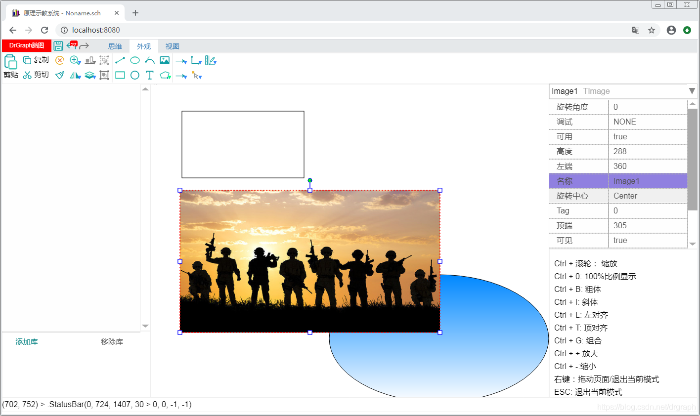
直接用之前的工具栏xml,主要修改Paste按钮为大按钮,Copy、Cut按钮增加Caption,后面的先不处理。
<?xml version='1.0' encoding='gb2312' ?>
<xml desc="UI Control Config by DrGraph">
	<TPanel name="mainToolPanel" autoArrange="true" >
		<TButton name="btnPaste" Icon="Icon/32x32/EditPaste.png" Width="36" Height="36" Caption="剪贴" glyphPos="Top" Transparent="true" onClick="true" Tag="1" Command="Edit.Paste" Hint="粘贴"/>
		<TButton name="btnCopy" Icon="Icon/24x24/EditCopy.png" Caption="复制" Width="30" Height="30" Transparent="true" onClick="true" Tag="1" Command="Edit.Copy" Hint="复制" />
		<TButton name="btnCut" Icon="Icon/24x24/EditCut.png" Caption="剪切" Width="30" Height="30" Transparent="true" onClick="true" Tag="1" Command="Edit.Cut" Hint="剪切" />
		<TButton name="btnDelete2" Icon="Icon/24x24/Delete2.png" Width="30" Height="30" Transparent="true" onClick="true" Tag="1" Command="Edit.Delete" />
		<TButton name="btnFormatBrush" Icon="Icon/24x24/EditFormat.png" Width="30" Height="30" Transparent="true" onClick="true" Tag="1" Command="Edit.FormatBrush" Hint="格式刷" />
		<TButton_DropDown name="btnZoom" btnMain.Icon="Icon/24x24/ZoomIn.png" listPanel.RowHeight="40" listPanel.fontSize="14" dropDownColor="#3388FF" Width="30" Height="30" Transparent="true" onClick="true" Tag="1" Command="Edit.ZoomIn" Hint="放大" >
			<TButton name="btnZoomIn" Icon="Icon/24x24/ZoomIn.png" Caption="放大" Width="30" Height="30" Transparent="true" onClick="true" Tag="1" Command="Edit.ZoomIn" />
			<TButton name="btnZoomOut" Icon="Icon/24x24/ZoomOut.png" Caption="缩小" Width="30" Height="30" Transparent="true" onClick="true" Tag="1" Command="Edit.ZoomOut" />
		</TButton_DropDown>
		<TButton_DropDown name="btnFlip" btnMain.Icon="Icon/24x24/FlipX.png" listPanel.RowHeight="40" listPanel.fontSize="14" dropDownColor="#3388FF" listPanel.RowHeight="30" Width="30" Height="30" Transparent="true" onClick="true" Tag="1" Command="Edit.FlipX" >
			<TButton name="btnFlipX" Icon="Icon/24x24/FlipX.png" Caption="水平翻转" Width="30" Height="30" Transparent="true" onClick="true" Tag="1" Command="Edit.FlipX" />
			<TButton name="btnFlipY" Icon="Icon/24x24/FlipY.png" Caption="垂直翻转" Width="30" Height="30" Transparent="true" onClick="true" Tag="1" Command="Edit.FlipY" />
			<TButton name="btnRotate90" Icon="Icon/24x24/Rotate90.png" Caption="顺时针旋转90度" Width="30" Height="30" Transparent="true" onClick="true" Tag="1" Command="Edit.Rotate90" />
			<TButton name="btnRotate180" Icon="Icon/24x24/Rotate180.png" Caption="旋转180度" Width="30" Height="30" Transparent="true" onClick="true" Tag="1" Command="Edit.Rotate180" />
			<TButton name="btnRotateN90" Icon="Icon/24x24/RotateN90.png" Caption="逆时针旋转90度" Width="30" Height="30" Transparent="true" onClick="true" Tag="1" Command="Edit.Rotate270" />
		</TButton_DropDown>
		<TButton_DropDown name="btnAlign" btnMain.Icon="Icon/24x24/AlignBottom.png" listPanel.RowHeight="40" listPanel.fontSize="14" dropDownColor="#3388FF" Width="30" Height="30" Transparent="true" onClick="true" Tag="1" Command="Edit.AlignLeft" >
			<TButton name="btnAlignLeft" Icon="Icon/24x24/AlignLeft.png" Caption="左端对齐" Width="30" Height="30" Transparent="true" onClick="true" Tag="1" Command="Edit.AlignLeft" />
			<TButton name="btnAlignCenterX" Icon="Icon/24x24/AlignCenterX.png" Caption="水平居中" Width="30" Height="30" Transparent="true" onClick="true" Tag="1" Command="Edit.AlignCenterX" />
			<TButton name="btnAlignRight" Icon="Icon/24x24/AlignRight.png" Caption="右端对齐" Width="30" Height="30" Transparent="true" onClick="true" Tag="1" Command="Edit.AlignRight" />
			<TButton name="btnAlignEqualX" Icon="Icon/24x24/AlignEqualX.png" Caption="水平等距排列" Width="30" Height="30" Transparent="true" onClick="true" Tag="1" Command="Edit.AlignEqualX" />
			<TButton name="btnAlignTop" Icon="Icon/24x24/AlignTop.png" Caption="顶端对齐" Width="30" Height="30" Transparent="true" onClick="true" Tag="1" Command="Edit.AlignTop" />
			<TButton name="btnAlignBottom" Icon="Icon/24x24/AlignBottom.png" Caption="底端对齐" Width="30" Height="30" Transparent="true" onClick="true" Tag="1" Command="Edit.AlignBottom" />
			<TButton name="btnAlignCenterY" Icon="Icon/24x24/AlignCenterY.png" Caption="垂直居中" Width="30" Height="30" Transparent="true" onClick="true" Tag="1" Command="Edit.AlignCenterY" />
			<TButton name="btnAlignEqualY" Icon="Icon/24x24/AlignEqualY.png" Caption="垂直等距排列" Width="30" Height="30" Transparent="true" onClick="true" Tag="1" Command="Edit.AlignEqualY" />
			<TButton name="btnAlignCenter" Icon="Icon/24x24/AlignCenter.png" Caption="窗口居中" Width="30" Height="30" Transparent="true" onClick="true" Tag="1" Command="Edit.AlignCenter" />
		</TButton_DropDown>
		<TButton_DropDown name="btnLevel" btnMain.Icon="Icon/24x24/LevelDown.png" listPanel.RowHeight="40" listPanel.fontSize="14" dropDownColor="#3388FF" Width="30" Height="30" Transparent="true" onClick="true" Tag="1" Command="Edit.LevelDown" >
			<TButton name="btnLevelDown" Icon="Icon/24x24/LevelDown.png" Caption="下移一层" Width="30" Height="30" Transparent="true" onClick="true" Tag="1" Command="Edit.LevelDown" />
			<TButton name="btnLevelBottom" Icon="Icon/24x24/LevelBottom.png" Caption="置于底层" Width="30" Height="30" Transparent="true" onClick="true" Tag="1" Command="Edit.LevelGround" />
			<TButton name="btnLevelTop" Icon="Icon/24x24/LevelTop.png" Caption="置于顶层" Width="30" Height="30" Transparent="true" onClick="true" Tag="1" Command="Edit.LevelTopest" />
			<TButton name="btnLevelUp" Icon="Icon/24x24/LevelUp.png" Caption="上移一层" Width="30" Height="30" Transparent="true" onClick="true" Tag="1" Command="Edit.LevelUp" />
			<TButton name="btnLockX" Icon="Icon/24x24/LockX.png" Caption="水平锁定" Width="30" Height="30" Transparent="true" onClick="true" Tag="1" Command="Edit.LockX" />
			<TButton name="btnLockXY" Icon="Icon/24x24/LockY.png" Caption="垂直锁定" Width="30" Height="30" Transparent="true" onClick="true" Tag="1" Command="Edit.LockY" />
		</TButton_DropDown>
		<TButton name="btnDeGroup" Icon="Icon/24x24/DeGroup.png" Hint="分解" Width="30" Height="30" Transparent="true" onClick="true" Tag="1" Command="Edit.DeGroup" />
		<TButton name="btnGroup" Icon="Icon/24x24/Group.png" Hint="组合" Width="30" Height="30" Transparent="true" onClick="true" Tag="1" Command="Edit.Group" />
		<TButton name="splitter1" Width="2" Height="60" FillColor="#F0F0F0" />
		<TButton name="btnInsertLine" Icon="Icon/24x24/Meta_Line.png" Width="30" Height="30" Transparent="true" onClick="true" Tag="1" Command="Insert.Line" />
		<TButton name="btnInsertRect" Icon="Icon/24x24/Meta_Rectangle.png" Width="30" Height="30" Transparent="true" onClick="true" Tag="1" Command="Insert.Rectangle" />
		<TButton name="btnInsertEllipse" Icon="Icon/24x24/Meta_Ellipse.png" Width="30" Height="30" Transparent="true" onClick="true" Tag="1" Command="Insert.Ellipse" />
		<TButton name="btnInsertCircle" Icon="Icon/24x24/Meta_Circle.png" Width="30" Height="30" Transparent="true" onClick="true" Tag="1" Command="Insert.Circle" />
		<TButton name="btnInsertCurve" Icon="Icon/24x24/Meta_Curve.png" Width="30" Height="30" Transparent="true" onClick="true" Tag="1" Command="Insert.Curve" />
		<TButton name="btnInsertText" Icon="Icon/24x24/Meta_Text.png" Width="30" Height="30" Transparent="true" onClick="true" Tag="1" Command="Insert.Text" />
		<TButton name="btnInsertImage" Icon="Icon/24x24/Meta_Image.png" Width="30" Height="30" Transparent="true" onClick="true" Tag="1" Command="Insert.Image" />
		<TButton_DropDown name="btnInsertPolygons" btnMain.Icon="Icon/24x24/Meta_Polygon.png" listPanel.RowHeight="40" listPanel.fontSize="14" rowCount="15" Width="30" Height="30" Transparent="true" onClick="true" Tag="1" Command="Insert.Polygon" >
			<TButton name="btnInsertPolygon" Icon="Icon/24x24/Meta_Polygon.png" Caption="多边形" Width="30" Height="30" Transparent="true" onClick="true" Tag="1" Command="Insert.Polygon.Polygon" />
			<TButton name="btnInsertLines" Icon="Icon/24x24/Meta_Polygon2.png" Caption="多线段" Width="30" Height="30" Transparent="true" onClick="true" Tag="1" Command="Insert.Polygon.Lines" />
			<TButton name="btnInsertPolygon3" Icon="Icon/24x24/Meta_Polygon3.png" Caption="等边三角形" Width="30" Height="30" Transparent="true" onClick="true" Tag="1" Command="Insert.Polygon.3" />
			<TButton name="btnInsertPolygon4" Icon="Icon/24x24/Meta_Polygon4.png" Caption="正方形" Width="30" Height="30" Transparent="true" onClick="true" Tag="1" Command="Insert.Polygon.4" />
			<TButton name="btnInsertPolygon5" Icon="Icon/24x24/Meta_Polygon5.png" Caption="正五边形" Width="30" Height="30" Transparent="true" onClick="true" Tag="1" Command="Insert.Polygon.5" />
			<TButton name="btnInsertPolygon6" Icon="Icon/24x24/Meta_Polygon6.png" Caption="正六边形" Width="30" Height="30" Transparent="true" onClick="true" Tag="1" Command="Insert.Polygon.6" />
			<TButton name="btnInsertPolygon8" Icon="Icon/24x24/Meta_Polygon8.png" Caption="正八边形" Width="30" Height="30" Transparent="true" onClick="true" Tag="1" Command="Insert.Polygon.8" />
			<TButton name="btnInsertPolygon5" Icon="Icon/24x24/Meta_Polygon5N.png" Caption="正五角星" Width="30" Height="30" Transparent="true" onClick="true" Tag="1" Command="Insert.Polygon.-5" />
			<TButton name="btnInsertPolygon6" Icon="Icon/24x24/Meta_Polygon7N.png" Caption="正七角星" Width="30" Height="30" Transparent="true" onClick="true" Tag="1" Command="Insert.Polygon.-7" />
			<TButton name="btnInsertPolygon8" Icon="Icon/24x24/Meta_Polygon8N.png" Caption="正八角星" Width="30" Height="30" Transparent="true" onClick="true" Tag="1" Command="Insert.Polygon.-8" />
			<TButton name="btnInsertPolygon8" Icon="Icon/24x24/Meta_Polygon9N.png" Caption="正九角星" Width="30" Height="30" Transparent="true" onClick="true" Tag="1" Command="Insert.Polygon.-9" />
		</TButton_DropDown>
		<TButton name="splitter2" Width="2" Height="60" FillColor="#F0F0F0" />
		<TButton_DropDown name="btnBeginArrow" btnMain.Icon="Icon/24x24/Arrow1.png" listPanel.RowHeight="40" listPanel.fontSize="14" rowCount="13" dropDownColor="#3388FF" Width="30" Height="30" Transparent="true" onClick="true" Tag="1" Command="Param.BeginArrow.1" >
			<TButton name="btnStyleArrow1" Icon="Icon/24x24/Arrow1.png" Caption="无箭头" Width="30" Height="30" Transparent="true" onClick="true" Tag="1" Command="Param.BeginArrow.1" />
			<TButton name="btnStyleArrow2" Icon="Icon/24x24/Arrow2.png" Caption="箭头2" Width="30" Height="30" Transparent="true" onClick="true" Tag="1" Command="Param.BeginArrow.2" />
			<TButton name="btnStyleArrow3" Icon="Icon/24x24/Arrow3.png" Caption="箭头3" Width="30" Height="30" Transparent="true" onClick="true" Tag="1" Command="Param.BeginArrow.3" />
			<TButton name="btnStyleArrow4" Icon="Icon/24x24/Arrow4.png" Caption="箭头4" Width="30" Height="30" Transparent="true" onClick="true" Tag="1" Command="Param.BeginArrow.4" />
			<TButton name="btnStyleArrow5" Icon="Icon/24x24/Arrow5.png" Caption="箭头5" Width="30" Height="30" Transparent="true" onClick="true" Tag="1" Command="Param.BeginArrow.5" />
			<TButton name="btnStyleArrow6" Icon="Icon/24x24/Arrow6.png" Caption="箭头6" Width="30" Height="30" Transparent="true" onClick="true" Tag="1" Command="Param.BeginArrow.6" />
			<TButton name="btnStyleArrow7" Icon="Icon/24x24/Arrow7.png" Caption="箭头7" Width="30" Height="30" Transparent="true" onClick="true" Tag="1" Command="Param.BeginArrow.7" />
			<TButton name="btnStyleArrow8" Icon="Icon/24x24/Arrow8.png" Caption="箭头8" Width="30" Height="30" Transparent="true" onClick="true" Tag="1" Command="Param.BeginArrow.8" />
			<TButton name="btnStyleArrow9" Icon="Icon/24x24/Arrow9.png" Caption="箭头9" Width="30" Height="30" Transparent="true" onClick="true" Tag="1" Command="Param.BeginArrow.9" />
			<TButton name="btnStyleArrow10" Icon="Icon/24x24/Arrow10.png" Caption="箭头10" Width="30" Height="30" Transparent="true" onClick="true" Tag="1" Command="Param.BeginArrow.10" />
			<TButton name="btnStyleArrow11" Icon="Icon/24x24/Arrow11.png" Caption="箭头11" Width="30" Height="30" Transparent="true" onClick="true" Tag="1" Command="Param.BeginArrow.11" />
			<TButton name="btnStyleArrow12" Icon="Icon/24x24/Arrow12.png" Caption="箭头12" Width="30" Height="30" Transparent="true" onClick="true" Tag="1" Command="Param.BeginArrow.12" />
		</TButton_DropDown>
		<TButton_DropDown name="btnEndArrow" btnMain.Icon="Icon/24x24/Arrow1.png" listPanel.RowHeight="40" listPanel.fontSize="14" rowCount="13" dropDownColor="#3388FF" Width="30" Height="30" Transparent="true" onClick="true" Tag="1" Command="Param.EndArrow.1" >
			<TButton name="btnStyleArrow1" Icon="Icon/24x24/Arrow1.png" Caption="无箭头" Width="30" Height="30" Transparent="true" onClick="true" Tag="1" Command="Param.EndArrow.1" />
			<TButton name="btnStyleArrow2" Icon="Icon/24x24/Arrow2.png" Caption="箭头2" Width="30" Height="30" Transparent="true" onClick="true" Tag="1" Command="Param.EndArrow.2" />
			<TButton name="btnStyleArrow3" Icon="Icon/24x24/Arrow3.png" Caption="箭头3" Width="30" Height="30" Transparent="true" onClick="true" Tag="1" Command="Param.EndArrow.3" />
			<TButton name="btnStyleArrow4" Icon="Icon/24x24/Arrow4.png" Caption="箭头4" Width="30" Height="30" Transparent="true" onClick="true" Tag="1" Command="Param.EndArrow.4" />
			<TButton name="btnStyleArrow5" Icon="Icon/24x24/Arrow5.png" Caption="箭头5" Width="30" Height="30" Transparent="true" onClick="true" Tag="1" Command="Param.EndArrow.5" />
			<TButton name="btnStyleArrow6" Icon="Icon/24x24/Arrow6.png" Caption="箭头6" Width="30" Height="30" Transparent="true" onClick="true" Tag="1" Command="Param.EndArrow.6" />
			<TButton name="btnStyleArrow7" Icon="Icon/24x24/Arrow7.png" Caption="箭头7" Width="30" Height="30" Transparent="true" onClick="true" Tag="1" Command="Param.EndArrow.7" />
			<TButton name="btnStyleArrow8" Icon="Icon/24x24/Arrow8.png" Caption="箭头8" Width="30" Height="30" Transparent="true" onClick="true" Tag="1" Command="Param.EndArrow.8" />
			<TButton name="btnStyleArrow9" Icon="Icon/24x24/Arrow9.png" Caption="箭头9" Width="30" Height="30" Transparent="true" onClick="true" Tag="1" Command="Param.EndArrow.9" />
			<TButton name="btnStyleArrow10" Icon="Icon/24x24/Arrow10.png" Caption="箭头10" Width="30" Height="30" Transparent="true" onClick="true" Tag="1" Command="Param.EndArrow.10" />
			<TButton name="btnStyleArrow11" Icon="Icon/24x24/Arrow11.png" Caption="箭头11" Width="30" Height="30" Transparent="true" onClick="true" Tag="1" Command="Param.EndArrow.11" />
			<TButton name="btnStyleArrow12" Icon="Icon/24x24/Arrow12.png" Caption="箭头12" Width="30" Height="30" Transparent="true" onClick="true" Tag="1" Command="Param.EndArrow.12" />
		</TButton_DropDown>
		<TButton_DropDown name="btnConnType" btnMain.Icon="Icon/24x24/Conn_RightAngle.png" listPanel.RowHeight="40" listPanel.fontSize="14" dropDownColor="#3388FF" Width="30" Height="30" Transparent="true" onClick="true" Tag="1" Command="Param.ConnectType.RightAngle" >
			<TButton name="btnConnTypeBezier" Icon="Icon/24x24/Meta_Bezier.png" Caption="贝塞尔曲线" Width="30" Height="30" Transparent="true" onClick="true" Tag="1" Command="Param.ConnectType.Bezier" />
			<TButton name="btnConnTypeLine" Icon="Icon/24x24/Meta_Line.png" Caption="直线段" Width="30" Height="30" Transparent="true" onClick="true" Tag="1" Command="Param.ConnectType.Line" />
			<TButton name="btnConnTypeRightAngle" Icon="Icon/24x24/Conn_RightAngle.png" Caption="直角折线" Width="30" Height="30" Transparent="true" onClick="true" Tag="1" Command="Param.ConnectType.RightAngle" />
		</TButton_DropDown>
		<TButton_DropDown name="btnPriority" btnMain.Icon="Icon/24x24/PriorityConnection.png" listPanel.RowHeight="40" listPanel.fontSize="14" dropDownColor="#3388FF" Width="30" Height="30" Transparent="true" onClick="true" Tag="1" Command="Param.Priority.Connection" >
			<TButton name="btnPriorityModel" Icon="Icon/24x24/PriorityModel.png" Caption="模型点优先" Width="30" Height="30" Transparent="true" onClick="true" Tag="1" Command="Param.Priority.Model" />
			<TButton name="btnPriorityConn" Icon="Icon/24x24/PriorityConnection.png" Caption="连接点优先" Width="30" Height="30" Transparent="true" onClick="true" Tag="1" Command="Param.Priority.Connection" />
			<TButton name="btnPriorityHelp" Icon="Icon/24x24/PriorityHelp.png" Caption="查看对象信息" Width="30" Height="30" Transparent="true" onClick="true" Tag="1" Command="Edit.Help" />
		</TButton_DropDown>
		<TButton_DropDown name="btnMark" btnMain.Icon="Icon/24x24/Mark.png" listPanel.RowHeight="40" listPanel.fontSize="14" dropDownColor="#3388FF" Width="30" Height="30" Transparent="true" onClick="true" Tag="1" Command="Insert.Mark.Points_Length" >
			<TButton name="btnMarkPointsLength" Icon="Icon/24x24/MarkPointsLength.png" Caption="两点长度" Width="30" Height="30" Transparent="true" onClick="true" Tag="1" Command="Insert.Mark.PointsLength" />
			<TButton name="btnMarkPointsHorz" Icon="Icon/24x24/MarkPointsHorz.png" Caption="两点水平" Width="30" Height="30" Transparent="true" onClick="true" Tag="1" Command="Insert.Mark.PointsHorz" />
			<TButton name="btnMarkPointsVert" Icon="Icon/24x24/MarkPointsVert.png" Caption="两点垂直" Width="30" Height="30" Transparent="true" onClick="true" Tag="1" Command="Insert.Mark.PointsVert" />
			<TButton name="btnMarkLineLength" Icon="Icon/24x24/MarkLineLength.png" Caption="线段长度" Width="30" Height="30" Transparent="true" onClick="true" Tag="1" Command="Insert.Mark.LineLength" />
			<TButton name="btnMarkLineHorz" Icon="Icon/24x24/MarkLineHorz.png" Caption="线段水平" Width="30" Height="30" Transparent="true" onClick="true" Tag="1" Command="Insert.Mark.LineHorz" />
			<TButton name="btnMarkLineVert" Icon="Icon/24x24/MarkLineVert.png" Caption="线段垂直" Width="30" Height="30" Transparent="true" onClick="true" Tag="1" Command="Insert.Mark.LineVert" />
			<TButton name="btnPriorityHelp" Icon="Icon/24x24/MarkAngle.png" Caption="角度标注" Width="30" Height="30" Transparent="true" onClick="true" Tag="1" Command="Insert.Mark.Angle" />
		</TButton_DropDown>
	</TPanel>
</xml>
运行效果
下一步工作
初步达到预期,后续需要做模块化工作,主要包括以下几点:
- 丰富Ribbon中的各界面要素,比如下拉框、Gallery等
- 完全可配置化
- BackView
- 主题皮肤


 2264


 扫一扫


 被折叠的 条评论
为什么被折叠?
 到【灌水乐园】发言


